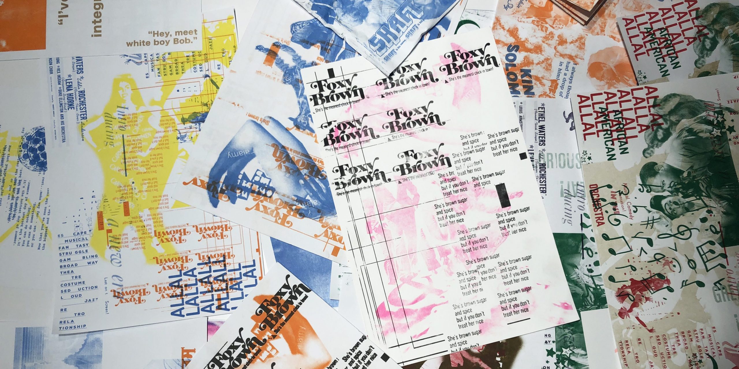
Student Submissions from the Swiss Grid Microsite

Grid Building Blocks: Movie Poster Design
What’s so special about a poster? A poster has a finite space to communicate a lot of information that is digestible in a quick glimpse. When it comes to movies, a poster has to entice the potential viewer, present a mood, and persuade someone to go see the movie. How are they successful or not successful in doing so? How does the grid impact the success of the design?
Beyond Print: The Instagram Grid
One of the most succinct ways to communicate a brand identity and company ethos is through their Instagram grid. Think about some examples of brands, companies, and organizations that you think use the grid successfully to create a unique identity? What characteristics come across through their selections?
Organizing Mass Material: Editorial Layout Design
The modular grid is a basis for all areas of graphic design but is especially important in editorial design. The use of such layout allows organizing of various elements of a page, giving its design integrity and clarity. At the same time, modular grid allows one to quickly and properly organize work on a magazine’s spreads, make graphic and text blocks proportional, as well as
to control margins.
Improv & Weaving: Recombinant Methods of Co-production in Design
This assignment by contributor Curry Hackett is a peer-led group “performance” which rejects the myth of the “individual genius” in the Euro-American tradition. Students are encouraged to work together in an iterative process to create something that represents the plurality of its makers. The assignment starts by considering how source material will influence the design, and asks students to call upon influences that speak to them.
This site features student submissions from the Swiss Grid Microsite, created by Poster House in conjunction with educators to be used in classrooms.