Wes Wilson: From Art Nouveau to Psychedelic
This article by our Chief Curator is reproduced in its entirety from the Muse by Clio, where it first appeared on February 14, 2020.
On Jan. 24, we lost Wes Wilson, one of the Big Five in the San Francisco rock scene. His posters would come to define an electric period of music advertising on the West Coast, one which borrowed heavily from 19th-century trends and which still manages to feel fresh and exciting today.
Despite what he would become best known for, Wilson’s fist poster was not actually for a concert but rather a self-published statement of protest. Caught up in the anti-Vietnam War sentiment that was sweeping the country, he produced a design that merged the American flag with a swastika, aggressively demanding, “Are we next?” With racism on the rise today, this poster seems just as relevant and terrifying today as it did in 1965, if not more so.
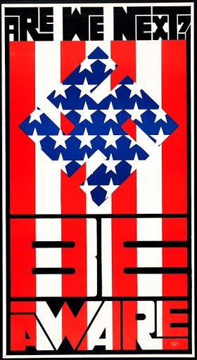
Art We Next?, Wes Wilson, 1965
Image c/o the Artist
Within a year, he would start making concert posters for event producers Bill Graham and Chet Helms. He had been working as a layout designer for Contact Printing in San Francisco, where Graham had been printing fliers for his early shows. Wilson took a shine to the content, creating one of the first psychedelic rock posters by taking a classic Secessionist typeface by Alfred Roller and warping it. You can perhaps best see this by comparing Roller’s 1902 poster for an art exhibition with Wilson’s 1967 poster for Otis Rush performing at the Fillmore.
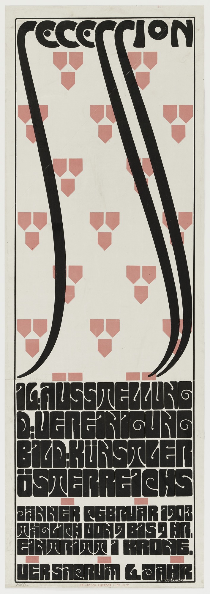
Left: Secession 16 Ausstellung, Alfred Roller, 1902
Image c/o MoMA
Right: Otis Rush, Wes Wilson, 1967
Image c/o SFMoMA
Popular myth has it that Graham liked Wilson’s first concert poster but said he couldn’t use it because the text was illegible, to which Wilson replied, “They’ll stop to read it because they can’t read it.” Targeted marketing at its finest.
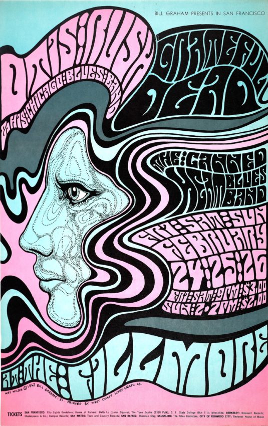
The Doors, Wes Wilson, 1967
Image c/o MomA
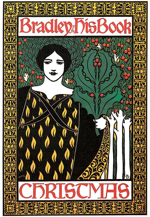
In his 1967 poster for the Doors, we get another of many glimpses into the trove of vintage imagery that inspired Wilson. His purple-haired lady surrounded by organic foliage and hand-drawn patterns clearly references some of the best work by American posterist Will Bradley. Look at the hairstyles in Bradley’s “When Hearts Are Trumps” and the intricate detail work in his Christmas design.
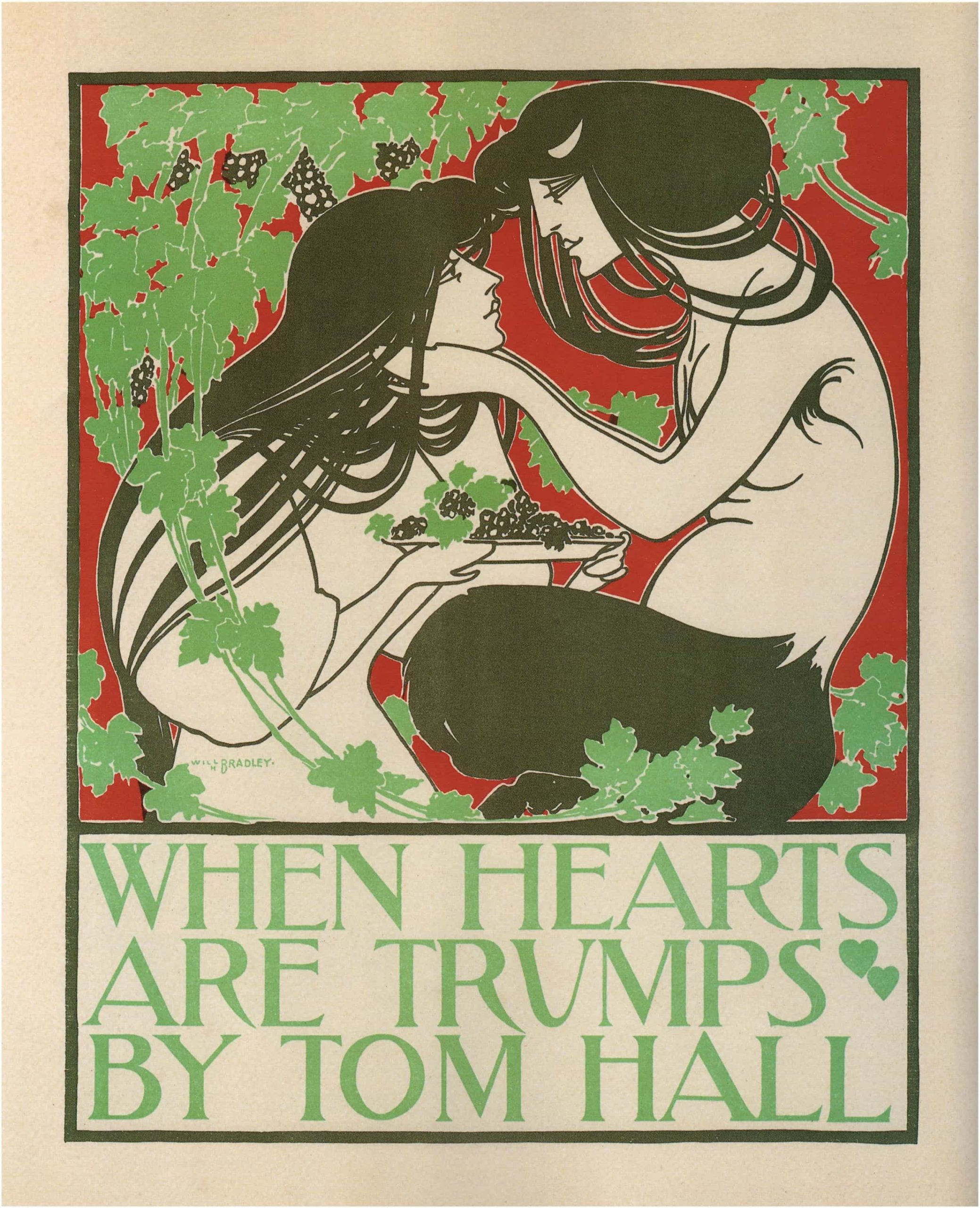
Left: When Hearts Are Trumps, Will Bradley, 1894
Image c/o RetroGraphik
Right: Bradley & His Book, Will Bradley, 1896
Image c/o Pinterest
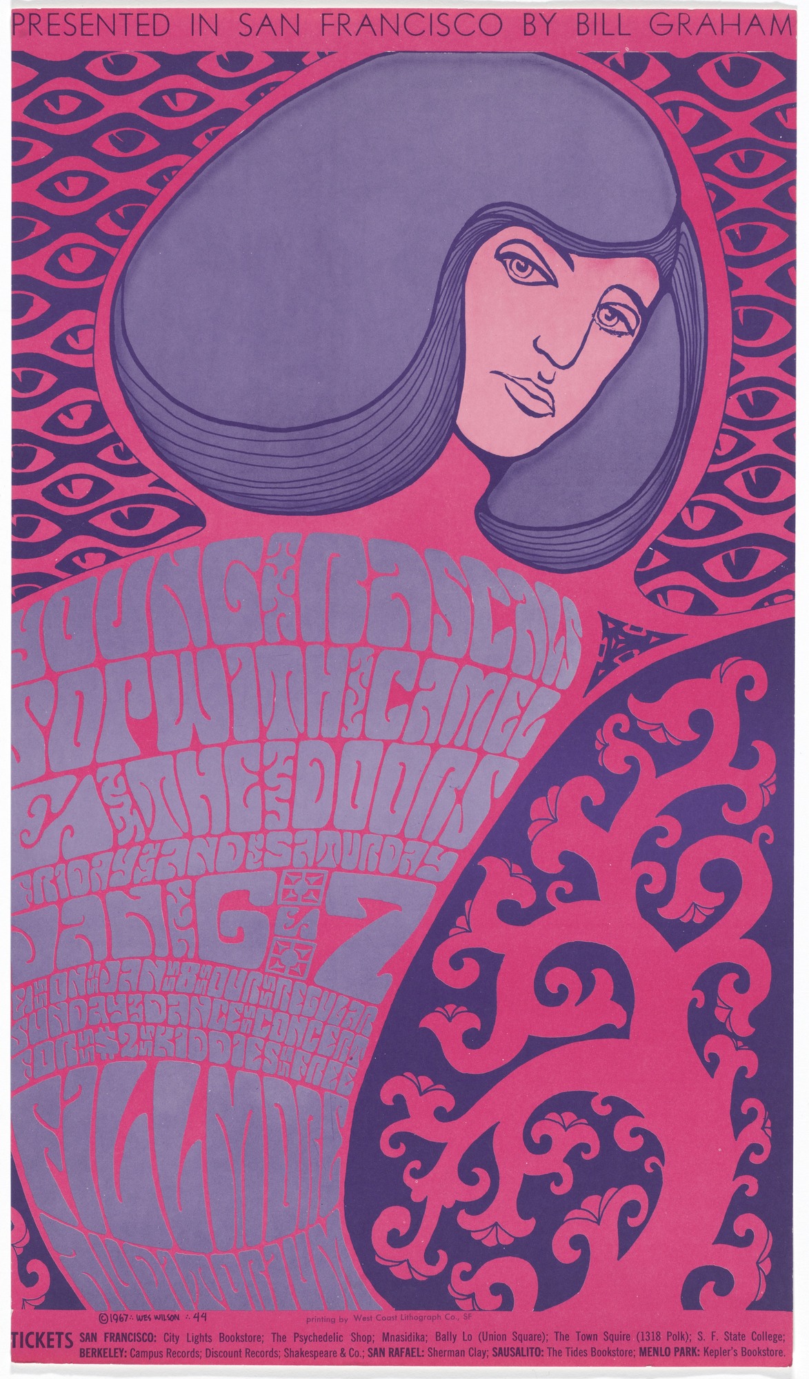
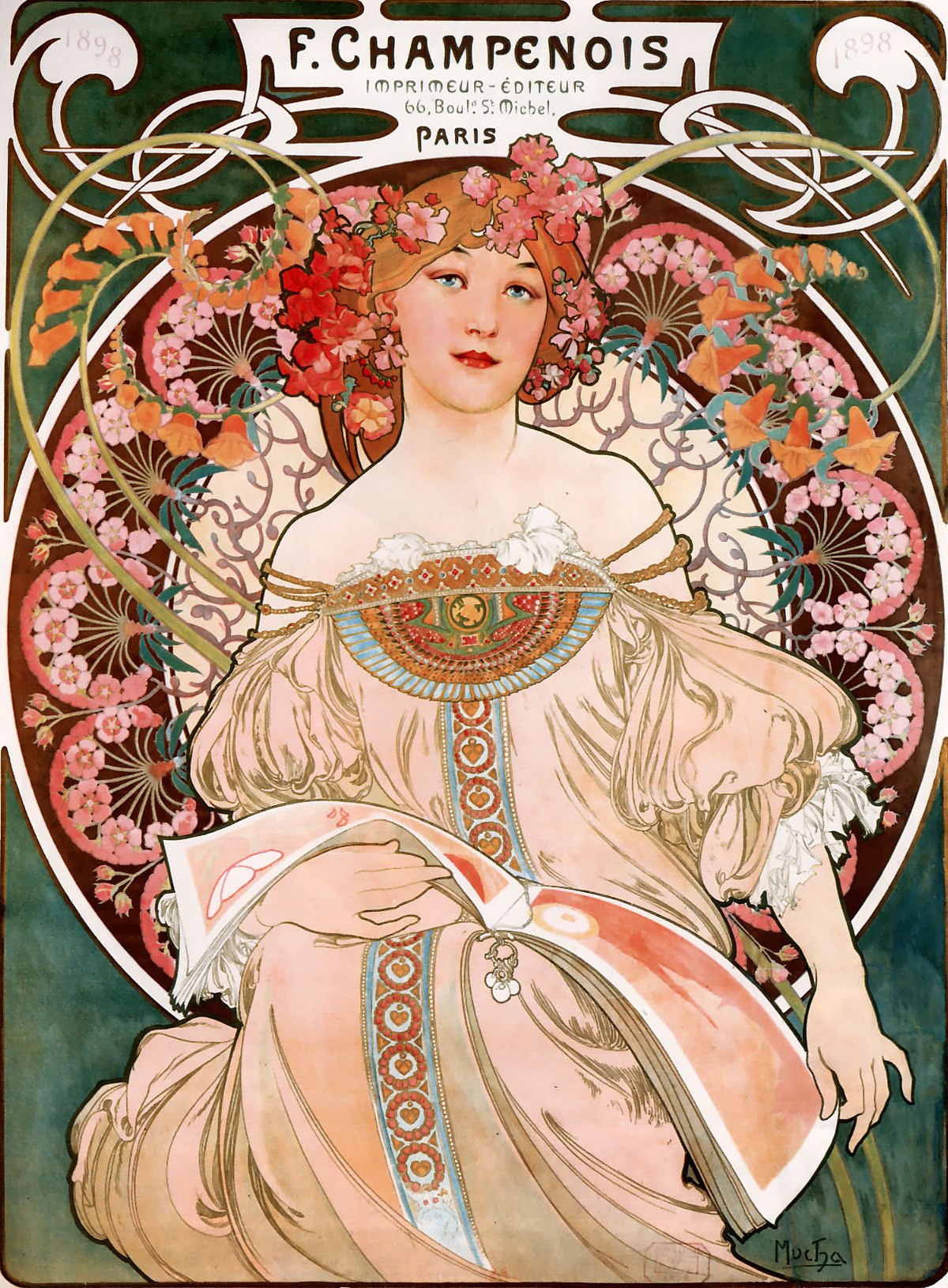
Now compare Wilson’s 1966 poster for Muddy Waters with any of Alphonse Mucha’s haloed Art Nouveau ladies. The first major modern Mucha exhibit had just occurred at London’s Victoria and Albert Museum, and Mucha was all the rage, with other psychedelic poster artists like Alton Kelley and Stanley Mouse also drawing from the Art Nouveau master.
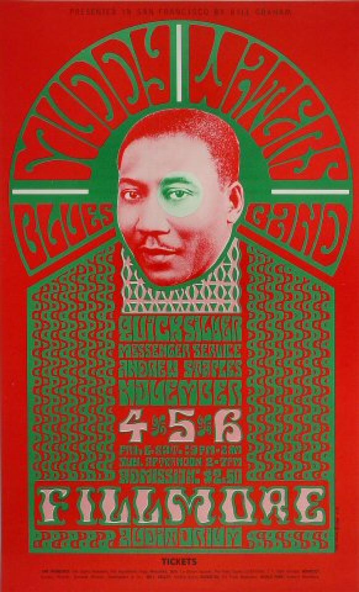
Left: Muddy Waters, Wes Wilson, 1966
Image c/o Wolfgang’s Vault
Right: Imp. F. Champenois, Alphonse Mucha, 1898
Image c/o Wikipedia
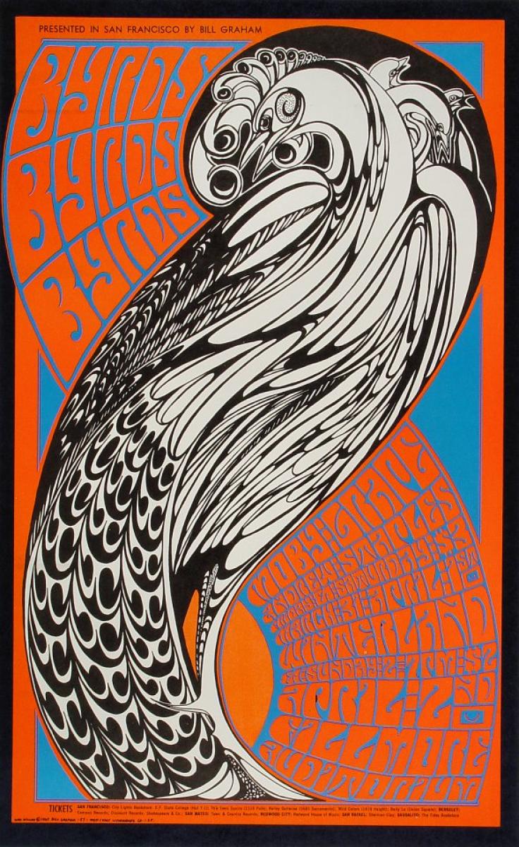
Even Wilson’s 1967 poster for the Byrds calls to mind many of the best peacock illustrations by Aubrey Beardsley, complete with undulating curves and thick pen-and-ink style line. Wilson and others in his field had a vintage poster playbook that they were sharing with the world in new, innovative ways draped in a curtain of neon.
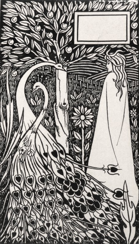
Left: The Byrds, Wes Wilson, 1967
Image c/o Wolfgang’s Vault
Right: A Damosel With Peacocks in a Garden, Aubrey Beardsley, 1893
Image c/o Chris Beetles
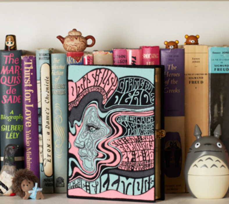
The enduring popularity of Wilson’s posters is evident not only in the skyrocketing market for concert posters of the period, but also in the consistent use of his imagery by major contemporary fashion houses. In 2016, Dries Van Noten replicated Wilson’s 1967 poster for Otis Rush in his Autumn/Winter collection, while Olympia Le-Tan would do the same in her 2017 line of handbags.
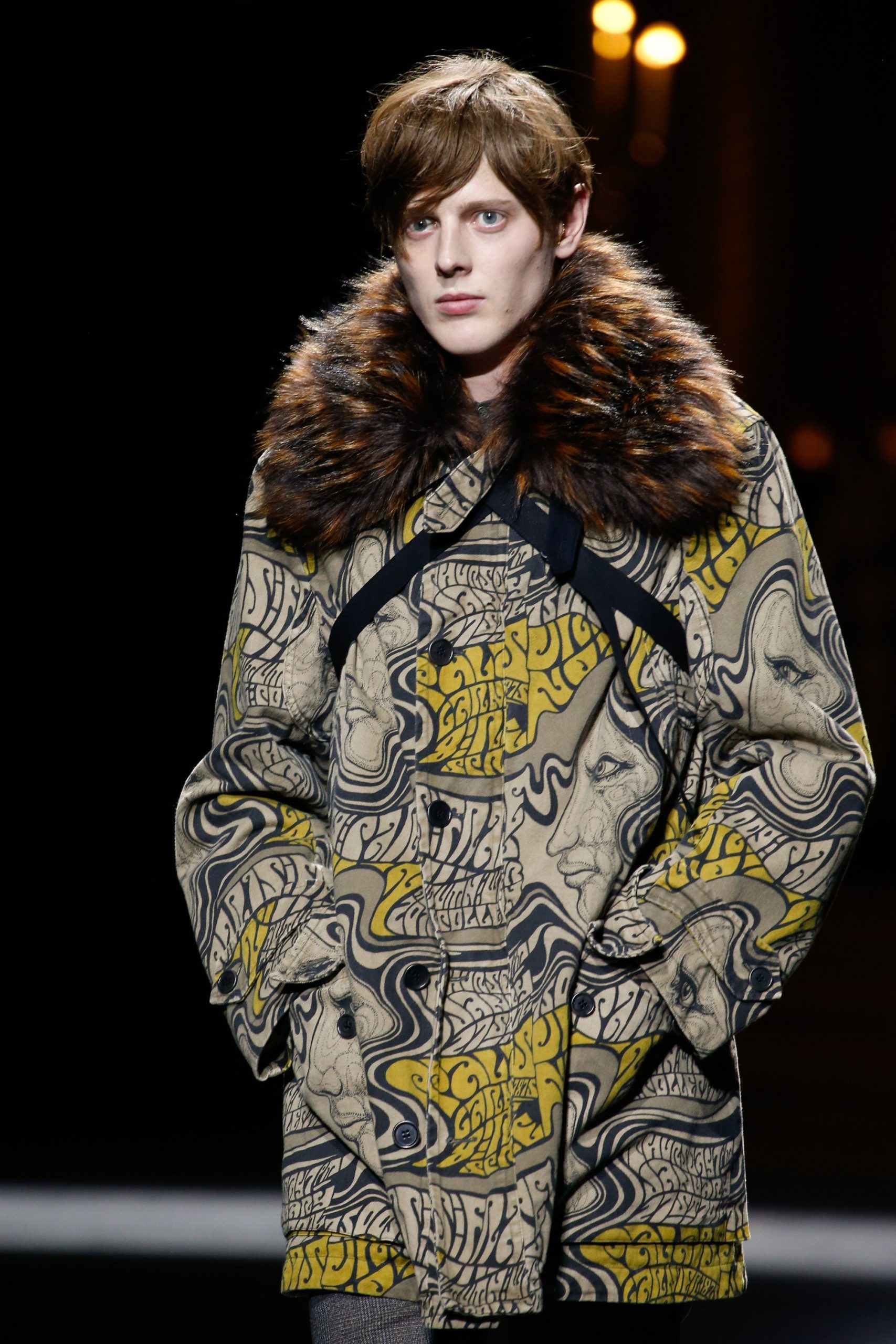
Left: Dries Van Noten’s 2016 Autumn/Winter collection
Image c/o Vogue
Right: Olympia Le-Tan 2017 handbag
Image c/o designer’s website
The trend of making a typeface and style of line that came to the fore in the 1890s not only chic but incredibly modern once more only proves the lasting power and impact of this type of advertising.