Station Domination: An Underground Exhibition
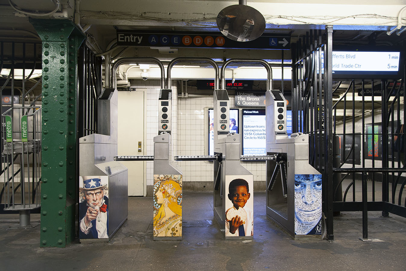
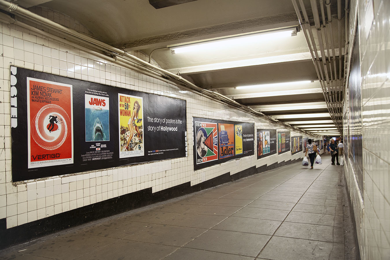
West 4th Street Subway Station, July 2019
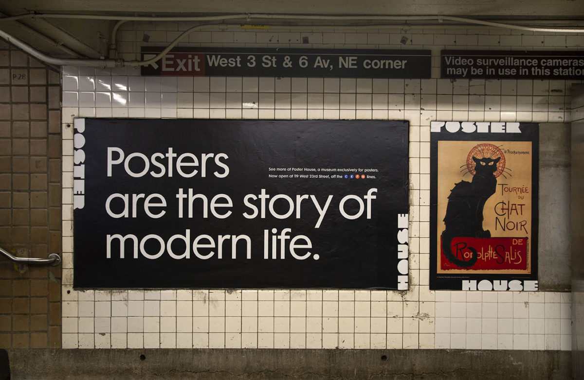
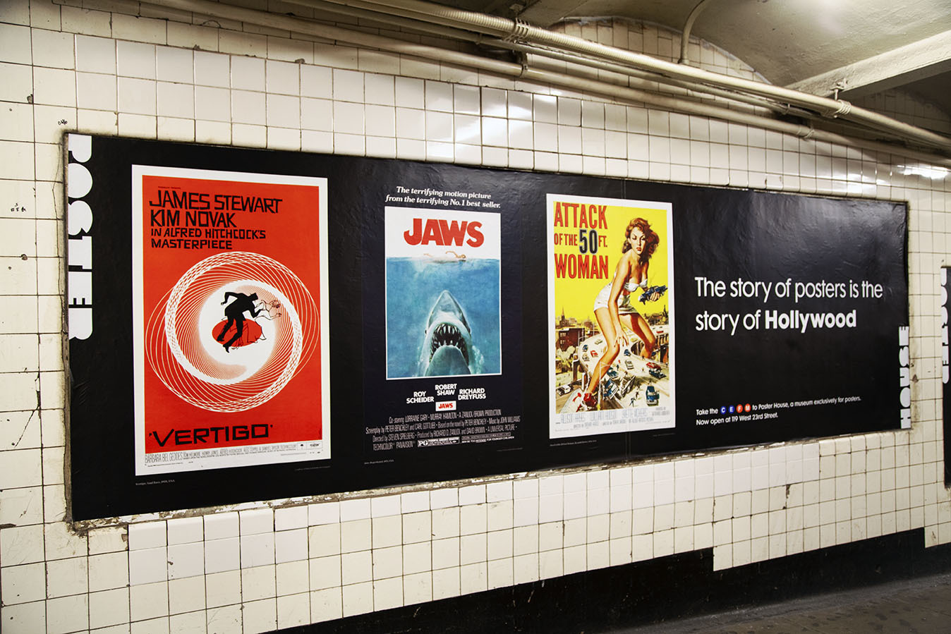
Posters are the story of modern life. They have the ability to start movements, sell products, entice followers, spark rage, pique interest, posit questions. They can shock, scare, entrance, beguile—all in a fraction of a second. For the month of July, we chose 47 posters from the past 130 years that still speak to a diverse audience about the power of graphic design. Flip through some installation images above, and read more about the unique history of each image.
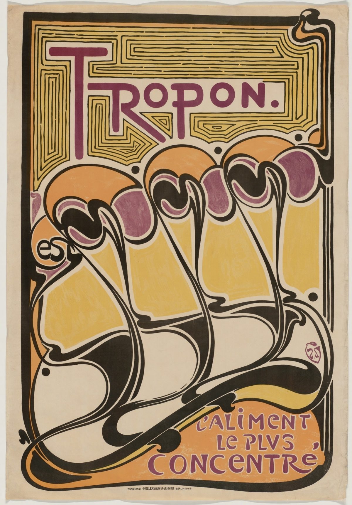
Tropon by Henry Van de Velde, 1898 (image c/o MoMA)
This is one of the most important and influential posters from the Art Nouveau period, fully embracing the movement’s obsession with organic, sinuous lines and pastel tones. It is also Van de Velde’s only poster, created soon after being hired by Tropon Werke, a food company, as its Director of Advertising. The best part is discovering that this ornate, sumptuous image simply advertise powdered egg whites—represented by the yolks, just below the text, being beautifully separated from the whites, below.
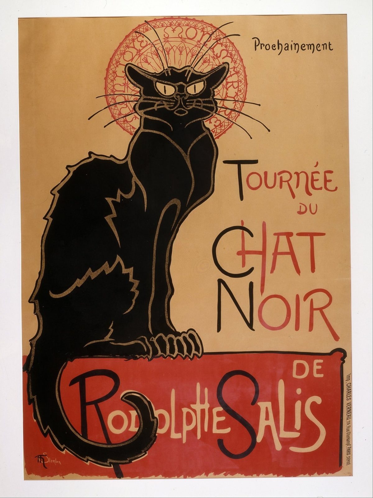
Le Chat Noir by Théophile-Alexandre Steinlen, 1896 (image c/o Wikimedia Commons)
You can’t walk down a street in Paris without seeing a hundred tchotchkes decorated with this image—and rightly so, as it has become one of the most recognizable posters from the Belle Époque period. What you may not know is that Steinlen was basically a crazy cat man, tending to dozens of them out of his home in Montmartre. At the time, cats were also frequently used to represent the bohemian female spirit, making the inclusion of a halo around this kitty a bawdy, tongue-in-cheek reference to Mucha’s well known poster ladies.
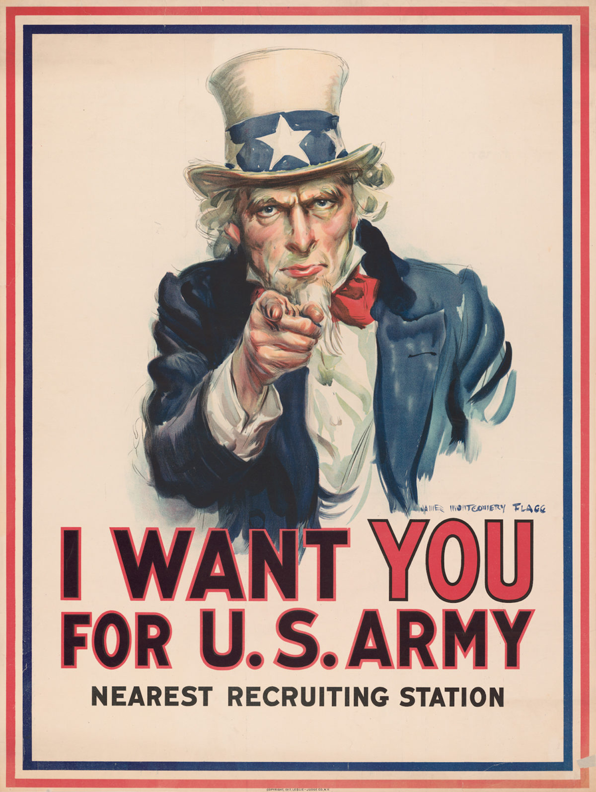
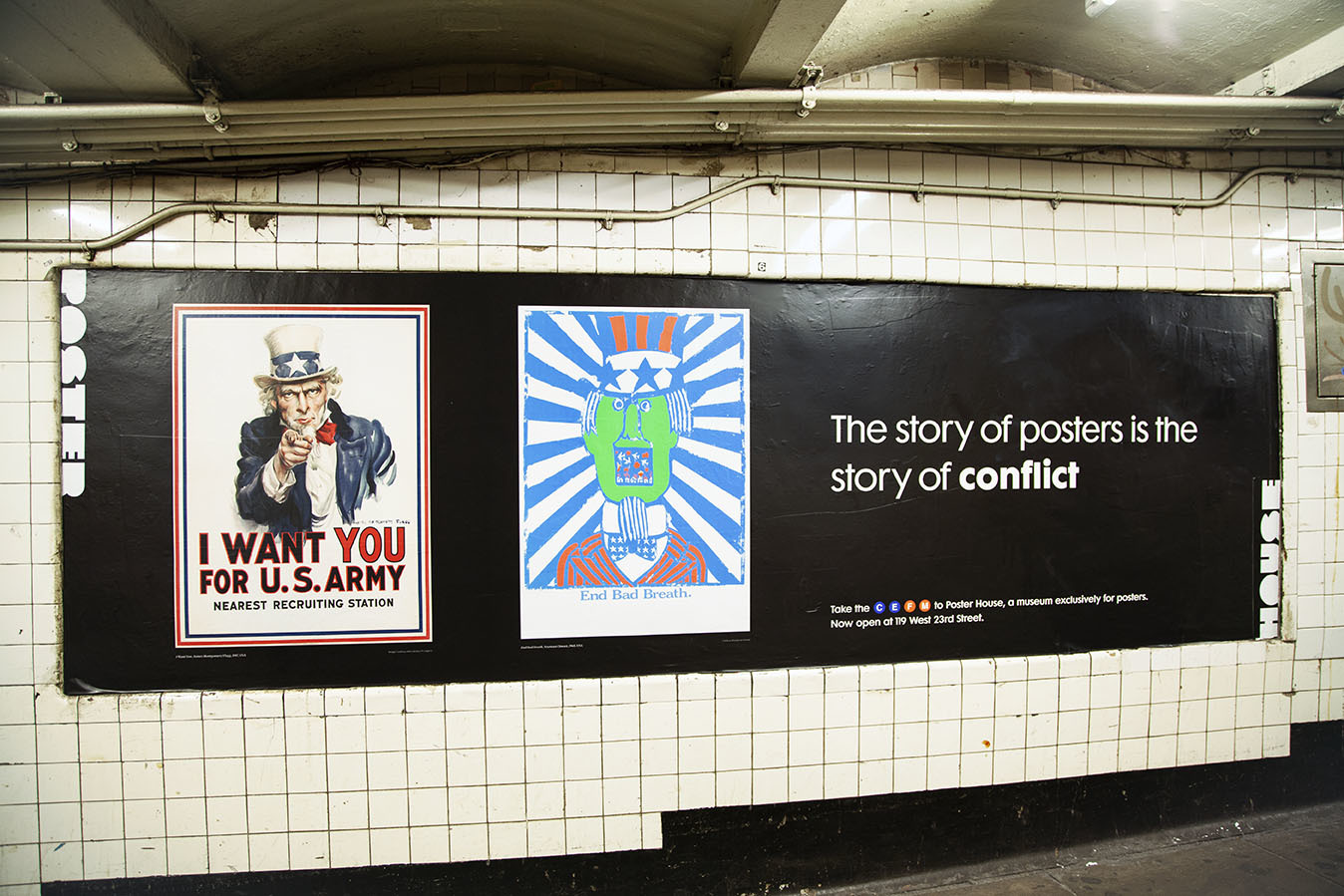
I Want You by James Montgomery Flagg, 1917 (image c/o Illustration Chronicles)
Much of this poster’s history was covered in our Hot Poster Gossip entry on the evolution of pointing fingers in posters (c/o the great Mirko Ilic). What we didn’t mention is that Flagg used himself as a model for Uncle Sam, adding a beard and aging himself slightly in order to become an authoritative symbol of America. This poster proved so powerful it was re-released during World War II.
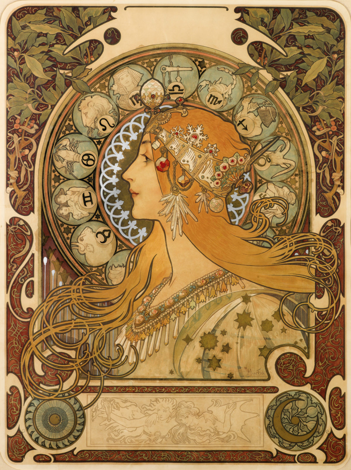
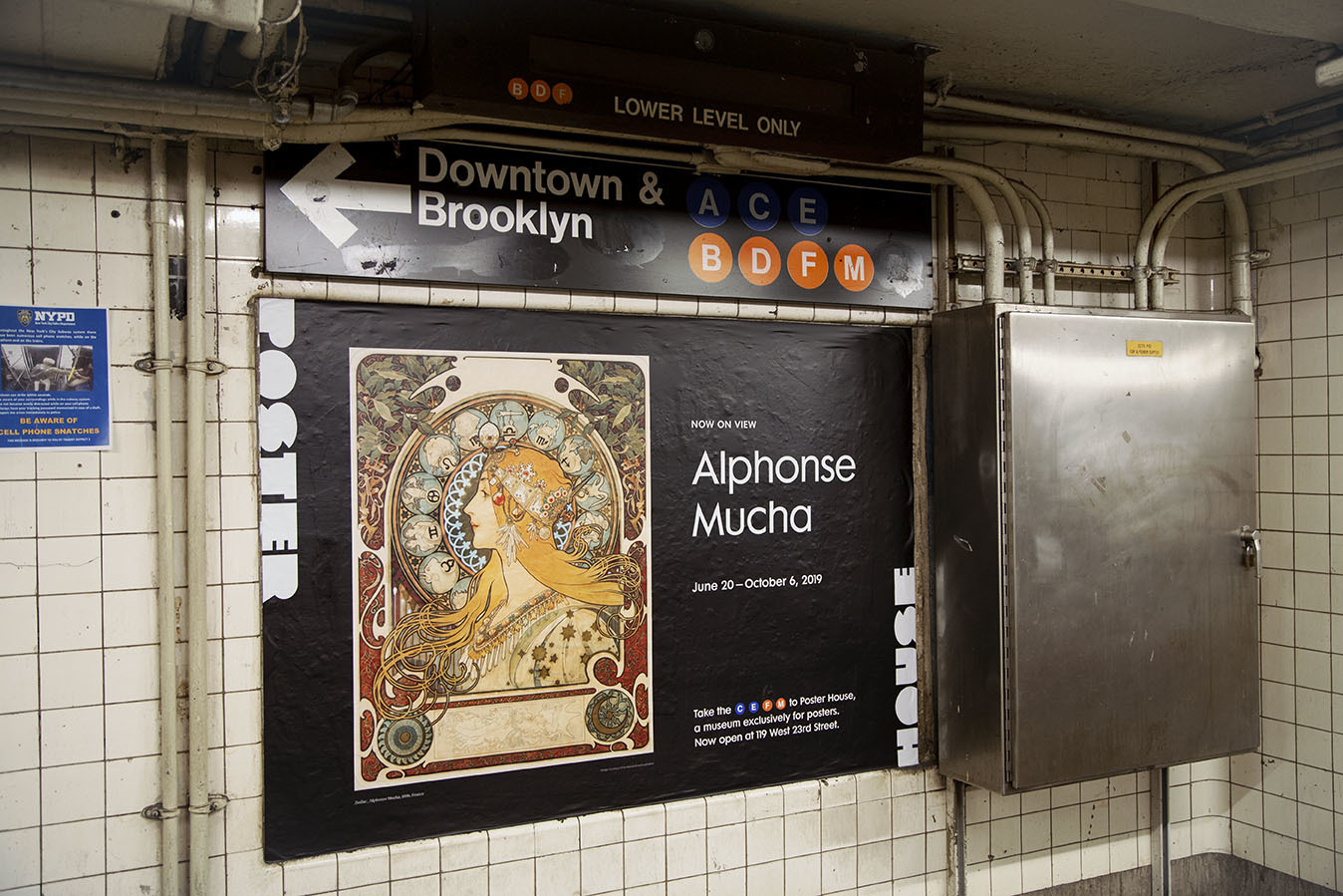
Zodiac by Alphonse Mucha, 1896 (image c/o The Richard Fuxa Foundation)
Of all the Mucha posters, it was difficult to choose just one; however, this is an all-time favorite, recognizable to even the most novice of poster lovers. This design wasn’t created for a single company, but rather sold off by Mucha’s printer, Champenois, to third parties. In turn, they could add their brand name at the top and give it away as a decorative print or year-long calendar (the blank space below the figure could hold a calendarium).
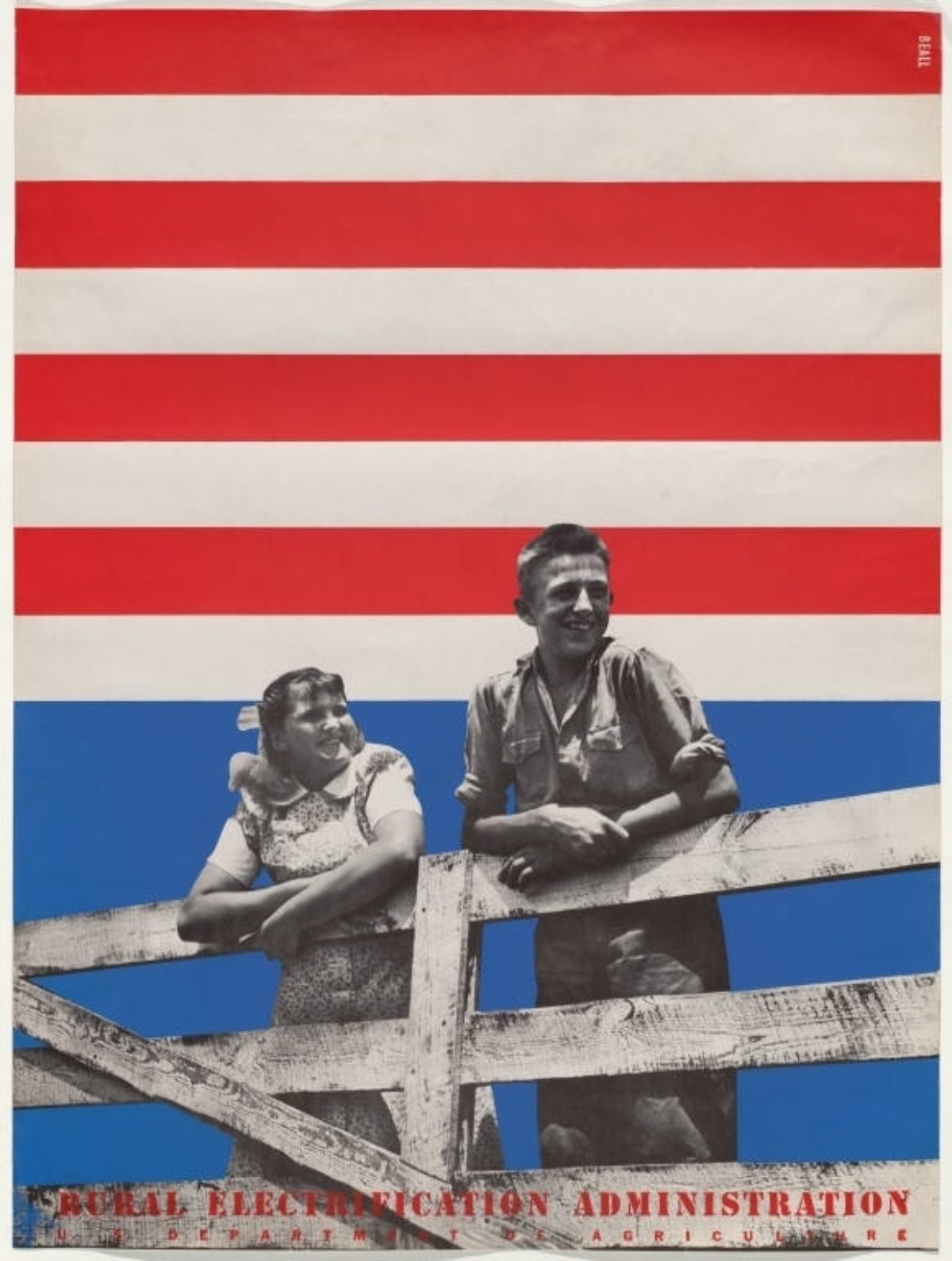
Rural Electrification Administration by Lester Beall, 1937 (image c/o MoMA)
Beall’s various series for the Rural Electrification Administration is one of the triumphs of American graphic design. Through the use of bold colors and simple imagery, he demonstrated why rural Americans’ lives would be made better by hooking up to the national grid. This series also garnered him the first retrospective of a living American poster designer at MoMA that same year.
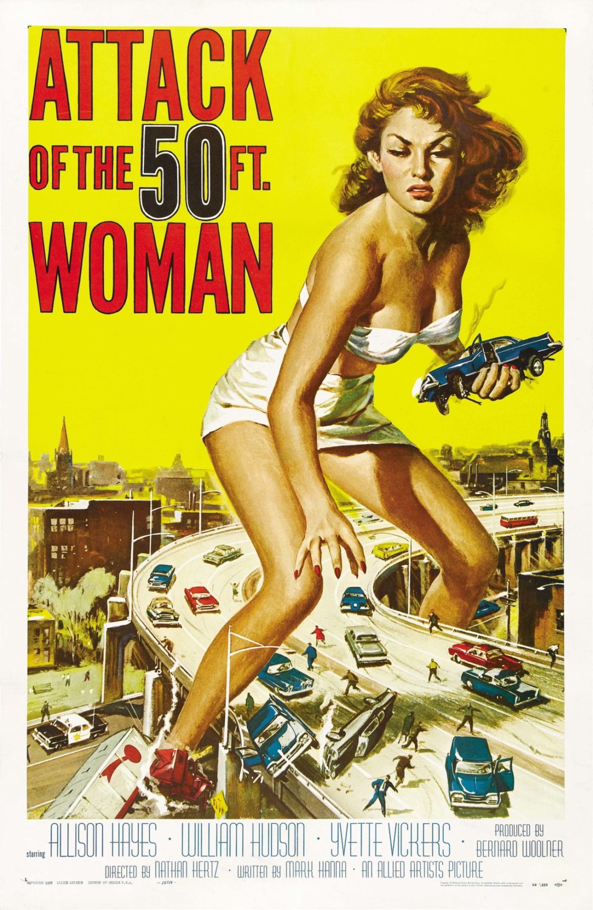
Attack of the 50 Foot Woman by Reynold Brown and Albert Kallis, 1958 (image c/o Wikimedia Commons)
While the film itself is nothing special, this poster reached icon status because it was one of the few sci-fi posters that didn’t have its copyright renewed, and thus became public domain. As such, it’s been riffed on hundreds of times, making it an image ingrained in our collective consciousness. We also offer it as one of our photobooth options!
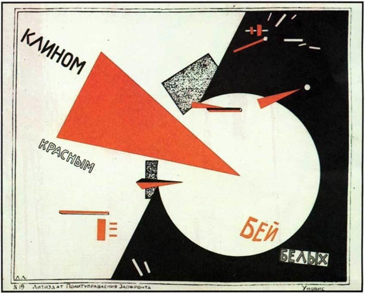
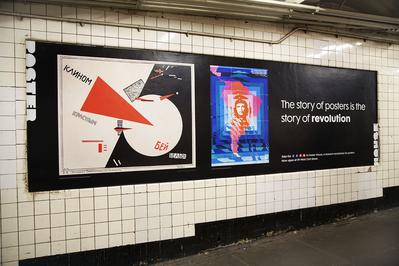
Beat the Whites with the Red Wedge by El Lissitzky, 1919 (image c/o Wikipedia)
Steeped in the geometric precision of Constructivism, this propaganda poster turns the anti-Communist White Army into a circle being brutally speared by the tip of the Bolshevik “Red Wedge.” It has since become one of the most referenced images of the Russian Civil War.
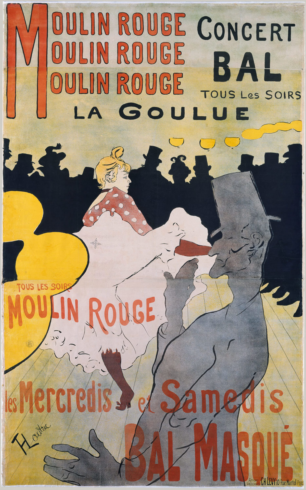
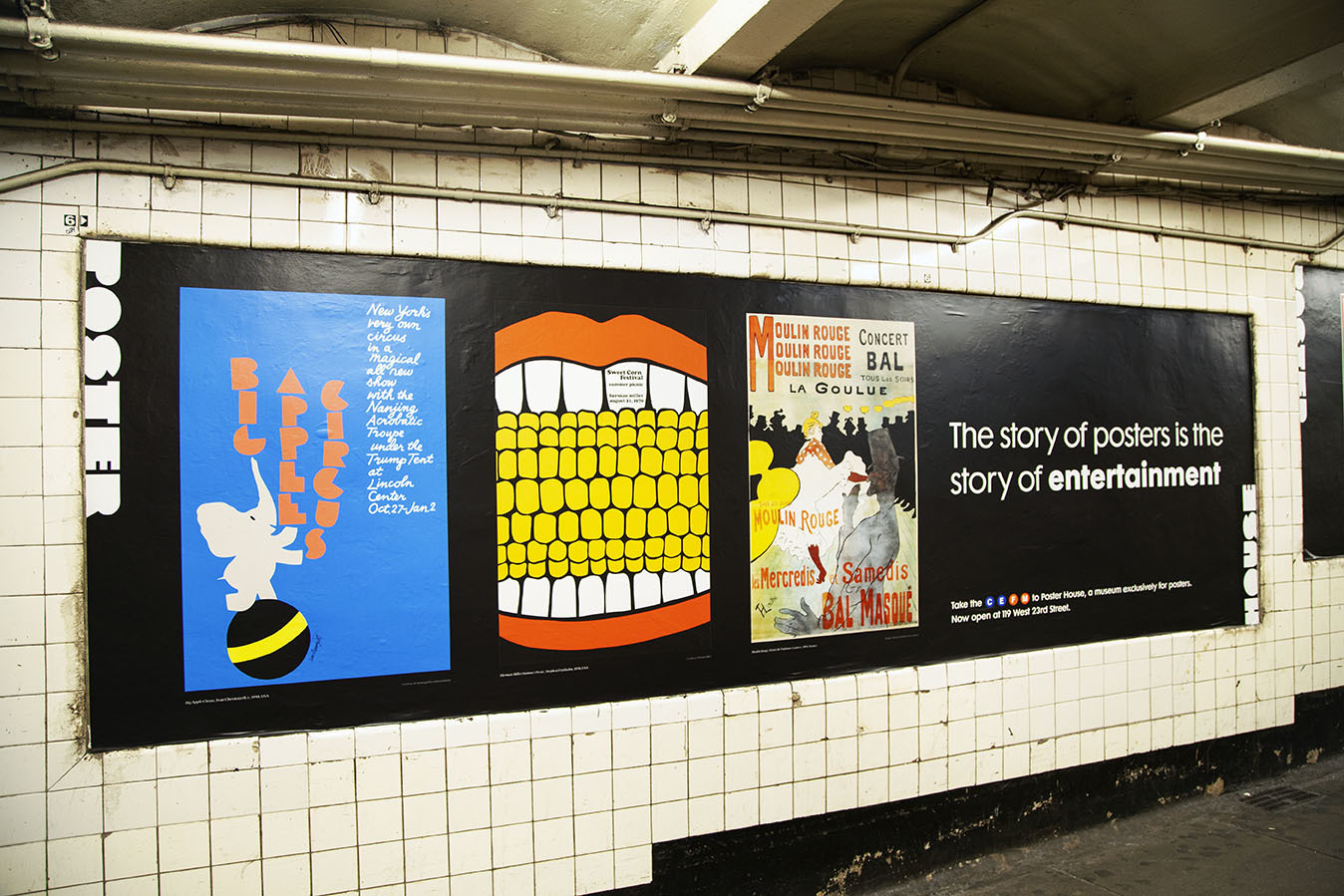
Moulin Rouge by Henri de Toulouse-Lautrec, 1891 (image c/o The Metropolitan Museum of Art)
Not only is this Lautrec’s most famous poster, it is also the first one he ever made. Gigantic in scale, other artists of the day wrote that they followed the billposters around Paris, in absolute awe of this incredible design. Collectors were primarily interested in the image itself, and so the third sheet containing only the text was often discarded. Today, having an original rather than recreated top sheet of this poster is both valuable and rare.
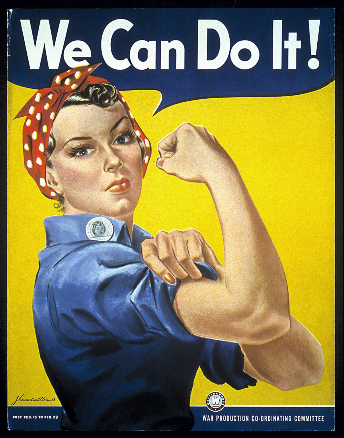
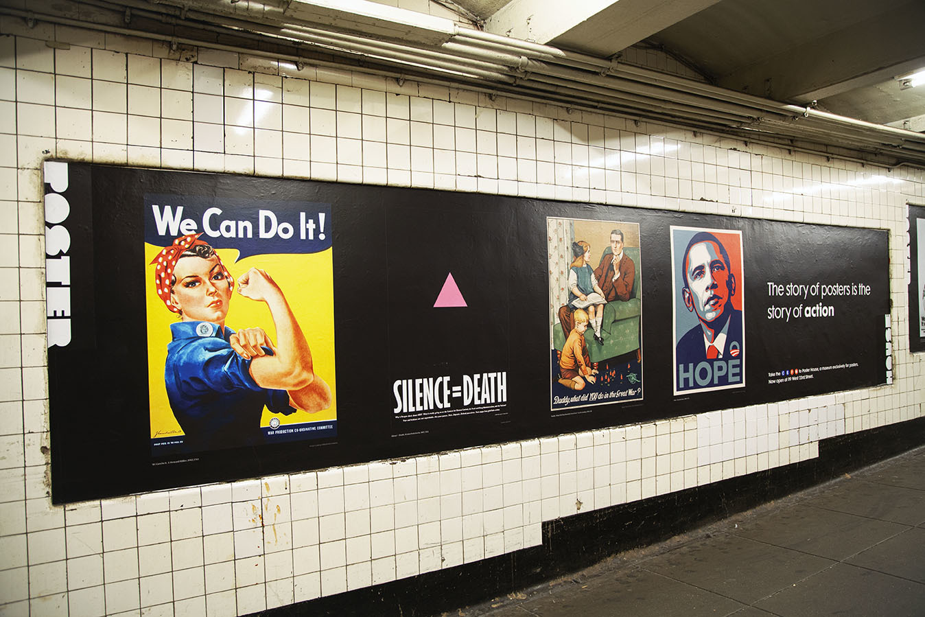
We Can Do It! by J. Howard Miller, 1943 (image c/o Wikimedia Commons)
While we’ve previously delved into the fascinating history of this design in our Hot Poster Gossip series, and also feature it in our fabulous photo booth, it is worth reiterating that despite popular opinion she is actually not Rosie the Riveter.
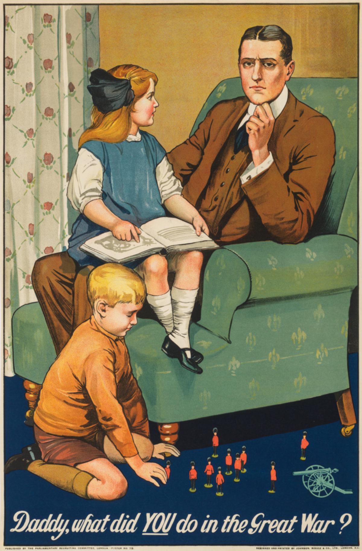
Daddy, What Did You Do in the Great War? By Savile Lumley, 1915 (Poster House Permanent Collection)
Without conscription, the British Army during WWI relied on volunteers to join the fight. Guilt and shame are some of advertising’s most powerful motivators, and so this poster, showing a father being asked by his children what he did to aid his country during the war, has become an enduring example of sophisticated recruitment tactics.
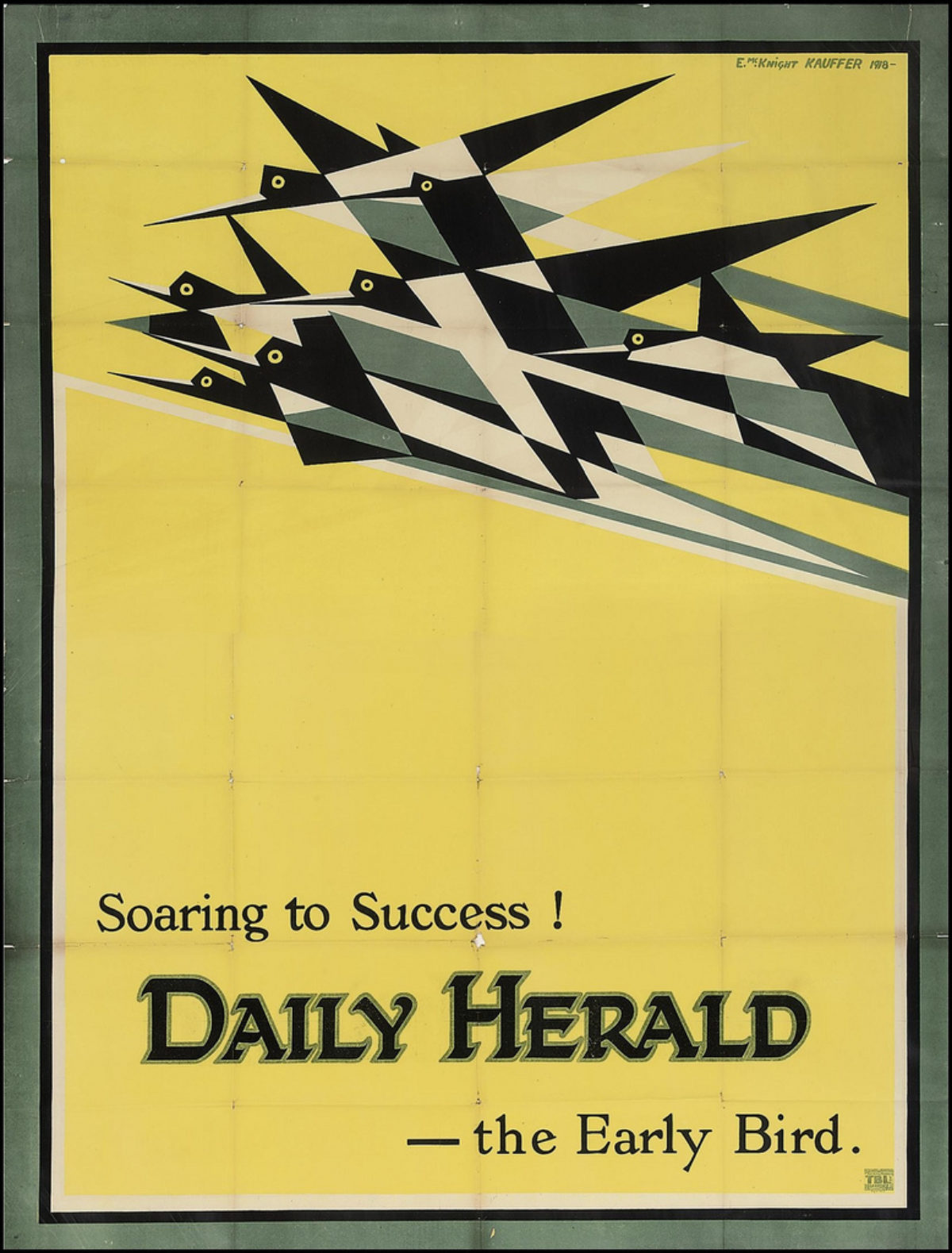
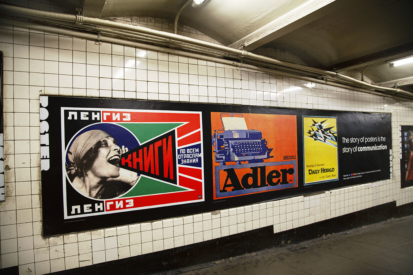
Daily Herald by E. McKnight Kauffer, 1918 (image c/o Wikipedia)
Born in America, Kauffer found success as England’s answer to A.M. Cassandre, one of the most innovative poster designers of the 20th century. Kauffer based this particular poster on a sketch he’d made in 1916 entitled “Flight.” He expanded the canvas, adding some brief copy, and created London’s first Cubist-inspired advertising poster.
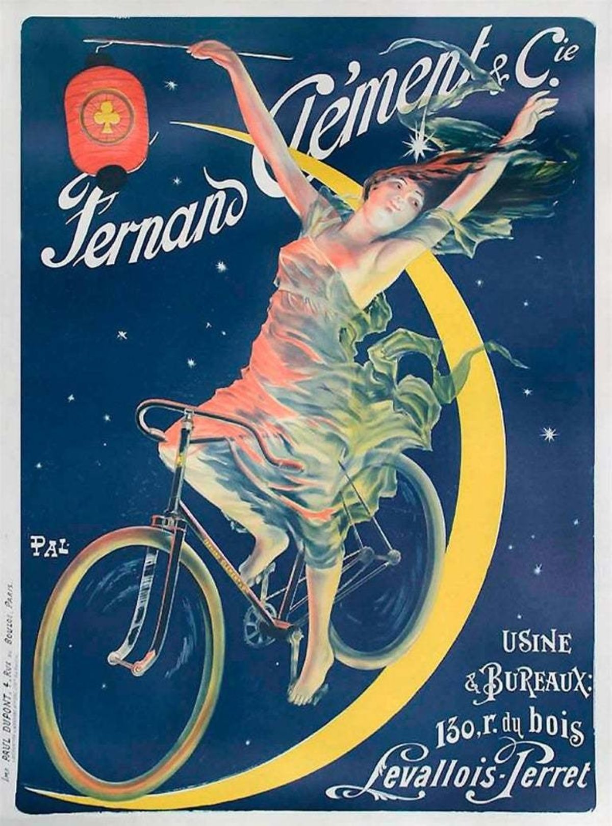
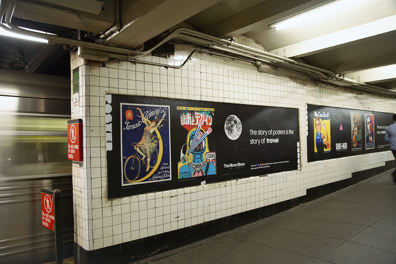
Fernand Clément by Pal (Jean de Paleologue), 1894 (image c/o 1stdibs)
While not a household name today, Pal was one of the most prolific poster designers of the Belle Époque period. Regardless of what was being sold, he typically used images of women mid-action, the wind whipping through their sheer attire. This poster shows a woman riding her Fernand Clément bicycle through space, a Chinese lantern decorated by a shamrock guiding her way.
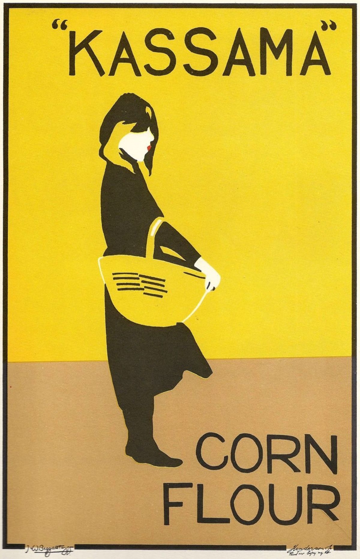
Kassama by The Beggarstaffs, 1894 (image c/o Pinterest)
The Beggarstaff Brothers were neither brothers nor Beggarstaffs. Instead, William Nicholson and James Pryde were brothers-in-law who thought the name sounded especially English, and took it on as the pseudonym for their artistic partnership. They created relatively few posters, all considered masterpieces within the medium. The maquettes (original working designs) are part collage, part stenciled image, resulting in remarkably simple but evocative finished posters.
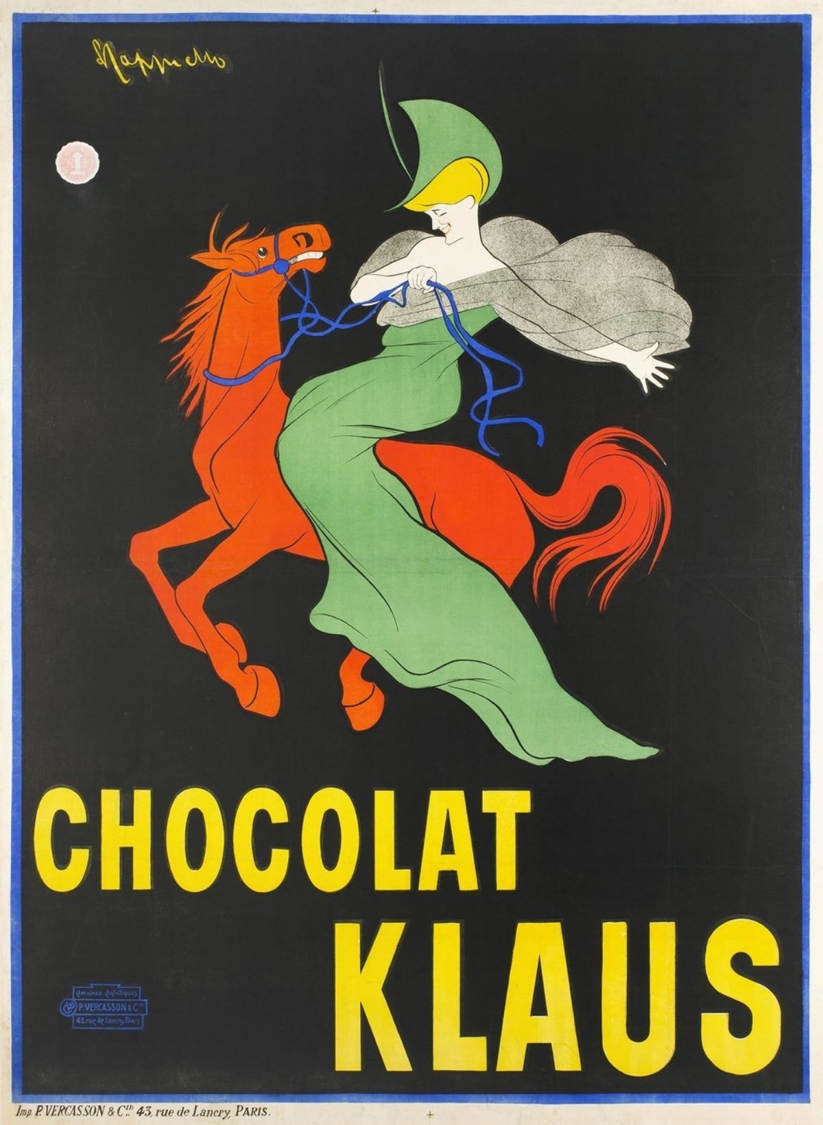
Chocolat Klaus by Leonetto Cappiello, 1903 (image c/o Galerie123)
Known as the Father of Modern Advertising, Cappiello reinvented the Belle Époque poster by positioning a central figure against a saturated, flat background, and enlarging or making curious a single prop. In this case, that prop is a horse turned red—an image that has nothing to do with the product being sold. Considered the first brand mascot, people started asking for the chocolate “with the woman on the red horse” rather than its actual name.
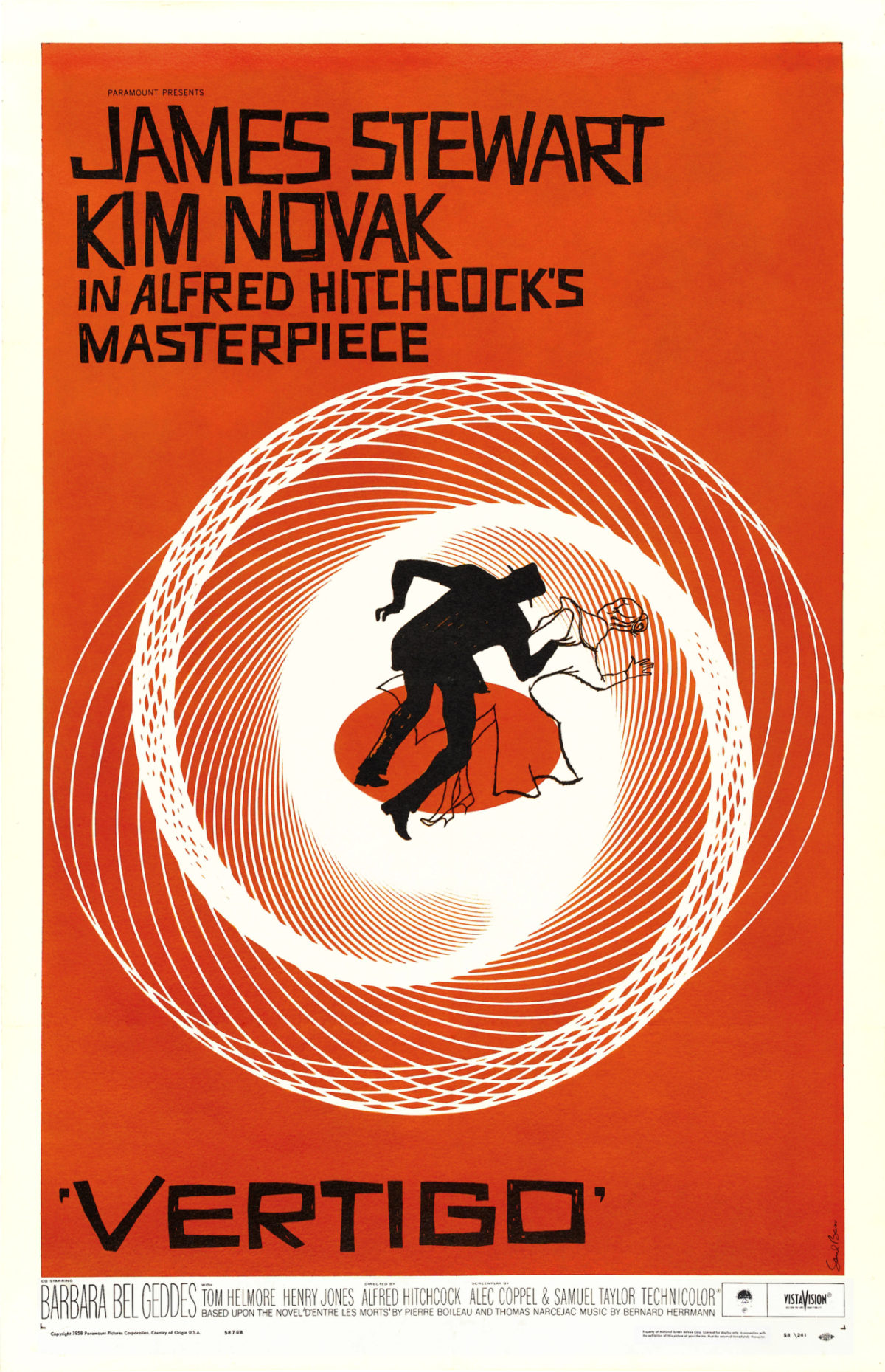
Vertigo by Saul Bass, 1958 (image c/o Universal Studios)
Nothing screams mid-century movie design like Saul Bass’s dynamic compositions. He took film posters out of the realm of fussy illustration, adding a modern sensibility through silhouettes and startling lettering. Here, rather than slavishly depict the stars in action, we get the outline of two people struggling at the center of a vortex that can also be read as an eye.
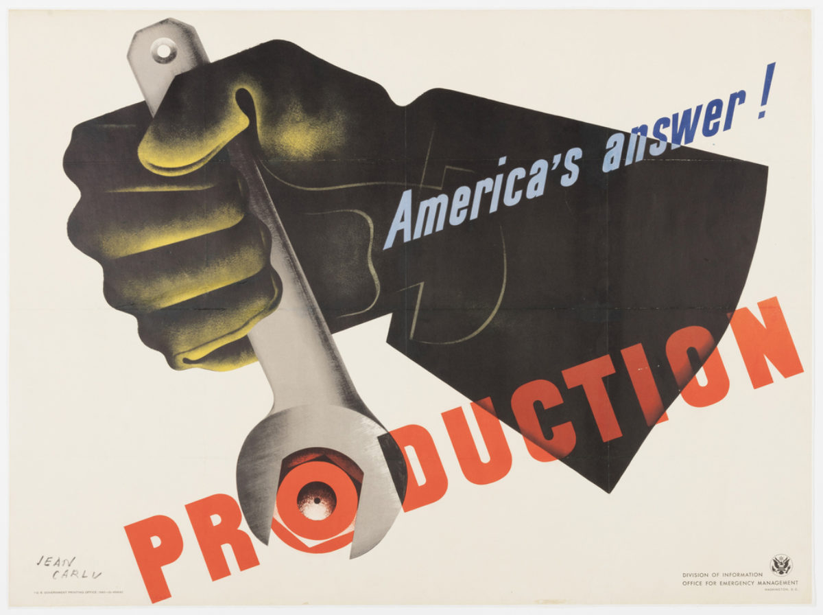
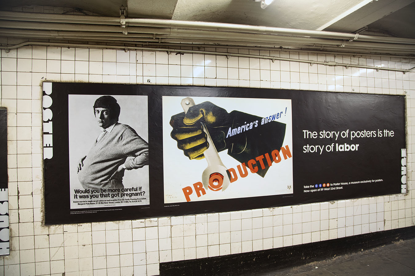
Production by Jean Carlu, 1942 (image c/o Cooper Hewitt)
Much like the We Can Do It! poster mentioned above, this image was meant to inspire Americans to work harder for the war effort. The more we could produce, the better a chance we had at defeating the enemy. Unlike Miller, though, Carlu came from the French school of poster design, relying less on illustration, and more on the isolation of a single, powerful object to drive the message home.
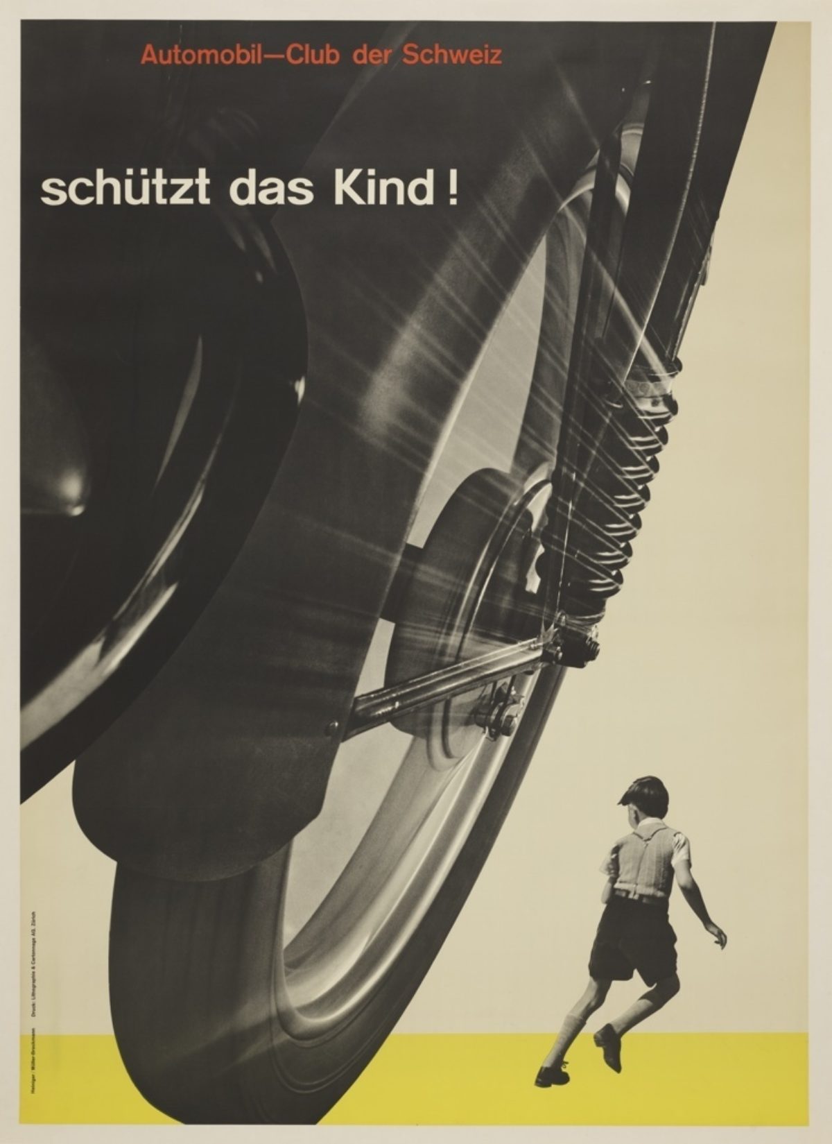
Schützt das Kind! By Josef Müller-Brockmann, 1953 (image c/o Cooper Hewitt)
Müller-Brockmann is considered the master of the Swiss International Style, bringing photomontage and grid-based layouts to poster design. Here, a young boy is seen fleeing from an oncoming vehicle with the phrase “Protect the Child!” in the upper left. Put out by the Swiss Automobile Club, this poster would be seen on the streets next to a real-time bodycount of those killed in auto accidents that month or week. The jarring visuals were credited with reducing automobile deaths in Switzerland.
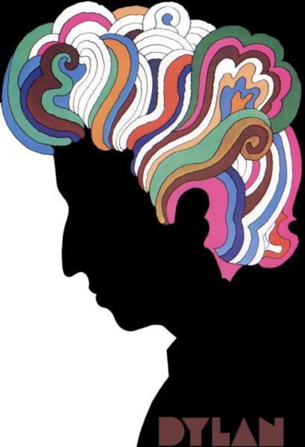
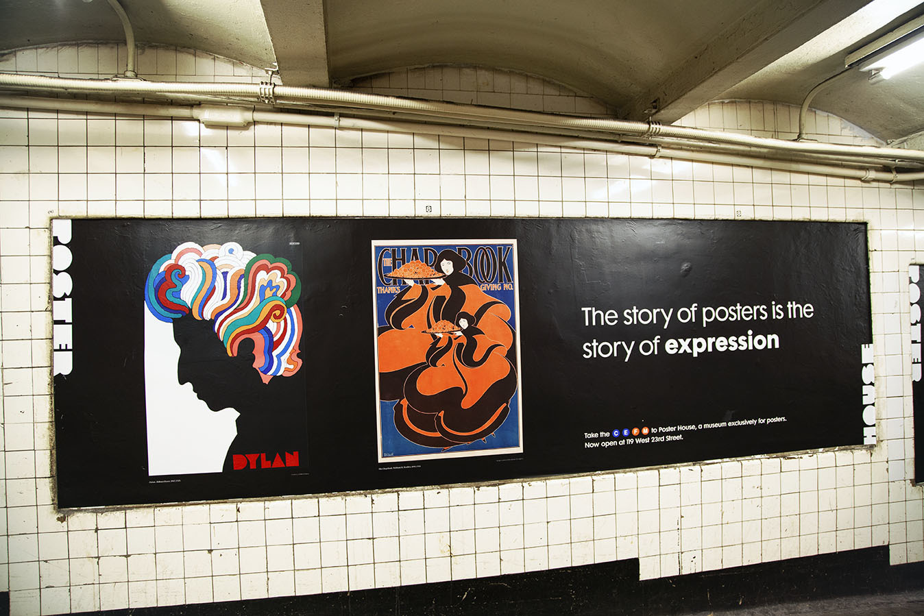
Dylan by Milton Glaser, 1967 (image c/o Print Magazine)
Originally folded inside the album Bob Dylan’s Greatest Hits, Glaser’s poster for the artist quickly became a staple in bedrooms and dorm rooms across the country. Today, it is considered Glaser’s masterpiece, the perfect embodiment of the psychedelic, counter-culture era.
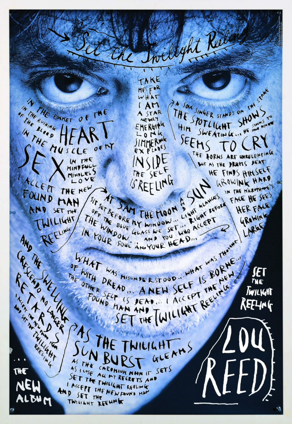
Set the Twilight Reeling by Stefan Sagmeister, 1996 (image c/o the artist)
Also used as the album art for the CD, this photograph of Lou Reed shows the singer’s face tattooed with the lyrics of the titular song. It has become a touchstone of contemporary graphic design, and certainly set Sagmeister apart as one of this generation’s most innovative graphic artists.
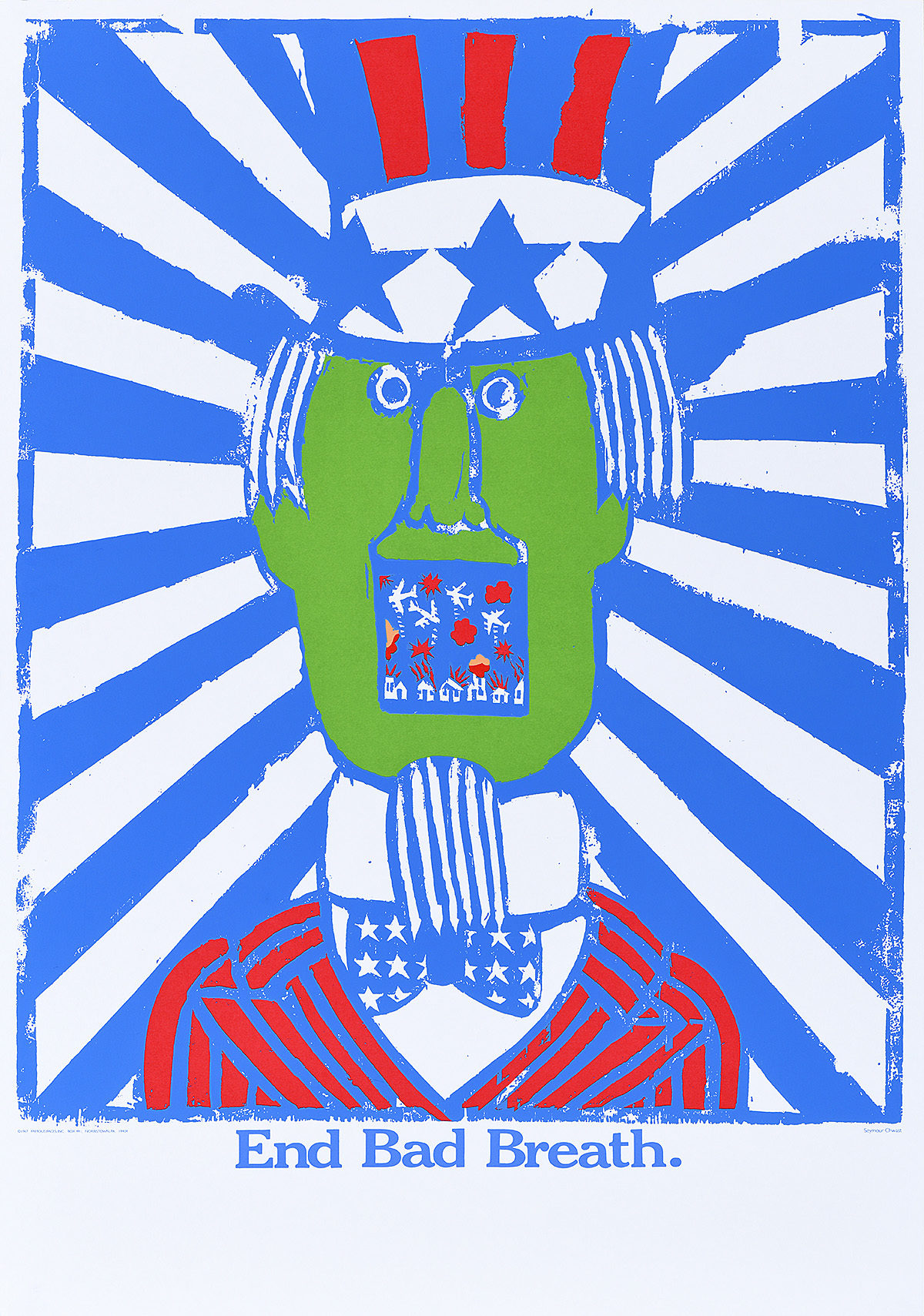
End Bad Breath by Seymour Chwast, 1968 (Poster House Permanent Collection)
By the 1960s, silkscreen had become the signature “look” of protest posters around the world, from those made in Cuba during the Revolution to those made during the Mai 68 Paris riots. Here, Chwast embraces that style to present Uncle Sam, his mouth agape to reveal American planes bombing a Vietnamese village.
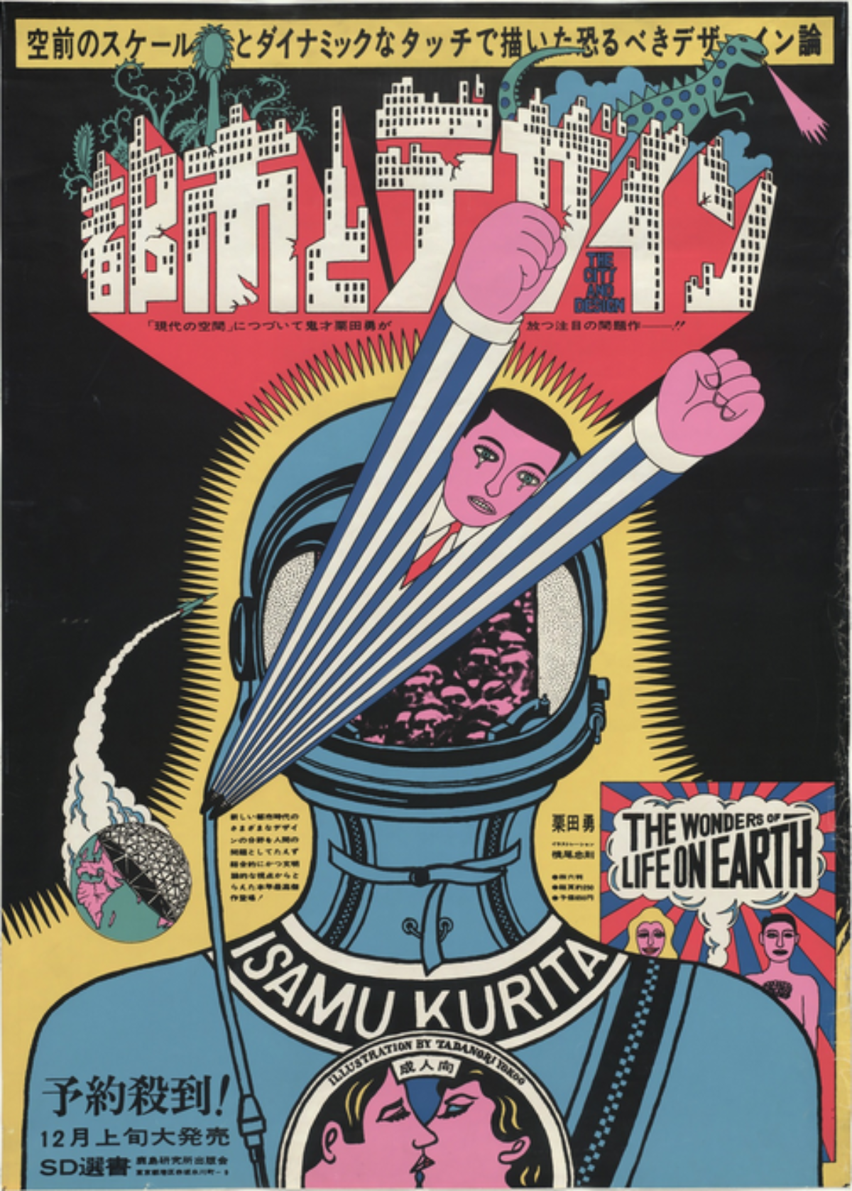
The City and Design, The Wonders of Life on Earth by Tadanori Yokoo, 1966 (image c/o the artist)
Also part of our awesome photo booth, this poster by Yokoo fully expresses his neon-pop style that paved the way for all of Japan’s contemporary graphic designers. The poster itself advertises a book for which Yokoo did the illustrations.
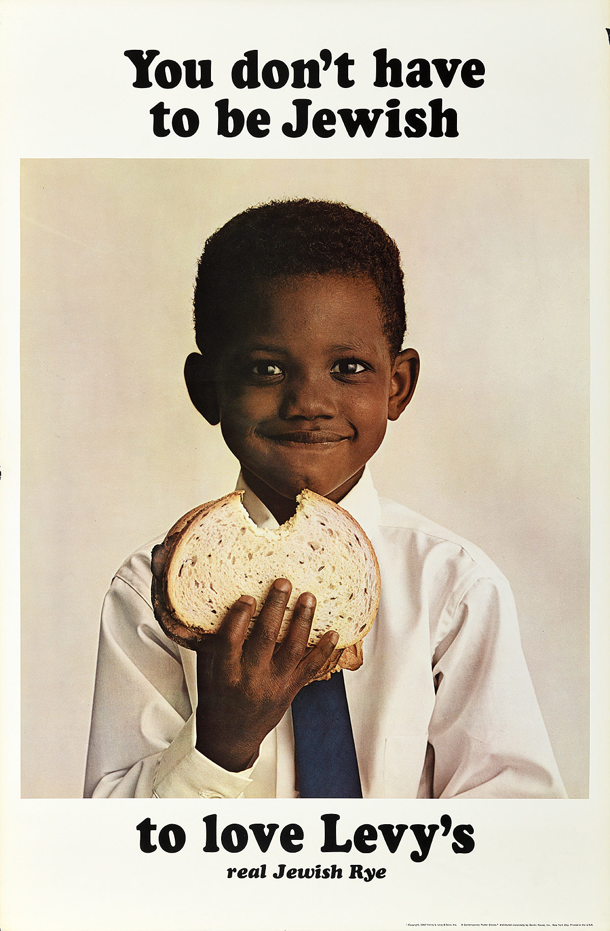
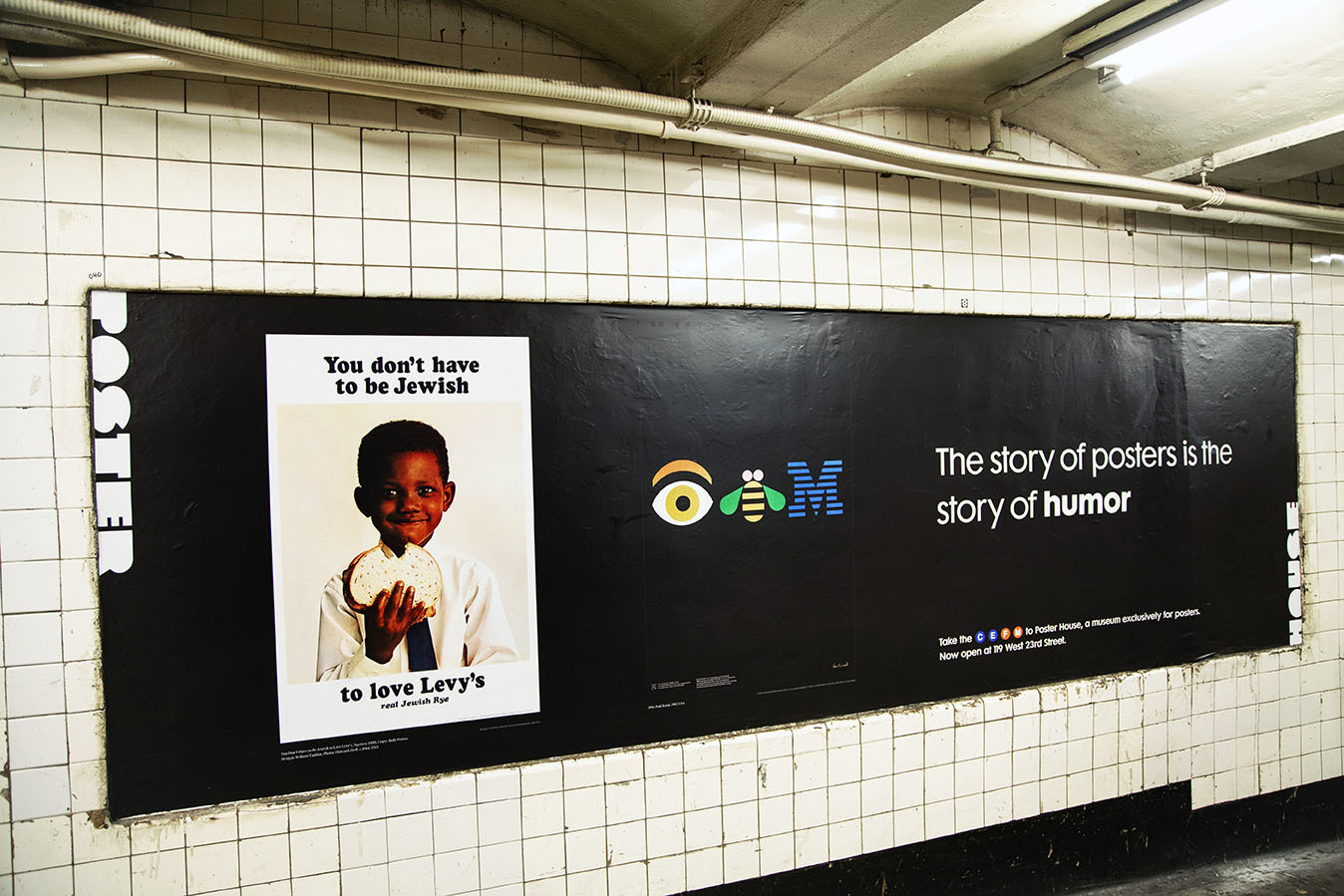
Levy’s by DDB, ca. 1961 (Poster House Permanent Collection)
If you visited our very first pop-up show three year’s ago, you would have seen this poster on display. The image is part of a landmark campaign in NYC, the first to take an ethnic product and embrace rather than hide that ethnicity when advertising to a national audience. Prior to this moment, products aimed at or created by a specific group were typically only promoted to those communities, and if they wanted to go broader those elements of Other-ness were hidden in order to generate mass-appeal. DDB had the brilliant idea of pointing out that Levy’s was Jewish Rye (the subtext being that Jews make the best rye bread), and that if you want the best, you should buy it regardless of your own background.
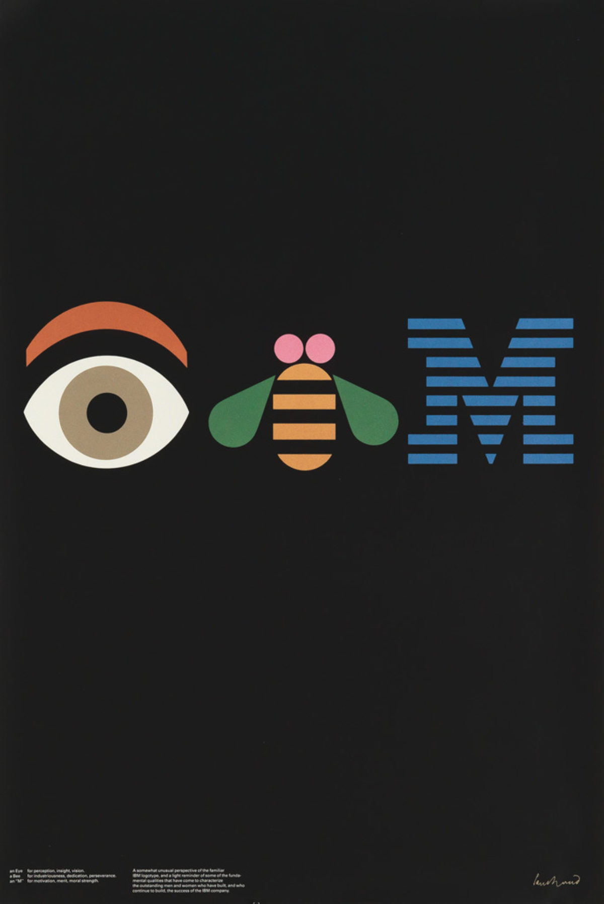
IBM by Paul Rand, 1981 (image c/o Swann Galleries)
Rand created his first logo for IBM in 1956, and would continue working with the company through the late 1990s. In 1981, he created this rebus for the company’s international design conference—a poster that would only be seen by those affiliated with the corporation. What began as an internal image has since become a landmark moment in design.
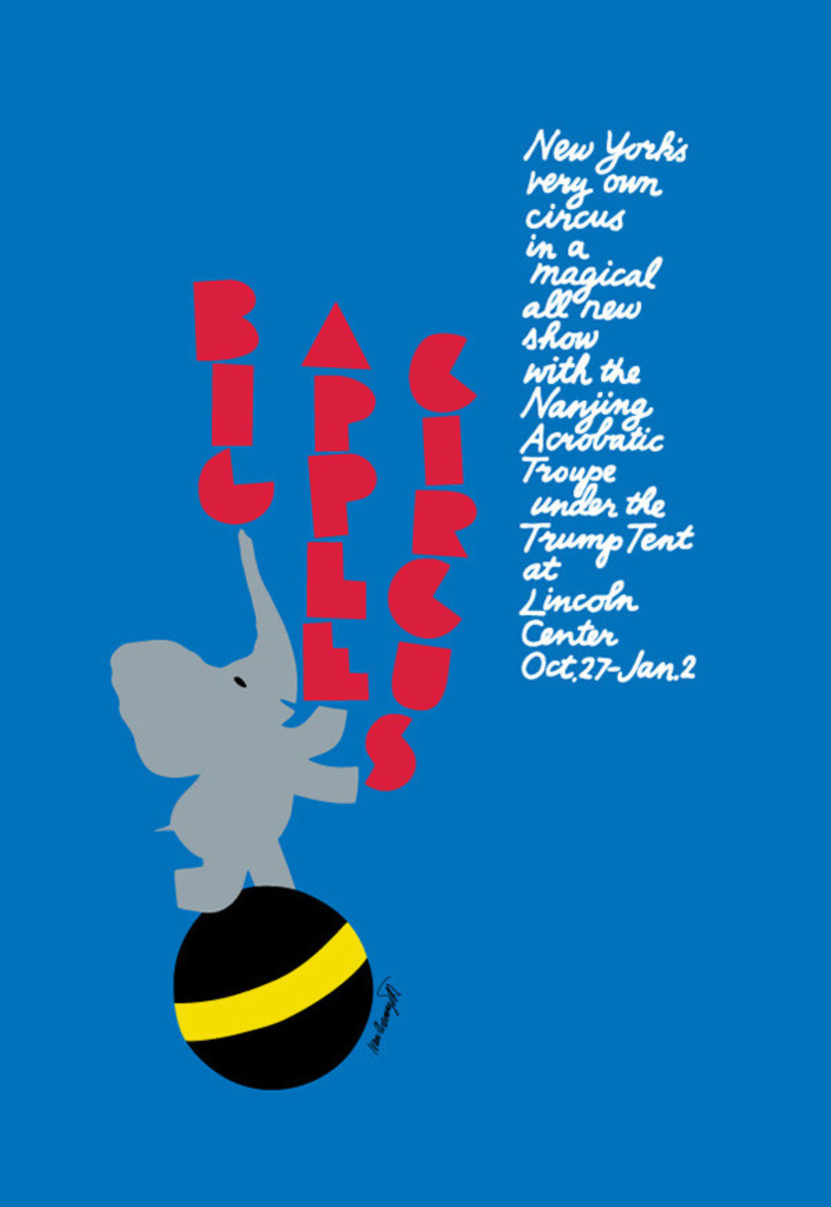
Big Apple Circus by Ivan Chermayeff, ca. 1990 (image c/o Cooper Hewitt)
Chermayeff created some of the standout contemporary corporate poster designs, from images for Mobil’s sponsorship of Masterpiece Theatre to the Big Apple Circus. Here, he wanted to embrace the family-friendly, uplifting essence of the circus through a child-like composition. The circus loved the image so much that they actually purchased a baby elephant the following season.
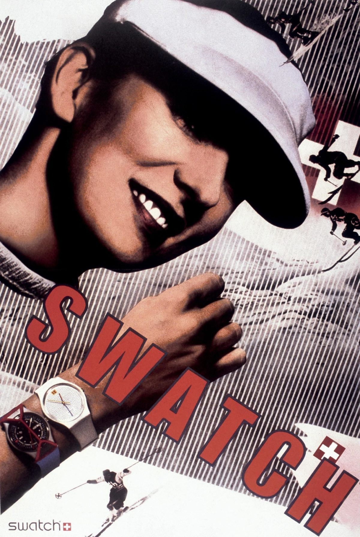
Swatch by Paula Scher, 1984 (image c/o AIGA)
Riffing on Herbert Matter’s well-known 1930s poster for the Swiss National Tourist Office, Scher’s image for Swatch created waves within the design community. Is this what Picasso meant when he said “good artists copy, great artists steal?” Was it a joke or an affront? Anyone who knows Scher quickly realized this was a brilliant moment, a tongue-in-cheek hat-tip to the fact that Swatch is a Swiss watch company turning the Swiss tradition of high-end watch making on its head.
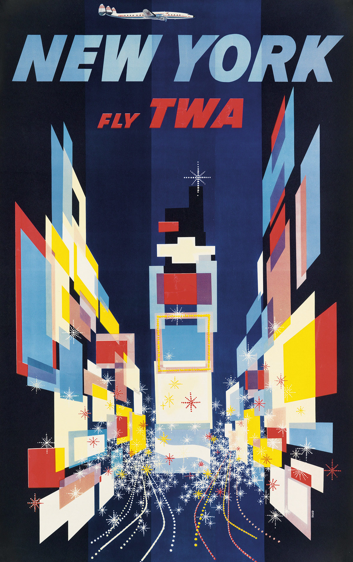
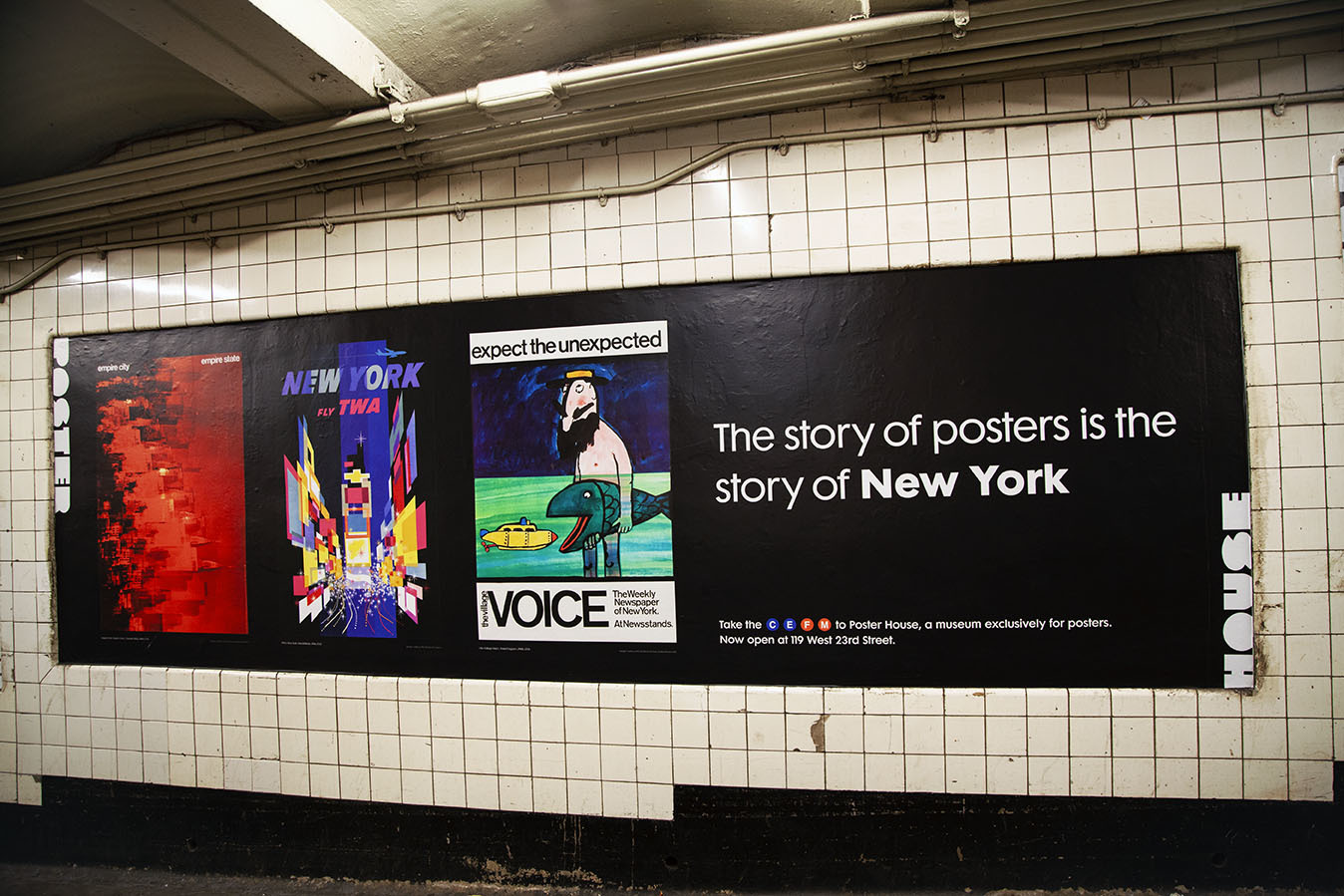
TWA/New York by David Klein, 1956 (image c/o Swann Galleries)
Klein is one of the greatest American travel poster artists, perfectly embracing the optimism of the Jet Age in his many upbeat, saturated posters for TWA. This image, though, is without a doubt his best and most popular (so much so that it appears in every hotel room at the TWA hotel). He gives us the absolute essence of Times Square without actually showing us a single solid form.
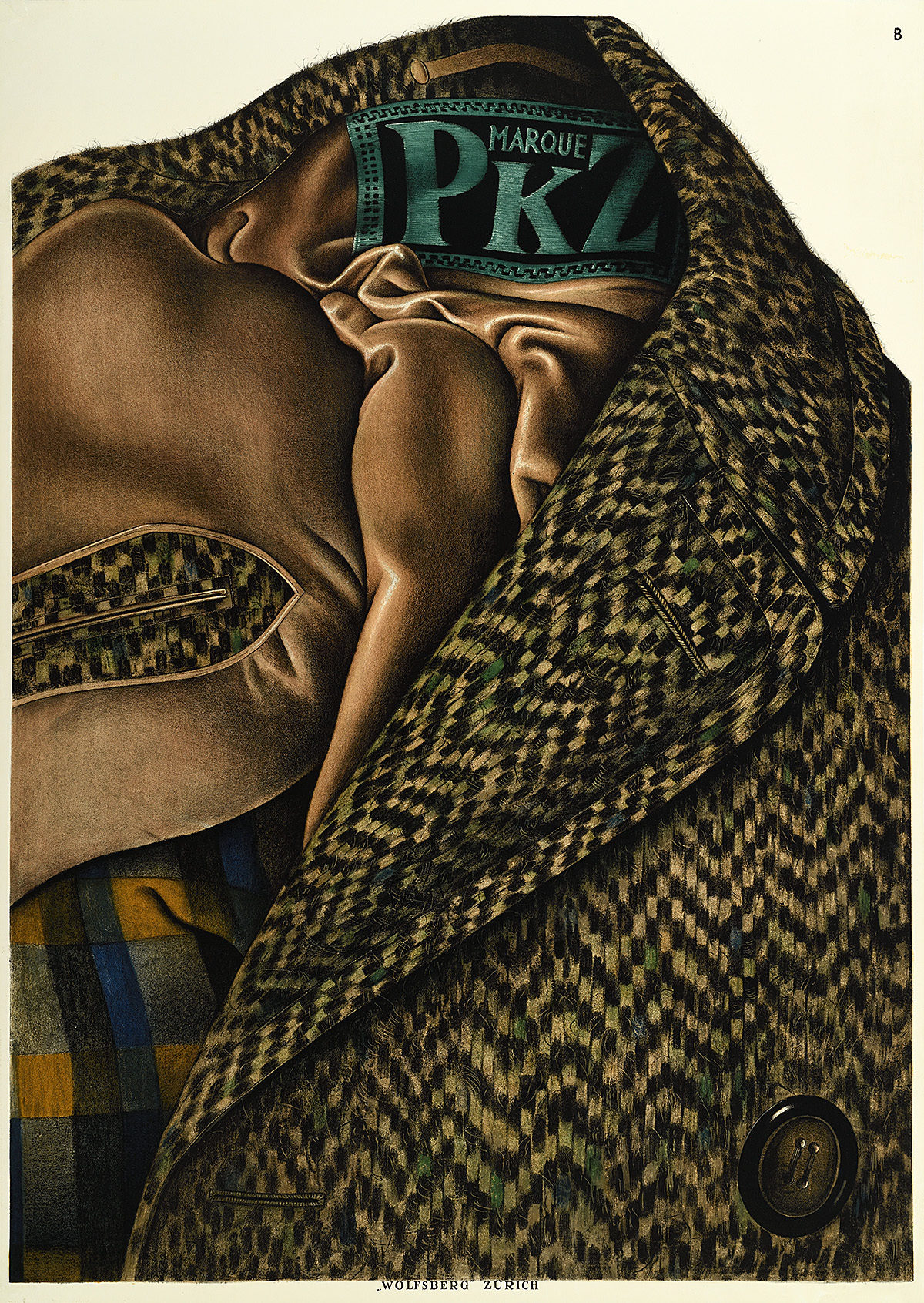
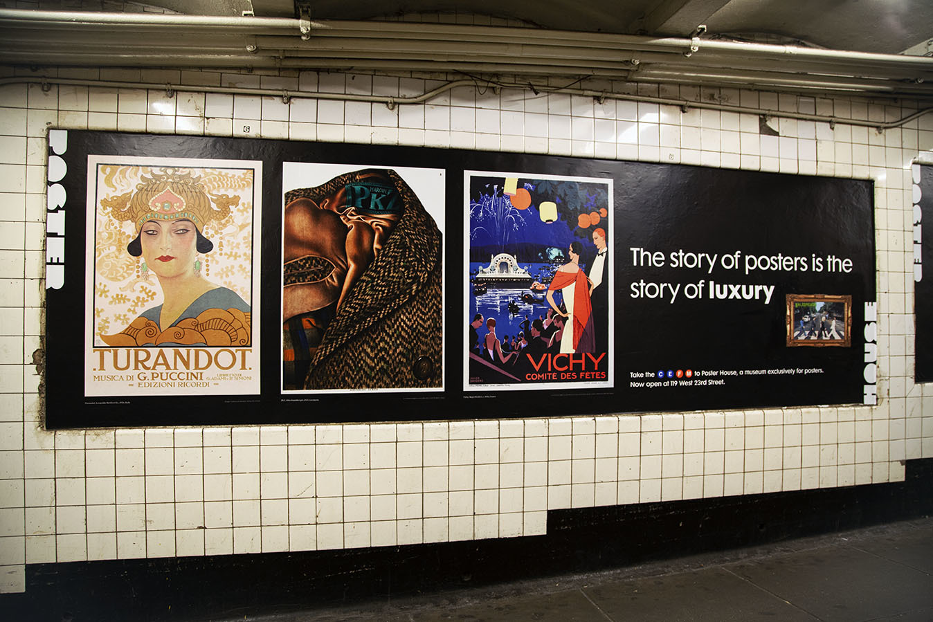
PKZ by Otto Baumberger, 1923 (Poster House Permanent Collection)
The Sachplakat or Object Poster was developed in Germany around 1905 by Lucian Bernhard. It relied on showing a single object and nothing more—the purest way of advertising a product. By the time Baumberger created this poster in 1923, the trend had moved to being increasingly photorealistic, which is why we see individual threads emerging from this tweed coat.
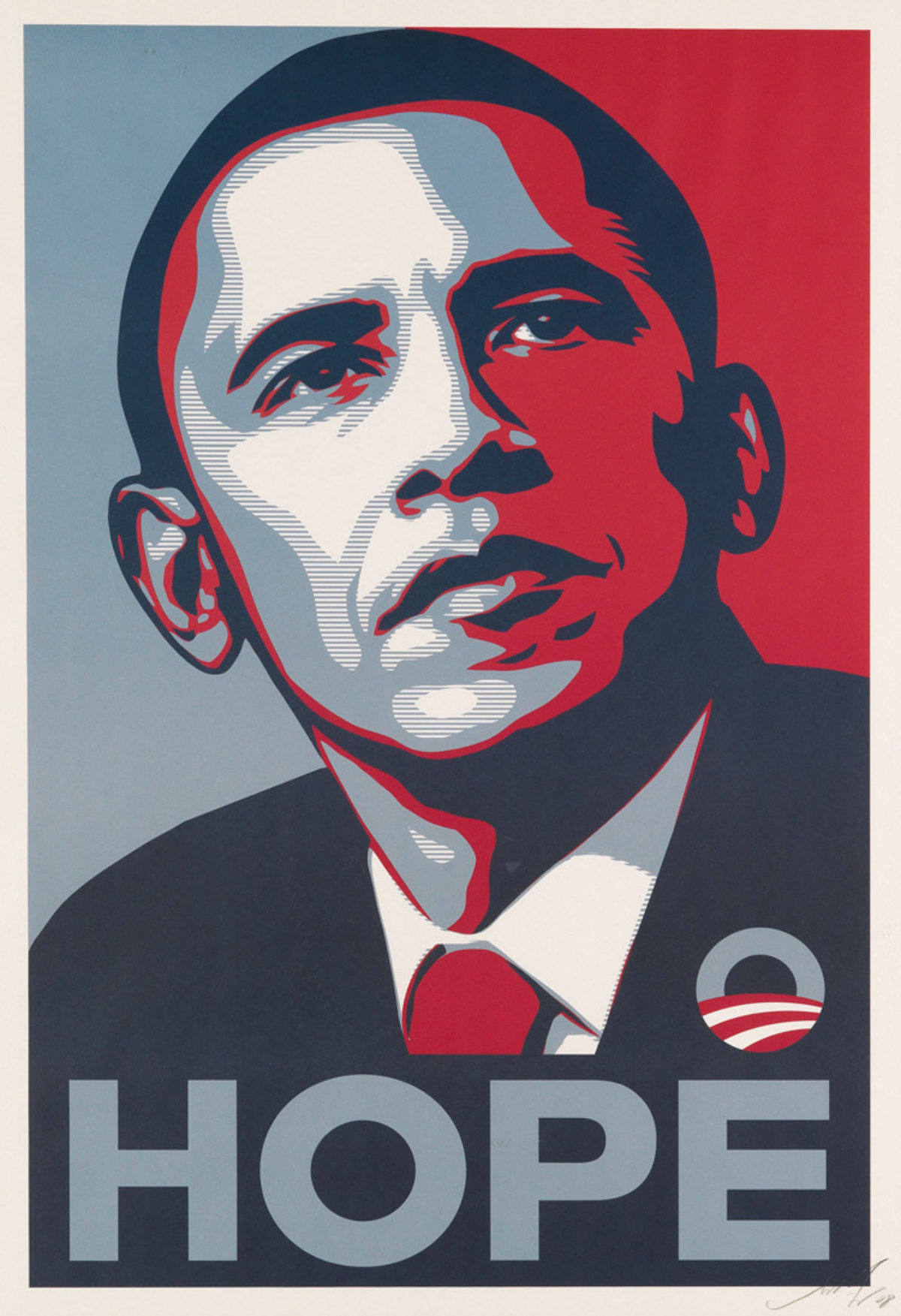
Hope by Shepard Fairey, 2008 (image c/o Swann Galleries)
Has there ever been a political campaign poster more universally recognizable than this image Fairey created for Obama? We do not even need to have the candidate’s name on the page to recognize the presidential nominee. And forget about a quaint slogan. Instead, Fairey adds the word “Hope” underneath his portrait, a masterful means of conveying everything he stood for for so many during that election cycle.
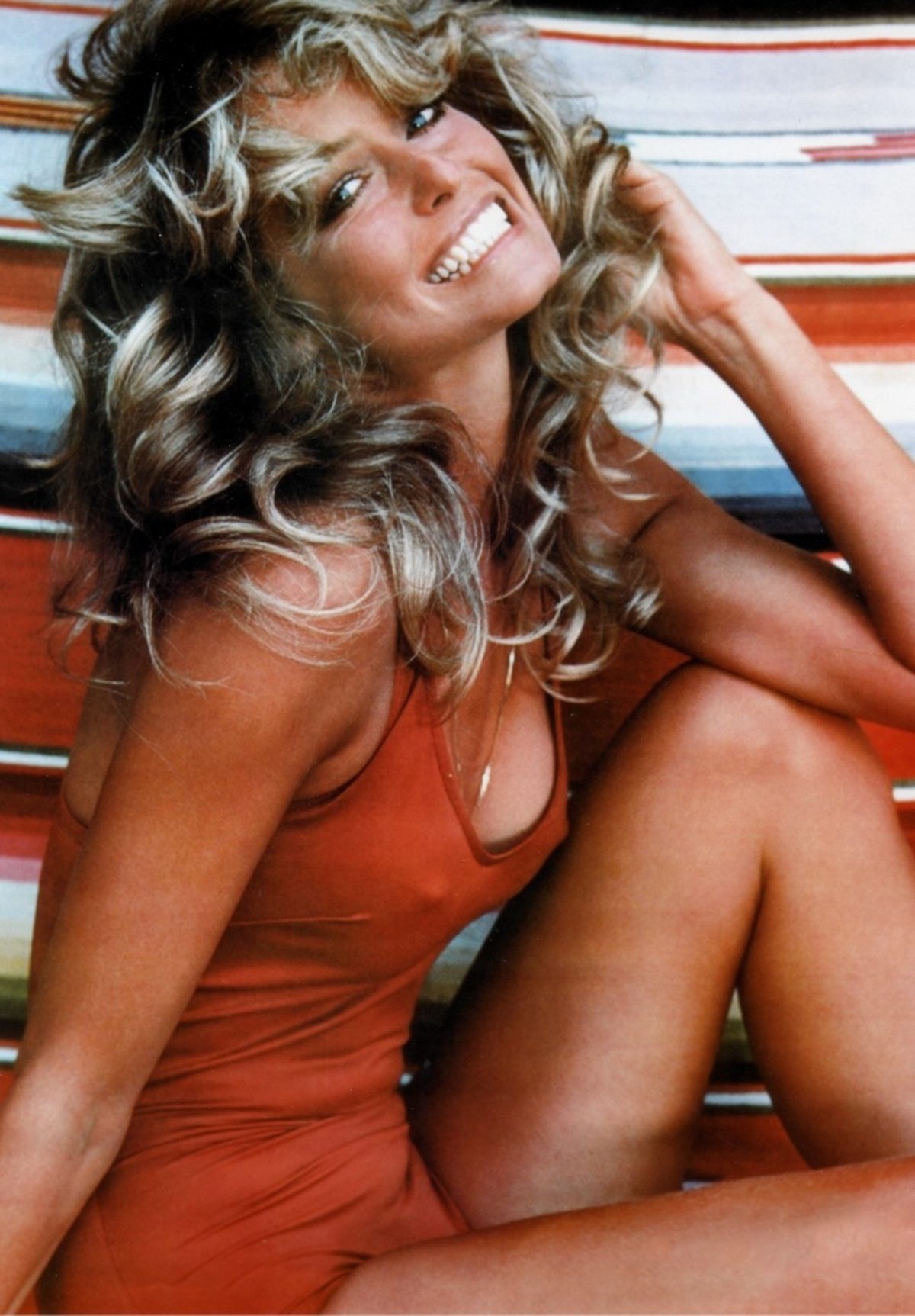
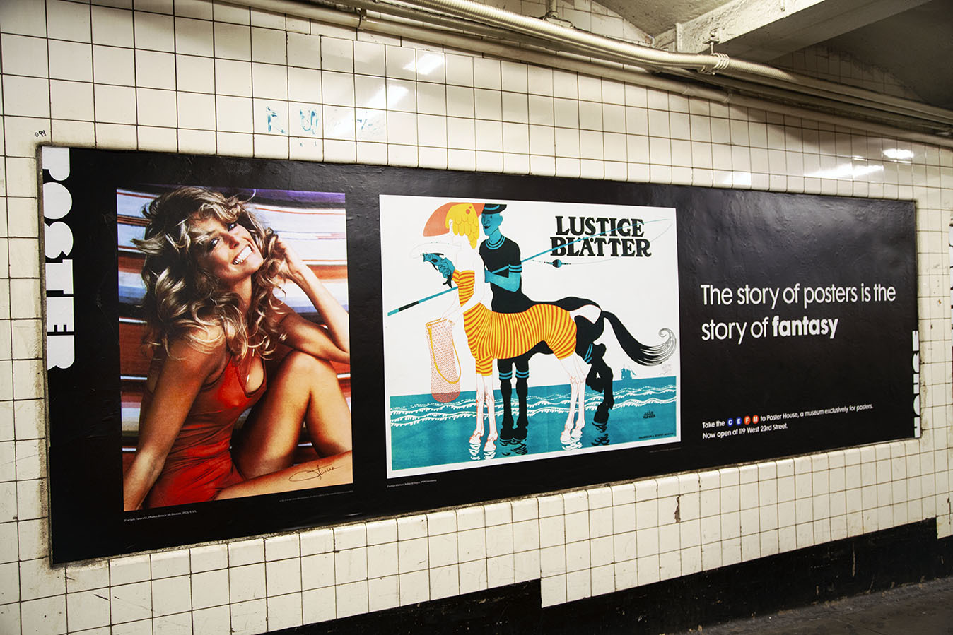
Farrah Fawcett by Bruce McBroom, 1976 (image c/o Biography)
The best-selling poster of all time, Farrah Fawcett’s gleaming face and girl-next-door pose was the choice pinup of nearly every man in America, regardless of age, for decades. Literally millions were sold in the first year alone. She did her own hair and makeup for the shoot, wore her own swimsuit despite the company’s request for a bikini, and chose the final shot that was used.
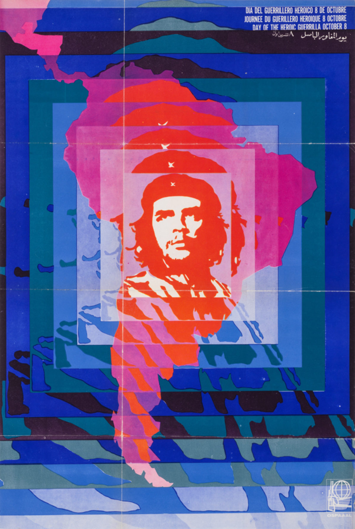
Día del Guerrillero Heroico by Elena Serrano, 1968 (Poster House Permanent Collection)
OSPAAAL is a Cuban group concerned with promoting socialism and communism among third-world countries, especially those who have suffered at the hands of colonizers. Through their magazine Tricontinental, posters like this one would be folded and sent to communist student groups around the world where they would go on to inspire others. Here, an image of Che Guevara is show radiating over all of Latin America, promoting the Day of the Heroic Guerilla.
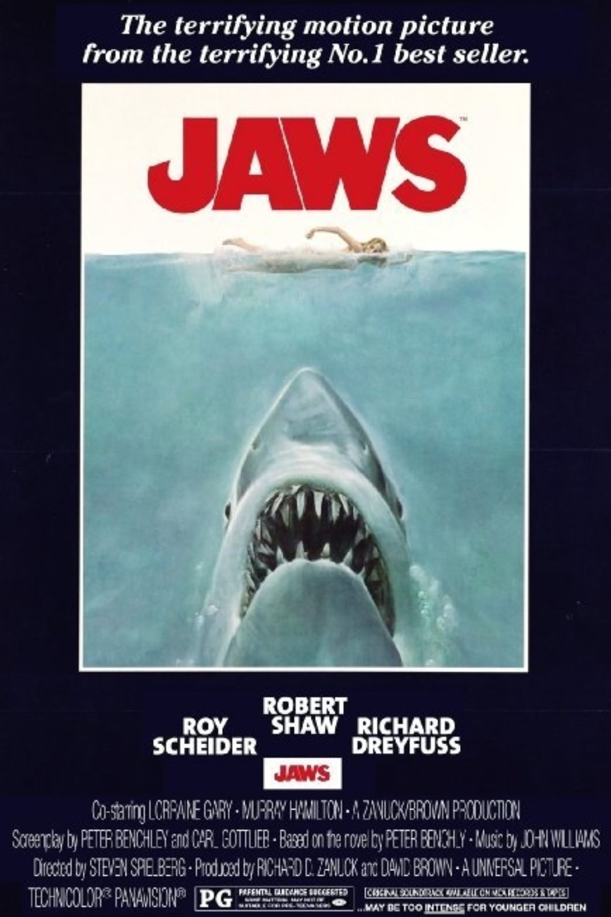
Jaws by Roger Kastel, 1975 (image c/o 1stdibs)
While Kastel has created numerous important movie posters, it is perhaps his image for Jaws that sets him apart. Originally used as the cover of the book, Kastel came up with the idea for the composition in an afternoon, basing the shark on ones in the American Museum of Natural History. The girl was a model he paid $35 to lay across two stools and pretend to swim.
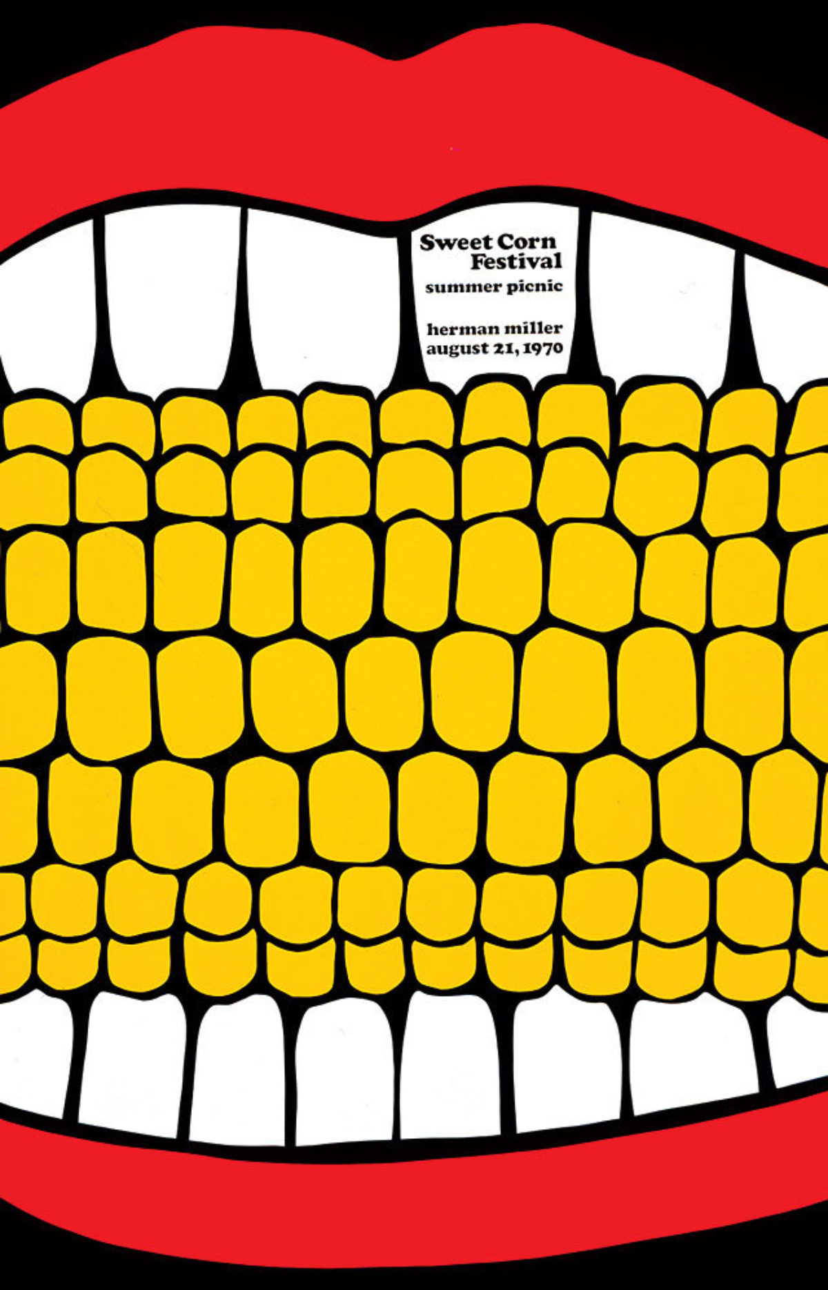
Herman Miller Summer Picnic by Stephen Frykholm, 1970 (image c/o Fonts in Use)
When Herman Miller hired Frykholm to head its graphics department, one of his first assignments was to create a poster for the annual employee summer picnic. This image was the result—a beautiful expression of pop-art-meets-modern-design. He would go on to create a new poster every year up through 1989, each portraying another part of a picnic in zoomed-in detail.
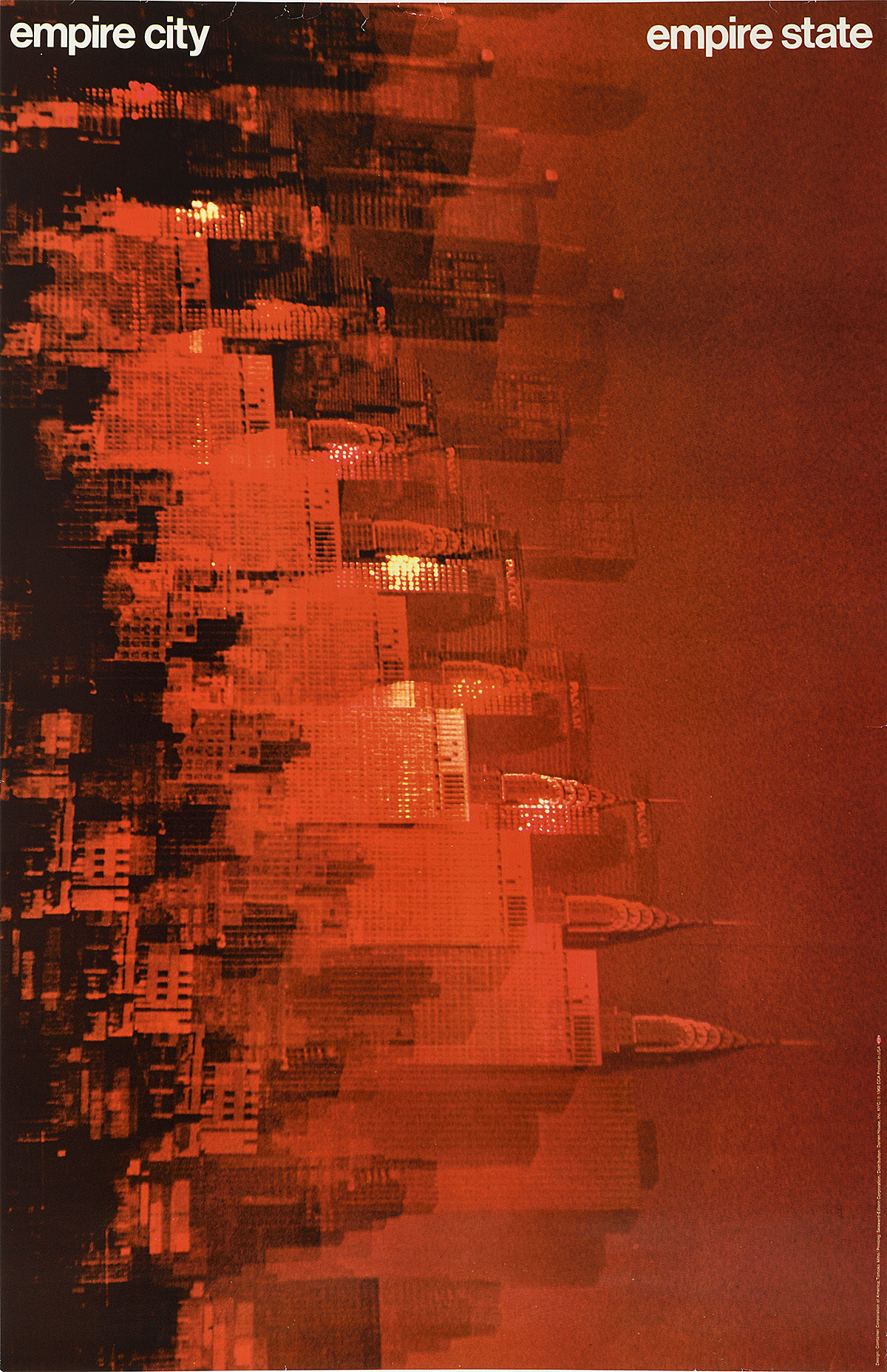
Empire City/Empire State by Tomoko Miho, 1968 (Poster House Permanent Collection)
In 1968, the Container Corporation of America commissioned a series of posters celebrating various aspects of NYC, from the subway system to Lincoln Center. The posters were then placed in public spaces around the city as part of an overall city beautification project. This image celebrates the kinetic energy of the skyline, ever growing, ever changing.
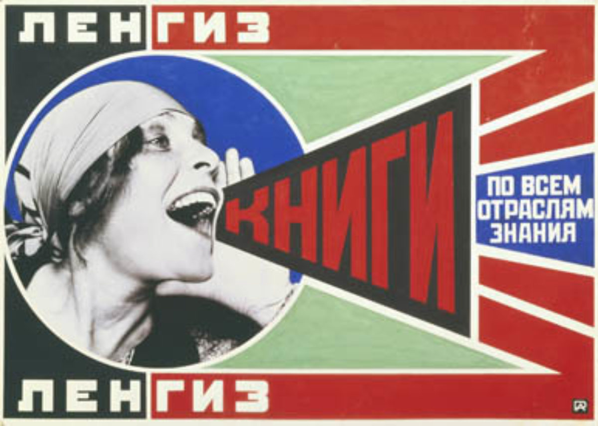
Books! By Alexander Rodchenko, 1924 (image c/o Learner.org)
Often associated with the Russian Revolution, this Constructivist poster actually just announces “Books (please)! In all branches of knowledge!” One of the priorities in the Soviet Union was increasing access to education for all citizens, whose literacy levels were around 20%. Since then, this design has been used for everything from pop album covers to wine labels, the graphics proving more inspiring than the message itself.
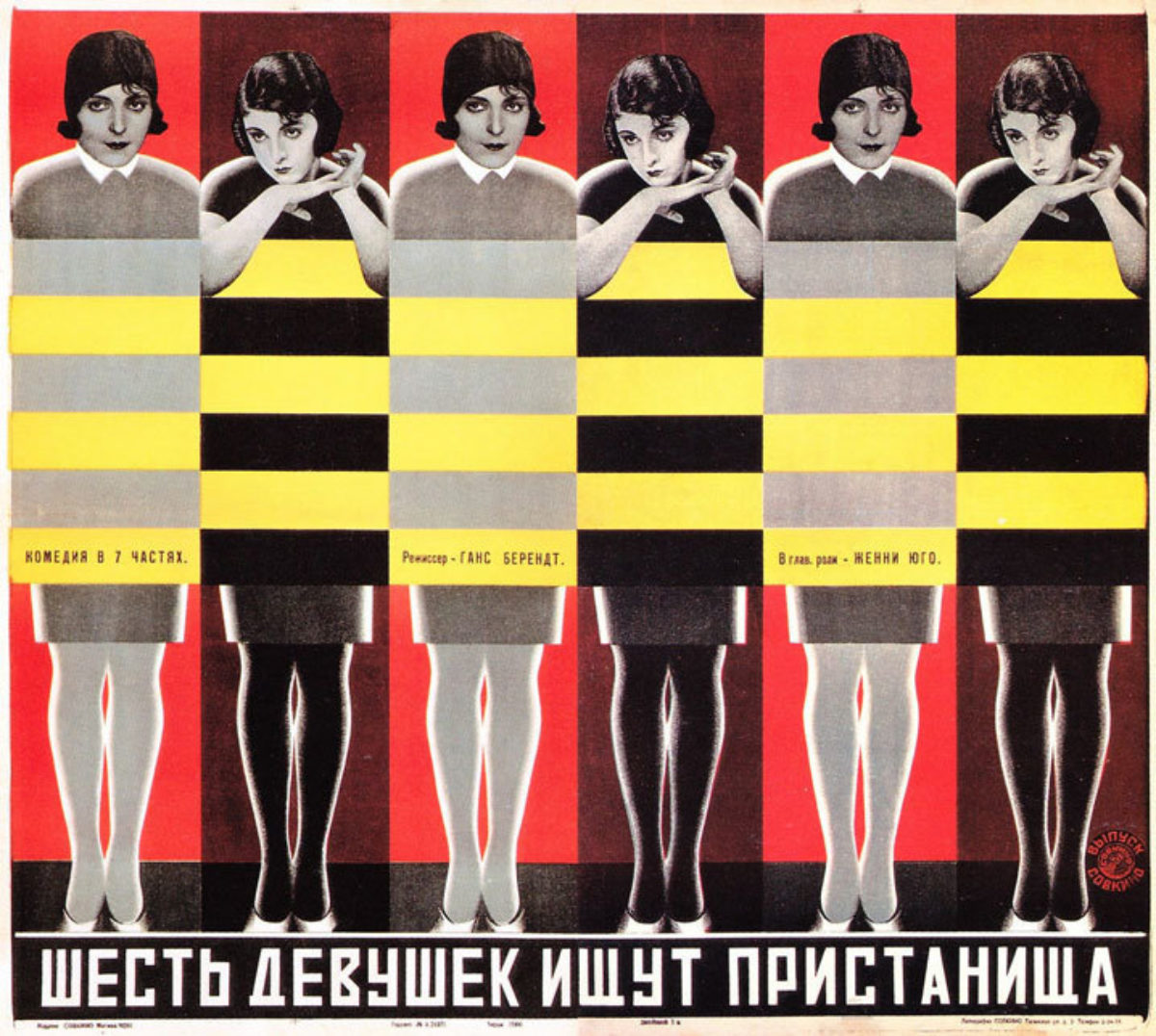
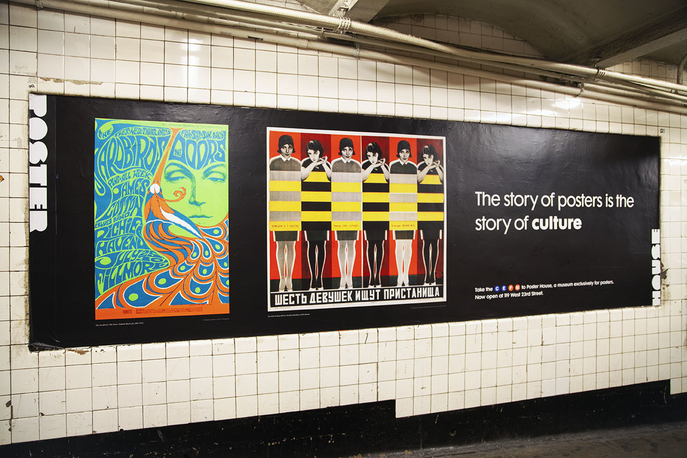
Six Girls Seeking Shelter by the Stenberg Brothers, 1928 (image c/o Curiator)
The Stenberg Brothers revolutionized the way films were presented in Soviet Russia, creating avant-garde surprising compositions every time. While these posters appear innovative and exciting, much of the vague, beguiling visuals can be attributed to the fact that the artists rarely saw the film before having to create the poster. The limited information they were given on each movie forced them to take a small idea and run with it, resulting in some of the greatest design creativity of the era.
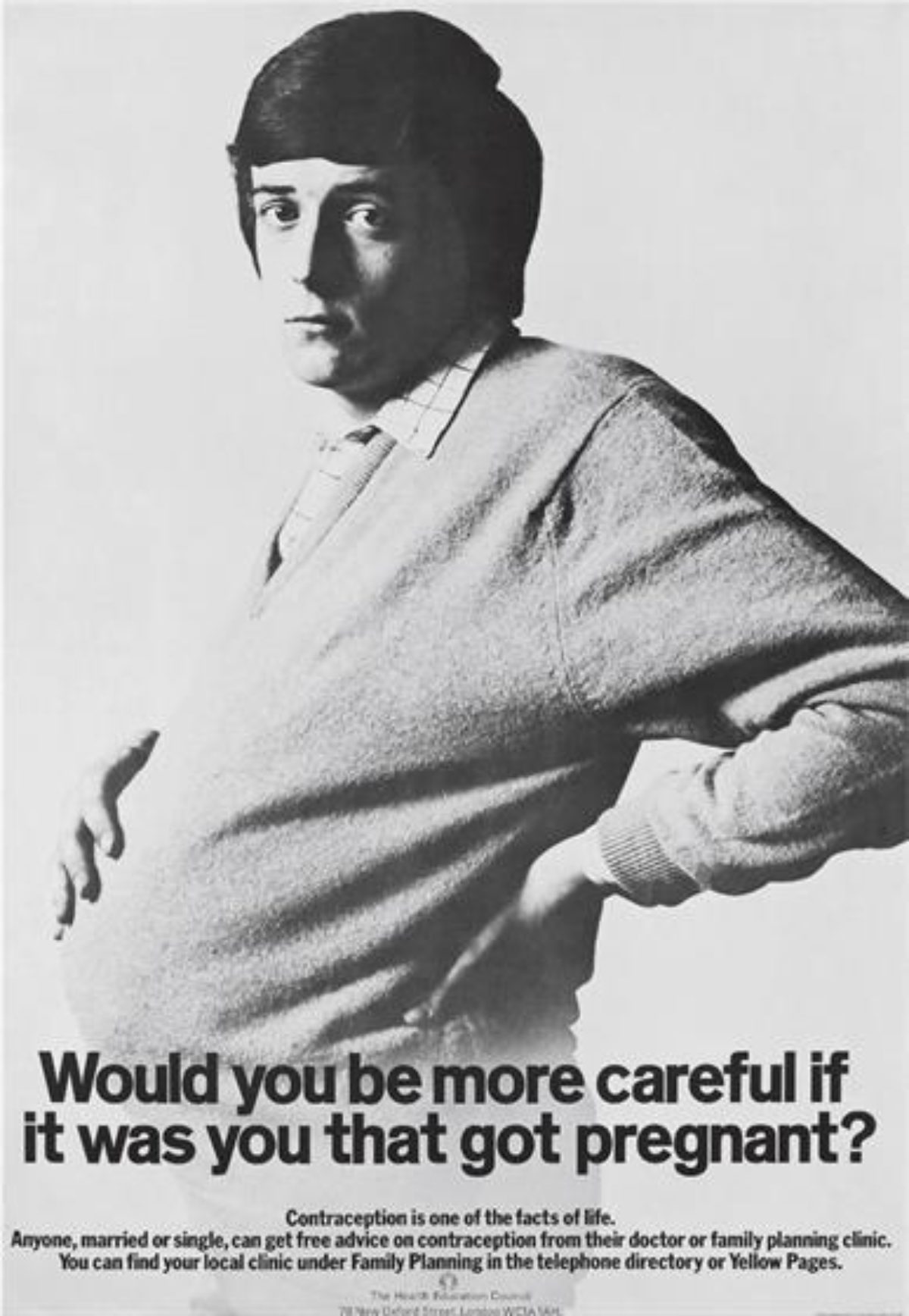
Would You Be More Careful If It Was You That Got Pregnant? by Cramer Saatchi, 1969 (image c/o Campaign)
Created for the Family Planning Association in England, to be displayed in doctors’ waiting rooms, this poster poses a very simple question: would you be more careful if it was you (a man) that got pregnant? The image, however, proved so powerful that it ended up in Time magazine, putting the firm Cramer Saatchi on the map.
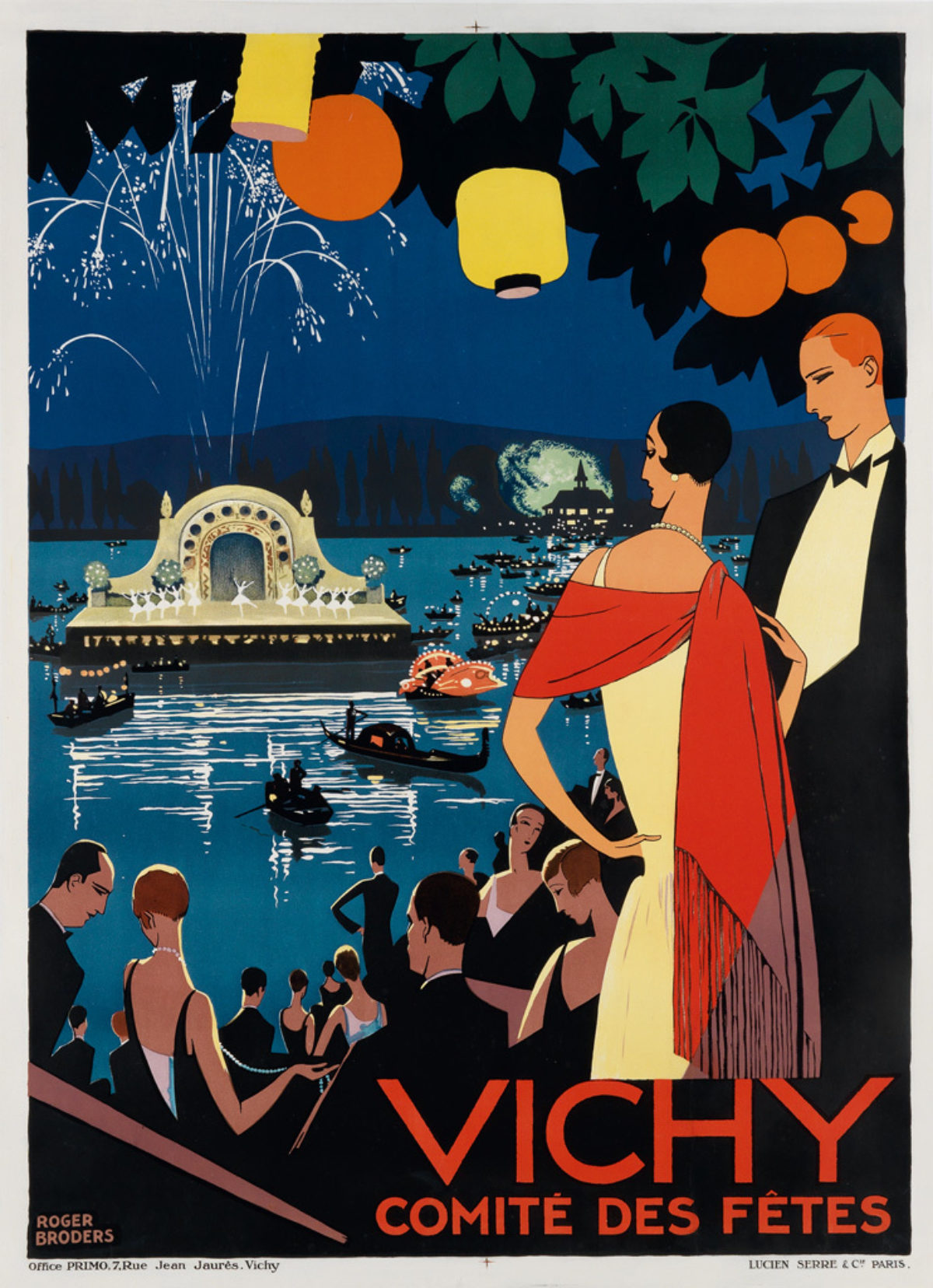
Vichy by Roger Broders, ca. 1926 (image c/o Swann Galleries)
Broders is a stand-out designer in the realm of Deco-era travel posters. His imagery always focuses on a moody foreground opening up onto an impressively deep field of dramatic perspective. When populated with people, like this poster, he manages to give every figure an above-it-all elegance with the fewest possible lines—a Gatsby fantasy potentially accessible to anyone who visits.
The Moon Show by Jacqueline Casey, 1969 (image c/o SFMoMA)
Best known for the many posters she created for MIT, Casey was one of the few female pioneers in the male-dominated field of graphic design. Heavily influenced by Müller-Brockmann and the International Style, she frequently combined bold imagery with simple, abbreviated text. This is her most famous poster.
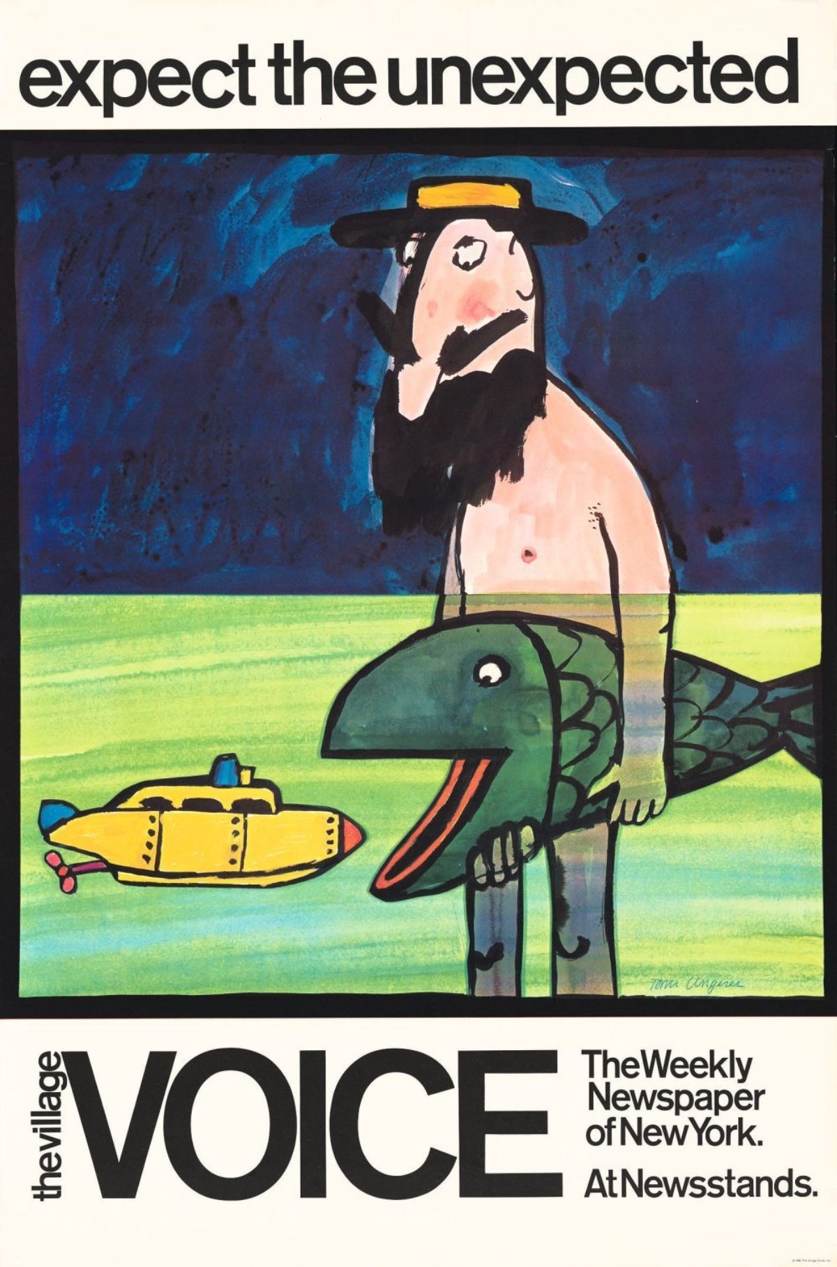
The Village Voice by Tomi Ungerer, 1968 (image c/o Curiator)
Ungerer changed the face of illustration from the moment he arrived in NYC in 1956. Best known for his children’s books, political work, and erotica, he also created numerous advertising posters, the best of which were part of a series he created for The Village Voice. The tagline “expect the unexpected” was actually created by him for the New York State Lottery, but they rejected it. Knowing it was a great motto, he presented it to The Village Voice, and that, as they say, is history.
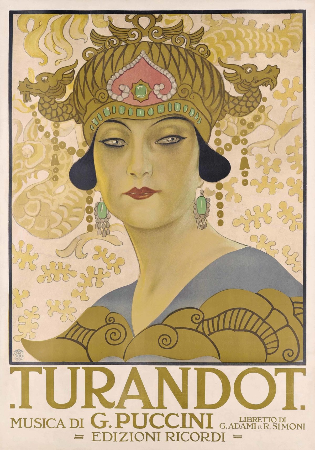
Turandot by Leopoldo Metlicovitz, 1926 (image c/o Christie’s)
Metlicovitz is one of Italy’s most lavish poster designers, especially when it came to the opera. Each production appears more seductive than the last, and this design for Puccini’s unfinished Turandot is no exception. Dripping in metallic gold, the princess pierces the gaze of the viewer—an especially daring choice of promotional image given that she sentenced to death anyone who tried to marry her.
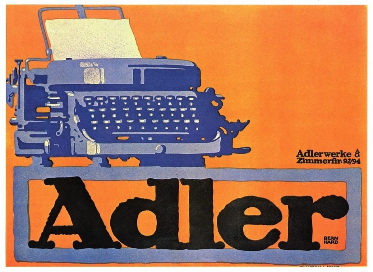
Adler by Lucian Bernhard, 1909 (image c/o Flickr)
In 1905, Bernhard invented the Sachplakat or Object Poster, a design style which removed all the frills and fussiness of advertising in order to focus on the object being sold. It is pure, direct, and powerful.
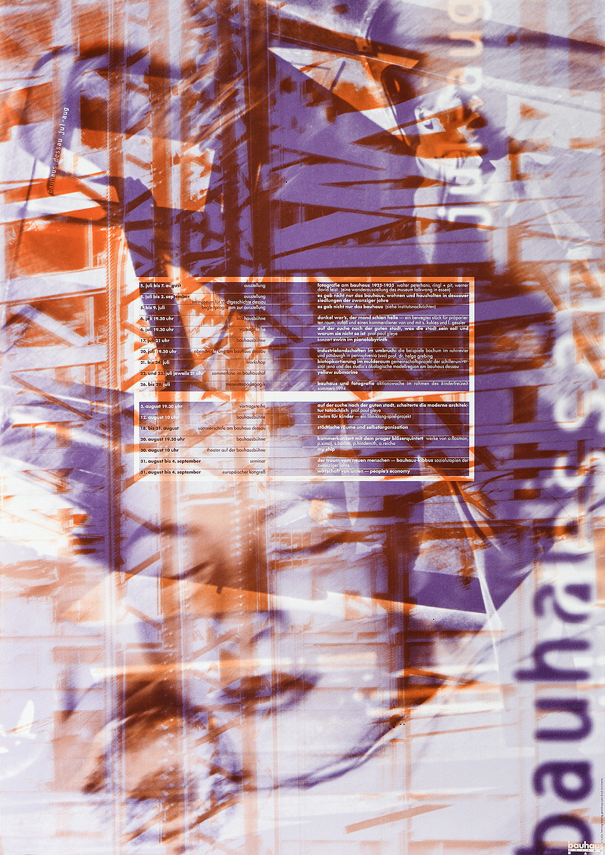
Bauhaus Program Juli August by Cyan, 1994 (Poster House Permanent Collection)
Appearing in every major history of graphic design, Cyan was one of the first groups to utilize desktop publishing tools like Photoshop to create street-facing advertising. A close partnership with their printer, Movimento, led to extreme innovation in the medium, each poster a miracle of lithographic prowess. They are also the subject of our opening exhibition Designing Through the Wall: Cyan in the 1990s.
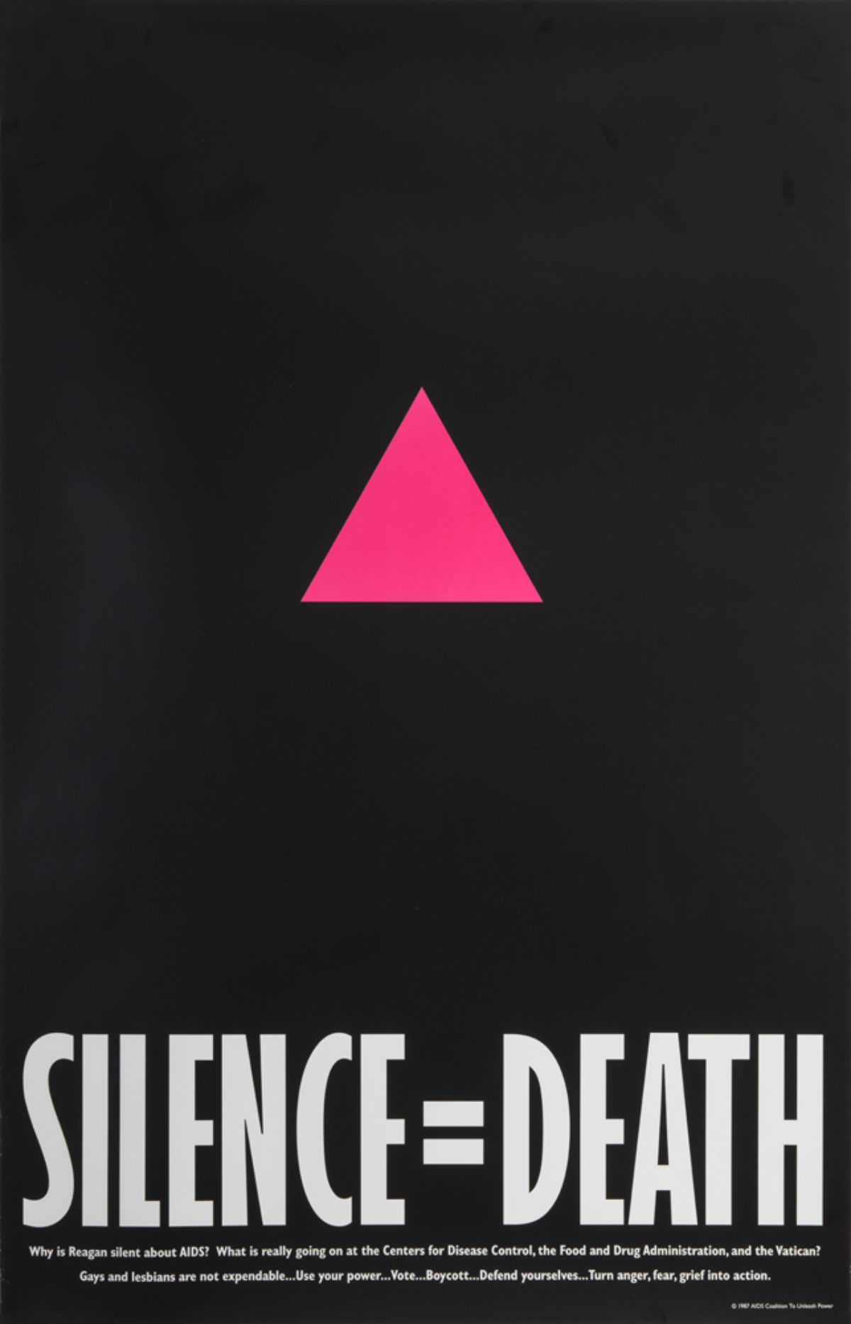
Silence = Death by Avram Finkelstein, 1987 (Poster House Permanent Collection)
In a time when thousands of people were dying from AIDS but the government was unwilling to mention, let alone take action around, this public health crisis, ACT UP created this poster. Reappropriating the pink triangle used by the Third Reich to designate homosexuals, the simple message that remaining silent would only lead to more deaths perfectly encapsulated the rage felt by so many toward mass public apathy.
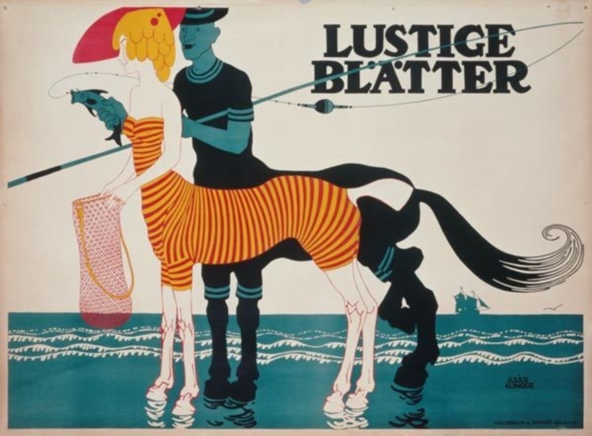
Lustige Blätter by Julius Klinger, 1909 (image c/o Kunstkopie)
Part of the Jugendstil movement, Klinger’s imaginative, humorous imagery continues to feel fresh and exciting today. This poster for a local newspaper is no exception, turning a seaside couple into a pair of centaurs. Klinger is also credited with bringing order to street advertising—a topic we’ll be exploring in more detail next summer during our Julius Klinger exhibition!
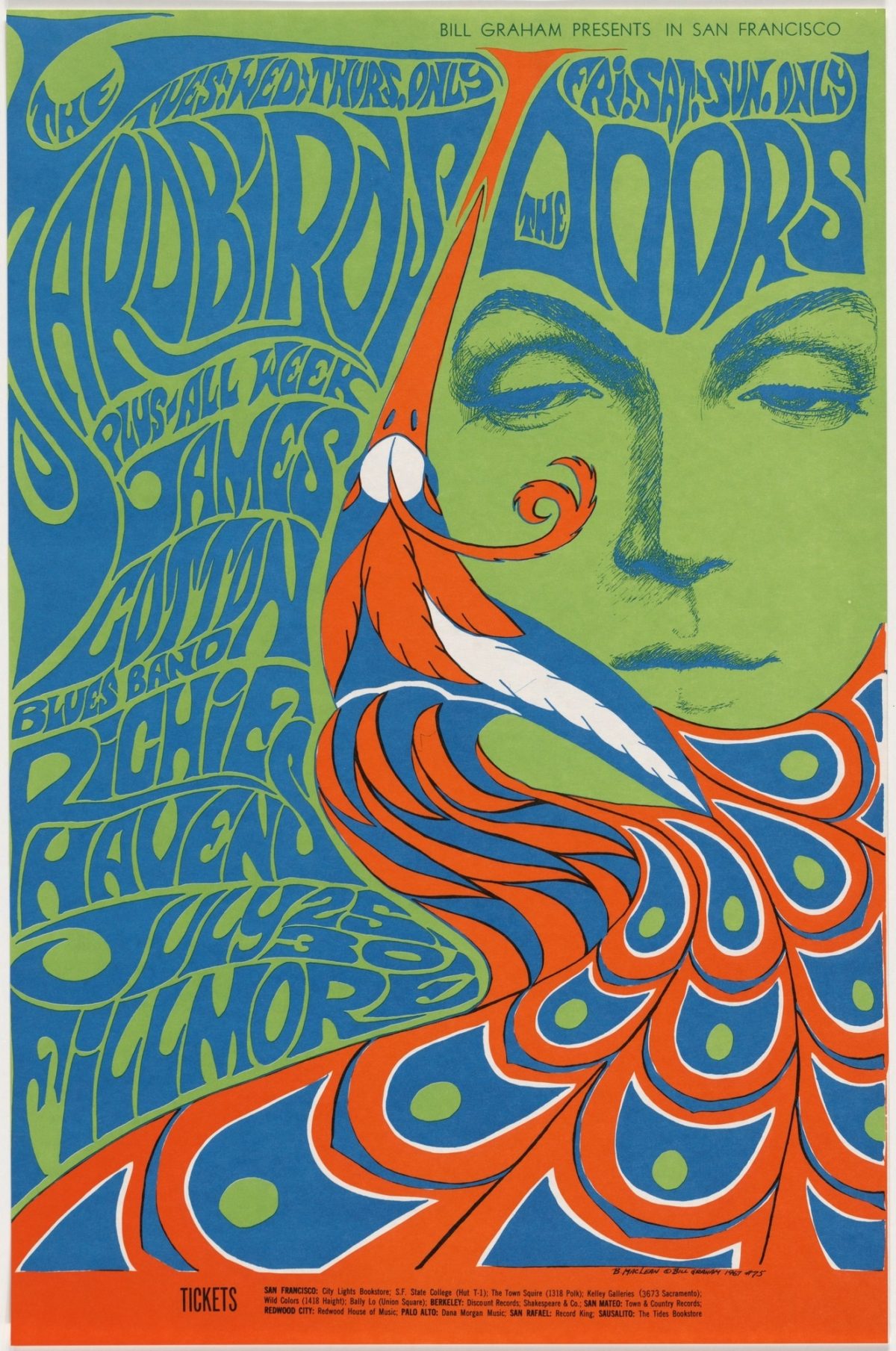
The Yardbirds/The Doors by Bonnie MacLean, 1967 (image c/o MoMA)
Married to Bill Graham, Bonnie MacLean made a name for herself as one of the few female artists in the psychedelic rock poster scene. This trippy design is so enticing that the Met recently used it as their primary merchandizing image for the show Play It Loud.
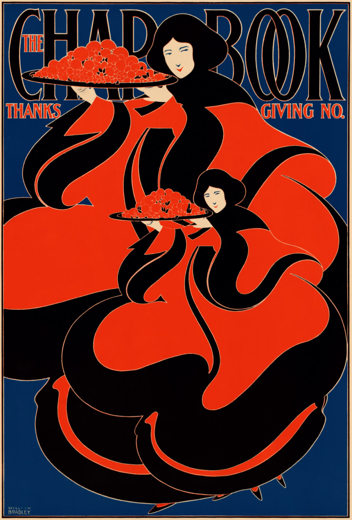
The Chap Book by William H. Bradley, 1895 (image c/o Period Paper)
Bradley was one of the few American artists to embrace the organic lines and intricate detail of Art Nouveau. He was a pioneer of lithography in the United States, and is often attributed with making posters popular outside of Europe. We at Poster House even refer to him as our Patron Saint of Posters. Here, two curious twin creatures promote the Thanksgiving edition of The Chap Book, an artsy literary magazine.
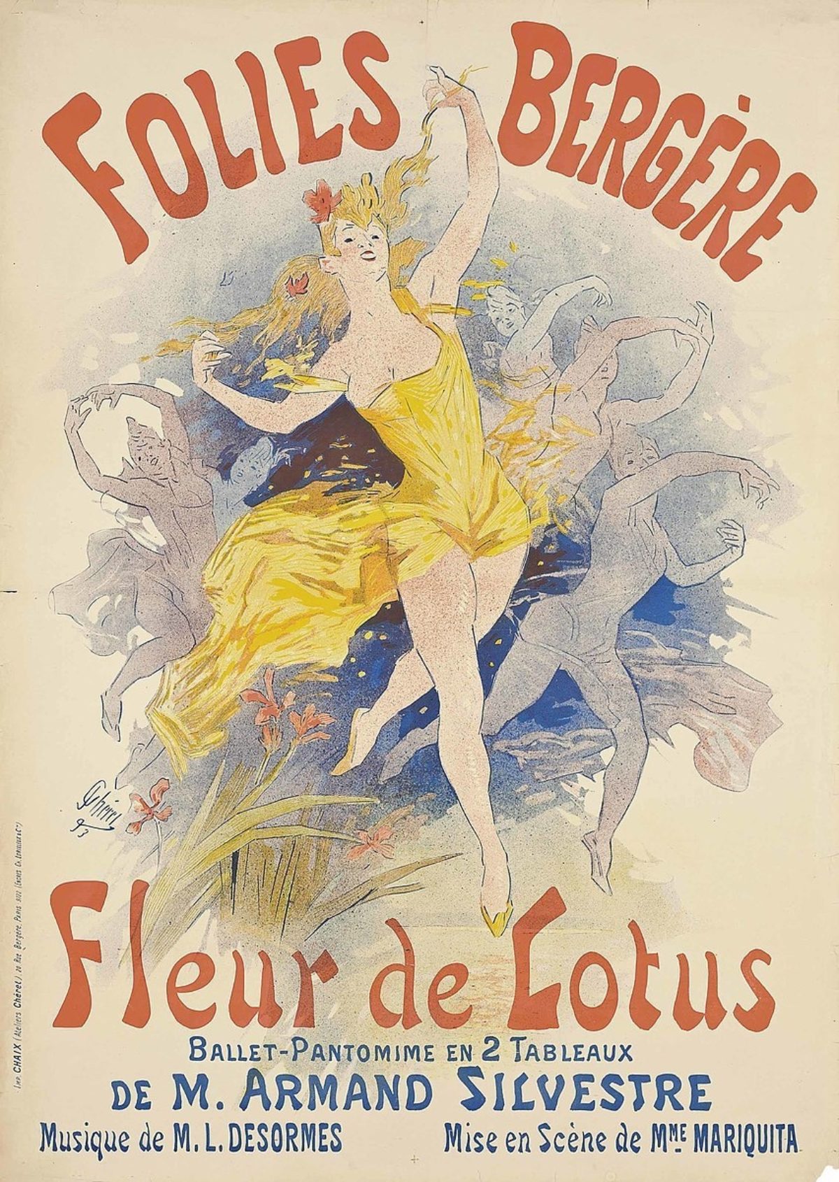
Folies Bergère/Fleur de Lotus by Jules Chéret (image c/o Wikipedia)
No exhibition on the history of posters would be complete without a design by the man who started it all, the Father of the Poster himself, Jules Chéret. He created over 1,000 posters in his lifetime, many of them populated by strawberry blonde nymphs in yellow dresses—aptly dubbed Chérettes. Here, he promotes a production at the infamous Folies-Bergère that involved, amongst other things, a moment where diamonds rained down on the audience.
If you liked all this, please let us know! We hope to possibly bring you another subway exhibition in the future.
