Poster Animation Competition
Poster House is joining forces with The Library of Congress to host an animation competition through the month of December, asking for modern takes on historical designs.
After sifting through thousands of posters in the Library’s collection, Poster House selected 31 images that speak of ages past, are free of any copyright issues, and are ready to party. All you need to do is visit the Library of Congress online to download a high res version of the file, crop it as you see fit, and lend your creative touch by animating it in a unique, fun, and compelling way.
Because backstories can only help make your designs richer, we’ve asked our curator to share a few fun facts about each poster. Once you’ve chosen your favorite, see our rules and regulations at the bottom of this post, and get crackin! Your work could be featured in the museum’s display window, and you could win a free membership to Poster House that gives you early access before opening day.
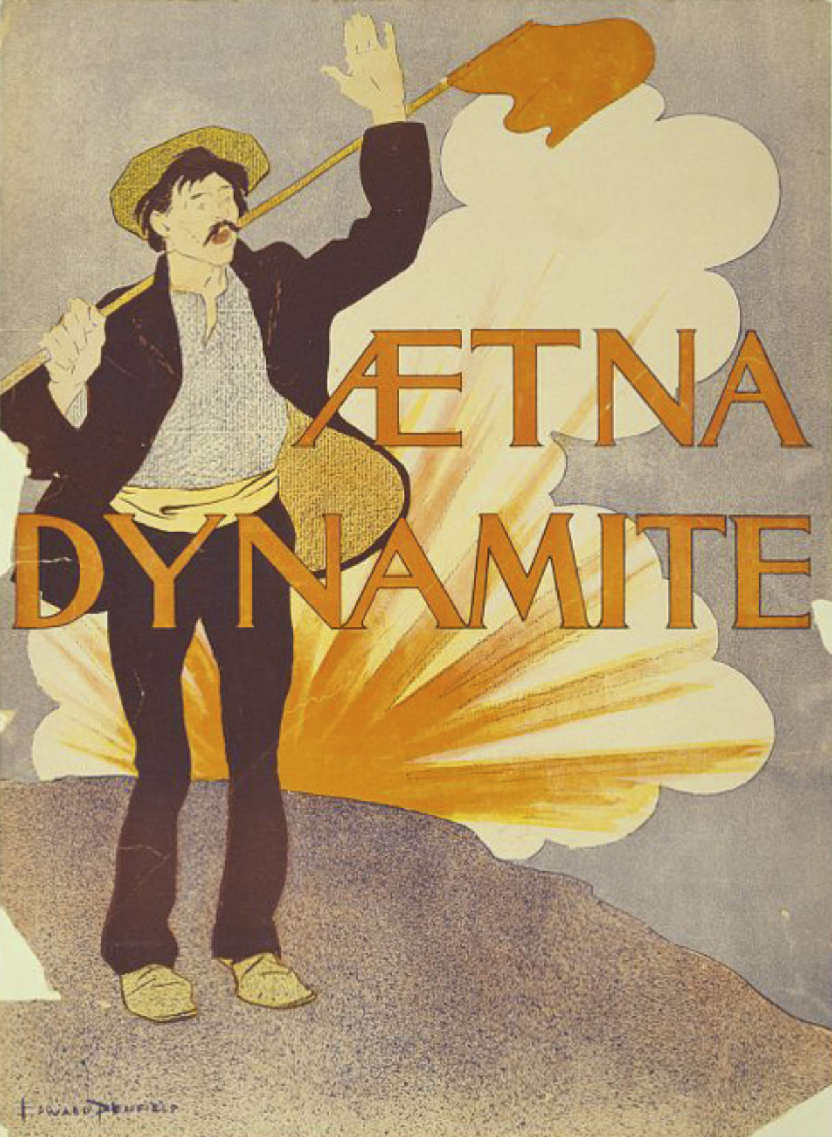
Aetna Dynamite by Edward Penfield, 1895
Originally conceived as a safer tool for industrialization than other black-powder explosives, dynamite was also a symbol of anarchist behavior around the turn-of-the-century. This poster is curious as it was created to promote Aetna, one of the largest dynamite manufacturers in America at the time, but also shows a figure in the typical attire of a revolutionary. Is the red flag a warning or a socialist banner? Artist Edward Penfield is considered the father of the American poster and is most famous for his scores of posters done for Harper’s magazine.
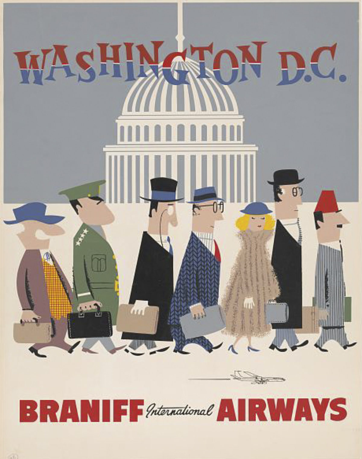
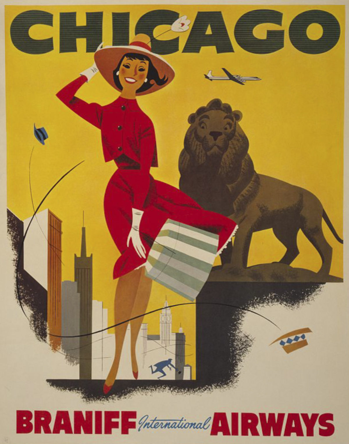
Braniff Airways Washington D.C. & Chicago by an Unknown Artist, ca. 1965
Download DC. Download Chicago.
Starting in 1965, Braniff Airways added “international” to its name, overhauling its entire image with Pop Art colors and zippy advertising. These posters are from that new era, when legendary ad executive Mary Wells Lawrence put together a team that included designer Alexander Girard and fashion designer Emilio Pucci to create a holistic aesthetic for the company. Pucci’s first line for Braniff debuted in 1965 – the same year as these posters – and was named Gemini IV, in a nod to the space mission that same year. It featured Pucci’s signature psychedelic prints and a “bubble helmet” designed to ensure that flight attendants’ hairstyles wouldn’t be disturbed on windy tarmacs.
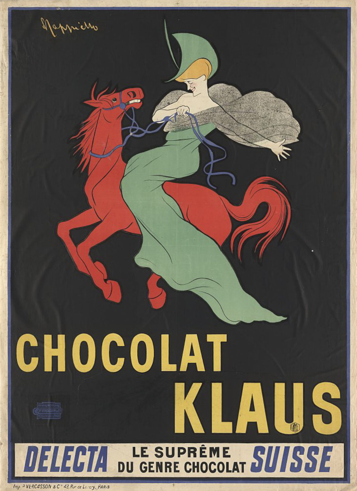
Chocolat Klaus by Leonetto Cappiello, 1903
As the Father of Modern Advertising at the turn of the 20th Century, Cappiello created dozens of iconic posters. His signature was a bold black backdrop that made his characters pop. This particular example stands out as the moment when he realized that a company mascot didn’t have to relate to the product, but through good design the image and the product could be linked for life. Still used by the company today, the image became so well-known that people would refer to it as the chocolate with the lady on the red horse rather than by its actual name.
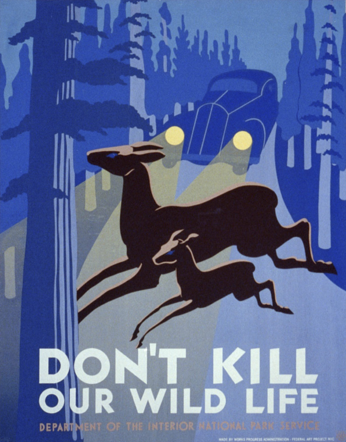
Left: Don’t Kill Our Wildlife by an Unknown Artist, 1936
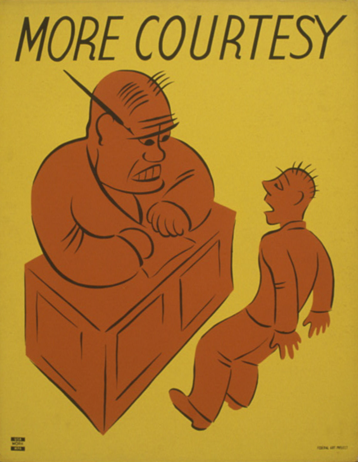
Right: More Courtesy by an Unknown Artist, 1936
Download Wildlife. Download Courtesy.
The Works Progress Administration (WPA) was the largest agency created out of FDR’s New Deal Policy. The WPA employed 8.5 million people over its lifespan from 1935-1943, and was responsible for building major infrastructure, including public buildings and roads. $27 million from the WPA was allocated to Federal Project Number One, which employed artists, actors, writers, and musicians in recognition that these jobs and art itself is necessary to a successful economy. In its heyday, the WPA paid artists to produce over 2,000 posters. Most promote community events, exhibitions, health guidelines, and – like these – general suggestions to make the world a better place.
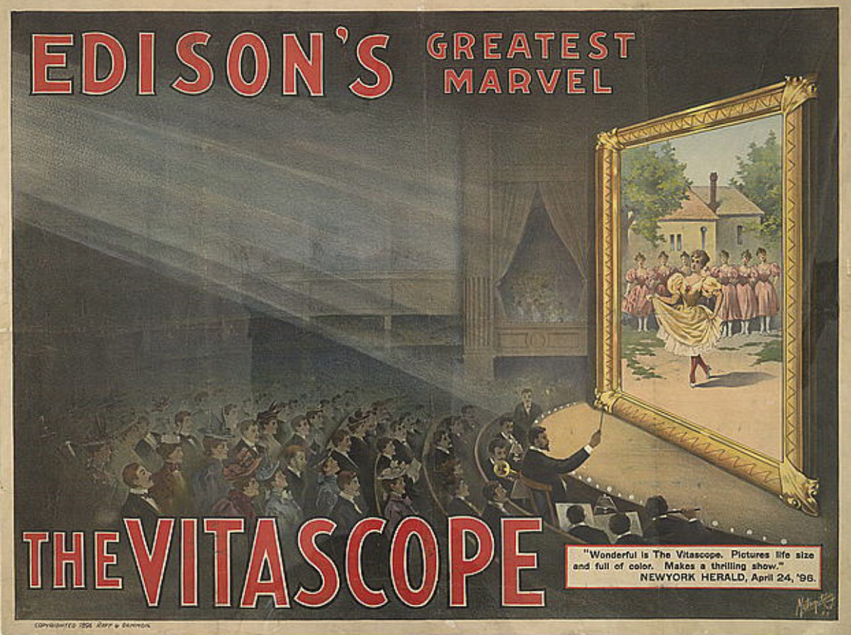
Edison’s Greatest Marvel / The Vitascope by an Unknown Artist, ca. 1896
The Lumière brothers invented the first successful movie projector and debuted it in Paris in 1895, but it wasn’t until 1897 that it came to the States. In the intervening years, American inventors made their own attempts and created the Phantoscope. When Edison was approached to manufacture the large-scale projector, he agreed under the condition that they rebrand the invention under his own name as “Edison’s Vitascope.” It was distributed widely in the States before the Lumière’s Cinematographe arrived, but Edison then developed his own projector and abandoned the Vitascope. This poster is from those first few years of advertising movies to a public audience, promoting the projector that will show the film rather than the film itself!
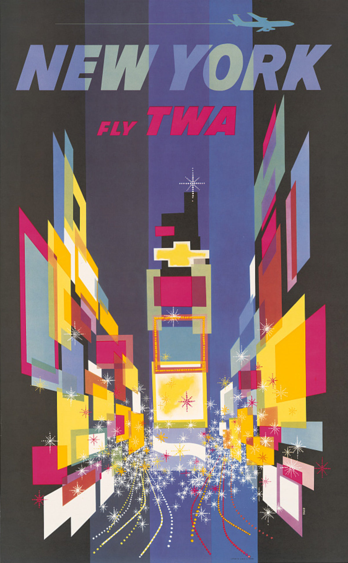
TWA / New York by David Klein, 1956
Throughout the 1950s and 1960s, David Klein rebranded TWA with an award-winning poster series that exemplified the Jet Age. A stand out of these is his TWA New York poster that turns Times Square into a series of brightly-lit geometric shapes. Created in 1956, it was accepted into the MoMA’s permanent collection the following year. Klein was hired under the leadership of the legendary Howard Hughes, who went from being a big-time movie producer in the 20s, to building and flying aircrafts in the 30s and 40s, setting multiple world air speed records. Hughes acquired TWA in 1941, his celebrity clout benefiting the airline as he expanded its routes internationally. In 1950, Hughes changed the name from Transcontinental and Western Air to Trans World Airlines, preserving the acronym.
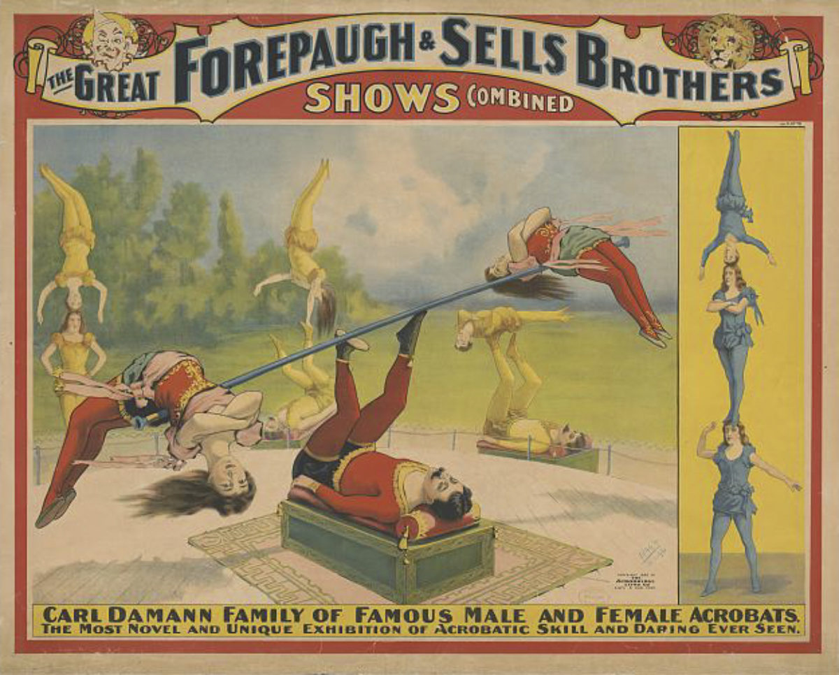
The Great Forepaugh & Sells Brothers by an Unknown Artist, ca. 1899
In operation from 1896 to 1911, the Forepaugh and Sells Brothers circus was a combination of two smaller circuses purchased by the famous James Bailey. Circuses had long been a favorite spectacle, and new acts continually had to be developed to entrance the audience. In the 1850s, the flying trapeze appeared; in the 1870s, the human cannonball was fired; and, in the 1890s, equestrian acts lost ground to exotic animal shows. At the time of this poster, there was a renewed interest in gymnastics and physical activities (which led to the resurrection of the Olympic Games in 1896) at a time when few gymnasts could be seen outside the circus. This might explain why this “family” of acrobats is the featured attraction in this traveling poster for the circus.

Gold Zerschlägt Eisen by Julius Diez, 1916
Created in Germany during World War I, this poster encourages viewers to give their money to the government in support of the war effort, as “gold smashes iron.” War costs money. By some estimates, Germany spent today’s equivalent of more than 1 trillion dollars over the 5 years of the war. This poster, from the middle of the war, shows a female embodiment of their investment, carrying a wheat sheaf of prosperity and a dove of peace, having just broken free of her iron chains. By the time this poster was published, Germany was experiencing major food shortages and conducted several national war loans financed by its population. Many of the bonds sold through these drives were deemed worthless years later due to hyperinflation after the national debt rose from 5 billion marks in 1914 to 156 billion marks in 1918.
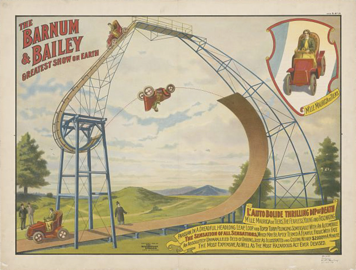
The Barnum & Bailey Greatest Show on Earth by an Unknown Artist, ca. 1905
Traveling circuses always needed to create bigger, better, more extreme acts to attract an audience – especially as trains, cars, and new technology expanded both what was possible and what people were fiending to see. Here a woman known only as the “Parisian” Mauricia de Tiers promises to perform “a dreadful, headlong leap, loop and topsy turvy plunging somersault with an automobile. The sensation of all sensations, which may be aptly termed a fearful frolic with fate, an absolutely unparalleled deed of daring, just as illustrated, and costing nearly $2,000.00 a minute. The most expensive, as well as the most hazardous act ever devised.”
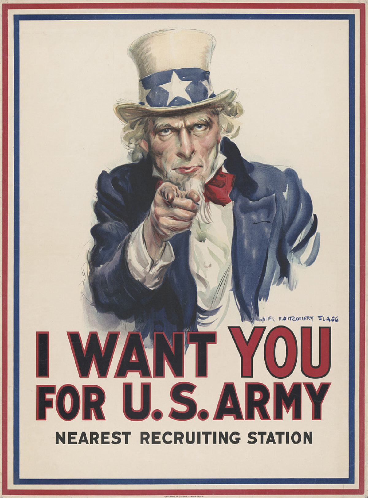
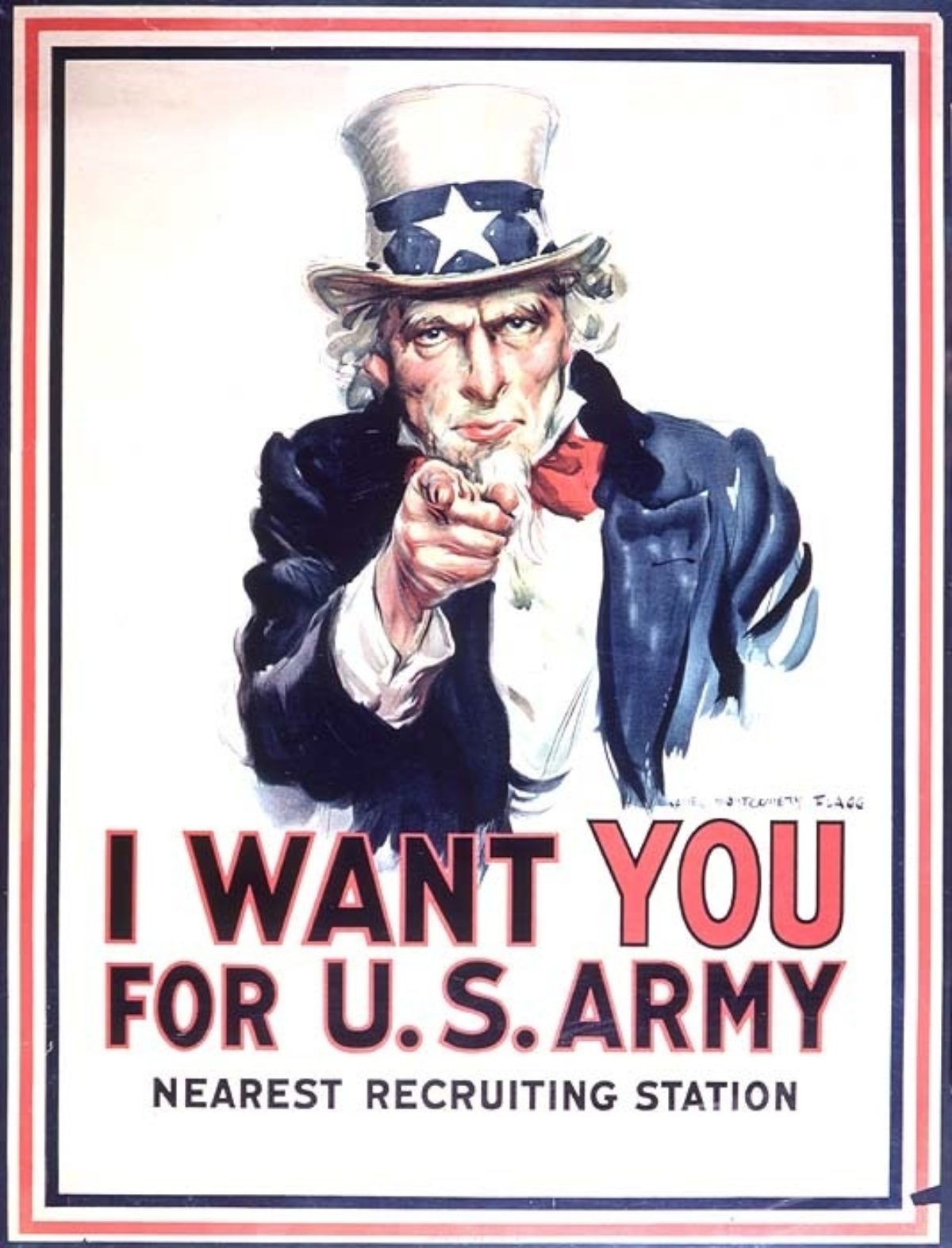
Left: I Want You by James Montgomery Flagg, 1917
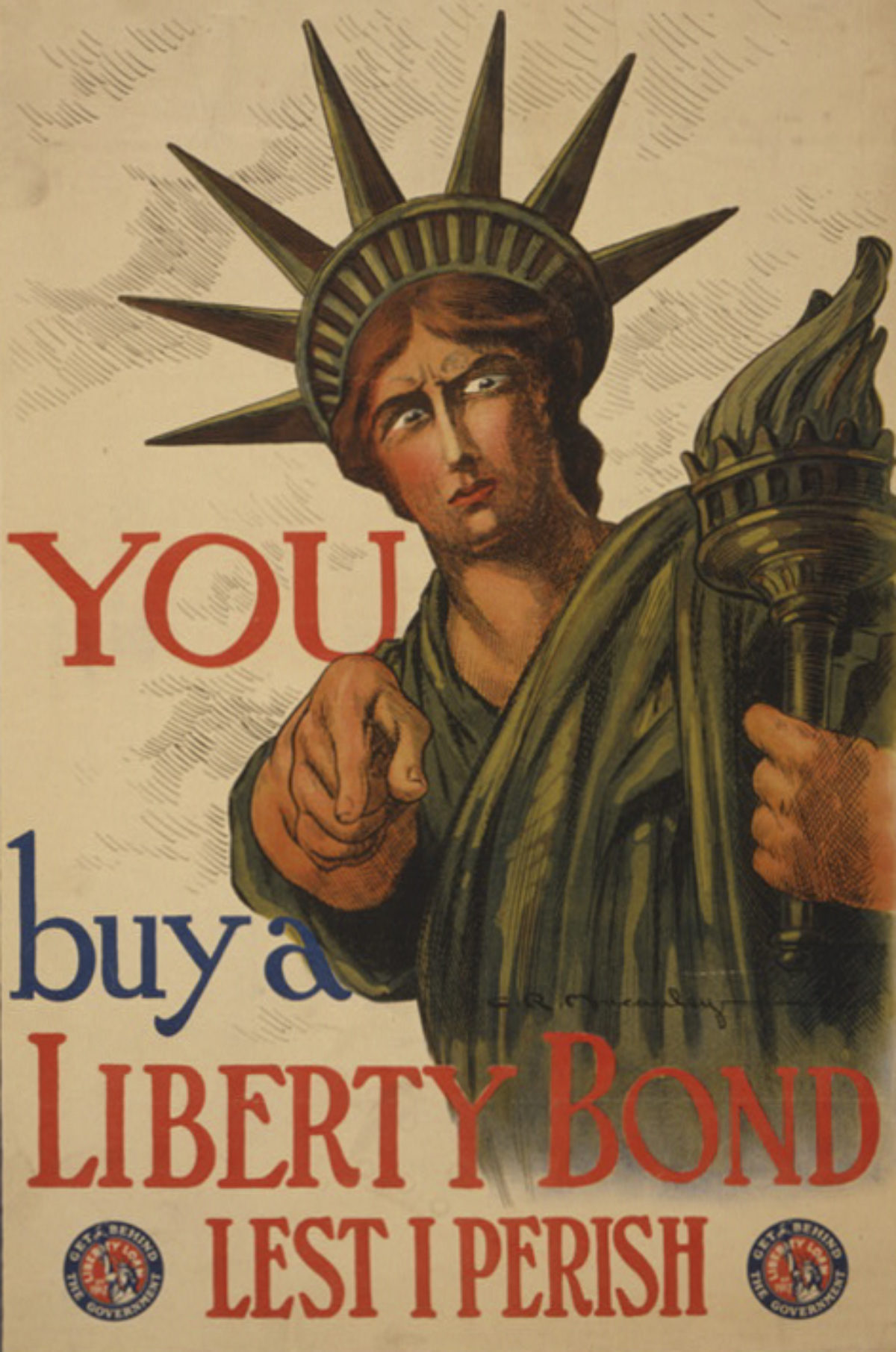
Right: You Buy a Liberty Bond Lest I Perish by Charles Raymond Macauley, 1917
Download Flagg. Download Macauley.
Perhaps the most iconic recruitment poster of all time, the image on the left by James Montgomery Flagg has been riffed on endlessly. In fact, you should read our blog post about the history of pointing in posters to get the full history behind both designs. According to the Library of Congress, Flagg’s Uncle Sam was printed more than 4 million times in the final year of World War I. The central figure was based on Flagg himself, apparently because he was under too short a deadline to hire a model. Ultimately, Flagg designed 46 propaganda posters for the government before moving on to his other successful career path of drawing beautiful women.
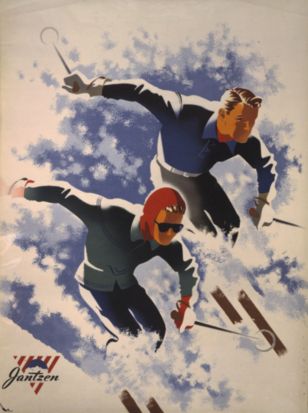
Jantzen by Joseph Binder, 1947
Binder was an Austrian artist who revolutionized commercial design in the 1930s by simplifying compositions into rhythmic geometric forms and bold contrasting colors. He incorporated the avant-garde movements of Cubism and De Stijl into his posters, which won many MoMA competitions after he emigrated to the United States in 1934. Here, he brings dynamism and a sense of Modernity to a new line of ski clothing – an out-of-the-box line of products produced by the Jantzen swimwear company, an incredibly popular brand that was the seventh most-known trademark in the world in the 1930s, a title currently held by 3M.
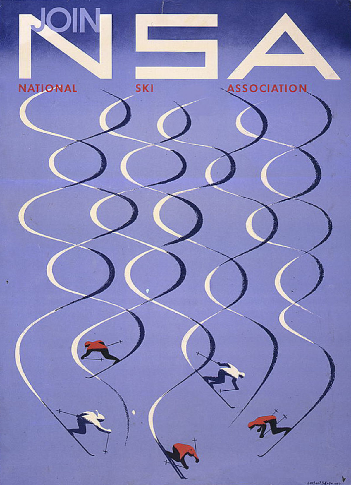
NSA by Herbert Bayer, 1957
In 1946, Herbert Bayer – then an internationally respected, Bauhaus-trained artist – was aggressively recruited to help present a new vision for the recently-developed Aspen, Colorado. Industrialist Walter Paepcke rehabilitated the ski mountain and founded influential centers for music, philosophy, and physics that made the town an international destination. Bayer had previously worked on advertising and design for Paepcke’s Container Corporation of America, where he eventually oversaw all of the company’s aesthetics. Bayer became Aspen’s original hype man, creating posters for the town since its inception and for years to come.
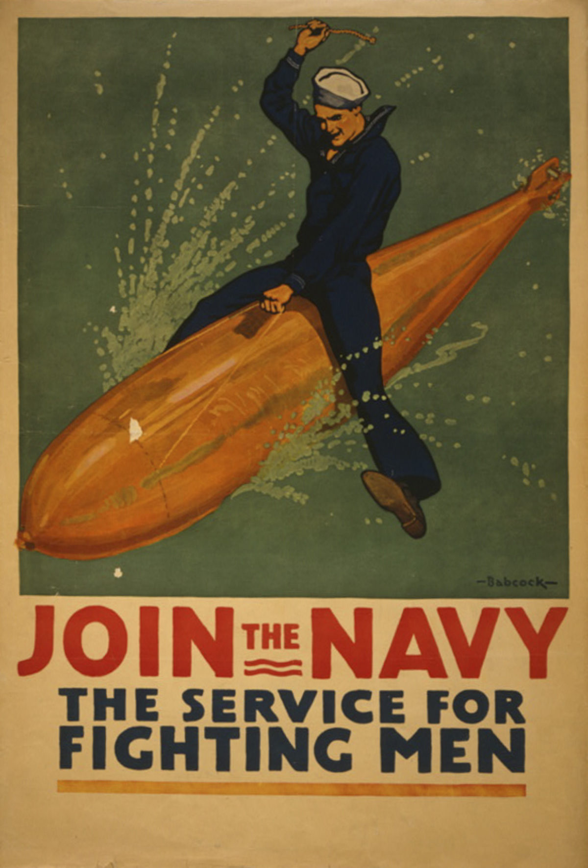
Join the Navy by Richard Fayerweather Babcock, 1917
Like a cowboy of the high seas, this sailor rides a warhead to victory – a hyper-masculine, over-the-top recruitment image for the first World War. The artist, Babcock, once studied privately with Ludwig Hohlwein, who would go on the be one of the most important Nazi poster artists. Ironically, the Navy actually saw little action and was kept close to home due to fuel shortages. Printed in the United States the year it joined the war, the image was widespread and well-known afterwards – it without a doubt serves as the inspiration for the final scene in Kubrick’s Doctor Strangelove.

Keep Your Teeth Clean by an Unknown Artist, 1936
An appealing Modern design put out by the Federal Art Project for the WPA, this poster promotes oral hygiene in 1936. Mass-produced toothpaste and toothbrushes had been on the market since the 1870s, and the 1930s saw the major development of nylon bristles, believed to be more hygienic. Schools and workplaces began to educate Americans on the importance of oral hygiene, but it was not until after World War II that oral care was established as a daily routine. To keep soldiers healthy and fighting during World War II, they were required to brush their teeth every day, a habit they brought home when returning from service.
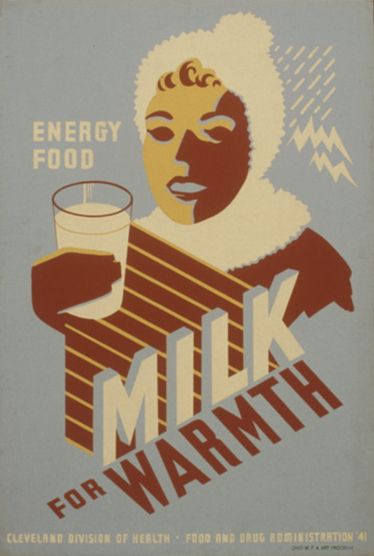
Left: Milk For Warmth by an Unknown Artist, 1941
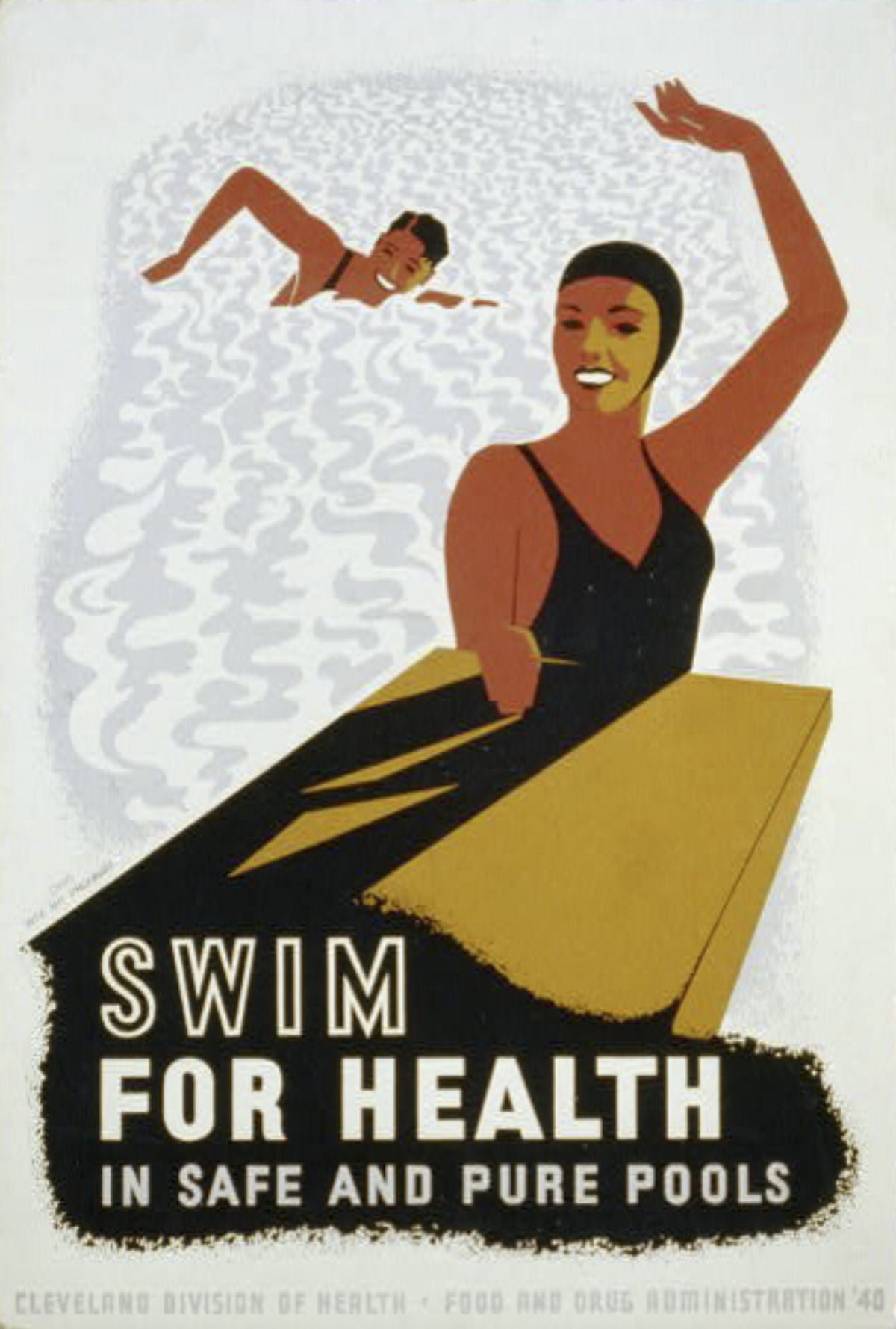
Right: Swim for Health by an Unknown Artist, 1940
Both of these posters were created by the WPA for the Cleveland Division of Health, and promote two very basic activities with rather odd taglines. In the first, we are told to drink milk to stay warm in the winter, and it is marketed further as being an “energy food.” In the second, we are told to “swim for health in safe and pure pools” (the word ‘purity’ today takes on a more complicated connotation when we remember that pools would have been segregated at that time). The 1940s was the start of US Government subsidies for the Dairy Industry, and pools had been a part of the infrastructure built by the WPA during the 1930s, so advertising for milk or pools was strangely not beyond the bounds of a government office.
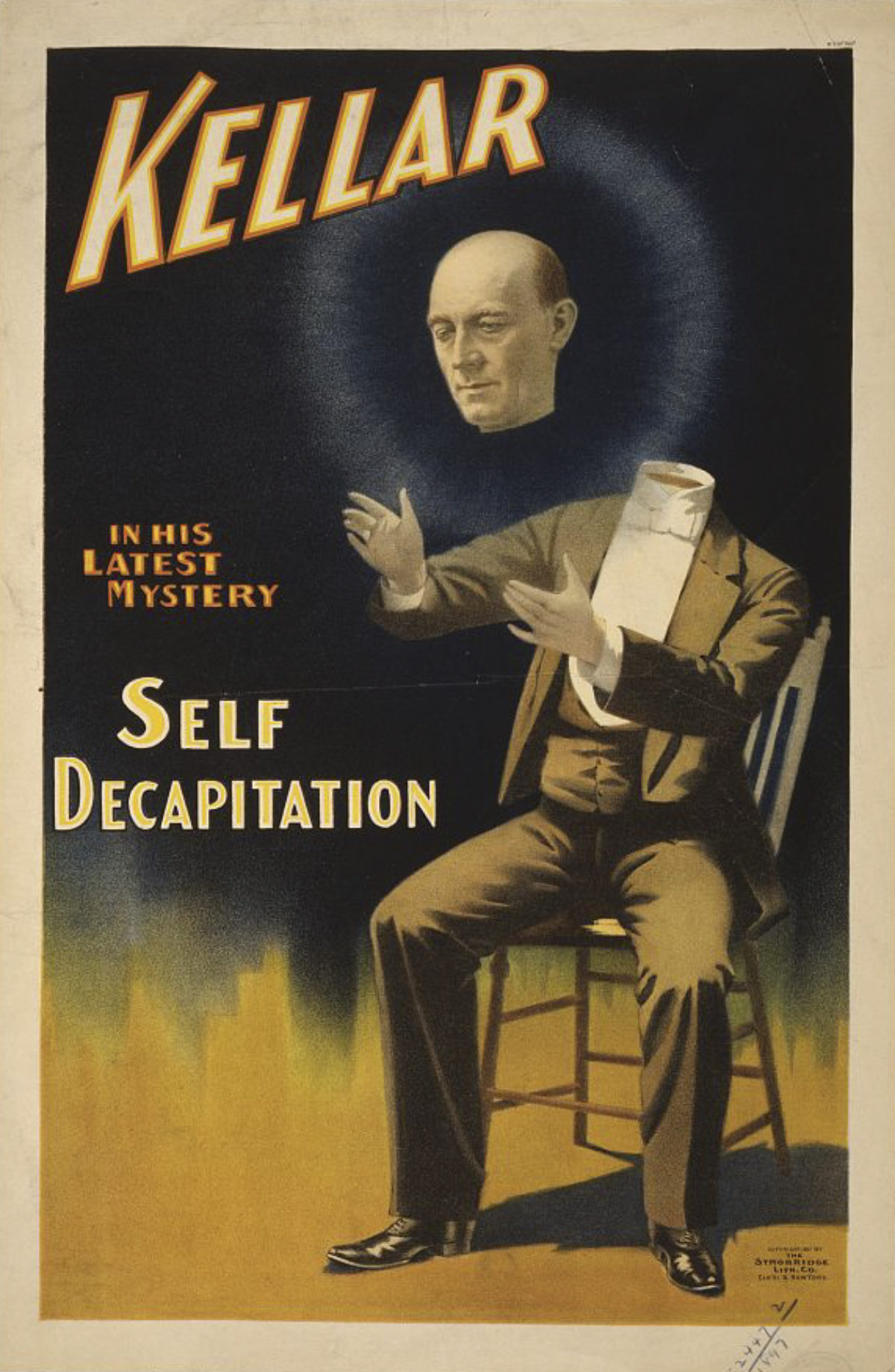
Kellar / Self Decapitation by an Unknown Artist, ca. 1897
Harry Kellar was one of the most famous magicians of the turn-of-the-century, traveling five continents with various partners and routines, and performing for President Teddy Roosevelt and his family. Keller was best known for his levitation and disappearing illusions – both of which are utilized in the trick performed in this poster. However, his most popular trick was The Levitation of Princess Karnack in which he used a custom made machine to create the illusion. Kellar preceded Houdini, who cited him as an inspiration, and they performed one time together in a 1917 benefit for families of a U-boat attack during WWI.
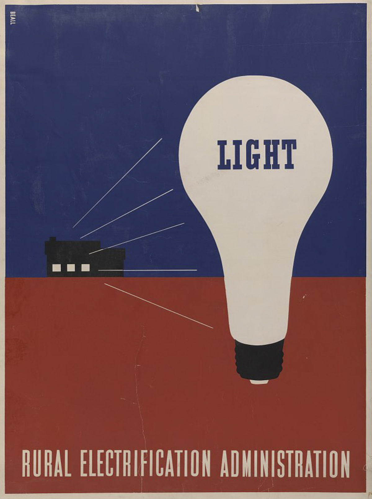
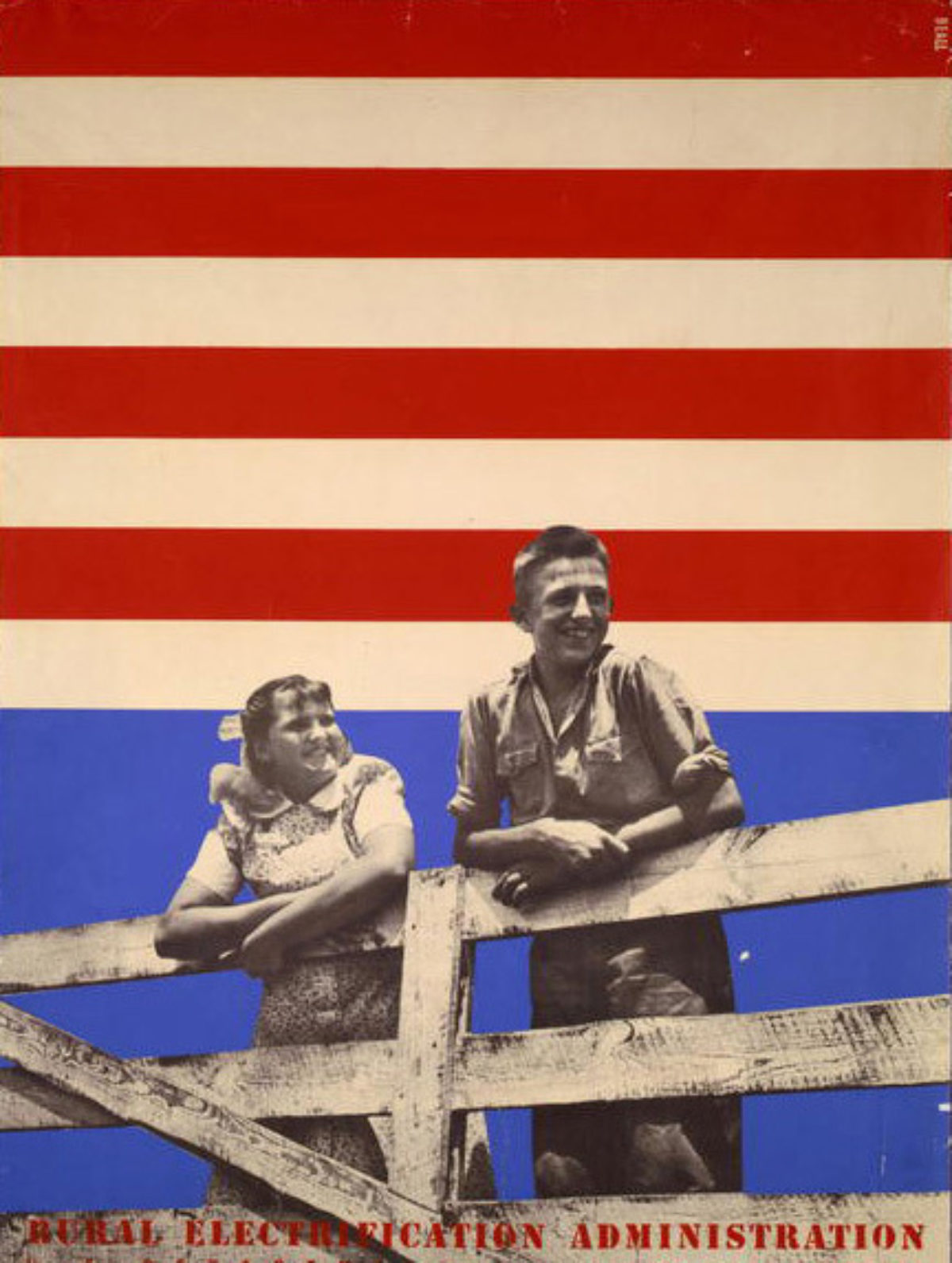
Left: Light / Rural Electrification Administration by Lester Beall, 1937
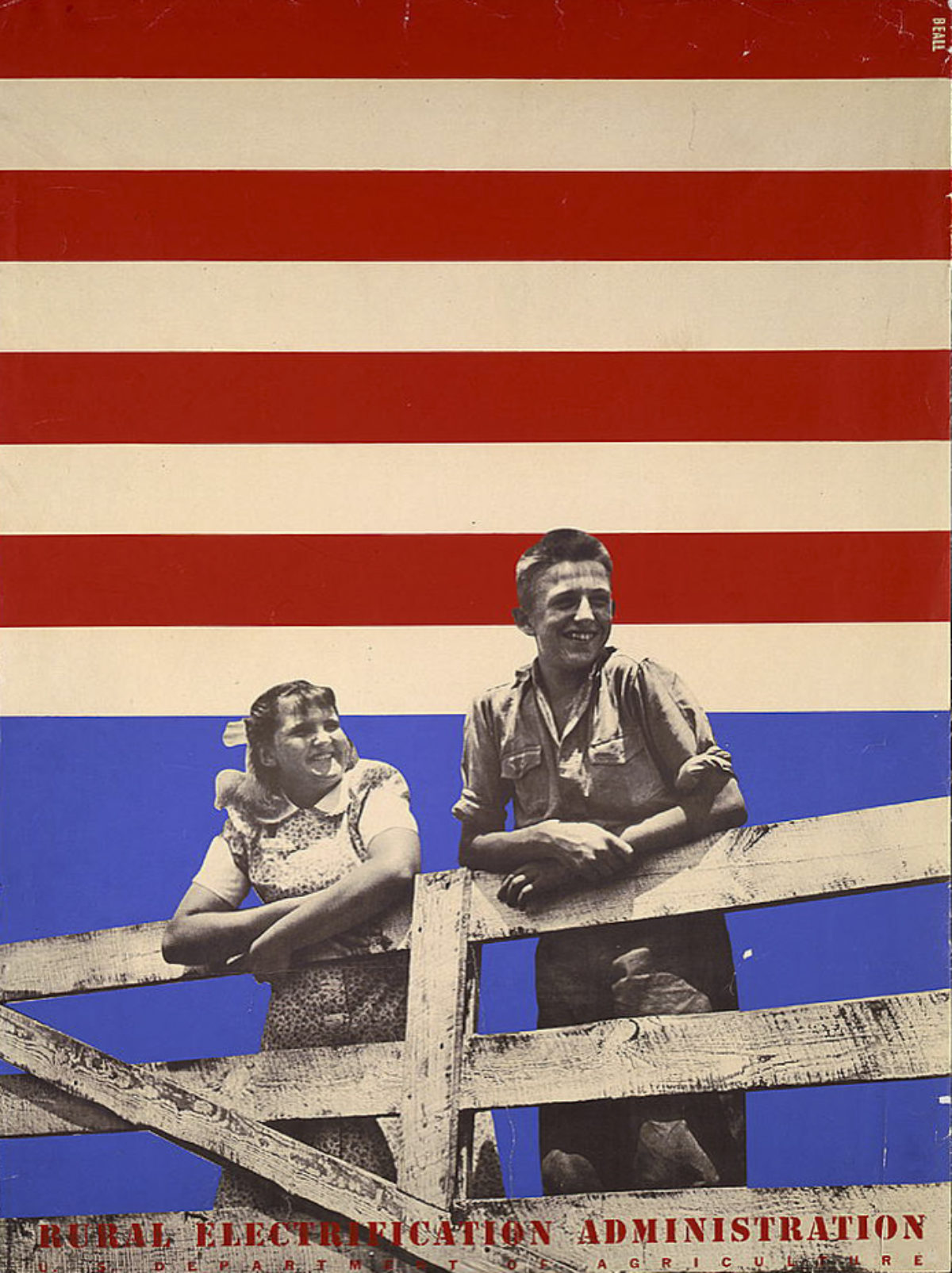
Right: Rural Electrification Administration by Lester Beall, 1937
Download Light. Download Fence.
In 1935, the Rural Electrification Administration (REA) was created in order to bring electricity to the most isolated and destitute parts of America, particularly in the Midwest. These 1937 Lester Beall classics followed a period of extreme drought in the rural regions and marked an investment in the area by President Roosevelt’s New Deal. Electricians from the REA traversed the American countryside adding wiring to houses and barns, and installing overhead lights and outlets in each room, where previously only 10% of the rural population had access to electricity.
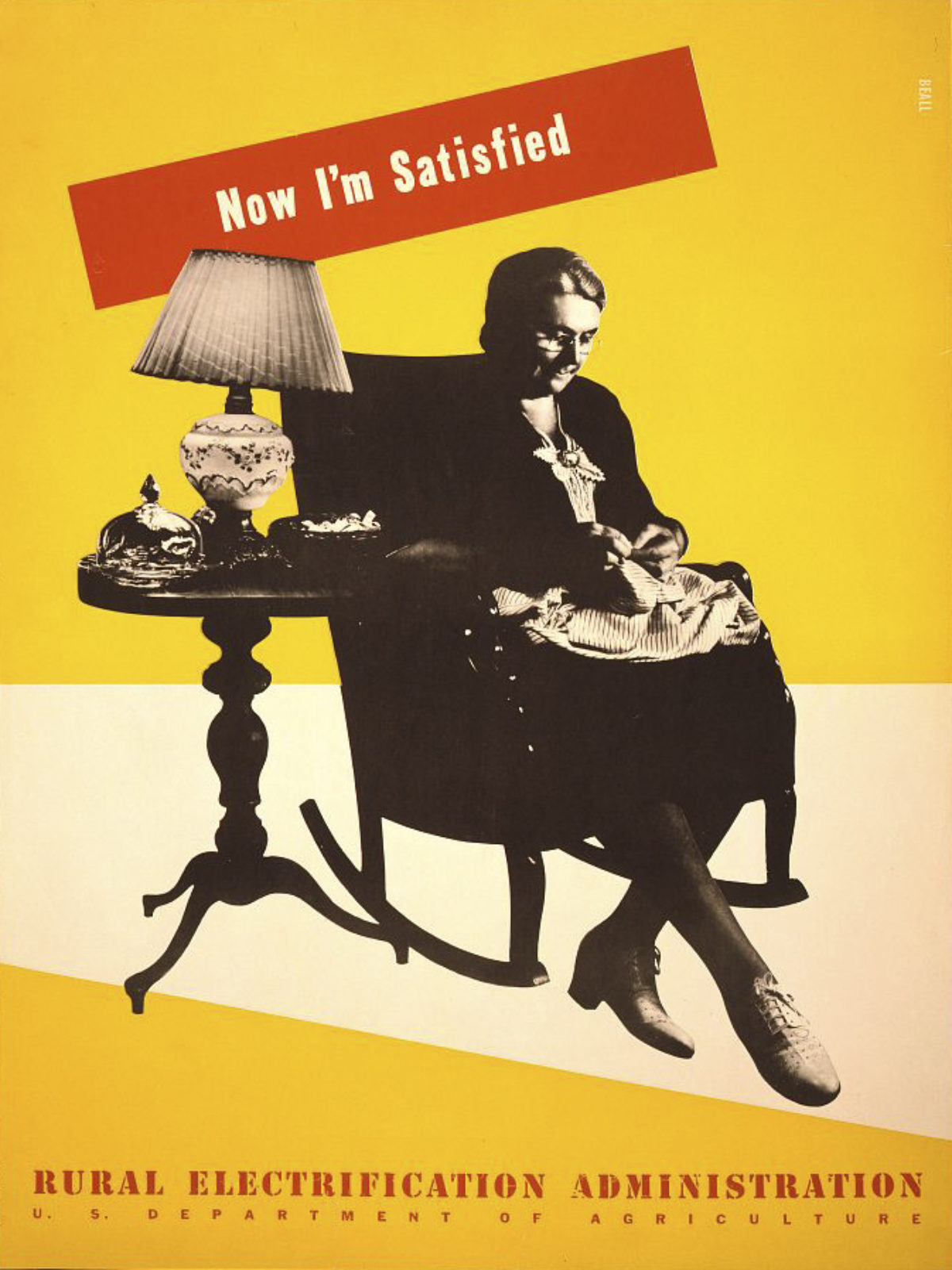
Now I’m Satisfied / Rural Electrification Administration by Lester Beall, 1939
Riding on the success of his 1937 series, two years later Beall was asked to create a second set of posters to encourage rural Americans to connect to the National Grid. Here, a photomontage image shows a “satisfied” old woman embroidering by the light of an electric lamp, indicating what an interior scene could look like with electricity. Beall’s posters were recognized for their design achievement in their own time, and MoMA exhibited them in 1937 and 1941.
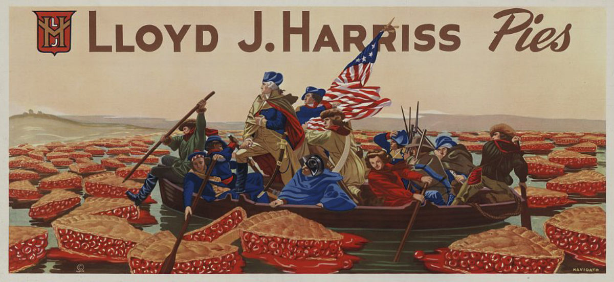
Lloyd J. Harris Pies by Rocco Navigato, 1947
As American as cherry pie and Washington Crossing the Delaware, this unusual poster promotes the Michigan-based Lloyd J. Harriss Pie Company. West Michigan’s microclimate was especially conducive to the fruit industry, which spawned a basket factory, fruit exchange, and fruit shipping business, and the Lloyd J. Harriss Pie Company, which eventually trademarked the slogan “Slice of America.”

Pâtes aux Oeufs et aux Légumes by Leonetto Cappiello, ca. 1903
Before there were authorized celebrity endorsements to commodities, poster artists like Cappiello would include famous actors of the day in their ads to help sell a product. Here, 12 Parisian celebrities are clamoring to buy this brand of pasta – and if you couldn’t recognize them from their caricature, their names are helpfully supplied beneath each figure. Using someone’s reputation to sell a product is a trope generally credited to Alphonse Mucha, who partnered with Sarah Bernhardt to sell cookies around this same time.
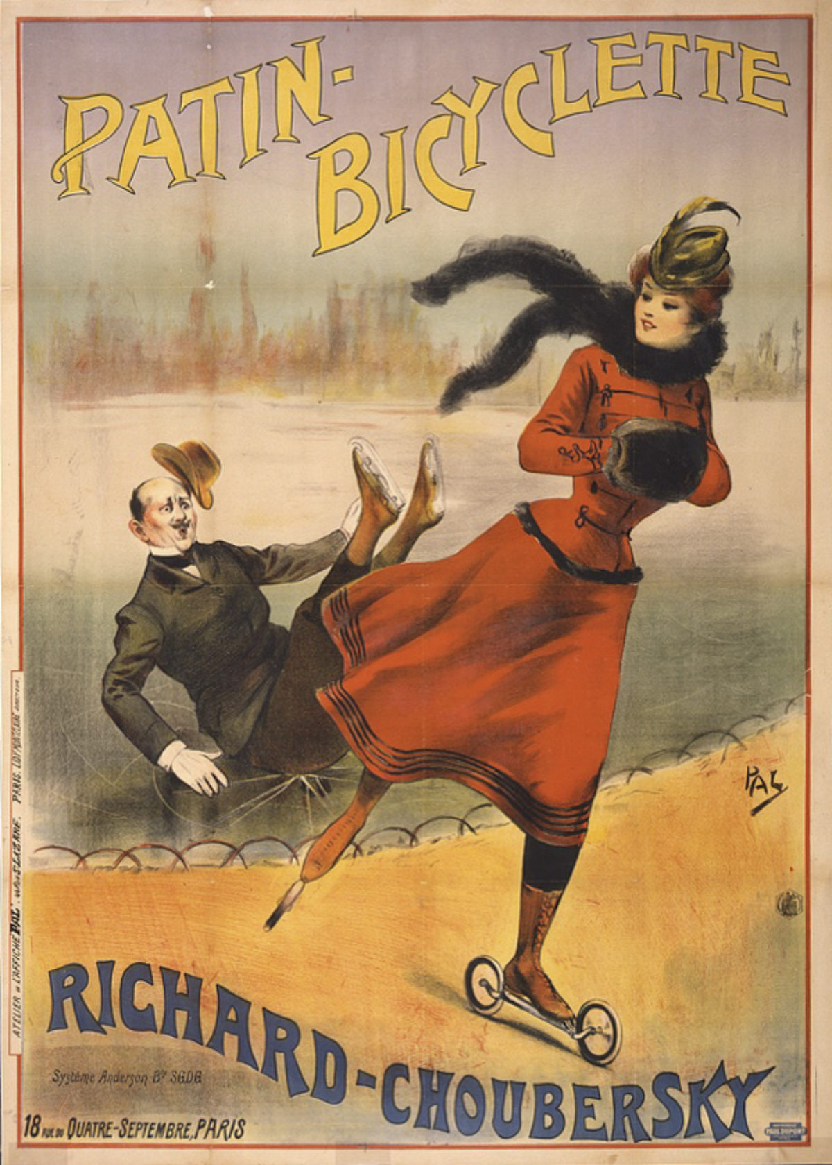
Patin Bicyclette by Pal, ca. 1896
Ice-skating was as fashionable in the 1890s as rollerblading was in the 1990s. Here, a set of “bicycle roller skates” designed by inventor Charles de Choubersky in partnership with another company are promoted as the way to take the joys of ice skating off the rink. A few years after this poster for the multi-functional skates, Choubersky organized competitions in Paris at the Bois de Boulogne and on the Paris-Versailles circuit. Choubersky was a renowned inventor, whose products included a mobile gas cooker that brought him fame and fortune. He was also known for his lavish spending on experiments leading up to his next invention.
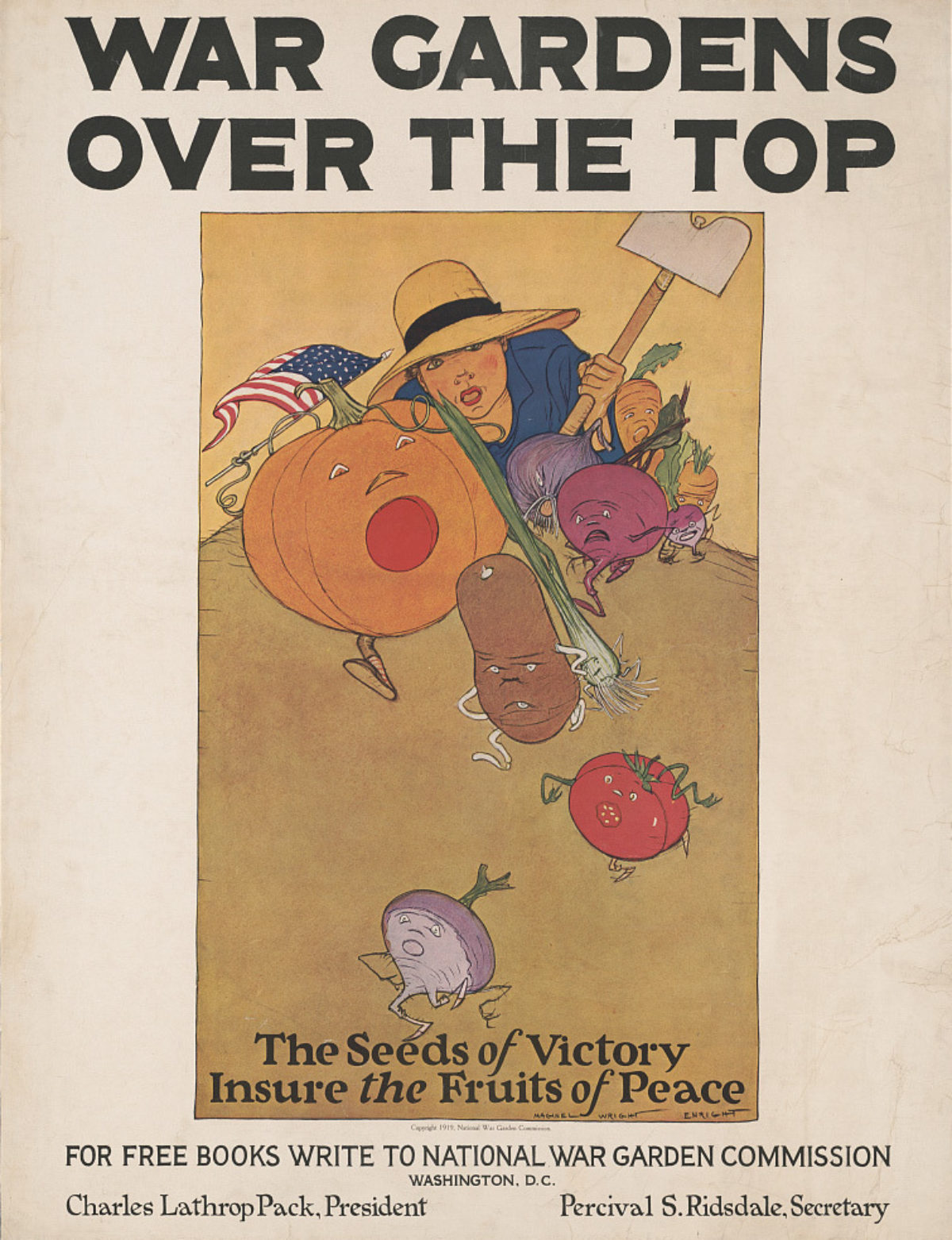
War Gardens Over The Top by Maginel Wright Barney, 1919
During World War I, the National War Garden Commission actively encouraged Americans to grow their own food in “victory gardens” with the idea that relying on your own crop allowed more nonperishable foodstuffs to be shipped abroad to troops – and well-nourished soldiers meant a quicker path to peace. Amateur gardeners were provided with instruction pamphlets along with tips on preventing disease and insect infestations. The endeavor was so well received that the government turned its attention to distributing additional canning and drying manuals to help people preserve their surplus crops. The commission estimated that home gardeners put up 500,000 quarts of canned vegetables and fruits in 1917, and 1,450,000 quarts in 1918.
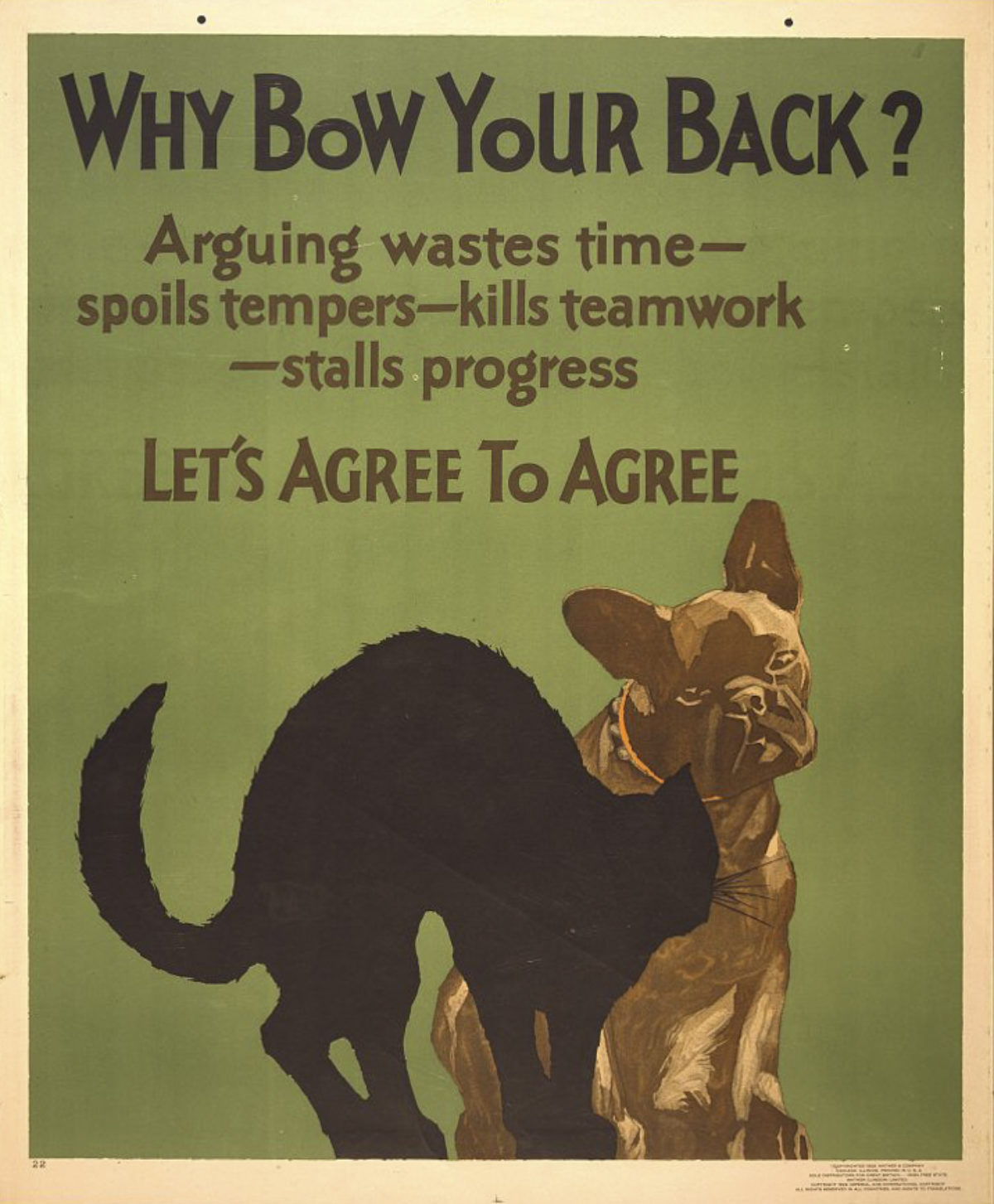
Left: Why Bow Your Back by Willard Frederic Elmes, 1929
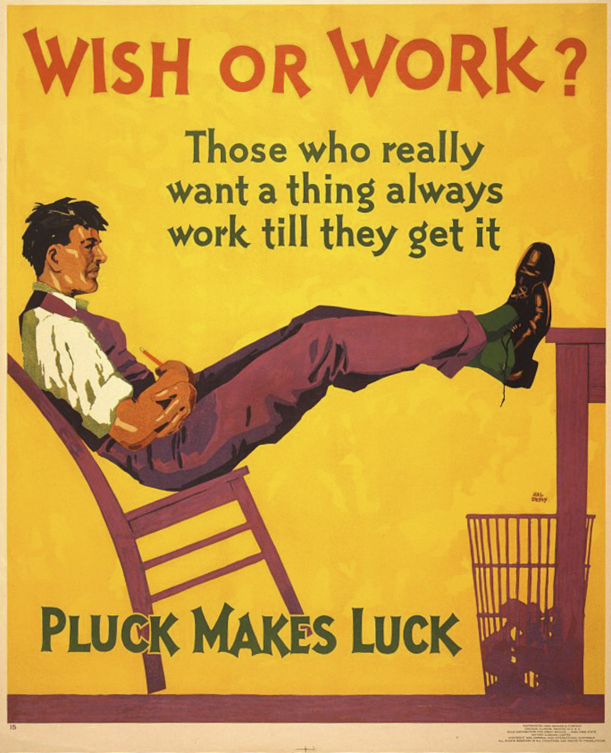
Right: Wish or Work by Hal Depuy, 1929
Between 1923 and 1929, the Mather printing company issued dozens of work-incentive posters, capitalizing on the era’s fascination with workplace efficiency. The posters were meant to encourage workers to behave in a way that benefitted their employer and, ultimately, them. They would be displayed in factories and halls, rotating on a biweekly basis through a Mather subscription. The Mather message is unique as it went beyond workplace logistics, and promoted ethical behavior among one’s peers.

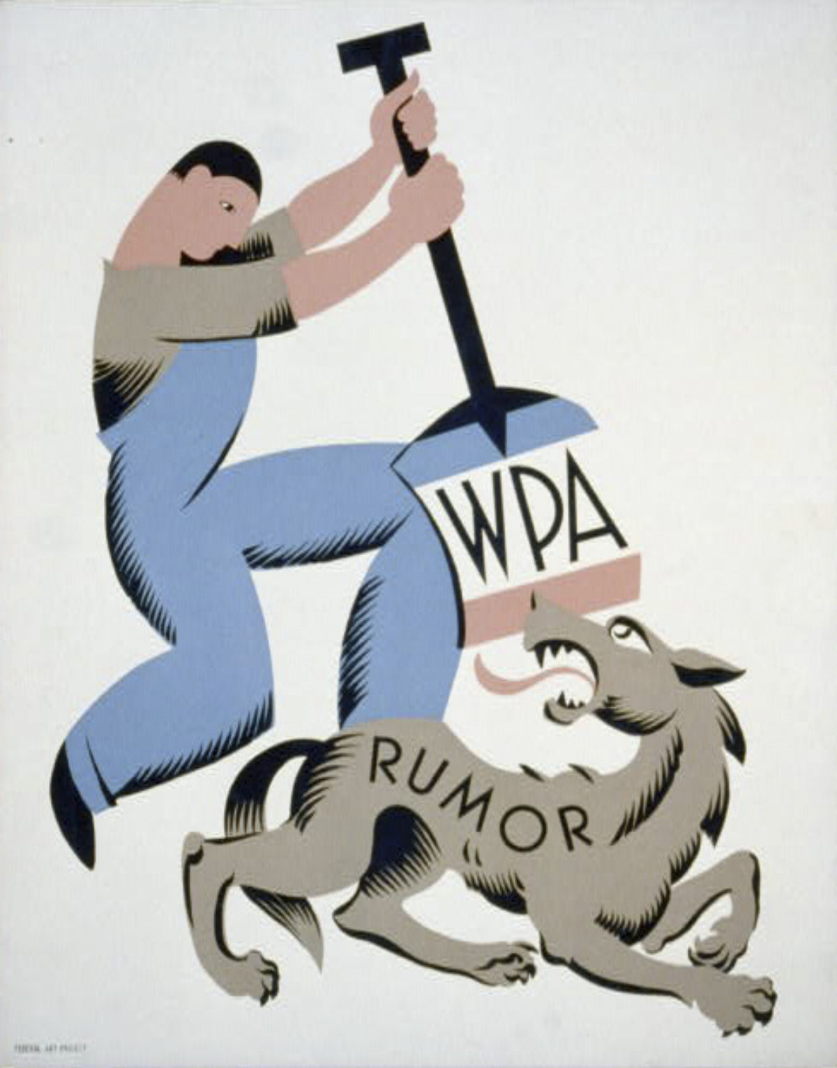
WPA / Rumor by Vera Bock, 1939
A great allegorical poster by one of the few known female poster artists in this selection, we see a gender-neutral government worker quashing the wolf of rumor. Vera Bock was also engaged in book design, which influenced her posters, and she was a member of the New York City poster division of the FPA from 1936 to 1939.
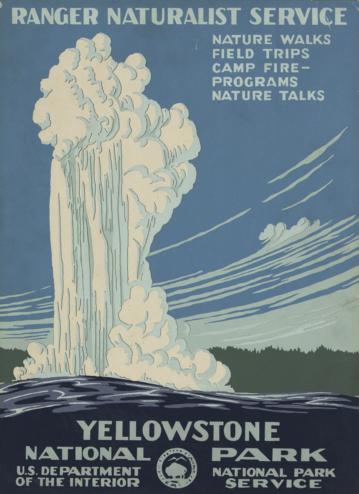
Yellowstone National Park by Chester Don Powell, ca. 1938
In 1938, the WPA was asked by the National Park Service to create posters for its parks to promote outdoor exploration. Only 14 parks would get posters before the project shut down due to America’s involvement in World War II. Yellowstone – the oldest National Park in the world – remains the best image from this series.
The Fine Print
This animation contest is open to students, professionals, and amateurs alike. The challenge is this: How can you animate these posters to tease new meaning out of them? or illuminate an aspect of particular note? or make us laugh? or challenge one’s technical skills?
All submissions are due no later than December 31, 2018 at midnight, EST. Every applicant who submits within the specs will receive 2 free tickets to visit the museum once open. A panel of esteemed judges from the design, advertising, and poster communities will choose their 20 favorite animations, and Winners will be notified by early February, 2019.
Winners will be digitally displayed in Poster House’s exhibition window on 23rd Street in Manhattan, leading up to the museum’s grand opening in 2019. Winners will also receive:
– Their animations featured on Poster House’s various social media channels and website
– Their names in vinyl on the museum’s window, as well as full credit on all website, social, and e-blast promotions
– A year’s membership to the museum for two, which grants special access to Poster House before we open to the public
HOW TO SUBMIT:
Interested participants can browse all of the images for the contest on The Library of Congress’s Free to Use & Reuse page under Poster Parade. Please click on your chosen image(s) and download the highest resolution offered (typically the TIFF file option in the drop down menu below the image). Then, go wild! We are seeking submissions without audio, and animations should only include the art as presented in the poster.
To support all intended uses and outlets for these animations, we require submissions to be emailed to us in all three of the following formats:
1. mp4 (without sound)
Resolution: 720p (horizontal: 1280 x 720p; with any 720p presets; i.e. HD 720)
Max File Size: 4MB
2. mp4 (exported with these specifications)
Resolution: 1080 x 1080 px (square format)
Max File Size: 10MB
Formats: H.264 codec/MP4
Frame Rate: 29.96 frames per second
Bit Rate: 3,500 kbps video bitrate
Audio codec: AAC audio codec at 44.1 kHz mono
Duration: 3 to 60 seconds
3. gif (original ratio)
Max Width: 1024px
Max File Size: 1MB
Submitting an entry to this competition will be considered an agreement to the following rules:
Submissions to this contest offer the usage and reproductions rights to Poster House for the purposes of juried selection, public display on its websites/social media, in its physical locations, for the purposes of advertisement, press releases and other marketing, for the entire period that those rights are retained limited to a period no longer than 3 years. For the independent-jury-selected Winning and Runners-up animations, Poster House will retain usage and reproduction rights to the work for three (3) years after the winning announcement. The submitting artist may during this time use the piece on their website and in their portfolio as an example of their work. Poster House will retain no rights for any submissions not selected by the Jury for winning or runners-up titles.
Poster House will credit each work’s creator in every location and any form in which it presents the piece. There will be no exchange or resale of the work by Poster House.
Submissions and Inquiries can be mailed to submissions@posterhouse.org

