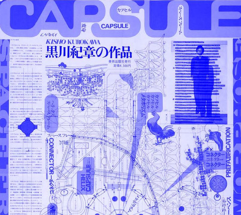
GRIDS are games: notes on a relationship
Ramon Tejada is a (New Yorkino / American) designer (as Estudio Ramon) and educator based in Providence, RI. Ramon is an Assistant Professor in the Graphic Design Department at RISD.
In his contribution to the Swiss Grid Microsite, Ramon plays a classic game of Kill Your Idols. Growing up with the canon of Swiss design, he tells the story of how he learned to use grids to showcase personality and culture as opposed to acting as rigid monoliths, and highlights diverse uses of grid design from around the world.
GIF Transcription:
Slide One: GRIDS are games: notes on a relationship.
Slide Two: ℐ was introduced to the GRID (or what was called a ‘mechanical’ then) while working in high school as a designer for the school’s newspaper.
Slide Three: That GRID showed up (ready made from our printer) as blank pages with beautiful blue lines drawn up on large sheets of paper onto which we haphazardly and playfully designed the monthly newspaper.
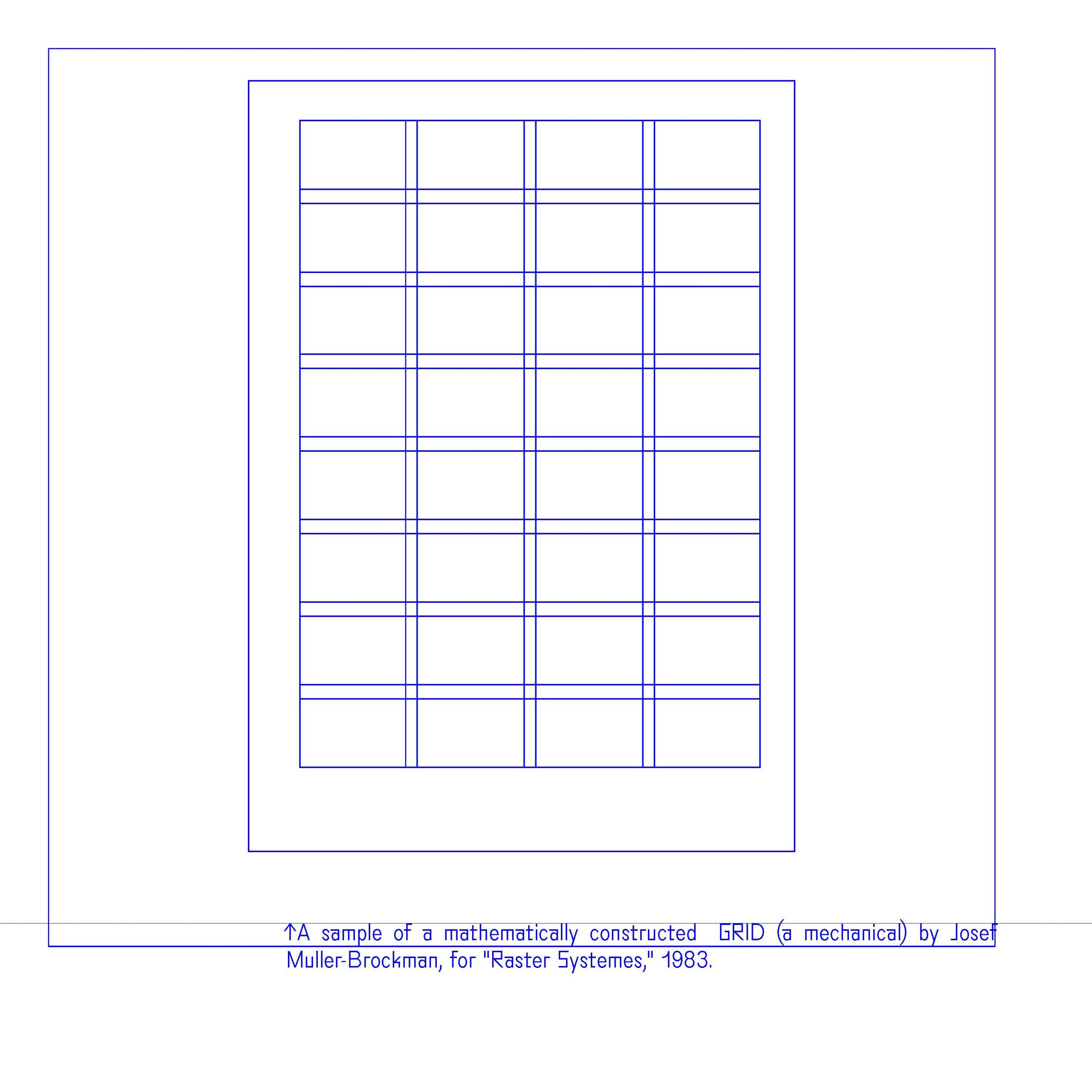
Slide Four: ↑A sample of a mathematically constructed GRID (a mechanical) by Josef Muller-Brockman, for “Raster Systemes,” 1983.
Slide Five: These were the early 1990s—before desktop publishing and Adobe In-Design. The GRID became a game, a puzzle to play and experiment with in our own ways.
Slide Six: I would later realize that the way we think of grids in a Design context manifests Western European ideals of rationality, thought, control, power, perfection, obsession and a singular monolithic logic.
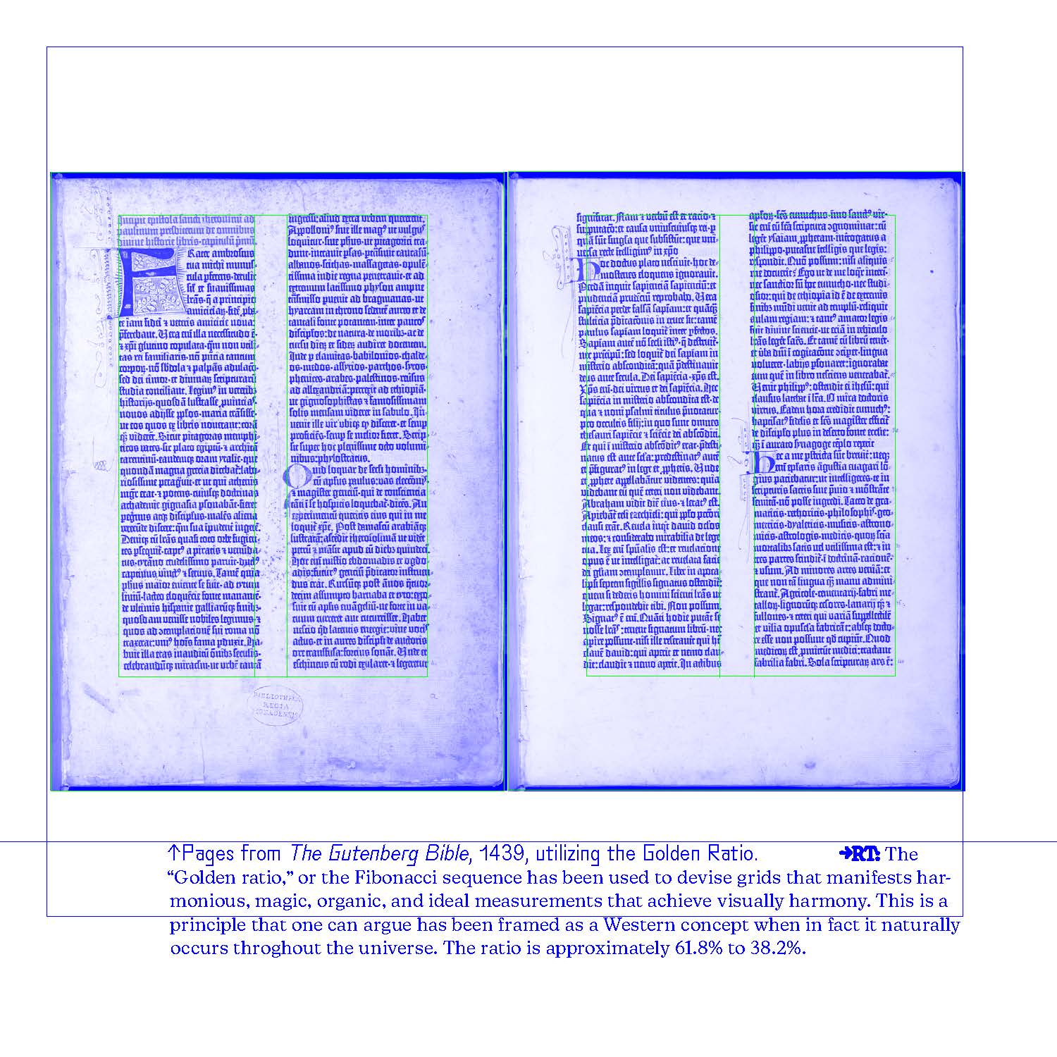
Slide Seven: ↑Pages from The Gutenberg Bible, 1439, utilizing the Golden Ratio.
→RT: The “Golden ratio,” or the Fibonacci sequence has been used to devise grids that manifests harmonious, magic, organic, and ideal measurements that achieve visually harmony. This is a principle that one can argue has been framed as a Western concept when in fact it naturally occurs throghout the universe. The ratio is approximately 61.8% to 38.2%.
Slide Eight: In Graphic Design, more specifically, we have subscribed to the Modernist (20th Century) view of a GRID that serves to organize, control, clean up, and reduce chaos to a singular hierarchical perspective.
Slide Nine: “an architectural dominion over surface and space.”
*↑Josef Muller-Brockmann, Grid and Design Philosophy, 1981. →RT: The use of the word dominion presents all sorts of problematic issues around control, oppression, colonial structures of erasure, and power. The root of the word coming from Latin means “lordship,” or “right of ownership.”
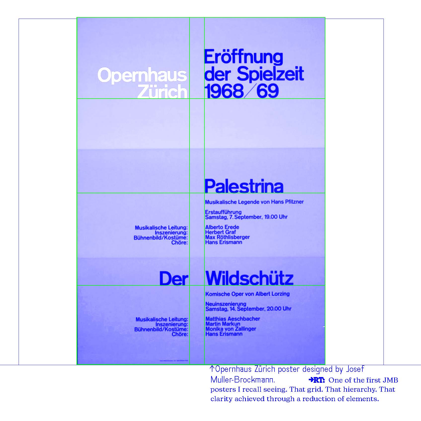
Slide Ten: *↑Opernhaus Zürich poster designed by Josef Muller-Brockmann. →RT: One of the first JMB posters I recall seeing. That grid. That hierarchy. That clarity achieved through a reduction of elements.
Slide 11: For graphic design students, the work of Swiss modernists has been canonized (become synonymous) as THE example of ‘good’ systematic design—rigorous,
innovative, precise, neutral, but can also be predictable, repetitive, clean, organized and reductive.
Slide 12: “Working within the grid system means submitting to laws of universal validity.”
—J. Muller-Brockmann
Slide 13: Wℍℴ sets these standards of ‘universal validity’ that we must all submit to?
Slide 14: In reality, many cultures have much ℴlder and ℛich ℑraditions that have employed ℊℛid systems in their logics for millennia.
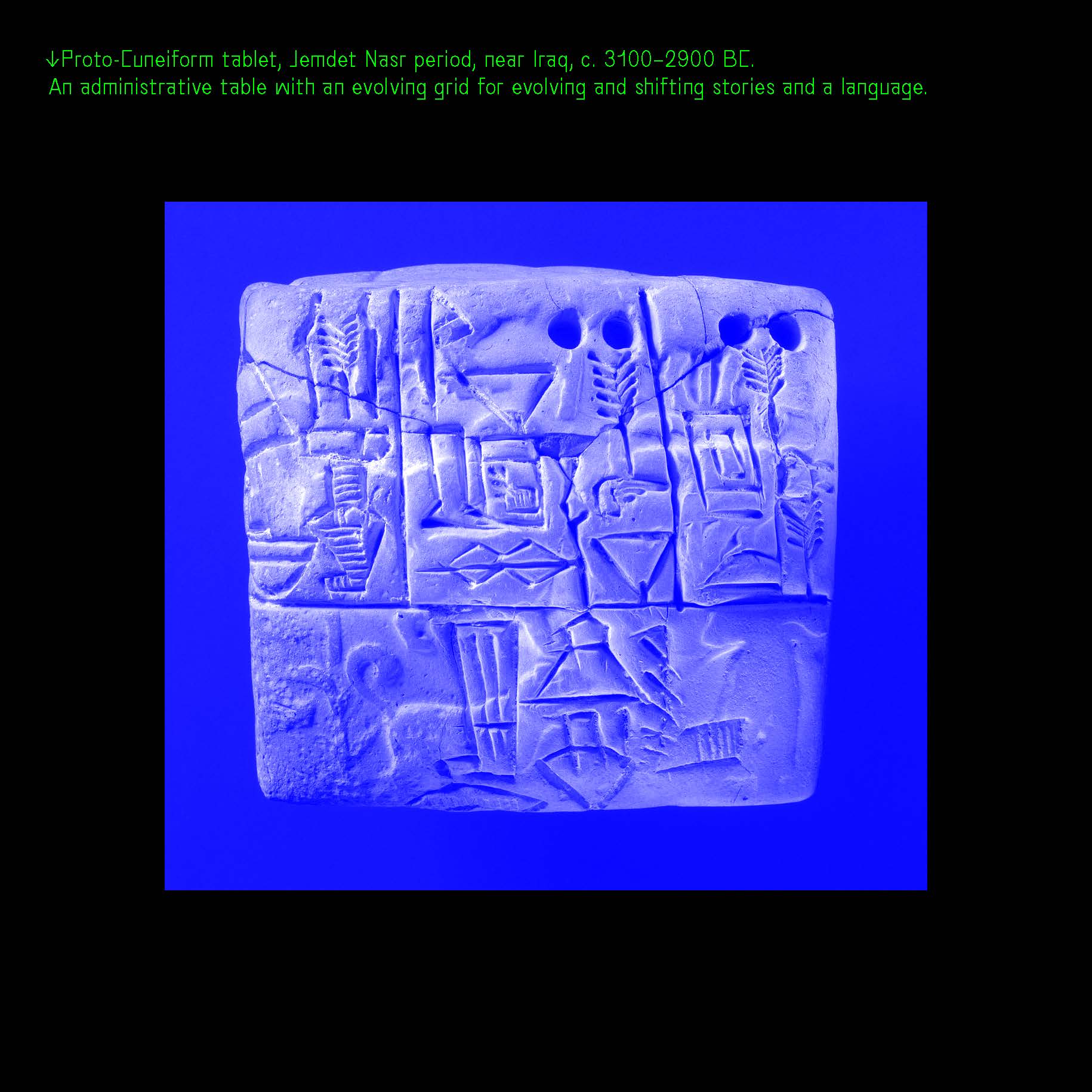
Slide 15: *↑Proto-Cuneiform tablet, Jemdet Nasr period, near Iraq, c. 3100–2900 BC.
An administrative table with an evolving grid for evolving and shifting stories and a language.
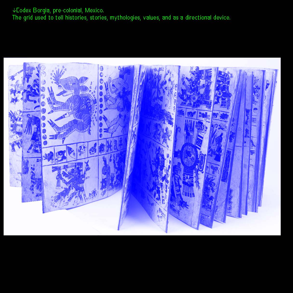
Slide 16: *↑Codex Borgia, pre-colonial, Mexico.
The grid used to tell histories, stories, mythologies, values, and as a directional device.
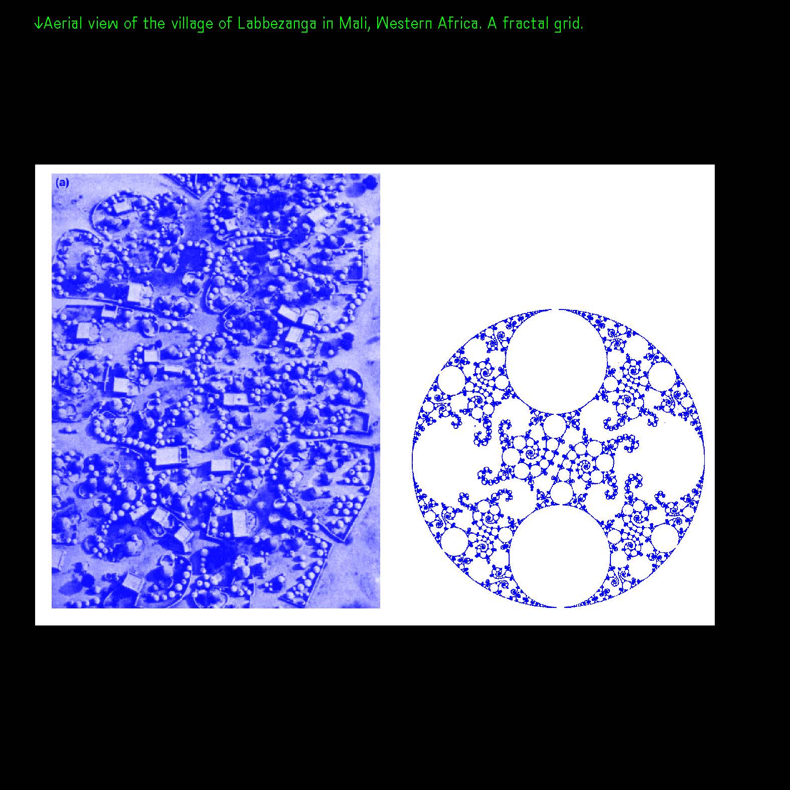
Slide 17: *↑Aerial view of the village of Labbezanga in Mali, Western Africa. A fractal grid.
Slide 18: Asking questions led me to shift my universally monolithic tendencies in designing & working with grids.
Slide 19: A ℊ ℛ i d c a n s e r v e to arrange narratives based on the multiple ways YOU see & understand the world.
Slide 20: ℊℛids that experiment with a multiplicity of ideas and voices co-ℰxisting in space. Stepping away from the singular and the universal, to the plural and
ℳultiple.
Slide 21: I started to see ℊℛids as ℴ p e n, ℓoose, generous spaces to engage in conver-
sations.
Slide 22: PRECEDENTS
ℊℛids, designers and ideas of multiplicity.
*→RT: The exposure to these works pushed me to rethink and re-frame my relationship and perspective to working and designing with grids.
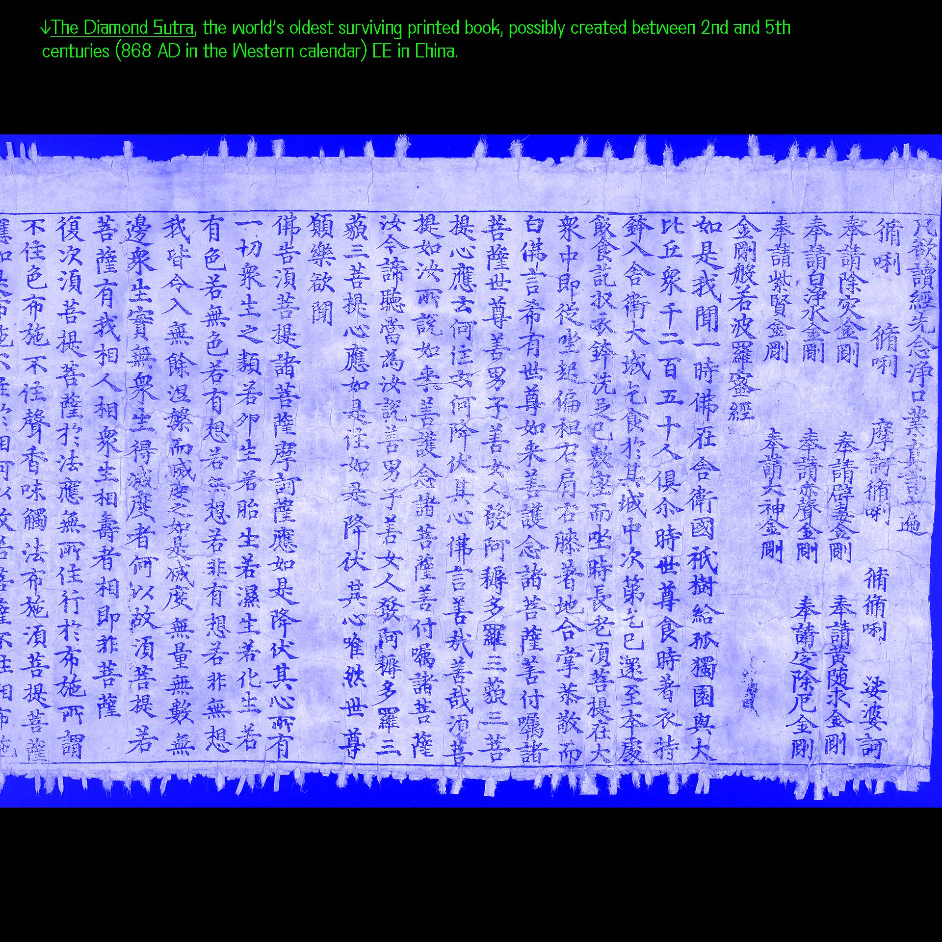
Slide 23: THE DIAMOND SUTRA, the grid structure takes on the form of conversations between the Buddha’s pupil Subhati and his master.
Slide 24: *↓The Diamond Sutra, the world’s oldest surviving printed book, possibly created between 2nd and 5th centuries (868 AD in the Western calendar) CE in China.
Slide 25: THE TALMUD, intertextual connections (annotations) representing centuries of discussion of a central text. A grid that expands through discussion and inquiry through time.
Slide 26: *↓The Talmud (the first page of the Babylonian Talmud is shown here) is the central text of Rabbinic Judaism and the primary source of Jewish religious law (halakha) and Jewish theology. The Talmud is an incredibly complex and rich structure that presents 15 centuries of discourse.

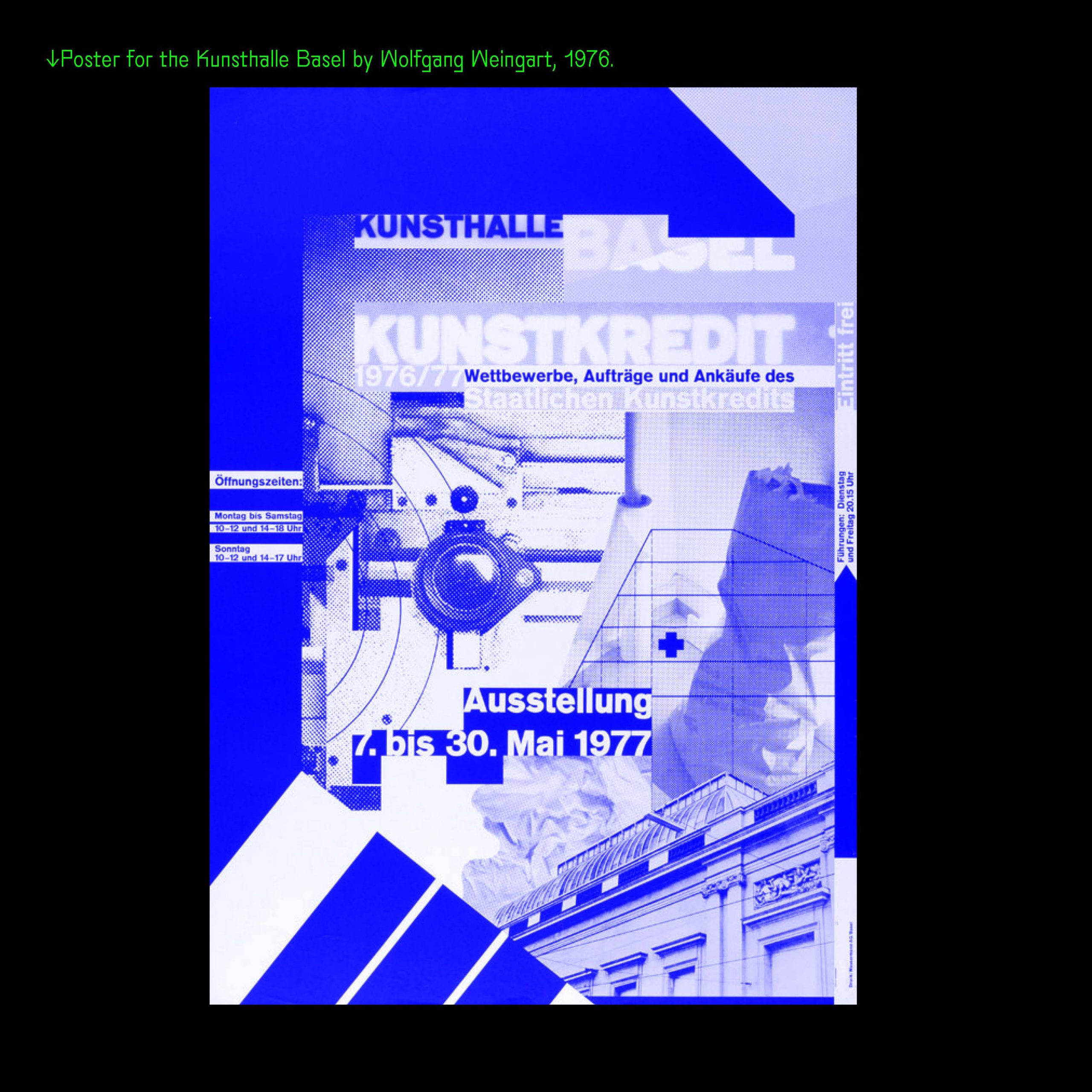
Slide 27: WOLFGANG WEINGART, challenging existing Design and typographic conventions: “get[ting] away from the stagnation, sterility, [stiffness] and anonymity [of Swiss design].”
Slide 28: *↓Poster for the Kunsthalle Basel by Wolfgang Weingart, 1976.
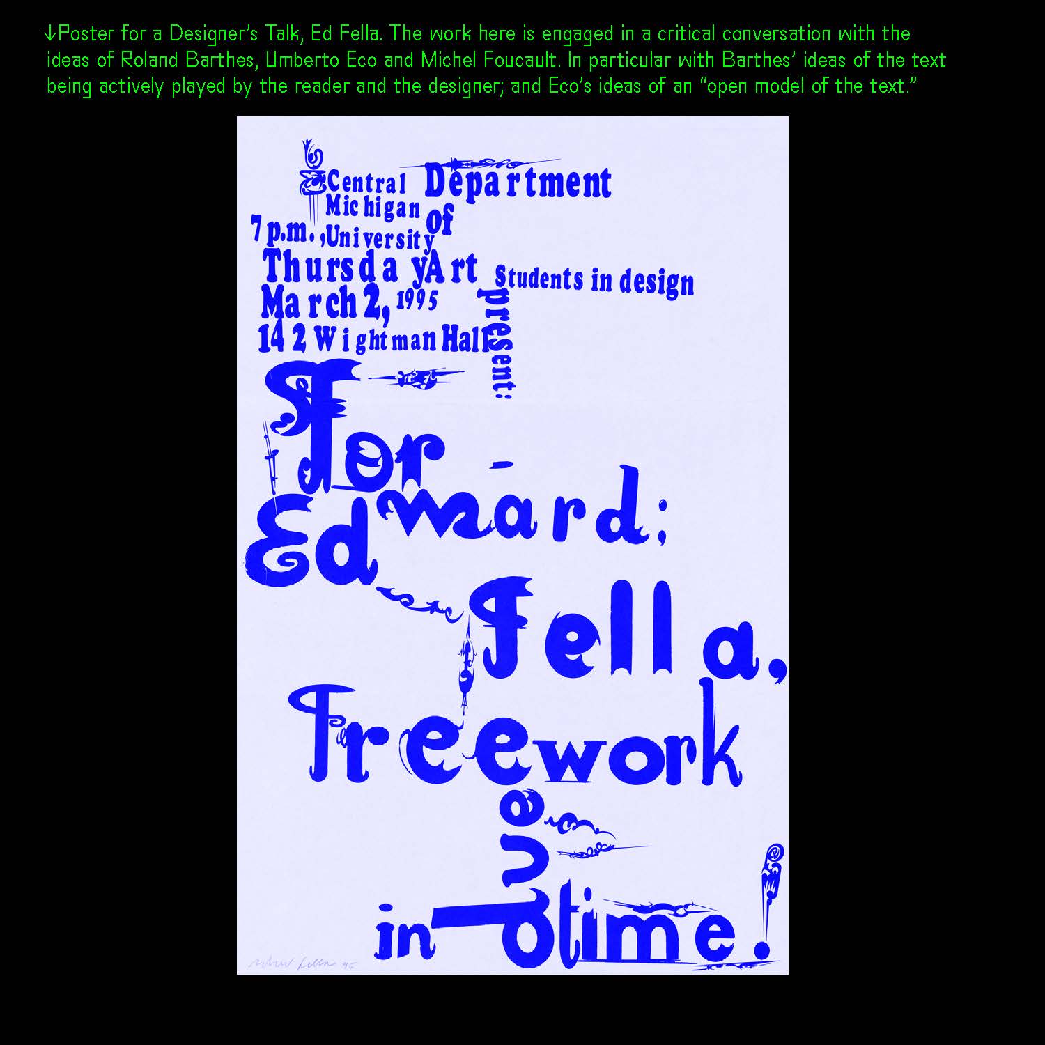
Slide 29: ED FELLA, grids with multiple entry points that shift and are open to different modes of engagement & interpretation. An open game with nods to vernacular forms and a rethinking of ideas about reading and interpretation.
Slide 30: *↓Poster for a Designer’s Talk, Ed Fella. The work here is engaged in a critical conversation with the ideas of Roland Barthes, Umberto Eco and Michel Foucault. In particular with Barthes’ ideas of the text being actively played by the reader and the designer; and Eco’s ideas of an “open model of the text.”
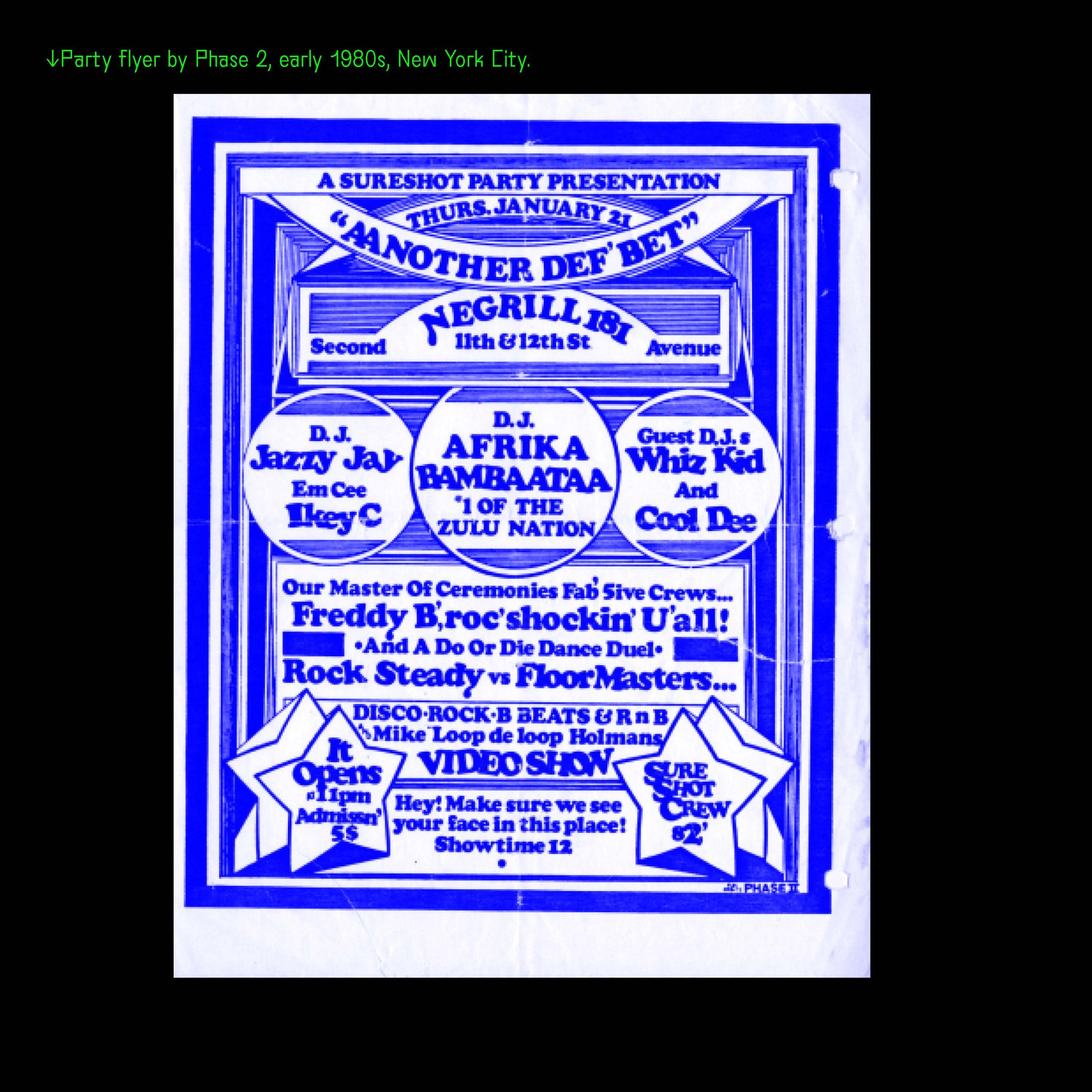
Slide 31: PHASE 2, a radiating energy fully rooted in the communal urban context of New York City. The grid holds a community’s own groove, spaces, and points of references.
Slide 32: *↓Party flyer by Phase 2, early 1980s, New York City.
Slide 33: AWAZU KIYOSHI, a contrast to the modernist dogmas which had become the universal way. Grids that are layered with multiple ideas, traditions and center the local.
Slide 34: *↓Capsule Metabolism, by Awazu Kiyoshi, 1970. A multi-layered jumble of image, color, type, swirling pop geometry and reproduced local imagery.

Slide 35: CHERYL D. MILLER, uses grids to show and highlight diversity and inclusion— shifting the visual cultural narrative of Design.
Slide 36: *↓”1st African American Female in Space,” 1992, design by Cheryl D. Miller.

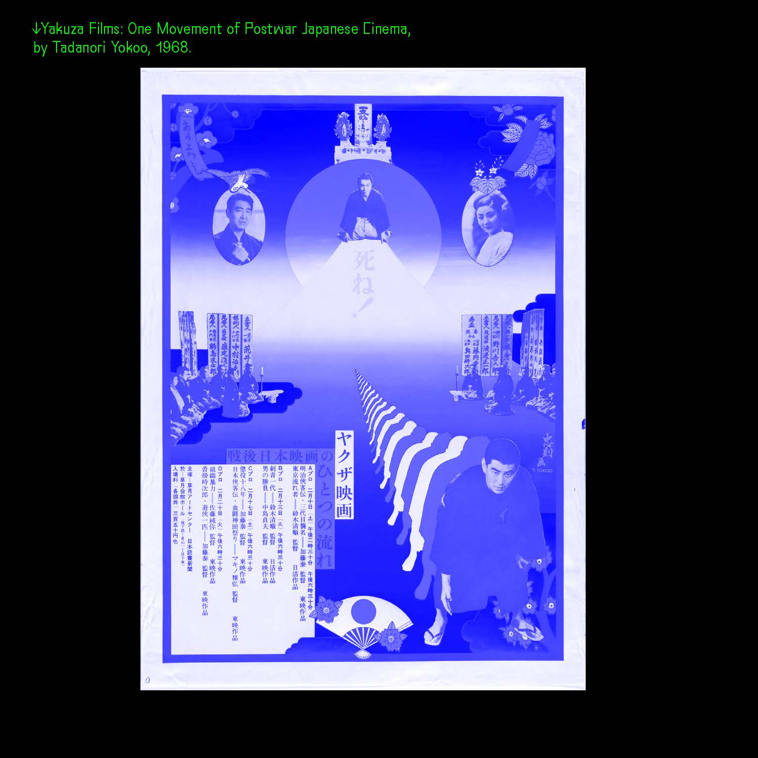
Slide 37: TADANORI YOKOO, takes the grid as a space to hold personal memories, narratives and lineages as essential parts of the design.
Slide 38: *↓Yakuza Films: One Movement of Postwar Japanese Cinema,
by Tadanori Yokoo, 1968.
Slide 39: JULIETTE BELLOCQ x KALI NIKITAS, a multi-functional grid that accommodates multiple materials that can be duplicated, repeated and re-arranged to reveal an array of messages.
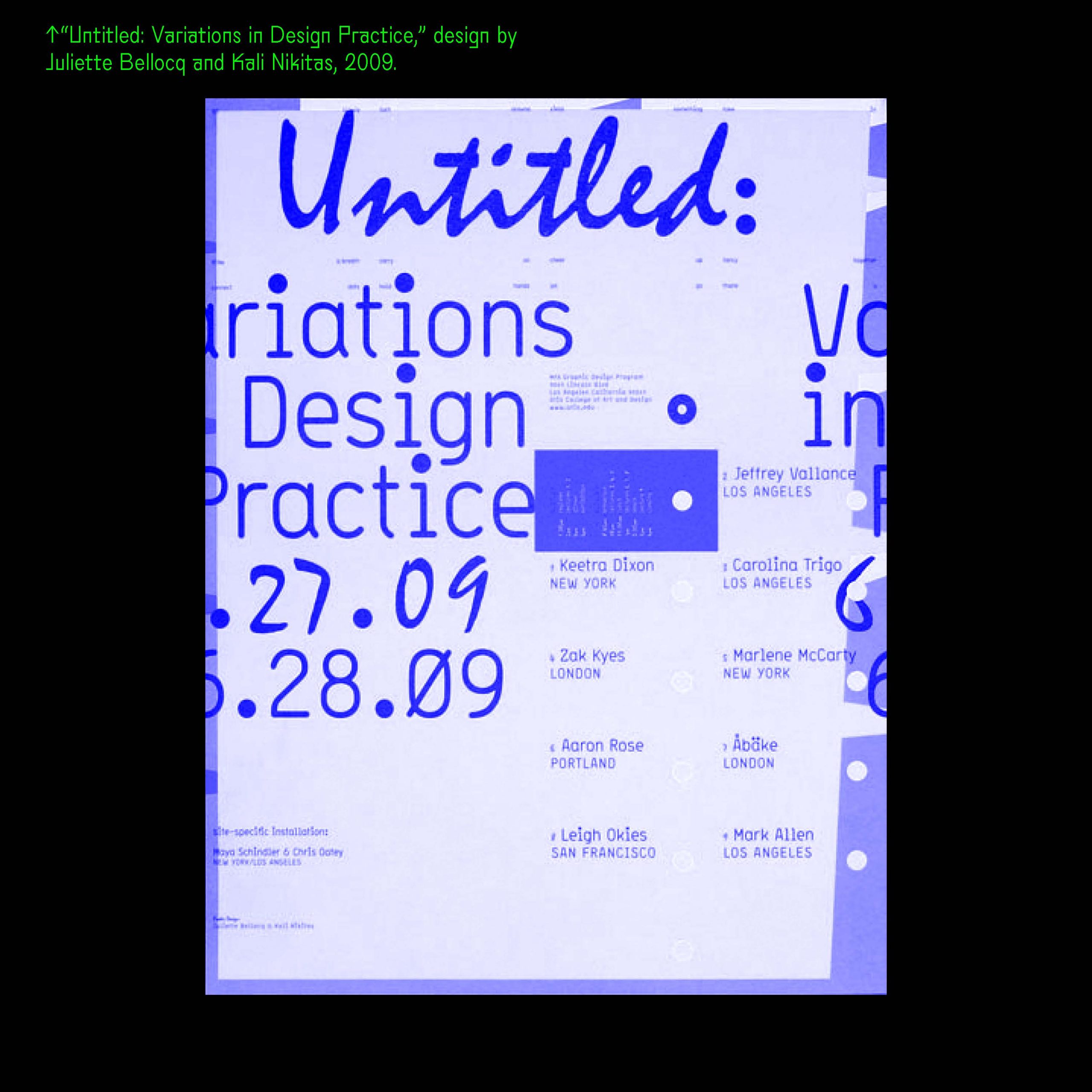
Slide 40: *↑“Untitled: Variations in Design Practice,” design by Juliette Bellocq and Kali Nikitas, 2009.
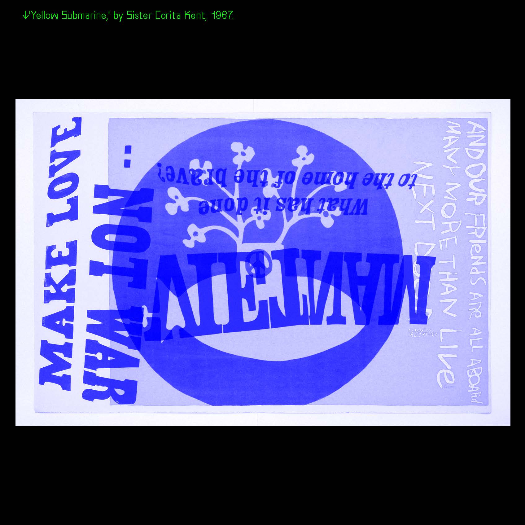
Slide 41: SISTER CORITA KENT, the grid is ever changing, open, generous, inviting, organic and flexible to allow for a multiplicity of references for work rooted in community, social justice, politics, love and joy.
Slide 42: *↓’Yellow Submarine,’ by Sister Corita Kent, 1967.
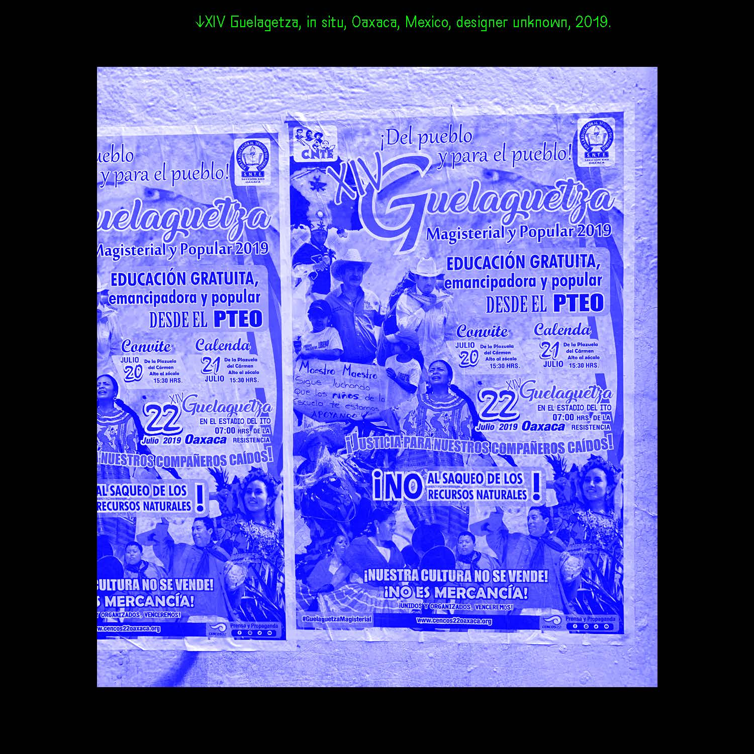
Slide 43: GUELAGUETZA, a layered grid in a local context—serving as a canvas or a mirror to present a plural vision of a generous, festive communities’ ideas, slogans, diversity of beliefs and pride.
Slide 44: *↓XIV Guelagetza, in situ, Oaxaca, Mexico, designer unknown, 2019.
Slide 45: P L A Y
Slide 46: A ℊℛid is simply a blank page with a few lines to play and
engage in local, joyous conversations.
Slide 47: ℊℛids are not monolithic.
They help
tell human
stories in endless
ways.
Slide 48: 
*↑REFERENCES:
—Raster Systemes, Josef Muller-Brockmann, 1983.
—From “Fractals in African Settlement Architecture,” by Ron Eglash, 1998. Photo by Georg Gerster; fractal graphic by Benoit Mandelbrot.
—Proto-Cuneiform tablet, Metropolitan Museum of Art.
—Codex Borgia, 16th Century Mexico, Vatican Library.
—The Diamond Sutra, British Library.
—Babylonian Talmud, The University of Pennsylvania, School of Arts & Sciences.
All works shown are credited to the artist and/or designer.
Thank you: Nikki Juen, Patrick Cumberland, and all the designers who have inspired me to work differently!
