Eckersley-Lombers: Poster Partnership, 1934–46
David Bownes is the former Head of Collections at London Transport Museum, Director of Collections at the National Army Museum, and the author of several books on poster history.
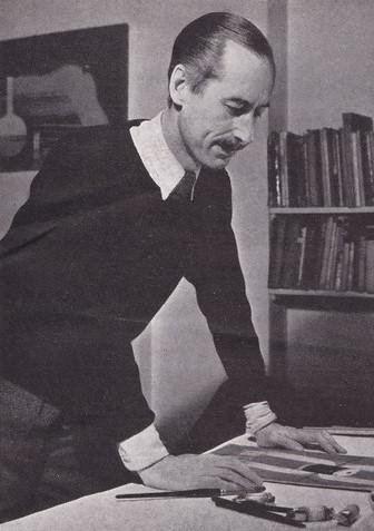
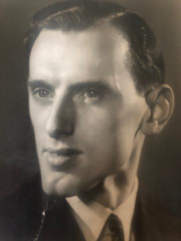
Tom Eckersley (left) & Eric Lombers (right)
In 1934, two aspiring Lancashire designers arrived in London at the start of a creative partnership that was to help transform commercial art in Britain. Tom Eckersley (1914-1979) and George Eric Lombers (1914-1978) had studied together at Salford Art School, where their shared interest in progressive design led to a close friendship. Years later, Eckersley recalled how the two students would push their tables together to work on joint poster projects inspired by the latest designs from Edward McKnight Kauffer and A.M. Cassandre. Their talent was spotted early on, with Lombers winning the School’s Heywood Medal for the best work done in 1932-33, while Eckersley won it the following year. Lombers also won £21 prize money for his entry in the Royal Society of Arts competition for Industrial Design (1933), judged by none other than Tom Purvis, one of the country’s leading poster artists.
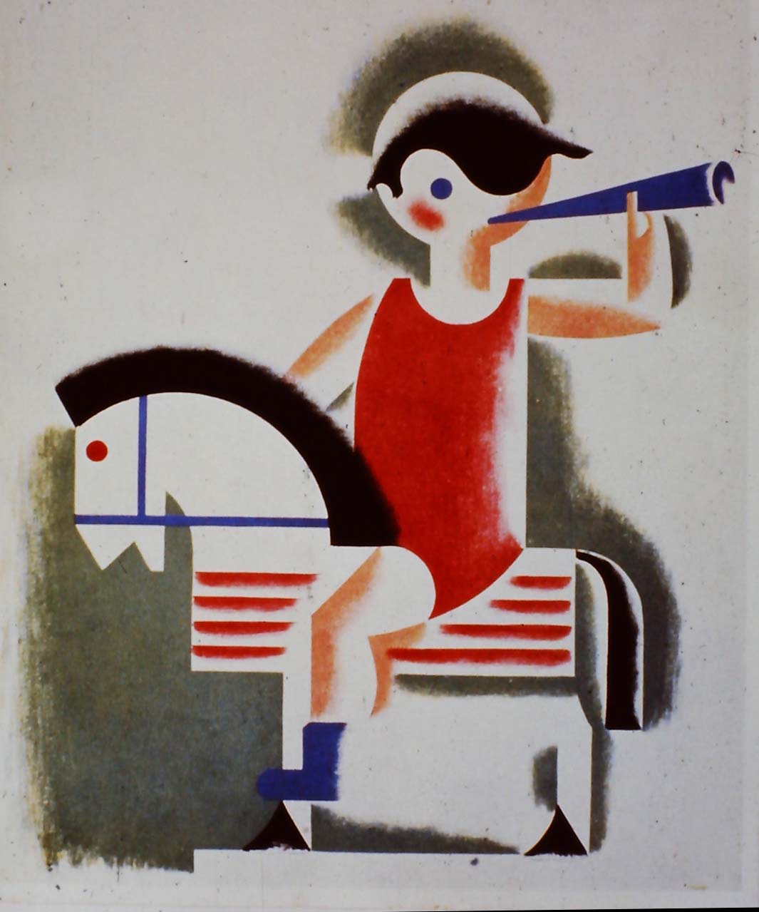
Left: Sample poster artwork, unused, c. 1934
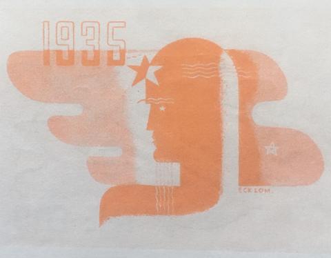
Right: Daily Mirror, New Year Forecast, December 31, 1934
The relocation to London was encouraged by the Principal at Salford, Harold Rhodes, an active member of the Design in Industries Association who offered to help with introductions. Eager to establish careers as freelance poster designers, both men readily agreed, although as Eckersley later recalled “we were given the opportunity on the condition that if the outlook after six months was not promising, we were to return to Manchester.”
They initially rented a studio on Ebury Street in the West End using the money Lombers had won supplemented by 30 shillings a week from their parents. But it was not enough, and after several weeks without work the situation looked desperate. Rejected by advertising agents, who warned that “your type of work is not what is wanted,” Eckersley and Lombers turned to newspaper editors and commercial managers where they found a more positive reception. One of their first commissions was to illustrate serialized short stories for the News Chronicle, where fellow illustrators included Eric Fraser and Stanley Herbert. More work followed with the Daily Mirror, the Draper’s Record, Man and His Clothes (magazine), and the Nickeloid Electrotype Company. But none was for poster design where their main ambition lay.
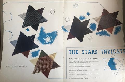
Brochure illustration from Man and His Clothes, 1935
Still, it marked a major turnaround in their fortunes and allowed them to remain in London. In an interview with Commercial Art magazine a few months later, Eckersley (who appears to have been the spokesperson for the partnership) dismissed their earlier setbacks, arguing that “there is plenty of openings for the large number of young designers, provided that they are willing to work hard and are able to handle any type of commercial design and provided also that they ignore the fables about there being no demand for original work and just go out and look for it on their own.”
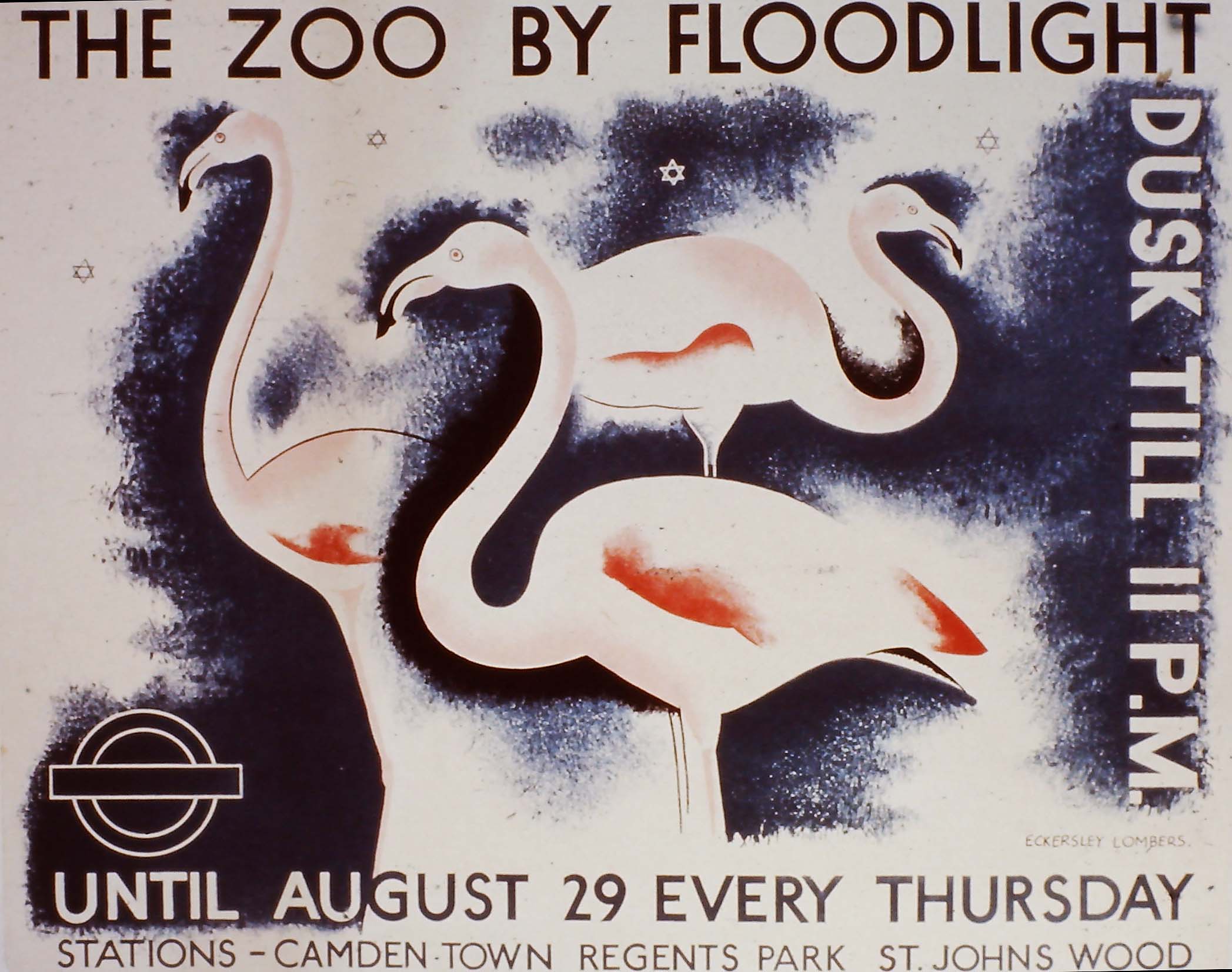
The Zoo by Floodlight, London Transport, 1935
This speculative approach to finding work was suddenly to yield spectacular results. In early 1935, they wrote to Frank Pick, managing director of London Transport and legendary patron of poster artists, requesting a meeting. A week later they received a reply from Pick’s head of publicity, Christian Barman, who invited Eckersley and Lombers to submit samples of their work for consideration. Nicknamed “Barmy Barman” by the poet and writer John Betjeman, Barman had a reputation for favoring modernist, progressive designs for London Transport publicity. The three men immediately hit it off, with Eckersley later claiming they were “on the same wavelength” when it came to appreciating tendencies in modern advertising. The result was an order for a small format panel poster promoting London Zoo “by Floodlight.” Displayed inside Tube carriages (or “cars,” to give them their proper name), it was the first paid poster commission to carry the Eckersley-Lombers signature.
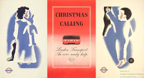
Three Christmas posters, London Transport, 1936
Barman proved an ideal client, rarely interfering in the progression of a design other than to suggest the title and theme. Over the next four years, Eckersley and Lombers designed 17 large format double royal posters and 19 panel posters (sometimes called “window stickers”) for London Transport. The commissions brought huge exposure for the up-and-coming designers, still in their early twenties, and were greatly admired by public and press alike. The triptych of posters they designed for Christmas 1936, which could be displayed individually or as a group, aroused particular praise. Commercial Art thought that “the air-brush treatment of the children evokes a feeling of tenderness and keeps the figures bold without being clumsy.”

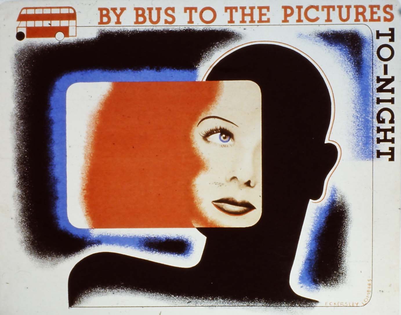
By Bus to the Pictures To-night, London Transport, 1935
Equally successful was the panel poster By Bus to the Pictures To-night (1935), which incorporated a photograph of a glamorous, but anonymous, screen siren against a graphic background. This was a modern technique, reminiscent of contemporary Continental developments in poster art. Commercial Art was more prosaic in its praise, commenting that “to express all of cinema in one window sticker while avoiding reference to any particular film star or film is no easy assignment.”
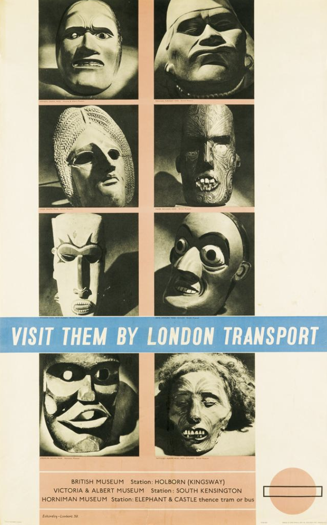
Visit them by London Transport, 1938
Eckersley and Lombers also designed leaflets and press ads for London Transport, as well as posters for sports matches, bus & coach hire, season tickets, and all manner of London events. Although Barman gave them a free hand, their designs were still subject to the approval of the Publicity Committee, chaired by Frank Pick. On one occasion, Pick (whom the designers only met once, and then fleetingly) issued instruction for a new poster based on photographs of grotesque masks exhibited at the British Museum. Eckersley and Lombers’ solution was to arrange the photographs in a grid format, but Pick was not happy with the result. Amazingly, given the seriousness with which Pick approached all matters of publicity, he suggested (via Barman) that the figure of Snow White should be included in recognition of the popularity of the recently released Disney film Snow White and the Seven Dwarfs (1937). Eckersley and Lombers were appalled but had to submit the change as requested. Luckily, Pick saw the error of his suggestion, and the poster appeared on the hoardings in its original form.
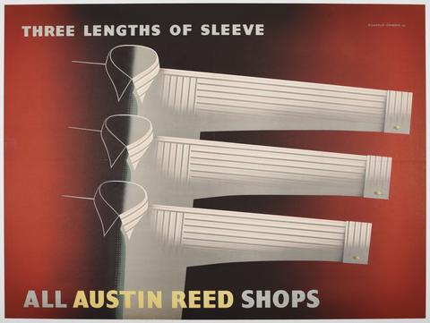
Three Lengths of Sleeve, Austin Reed, 1940
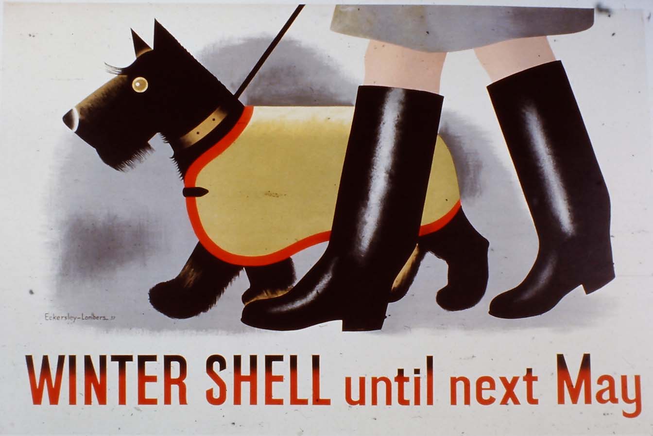
No doubt helped along by their work for London Transport, the Eckersley-Lombers team was quickly established among the leading names of poster design. Their arrival in London coincided with a dynamic time for commercial art in Britain, when progressive clients and agencies were looking for conspicuously modern methods to sell goods and services. The Eckersley Lombers “style,” with its airbrushed graphics and uncluttered appearance, fit the bill. New orders came in from Shell-Mex, the BBC, Austin Reed, and the advertising agency W.S Crawford. Of these, Shell and Austin Reed were to prove the most important for the duo’s growing reputation and arguably resulted in some of their finest work.
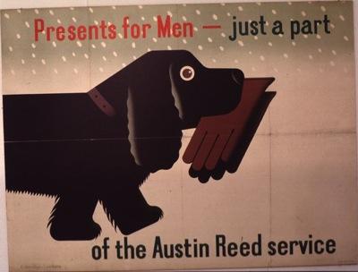
Left: Presents for Men/Austin Reed, 1938
Right: Winter Shell, 1938
One design for Shell, featuring a jockey’s cap and scorecard, was specifically designed as a panel poster for Tube car advertising—a testimony to the significance of London Transport as a venue for poster advertising as well as being a leading commissioner of commercial art. In fact, LT managed 480,000 poster sites across its fleet of vehicles and stations at this time, of which about 120,000 were reserved for the company’s own publicity.
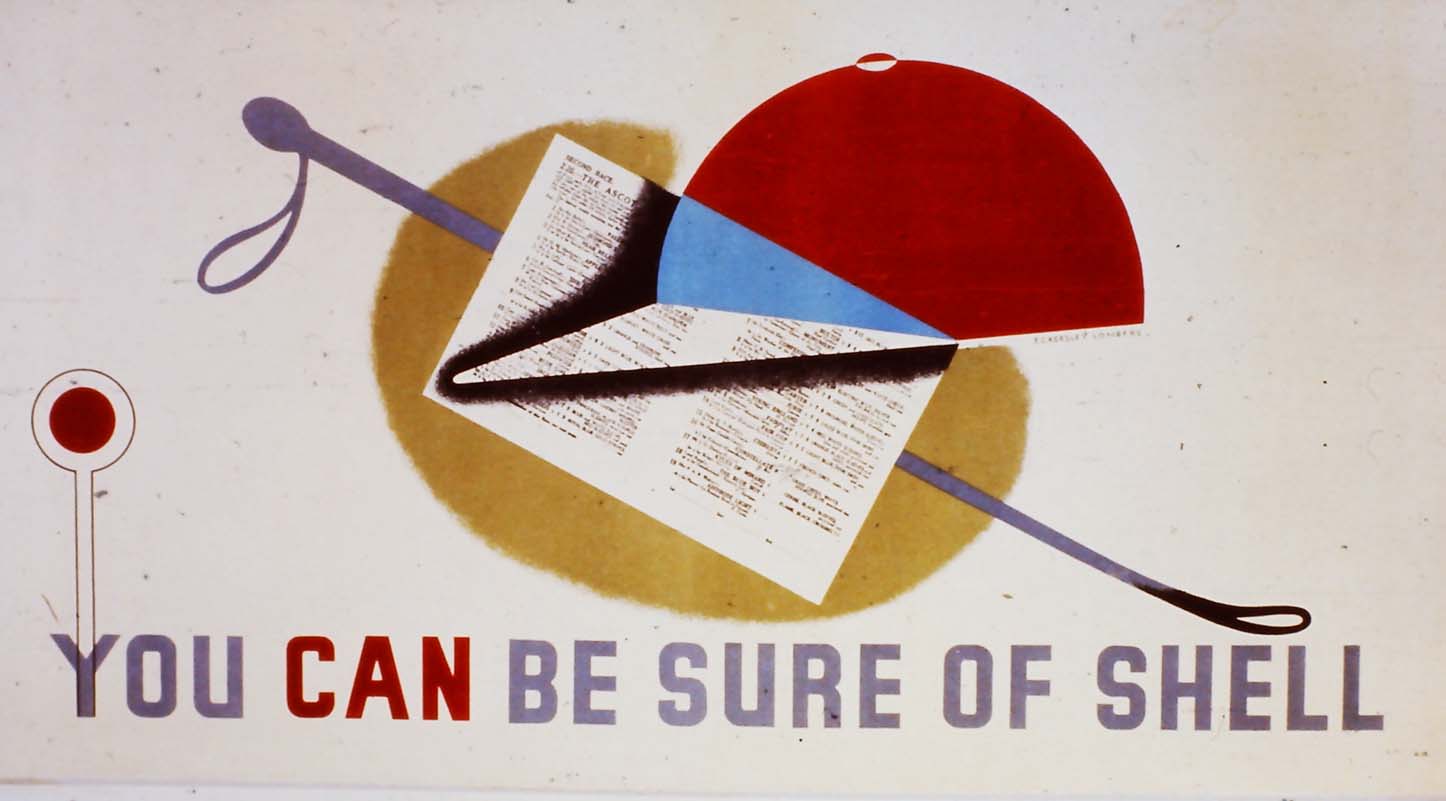
Panel poster designed for display in Tube cars, 1936
Although primarily focussed on poster design, the pair continued to undertake other forms of commercial advertising, including brochure and magazine illustration, and, occasionally, window display. An example of the latter is their layout for Permutit, manufacturers of water softening equipment which, according to a contemporary account, resulted in noticeably increased sales for the company. Happily, a photograph survives of the display, which was made using models of the softener with a photographic enlargement by Autotype of the hand and glass (below).
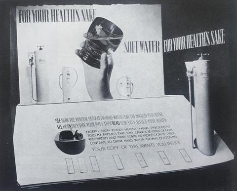
Window display, Permutit, 1937
Their reputation was cemented in other ways, too. From 1937, both men taught poster design at the Westminster School of Art. Other established practitioners, such as Austin Cooper and Edward McKnight Kauffer, held similar positions elsewhere, but none were as young as the recent graduates from Salford. They also had a talent for self-publicity and were interviewed by the specialist advertising press on several occasions, or had their work reviewed. Between 1935 and 1941, examples of their work regularly appeared in Commercial Art and Modern Publicity (the annual “Bible” of the advertising industry), as well as the German design magazines Graphis and Gebrauchsgraphik. They were, as Commercial Art had noted in 1935, “young designers full of promise.” Perhaps the ultimate acknowledgement of their new status, however, was inclusion in the autobiographical manuals of poster design by Austin Cooper (1938) and Tom Purvis (1939) where their work was set alongside that of the very masters they had admired at art school.
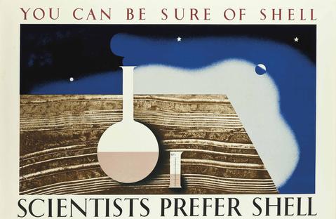
You Can Be Sure of Shell, 1936
So how did the two men work together? According to a contemporary interview in 1935, their basic method was to thoroughly discuss a commission first, considering “the elements of the design from all angles.” Unnecessary detail would be discarded in the search for a graphic solution to the advertiser’s problem. In practice, this often meant that one of them would come up with an idea and the other would suggest changes. As Eckersley said, “I put things in, he took them out, and vice versa.” If this method provoked tensions, there’s little evidence in the surviving accounts of either designer.
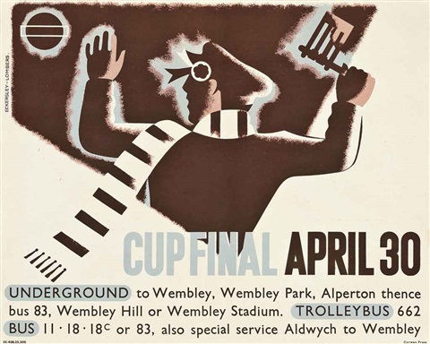
Original artwork for Cup Final, 1938, showing hand drawn main text with applied printed copy below
Their finished poster artwork was always supplied full size with hand drawn lettering for the principal slogan. Eckersley thought that Lombers was “very good” at the latter, suggesting that he may have done the majority, although this is just conjecture. Some commissioners, especially London Transport, provided the detailed copy (such as travel information) which would be printed in the company’s house style rather than hand drawn.
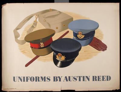
Uniforms by Austin Reed, 1940
The start of the Second World War effectively marked the end of the Eckersley-Lombers partnership, as they joined different military services and had little opportunity to work together. Eckersley originally joined the Royal Air Force as a cartographer, before being transferred to the Publicity Section of the Air Ministry. This posting allowed him to take on commercial commissions for the General Post Office (GPO) and Royal Society for the Prevention of Accidents (RoSPA). Lombers, meanwhile, had joined the army and saw active service in North Africa, Malta, and Italy where he also worked as a military cartographer.
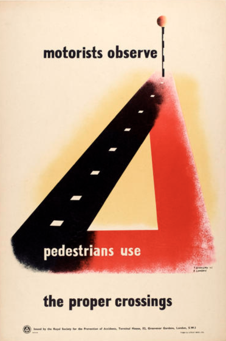
Left: Pedestrians Use the Proper Crossings, RoSPA
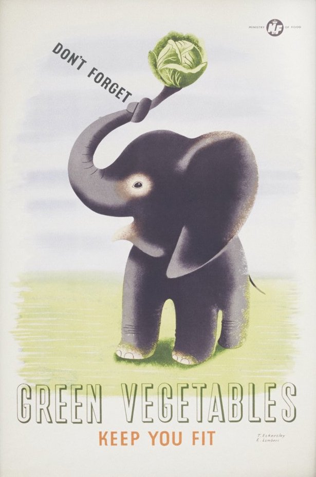
Right: Green Vegetables Keep You Fit, Ministry of Food, c. 1946 (?)
At the end of the war, the partnership was briefly revived with Eckersley and Lombers collaborating on at least one poster for RoSPA and another for the GPO, both published in 1946. It was possibly at this time, too, that they jointly designed a poster for the Ministry of Food, although a surviving copy in the Victoria & Albert Museum collection is speculatively dated 1951.
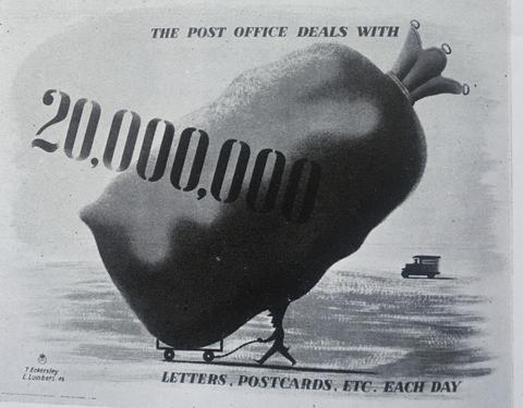
Left: B/W photograph of GPO poster, 1946
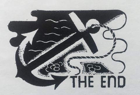
Right: Illustration for the Female Felon, a News Chronicle serialized story c. 1934
But this seems to have been a final collaboration. In 1946 Lombers, who was by now married with a young family, moved to Bradford where he taught lettering and graphic design at the local College of Art until his death. He also had a small design practice which covered exhibition design, poster design and calligraphic commissions, with clients including Grattan and the Wool & Textiles Marketing Board.
Eckersley, meanwhile, became one of Britain’s foremost poster designers and Head of Graphic Design at the London College of Printing. He was awarded the Order of the British Empire in 1948 for services to poster design during the war (principally his work for RoSPA) and continued to work for clients such as London Transport and the GPO throughout his long career.
Special Thanks
In putting together this blog post, I would like to thank Eric Lomber’s granddaughters, Ruth Henderson and Mary Hartley, for generously sharing photographs and biographical information, and Chris Mullen for his equal generosity in allowing me to reuse extracts from interviews he made with Tom Eckersley. I would also like to acknowledge London Transport Museum online collections, a superb resource, and especially the recorded interview with Tom Eckersley from 1983 which you can listen to.
Other sources used in this blog include contemporary issues of Commercial Art & Industry magazine, Modern Publicity, Making a Poster by Austin Cooper (1938) and Poster Progress by Tom Purvis (1939).
All images provided by the author.

