Desert Island Posters
Tim Medland is a docent at Poster House. Hailing originally from the UK, he is pursuing an MA in museum studies after a career in the financial world. He loves giving tours in English or French and sharing his passion for material culture and the arts in general. When we reopen, he will be lobbying hard for the museum to adopt a small, white museum dog to be named after Tintin’s canine sidekick, Snowy, or Milou in French.
Desert Island Discs is the UK’s longest running radio program, having been on for 75 years. An invitee a week chooses eight recordings, commenting on why the songs matter to them, frequently while discussing their broader lives. I believe that in the same way that most people have a soundtrack to their lives, many of us have posters that we remember, or own, as mementos of key periods in our lives. They are, after all, the art of the people. Similar to popular music, they may be regarded as ephemera with immediate impact that fades over time, but the best of them have longevity, and by their immediacy they are paradoxically reflective of time and place.
For this blog I have chosen five posters that matter to me, a number of which I own, and explain why they matter to me and what memories I associate with them. If you like the concept, please let us know via social media (@posterhousenyc) of a poster that matters to you and why. If you have an image, so much the better.
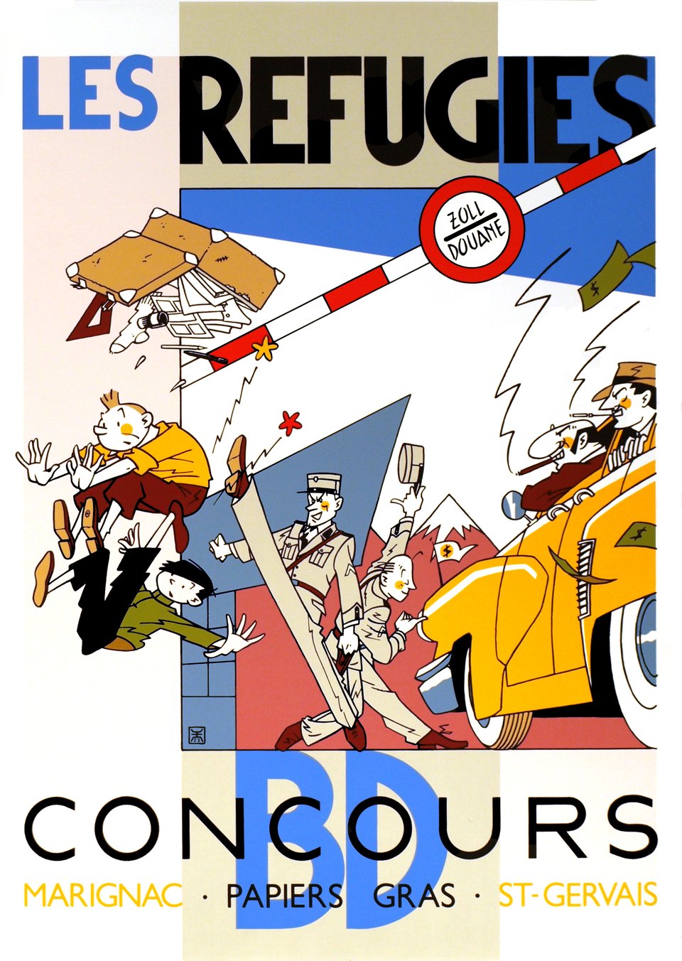
Les Réfugiés
Exem, c. 1988
(image c/o Galerie 123)
In the 1960s, I moved to France from the UK, aged five without knowing how to speak French. Comic books were one of the ways I honed my language skills. Along with many francophone (and other) kids, the Tintin series by Herge quickly became my favorite graphic novels and I remain a fan. This poster by the Swiss illustrator Exem uses characters from Tintin, including the eponymous hero and his Chinese friend Chang (named after Herge’s real life Chinese friend Chang Chong-chen). It portrays them as refugees denied access to Switzerland while his nemesis, the criminal billionaire Rastapopoulos, is respectfully ushered in. In all the Tintin books, the hero always takes the side of the underdog, regardless of race or nationality, so this image is in keeping with Herge’s ethos. I should add my devotion to Tintin extends to an encyclopedic collection of Tintin T-shirts. Wherever I am in the world, people identify them and initiate a conversation because of them.
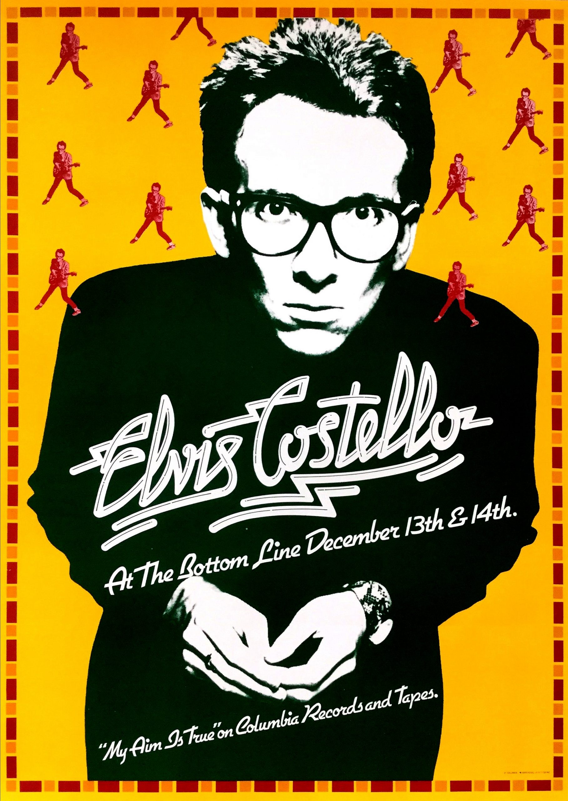
Elvis Costello
Designer Unknown, 1977
Poster House Permanent Collection
This poster was created for Elvis Costello’s first tour of the US at the time of his debut album launch, captures the inherent spikiness he displayed at that time, and is in the Poster House permanent collection. As a devotee of punk rock concerts, I was entranced, if a little taken aback, by Elvis when I first saw him either in 1977 or 1978, as he did not fit into obvious categories; but his lyrics and persona blended the anger of the time with a rare intelligence. This poster, sharp and stark, reflects that aggression. Interestingly, having been to a few of his concerts over the last three years he is a much more mellow, funny character now, but his steadfast refusal to be categorized remains as he covers every conceivable musical style, from rock to reggae, classical to country, and a collaboration with Burt Bacharach.
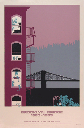
Brooklyn Bridge 1883-1993
Jan V. Roy, 1993
(Image c/o the artist’s website)
I first visited New York City in 1983. While obviously impressed by the architecture, for some reason the bridges, and Brooklyn Bridge in particular, captivated me rather more. I used to love walking over the bridge from Manhattan to Brooklyn Heights, where I saw this poster for sale in a local store. It has been hanging up in my home, wherever that may be, ever since. I now know that the cat and piano are features of many of Jan Roy’s posters; however, even though I am allergic to cats and cannot play the piano, they just seem appropriately part of living in that part of the city, as do the fire escapes. For those looking for book recommendations at this time, The Great Bridge by David McCullough is epic, detailing the incredible story of the planning and building of the bridge.
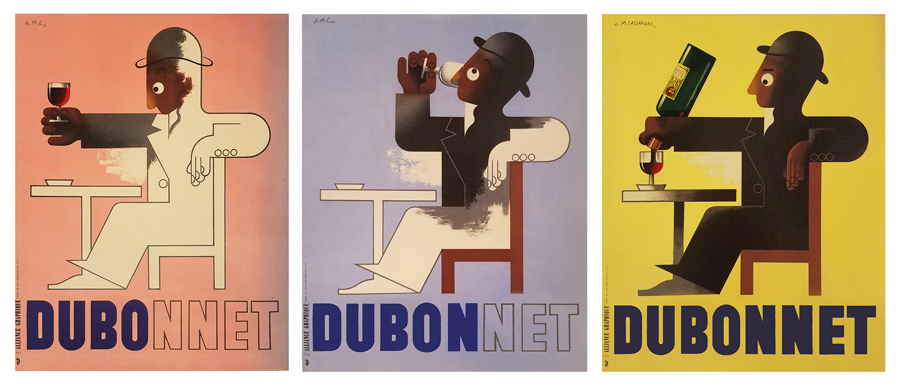
Dubo-Dubon-Dubonnet
A.M. Cassandre, 1932
(image c/o The Omnibus Gallery)
I own a number of Cassandre posters, including the last image of the triptych (I hanker after the full triptych), and struggled which one to pick. However, the Dubonnet man won out because of its inherent gentle humor in these troubled times; this poster never ceases to make me smile. It is a deceptively simple, short poem of a poster.
Writing in 1929, Cassandre himself said:
A poster has to contain the solution to three problems
1) An Optical problem
2) A Graphic problem
3) A Poetic problem
The Optical problem. A poster is designed to be seen. A truism, but if the poster does not possess this primary virtue of being visible, its merits cannot save it. An orator, no matter how well he speaks, cannot persuade his audience if he has lost his voice. This visibility is the result, not of a simple color contrast, but of a relationship of values given prominence by colliding forms-a formal accident.
The Graphic problem. One does not put signs along a railroad track saying, “Please come to a stop.” Instead we have very sensibly devised colored signals, which are kinds of ideograms and are infinitely more expressive and more readily understood than verbal messages. Obliged to get its message across rapidly, the poster uses the same language—the image, the true vehicle of thought. The vocabulary it draws on—the same vocabulary as in painting and the graphic arts—is limited by the technical requirements of printing—moreover the poster has to respect the laws governing these other arts. It is obliged to use the same grammar, the same syntax in order to achieve the same harmony. You can never be too seductive!
The Poetic problem. The poster is an image combined with a word (or a name). Its goal is to create, around this image-word, a series of very simple mental associations. What is more, these mental associations must be unforgettable. Therefore, it is not enough to give the viewer an ephemeral visual sensation. The poster has to trigger an emotion. And this emotion, whether or not the viewer is conscious of it, has to be an obsessive one.
As you can probably tell from this, Cassandre himself was an intense, tortured individual who sadly committed suicide at the second attempt. On his desk lay a rejection letter for a new typeface he was proposing. I prefer to focus on the many great images he left us, for today the Dubonnet Man, as the English would say, a true “Cheeky Chappie.”
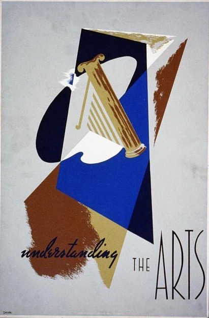
Understanding the Arts
Shari Weisberg, 1936
(image c/o The Library of Congress)
This is a poster promoting the study of the arts, showing an abstract print, held like many WPA posters by the Library of Congress. Until a decade ago, when I moved to the US full time, I was unaware of the WPA/FAP, or, to give it its full name, the Works Project Administration Federal Arts Project. The WPA was created by Franklin Delano Roosevelt in 1935 to create jobs at every level of the skill ladder, preserving professional and technical skills while helping individuals maintain their dignity and self-respect. The Federal Arts Project as part of this, had four major areas of activity: The creation of art, art education, art as applied to community service, and archeological research. Thus, artists were paid by the federal government directly to produce, with murals, sculpture, and fine art prints being especially popular. The program ran from 1935-1943, when US entry into World War Two provided alternative means of employment. When a good friend explained the whole project to me, I was fascinated that such an enterprise could have existed in the US.
I believe this poster meets the criteria defined by Cassandre some years earlier, with colliding forms in the images and the typefaces. The message is of its time but poignantly contemporary. Understandably as we all face the Covid-19 crisis and its potentially devastating aftermath, small museums like ours and the arts in general are going to face a major funding crisis. It is clearly not a first or even second level priority, but for those who believe that arts play a vital role in civic society, new methods will have to be found to encourage them.
If you would like to share your Desert Island Posters with us, please DM an image and brief writeup via Facebook, Instagram, Twitter, or traditional email! We’ll post our favorites as they roll in