Collecting Swiss Posters
Tom Strong is the primary lender to The Swiss Grid and has one of the most remarkable collections of Swiss mid-century and contemporary posters in private hands. Below, our Chief Curator interviews him about the origins of his collection and the lasting power of Swiss design.
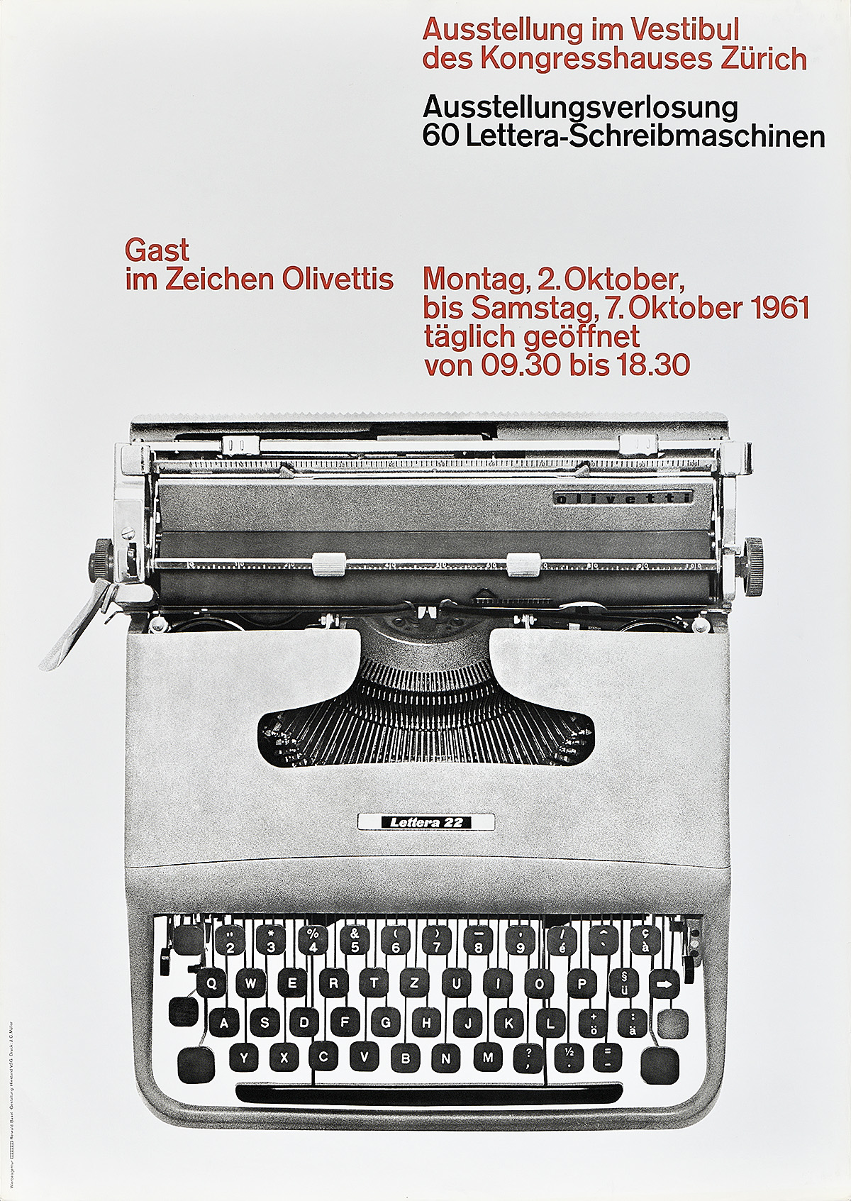
Olivetti, Ernst Hiestand, 1961
Poster House: When was the first time you saw Swiss mid-century design?
Tom Strong: As students with a wonderful art library right above our quarters in the Art & Architecture building in 1965-67, we could race up and look up at copies of Graphis or Typographische Monatsblätter—the Swiss journal—or Novum—a journal from Germany—and see small pictures of things that we thought were vital and important and new. But we hadn’t seen the things themselves full size.
That was made possible by Christopher Pullman, who, at the suggestion of the head of the Yale program, went to Basel and interviewed Armin Hofmann. Pullman’s purpose was to ask Armin if there were any graduates from his program that might be interested in teaching at Yale. In addition, Armin said, “oh go around to this theater and that museum and they may have some copies of my work which you can take home.” And Chris did! So, he took the full size, original posters back to New Haven and providentially had extra copies that he gave to his buddy, me. I was a year behind him in the program, but Chris was already teaching when I met him.
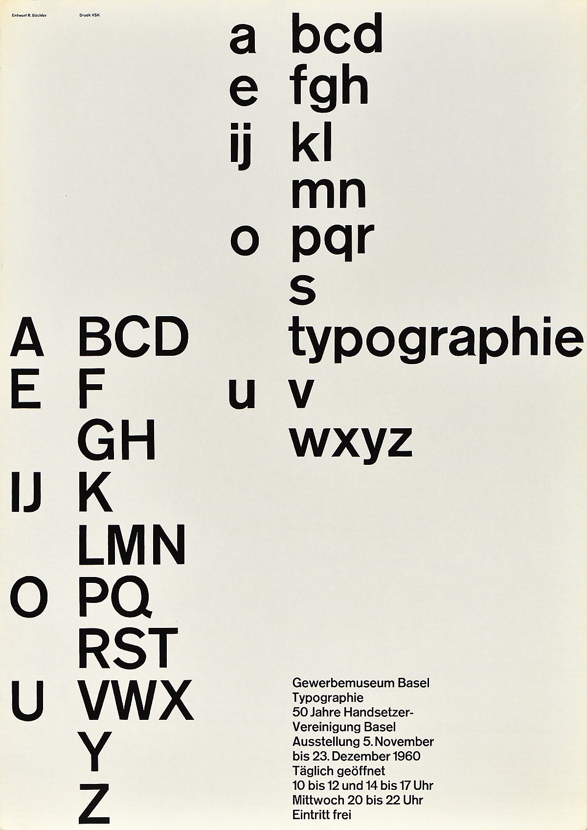
Typographie, Robert Büchler, 1960
PH: What was Chris teaching at Yale?
TS: Chris served as a teaching assistant to three-year students—those who had been accepted into the program but who might not have had the technical skills that the program thought you should have before you were thrown at Paul Rand and others.
Chris continues to teach in the program today, commuting from Cambridge, Massachusettes one a week in the Fall term. But back then, Chris is giving me posters by Armin and by Müller-Brockmann, whose studio he also visited. It was almost like, well, the drug analogy would be that I was inoculated. You know, I didn’t have to think that just a little picture the size of a cigarette pack is what it’s really about. I had the full size poster! And guess what? They’re available and they’re inexpensive! So, that led to trips maybe every other year to Switzerland, and I would go knock on the door with Swiss Francs in hand. I’d end up with a big roll which would fit into the overhead on Swissair flying back.
More recently—twenty, thirty years later—I found the dealer Stefan Heezen in St Gallen. Or he found me. And he’s a great fellow who would recommend things I didn’t know existed. I’d also send him pictures of posters that have been printed by the foremost silkscreener, Uldry. I go to his website and photograph images with a cell phone, send the images to Stefan, and he does the legwork. And when he has ten in hand, he ships them to me. And that’s what it’s been the last, you know, 15 years. I don’t have to fly to Switzerland, although I miss it. Stefan does the work. He scouts, I scout, and generally that’s how the collection has grown.
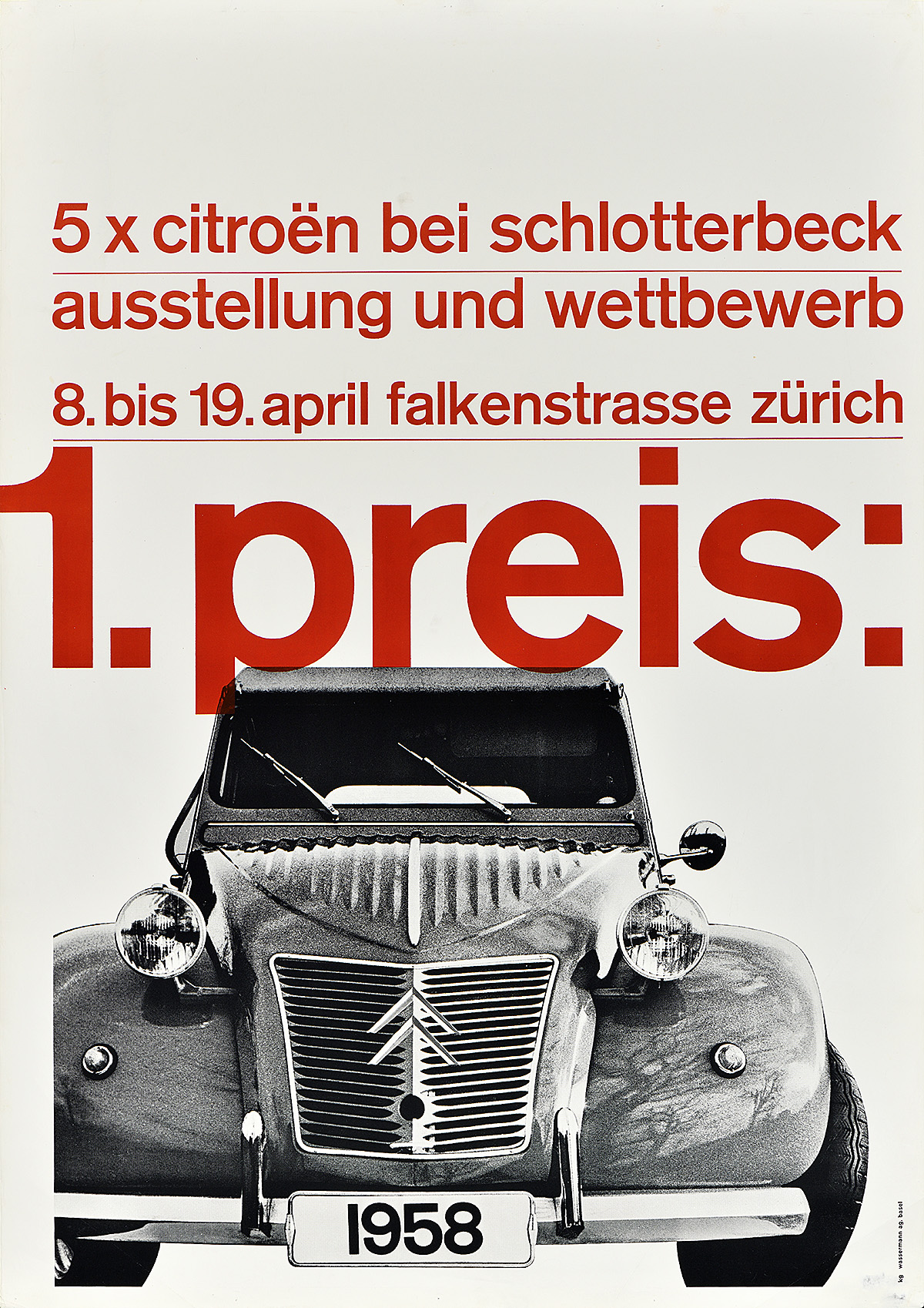
Left: Citroën, Karl Gerstner & Markus Kutter, 1958
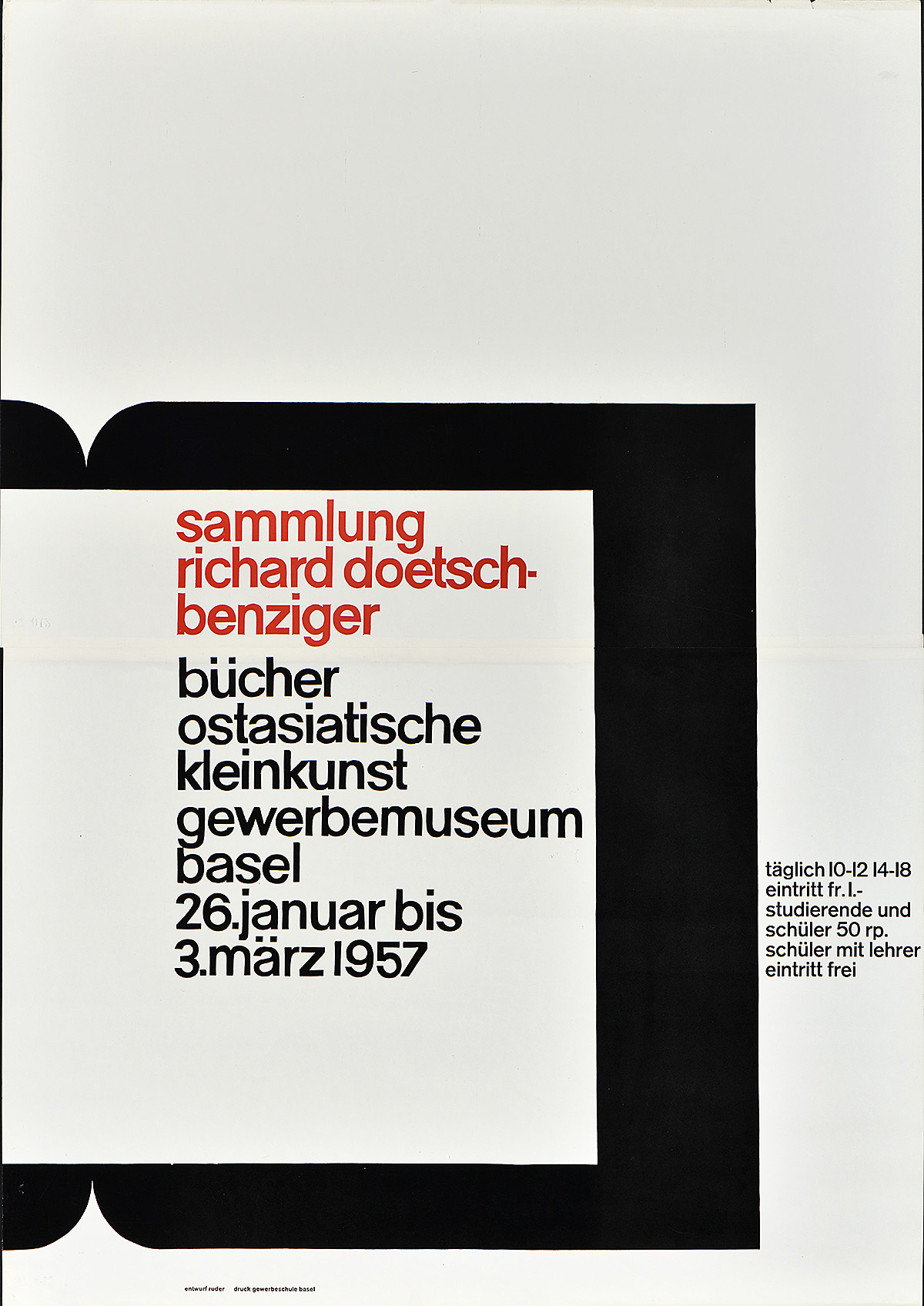
Right: Sammlung Richard Doetschbenziger, Emil Ruder, 1957
PH: When you say you first saw the posters in Graphis in small size, what about them struck you at the time and how were those compositions different from what you were being taught and exposed to at Yale?
TS: The second part of your question is terrific, although I don’t know if I can answer it. I think that even at the size of a postage stamp, the fact that these posters were enormously simplified and clear and understandable to us was striking. I knew a smattering of German, so I had a head start against my peers in understanding the messaging. The designs were often like a Puritan revival—black and white only, maybe a little red. They stood out by contrast. And I must say that the influence of Swiss design was already in the air. While the faculty knew of it, I think they were all embarrassed that we all wanted to do all of our work in Helvetica or Univers. They said there are so many other fonts, please! But they didn’t stop us. So, like a heard, we followed that. All my early work for Yale clients was in Helvetica, and I’m not ashamed since that was the story.
So the posters clearly were unlike the earlier stuff like Object Posters, in which a single image has been turned into a closeup design with wonderful color and then printed via stone lithography.
The typography was also compelling to us. The posters seemed to say, what can I do with one size of Akzidenz Grotesk, not four typefaces? We felt that was easy for a student to understand, the simplicity and the tie-one-hand-behind-your-back approach and try to do it with less, fewer typefaces, fewer sizes. And the Swiss had already mastered that, at least the ones we followed.
A lot of that attitude was already there in the Yale program. Alvin Eiseman, for example, was famous for saying “if nine point doesn’t work, try eight.” Go down in size, don’t go up. And Rand would say “remember, graphic design activates the edges.” So much of what we saw in the Swiss posters was edge happy, which you know from the exhibition. You could crop and things could go off the edge. For Rand, that was a necessity of good design. There was a surprise when you turned the page. Things could get close to the edge, and that’s ok.
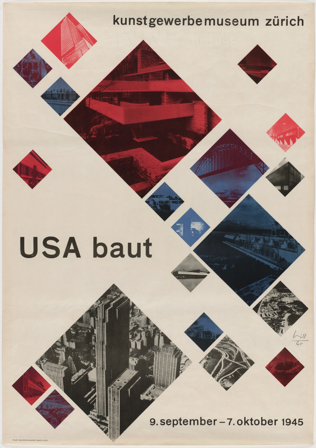
Left: USA Baut, Max Bill, 1945 (image c/o MoMA)
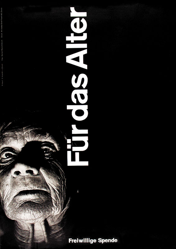
Right: Für das Alter, Carlo Vivarelli, 1949 (image c/o Swann Galleries)
PH: Your collection seems very intentional, very focused. What made you not choose certain pieces by some of the great mid-century designers? I’m thinking specifically of Vivarelli’s Für das Alter, a personal favorite from the period.
TS: They weren’t available, they were older, they weren’t online, and I couldn’t find them. I have other charity posters and posters by that designer—you have one in the show. I was aware of the others, but at that point I didn’t have Stefan Heezen who could find them for me or they weren’t in the Zürich or the Basel museums, which sold originals of these posters.
PH: And what about the work of Max Bill, someone who so decidedly influenced many of these designers. He’s not in your collection?
TS: Again, they were not being offered at $15 a piece or $20 a piece because they were published by the Basel school or museum or by the Zürich school or museum. He had done a few for the Zürich museum, and you’re quite right that I have avoided his work—but not for any good reason I could think of other than that I was concentrating more on what was useful for me. Remember, Bill was wonderful—he did his Constructivist art and his wonderful calligraphy, but the typography was not there. His was hand-lettering, beautifully composed, but not as simple and therefore not as instructive to us who were working with type or Letraset.
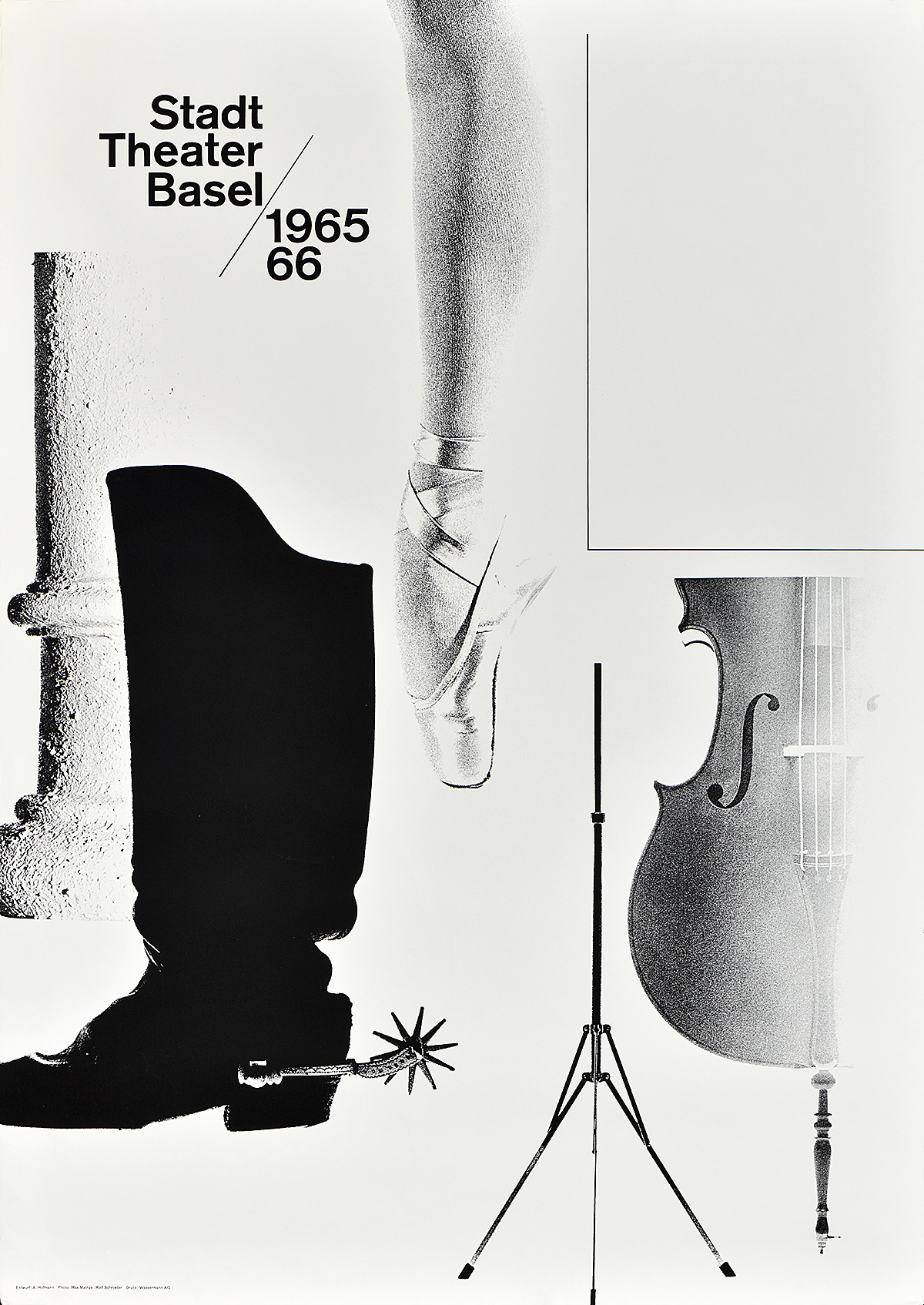
Stadt Theater Basel, Armin Hofmann, 1965
PH: Did you see the posters you collected as inspiration for your own design work? Did you see yourself as part of that graphic lineage?
TS: I have often wondered if my work would have been different if I hadn’t collected. And I’d have to go to psychoanalysis to get an honest answer. Clearly, we learned about surprise, about make it larger don’t make it smaller, make it clear, employ a grid—that was all encourage apart from what I found in the posters here at the Yale program. But, we also had Armin Hofmann as a teacher here, who clearly understood all of that. So, the design principles were in the posters, but they were also in the Yale program. They reinforced each other.
PH: When Armin Hofmann came to work at Yale, did you meet him and hang out with him at all? Did he know you were collecting his work?
TS: He did a walkthrough some time in the 60s, but he didn’t start teaching until I had finished the program. I was able to put up a show of Swiss posters, including many of his, on the first floor of the architecture building while he was here. As I may have told you, I had one of a unicorn—it was probably an advertisement for a shoe store, and somehow he had lost control of either the color or the final decision of how it would be printed. And he saw it and said, “Tom, hang that poster face to the wall.” And I did.
Another time, while he was teaching and I was working at Yale at the press and had my own business, I took seven or eight of his posters to a class he was having with the first or second-year students to allow him to talk about what he did and then point to what it looked like in the posters. One story that comes to mind is about a poster in your show—the one of the music stand and the column and the ballet slipper. He referred to it as his—plural—”feets” poster. In German it’s “fuss” and “fusse”—we never speak of “feets,” we speak of “feet.” It’s already a plural or a singular. Anyway, it seemed to me the students were lapping it up; I was lapping it up. He was able to make general observations and answer questions, but of course I didn’t record any of it or write it down. It was nice to be that close to a one-on-one with him along with students who were obviously enthused by his work.
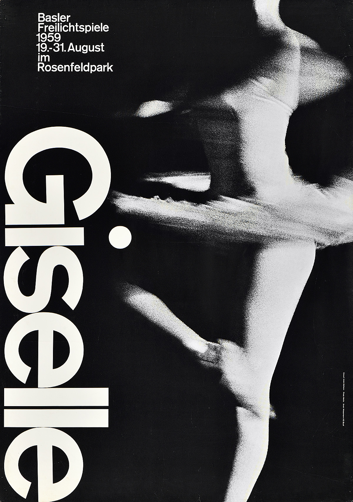
Left: Giselle, Armin Hofmann, 1959
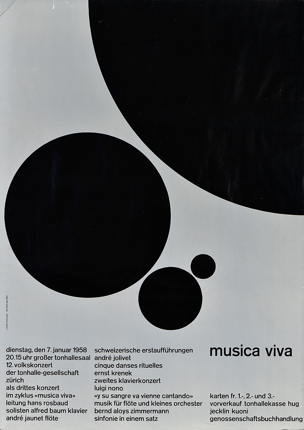
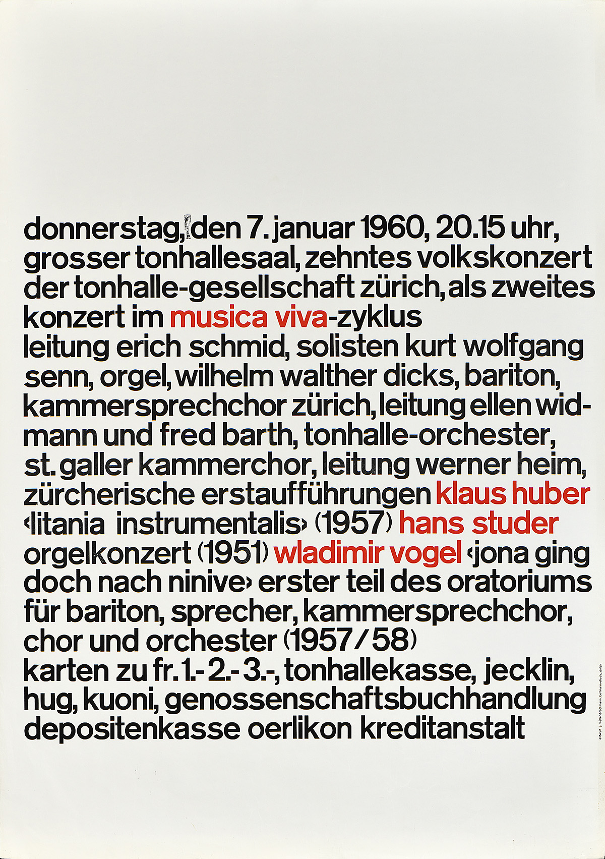
Right: Musica Viva, Josef Müller-Brockmann, 1958
PH: Do you have a fave piece in your collection?
TS: Well, if a parent can have 32 children, you have to be fair. I’ve been asked that by several people. From Hofmann’s work, I would say two that strike me are Giselle—which has so many wonderful lessons of contrast and cropping and making the type ride with the figure as it dances or twirls—and his poster for the Basel theater that I just described with the column, the feet, the dancer. Those would be my favorites. Among Müller-Brockmann’s work, certainly any of the early typographic posters—the two that you chose for the exhibition to me are not lovely to look at but they are revolutionary for the time.
PH: You mean the Musica Viva series?
TS: Exactly. He had been doing sort of the Max Bill idea with type. He had constructed beautiful things, you know, apart from the Constructivist movement that so heavily influenced Swiss sculpture and painting of that time. He put two or three columns of text below an image, such as in the first Musica Viva poster with the large black dots. And then, as you know, Vivarelli said, “Josef you’re missing the point. You’re selling movement and performance.” And that persuaded Müller-Brockmann to take the advice of someone five years younger than him and start working with type only. In your show, you see those first two examples. What comes after that, which you do not have, is a show unto itself. And hopefully someday they can be on your walls. Those posters have diagonals, colors, different grids, lots of permutation and richness—and most of it all in lowercase Akzidenz Grotesk.
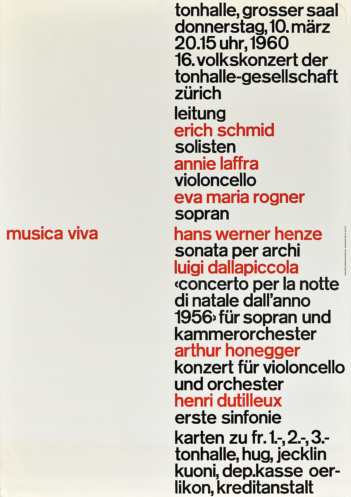
Left: Musica Viva, Josef Müller-Brockmann, 1960
Right: Musica Viva, Josef Müller-Brockmann, 1960
PH: You said earlier that you used Helvetica primarily in your own work. Since none of the Swiss designers really used that typeface, what made you avoid using Akzidenz Grotesk?
TS: Didn’t have it! It wasn’t on Letraset, which we used if we did posters. We had to rub down and make a film positive with Letraset. Only probably one in a hundred here in the program could render type. They’d probably worked in New York and been expected to render type as the text for an advertisement. So, it just was not available. We saw it in the posters, and many people because they didn’t know one from the other probably thought it was Helvetica when they looked at a small reproduction. Helvetica was in the air, and was available in many sizes and weights on Letraset.
PH: Your collection extends beyond the 60s and 70s to include the work of designers like Wolfgang Weingart and Rosmarie Tissi. Why did you continue to collect Swiss posters as they moved away from the really pared down, grid-based, simple, straightforward designs into styles that were incredibly wild and rebellious.
TS: So the question is, why did I give up religion? I guess you like Beethoven and then Stravinsky comes along with different principles, blows your head off. And then you go further, and you get David Lang or you find Erik Satie who you never knew anything about. The body and the brain and the ear are accustomed to surprise and difference and beauty as described by someone else. Other than that, I can’t defend it or describe it. These posters have wall power. You can’t deny it.
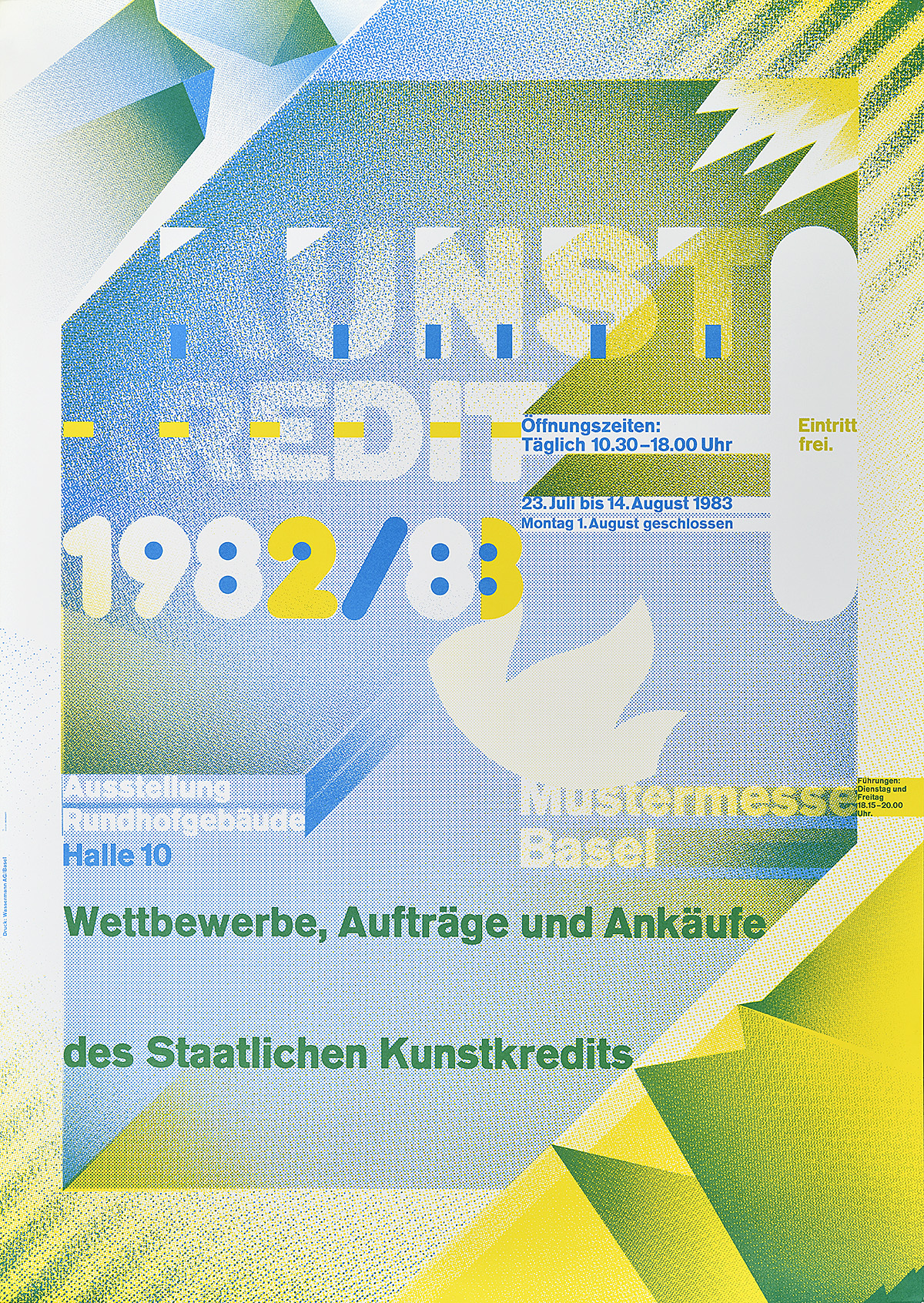
Kunstkredit 1982/83, Wolfgang Weingart, 1983
PH: So you think the contemporary posters are just as powerful as the mid-century designs?
TS: Sure, and probably more enjoyable by a larger circle of people because they aren’t as puritanical. And that Puritanism was probably directed by economy. They were being printed by letterpress at the schools in Basel and Zürich. Black ink they had, but they didn’t have time nor could they afford to print in color. Maybe a little red, but they couldn’t do a four-color transition. That would be too expensive and probably beyond the budget of what they could spend on a school project with faculty giving direction. But nowadays, you know, black and white or full color is probably the same price.
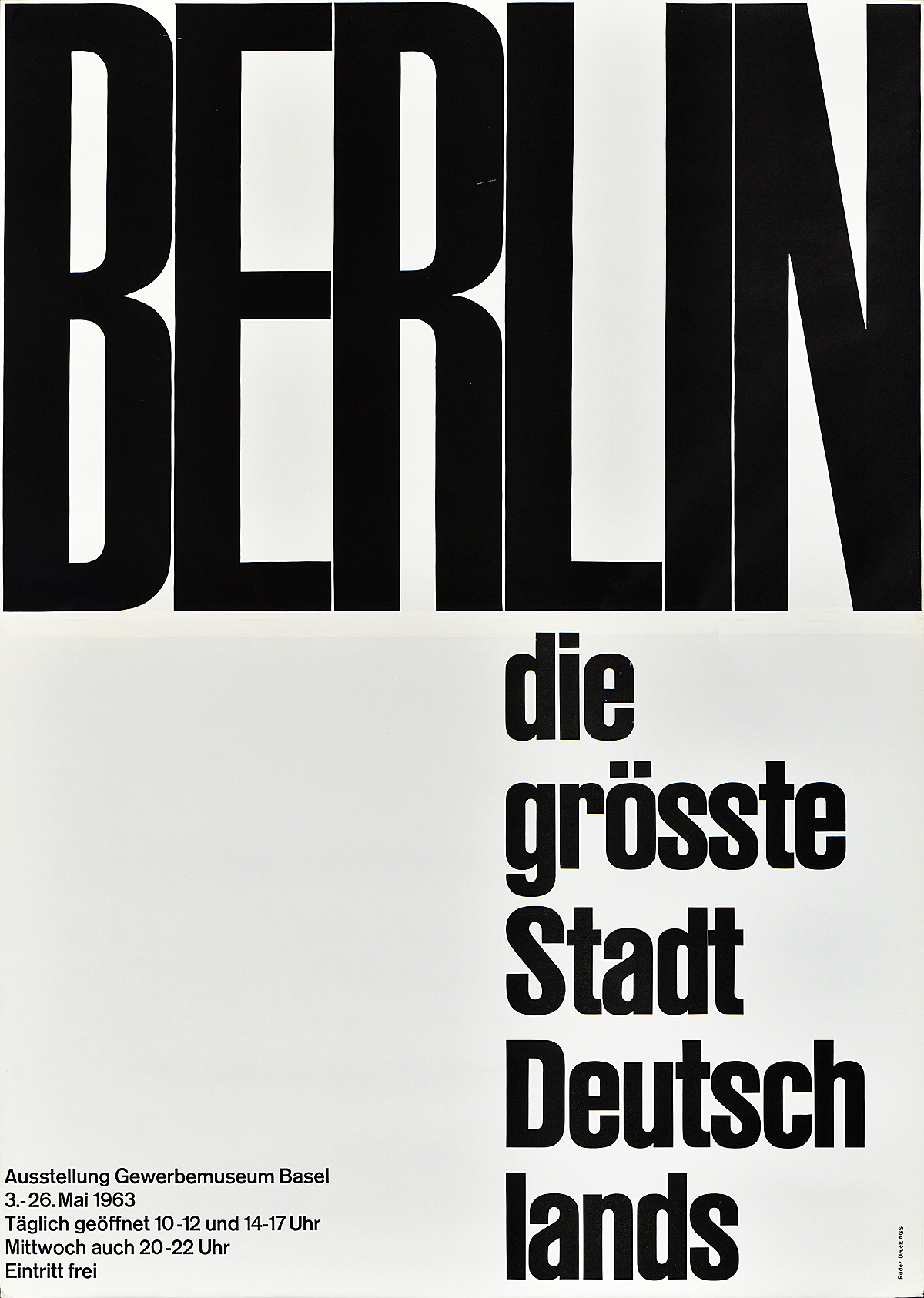
Another favorite in the show is the Jeux de Mots—word games—by Martine Waltzer, which I love for so many reasons and which most people don’t get. First of all, this is a poster that if you spend any time with it, you learn something whether or not you go inside to see the exhibition. And that is so unlike the earlier posters. By contrast, what does the Berlin poster tell us? Merely that Berlin is the largest city in Germany. There is no other hint at why you might want to go to the Berlin show. But Waltzer toys with the idea that all of these other cultures contributed to the French language spoken in both France and Switzerland today. And the French are so alarmed by this. I know the Academy used to say that we can’t say “weekend,” we have to say “fin de semaine.” And that was the accepted word as far as they were concerned. I’m sure that doesn’t influence normal conversation. But this poster teases you to learn something even if you only have three or four minutes. It shows you German words which you thought were French words. Jardin and bleu and vague—they’re all Germanic. And the Swiss have no problem with that because they have that wonderful culture which includes two Romance languages, German, and the rump stock of Latin up in the hills, Romansh.
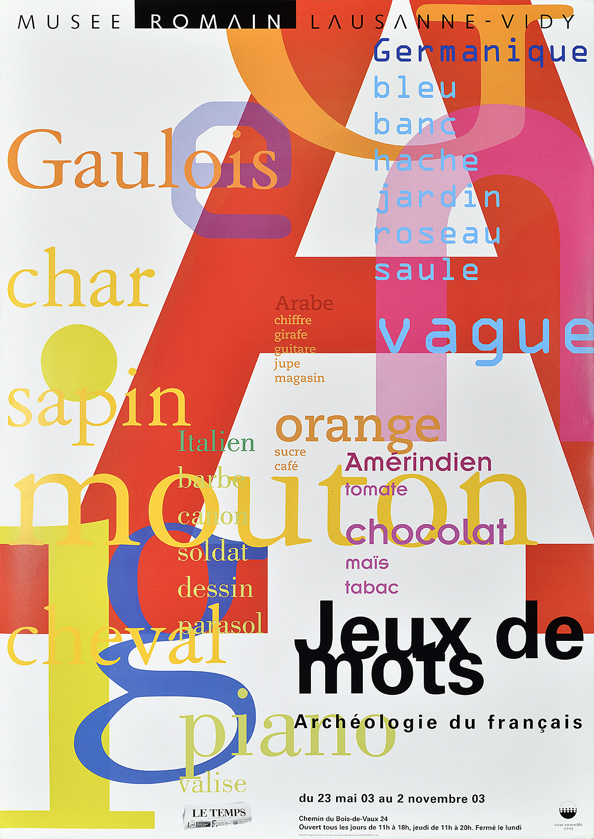
Left: Jeux de Mots, Martine Waltzer, 2003
Right: Berlin, Emil Ruder, 1963
PH: Are you still actively collecting?
TS: Yes! My friend who teaches here at Yale is very fond of Velvet’s work, with the large white or black circles which I think we talked about being inspired by much earlier white or black dots.
PH: Those posters are not in the show, though.
TS: No, but think of the Schützenfest poster. There’s the black target, the black dot—Velvet has used the black dot or the totally white circle imposed over a photograph, and then the text of what it’s about is at an angle. I tried to get three or four that are currently online, but Stefan said he tried and that they won’t sell. They’re down to two or three copies, and they have to keep them for their own purposes. So, I haven’t been able to add them, but I have two or three earlier examples by them. The same is true of Brechbühl. You have his Dämonen in the show. He has other wonderful things that you can see online, but he also doesn’t have extras to sell. I’m hoping someday they’ll show up on some secondary market and I can grab them, or, if I get the address of his studio, I can possibly tempt him with a bigger bit of bait. You know, money talks.
PH: Do you think Swiss Style still has its own identity even though today’s design community is so global?
TS: Well, they’re so open to outside influence today. Monguzzi was clearly influenced by New York design. Everybody seems to know everything thanks to the internet and the publications. But there’s a saving remnant in most Swiss typography, at least that which I’ve come to collect. The designers may be taking chances with illustrations and with ideas, but the type is always thoughtfully put together. And while the grid may not be important today, they seem to be observant of the niceties established well before of what’s an acceptable poster type. But that’s just an opinion on my part.
PH: Would you say then that typography is really the hallmark of Swiss design more so than grids or economy of expression?
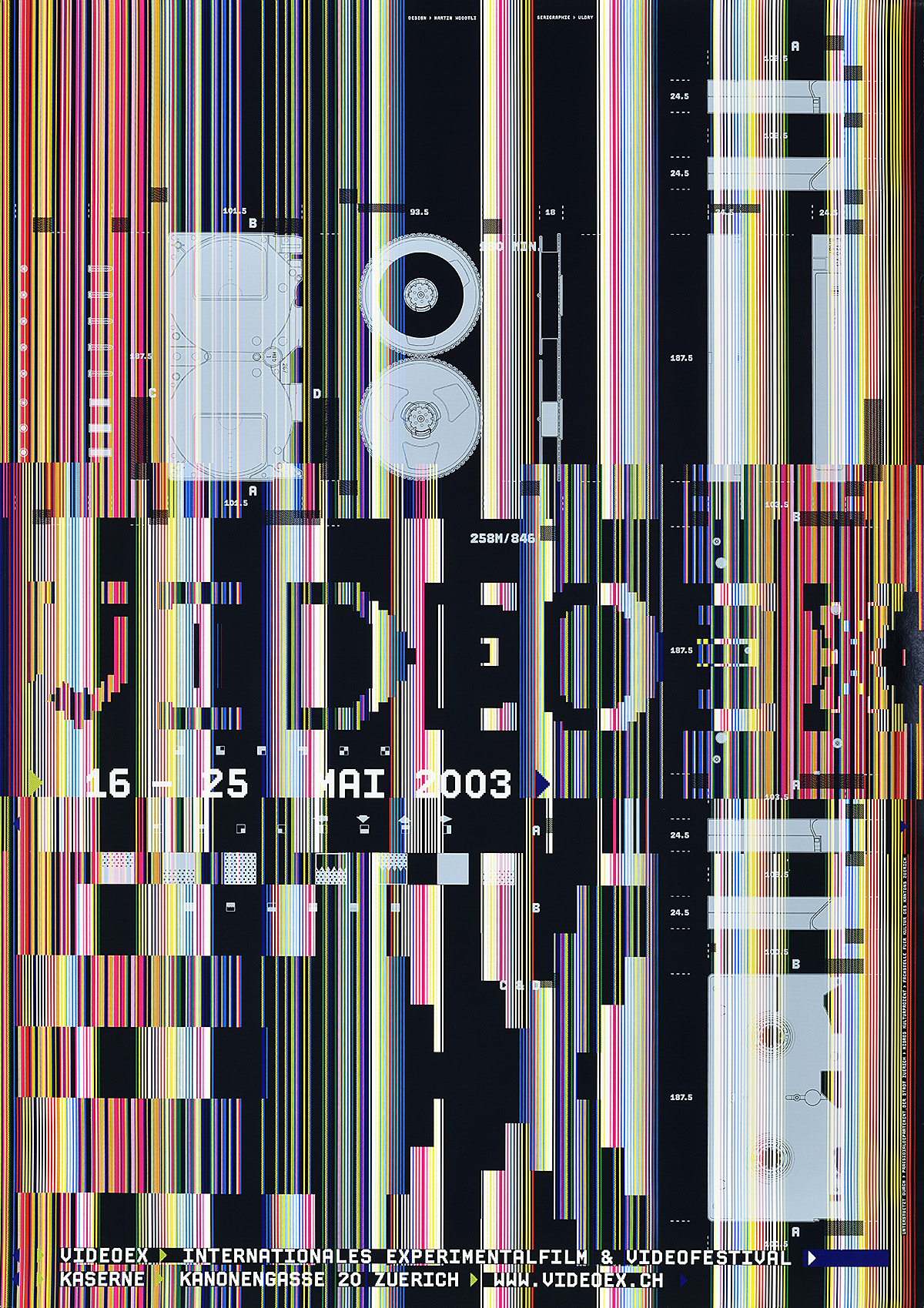
TS: Today, yes. You have two posters in your show worth mentioning. VideoEx by Woodtli is really hard to read. It looks like vertical lines interrupting a TV screen. But, if you can’t read it, it’s repeated again underneath, clearly, in solid caps, in white type. And Monguzzi does the same thing in Consonanze. If you don’t get it, he repeats it in black. So these designers are being responsible. They’re saying that they’re playing a game and you may not get it, but rather than go away disappointed and frustrated, here is the name of this event a different way. I applaud that. I think that is being Swiss and that is being responsible. You can have fun, but you also are trying to get people to go somewhere, so they have to know what it is and when it is, and that should be clear.
PH: So then clarity of communication, which was the same goal held by the mid-century designers, seems to still take precedence.
TS: Right. And most of these designers haven’t forgotten that these posters were not created to go on a wall in New York City or in New Haven. They were designed to get people to stop, decipher what they’re about, and then decide to go inside or spend money and buy a ticket online. They are advertising. They’re not just beautiful things for someone’s collection. And the fact that it’s commercial art in Switzerland doesn’t seem to offend anyone. In this country, you’re either a commercial artist or a fine artist. But so many of these people work both sides of that fence without any embarrassment. And that’s what makes them great posters.
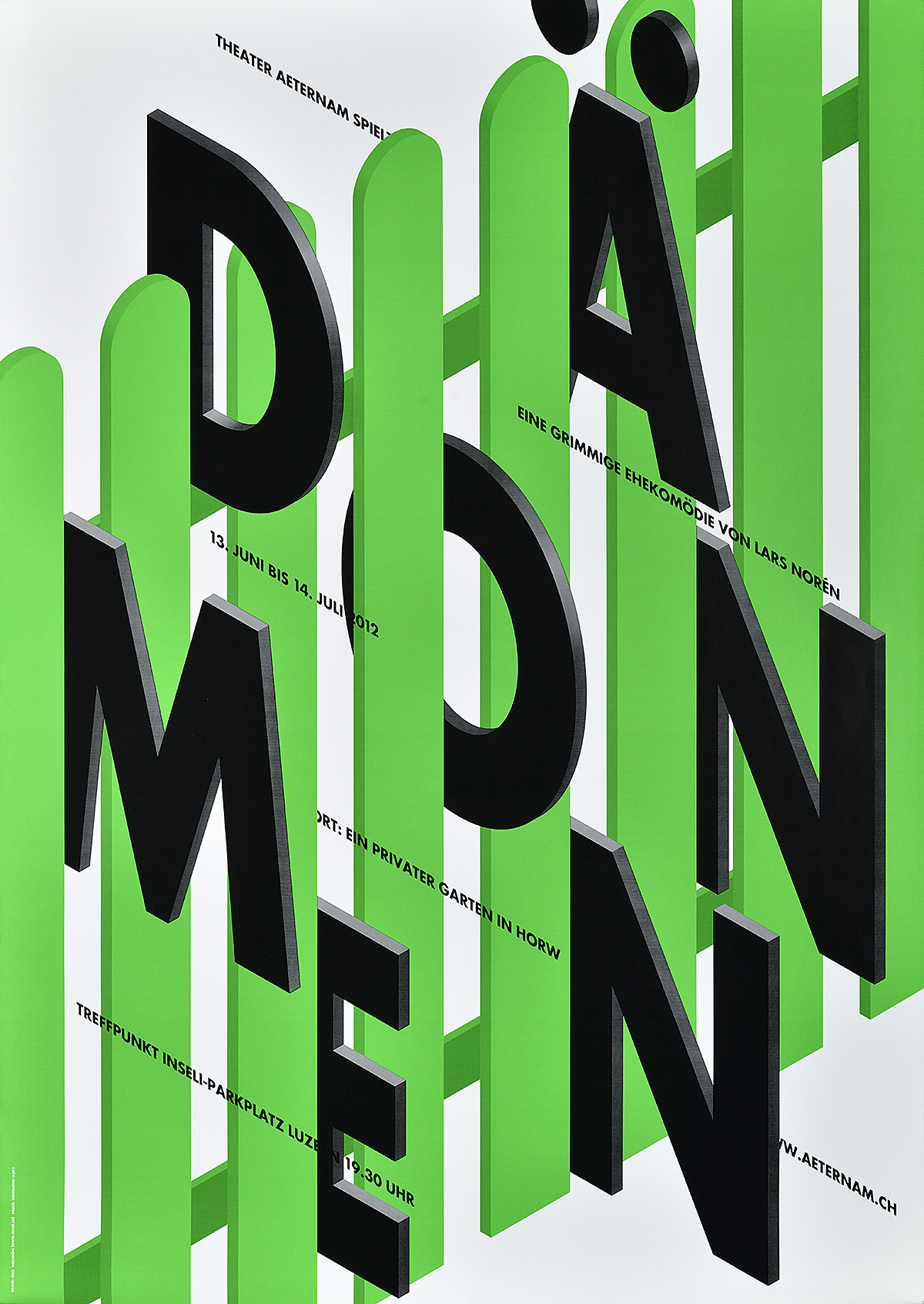
Left: Dämonen, Erich Brechbühl, 2012
Right: VideoEx, Martin Woodtli, 2003
The Swiss Grid will be on view at Poster House through August. Please check back for extended exhibition dates once we reopen.
Unless otherwise noted, all posters pictured are from Strong’s personal collection.