A Presidential Parody
After seeing their work all over New York City and Instagram, our Curator finally reached out to the artists behind A Presidential Parody, Maia Lorian & Abe Lincoln Jr., to learn more about their creative process and the practice of poster ad takeovers.
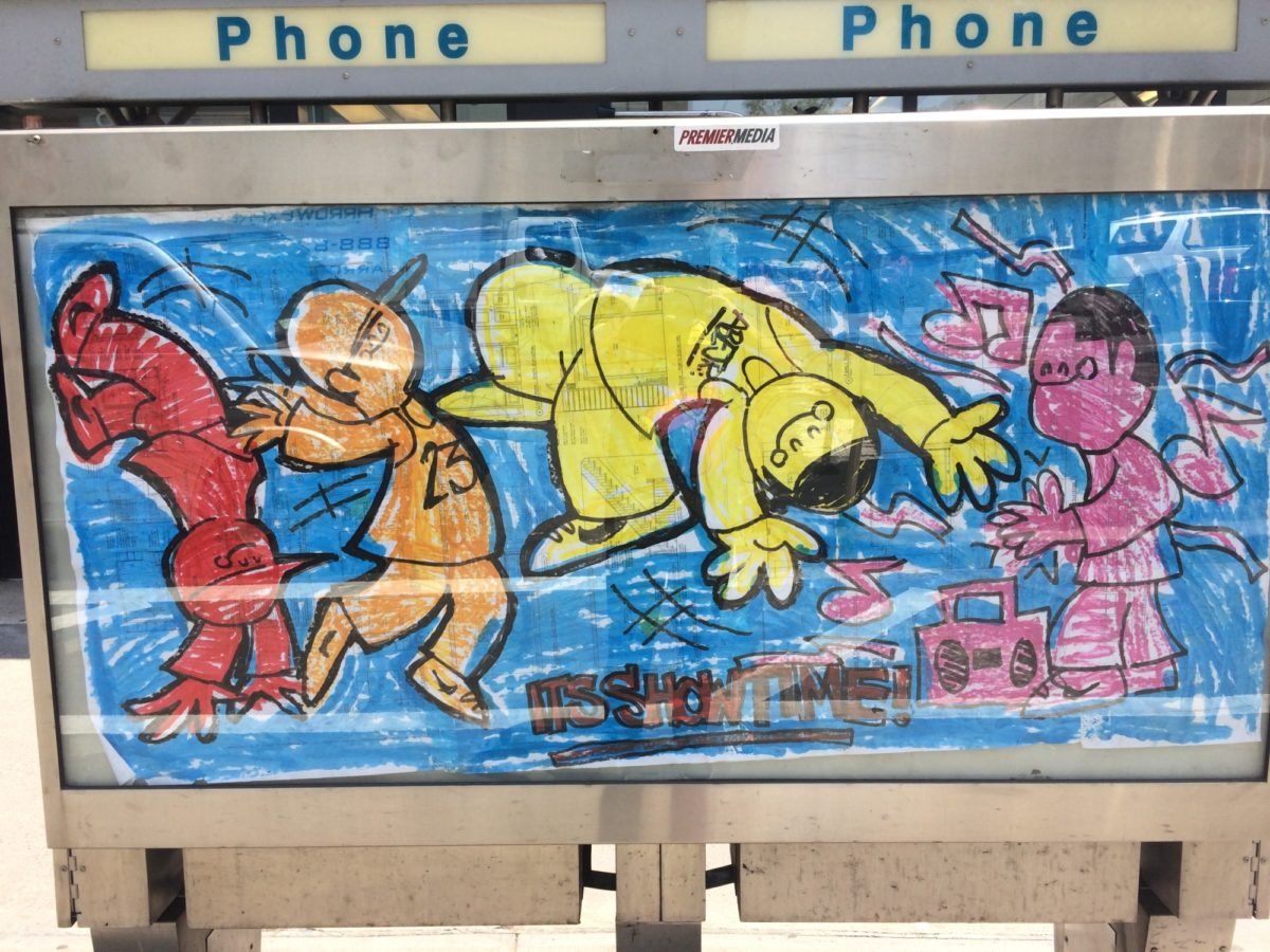
It’s Showtime by Abe Lincoln Jr., October 2016 (in situ across from Alvin Ailey Dance Theater)
Poster House: Abe, you’ve created numerous series over the years which break into the public ad space and insert pieces of social commentary under the guise of an actual poster. Can you talk about the evolution of the characters and various campaigns you created prior to your collaboration with Maia? What was the first one, and why did you move from street art to the poster space? I know some of your early works were painted, so why and how did you switch to printing?
Abe Lincoln Jr.: I started doing Street Art in the Early 80s, but they just called it Vandalism back then. I came up in the hardcore scene at that time, and my first “posters” were flyers for hardcore shows for bands like Black Flag. Fast forward a bit, and I’ve been doing street art under the Abe Lincoln Jr. name since 2003. I switched to ad takeovers about 3 years ago.
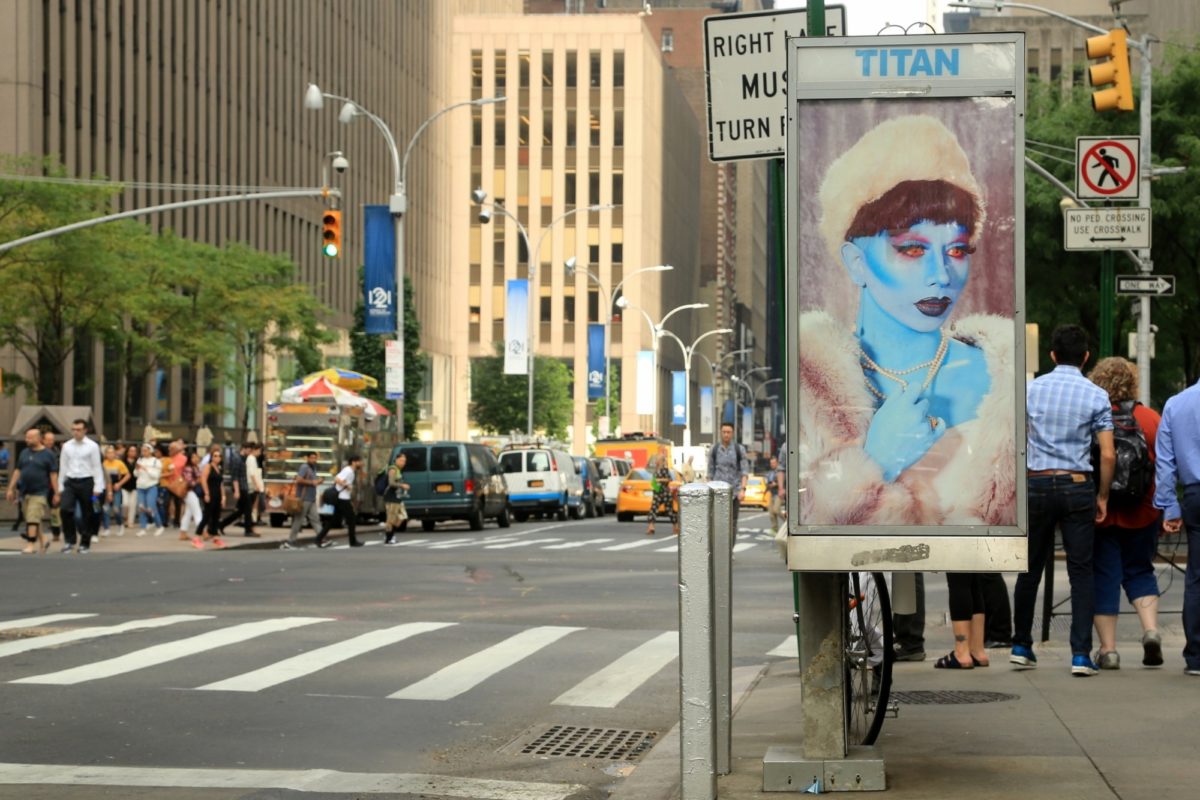
Initially, I started out doing single hand-painted posters. Then I did full booth takeovers that followed a theme. For instance, I did a site-specific piece across the street from Alvin Ailey Dance Company that was themed “Showtime” after the kids who do the acrobatic dancing on the subway. All three sides of the phone booth had brightly colored posters of kids dancing on the subway. After that, I transitioned into fake ads. The first series was Sloppy Jones, a fake fast food chain. The posters used stock photography of hamburgers etc., and had lyrics from punk and metal songs with a QR code that played the song on YouTube. Later ones were a little more juvenile…
Then things got real in 2016, and I started doing political posters. I did my Jesus Wasn’t a Dick series. These posters had a cute Sanrio-style Jesus on them and messages like “Can you people stop? I just can’t!” After the Women’s March on Washington in 2017, I created the concept for Resistance Is Female, and was a co-founder of the collective. That got an amazing response and was featured in Milton Glaser’s The Design of Dissent book and got tons of press.
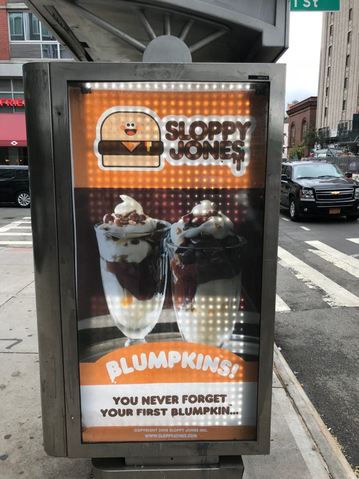
Sloppy Jones/Blumpkin by Abe Lincoln Jr., August 2018 (in situ on 2nd Avenue, NYC)
PH: Maia, I know your previous work has been primarily acting in both film and performance art, from being featured on SNL to CollegeHumor and The Onion, as well as making memes and other original content. What appealed to you about collaborating with Abe and breaking into the two-dimensional, fixed world of poster advertising? What is different in your process when you create compositions and messaging for static posters vs. your other art mediums?
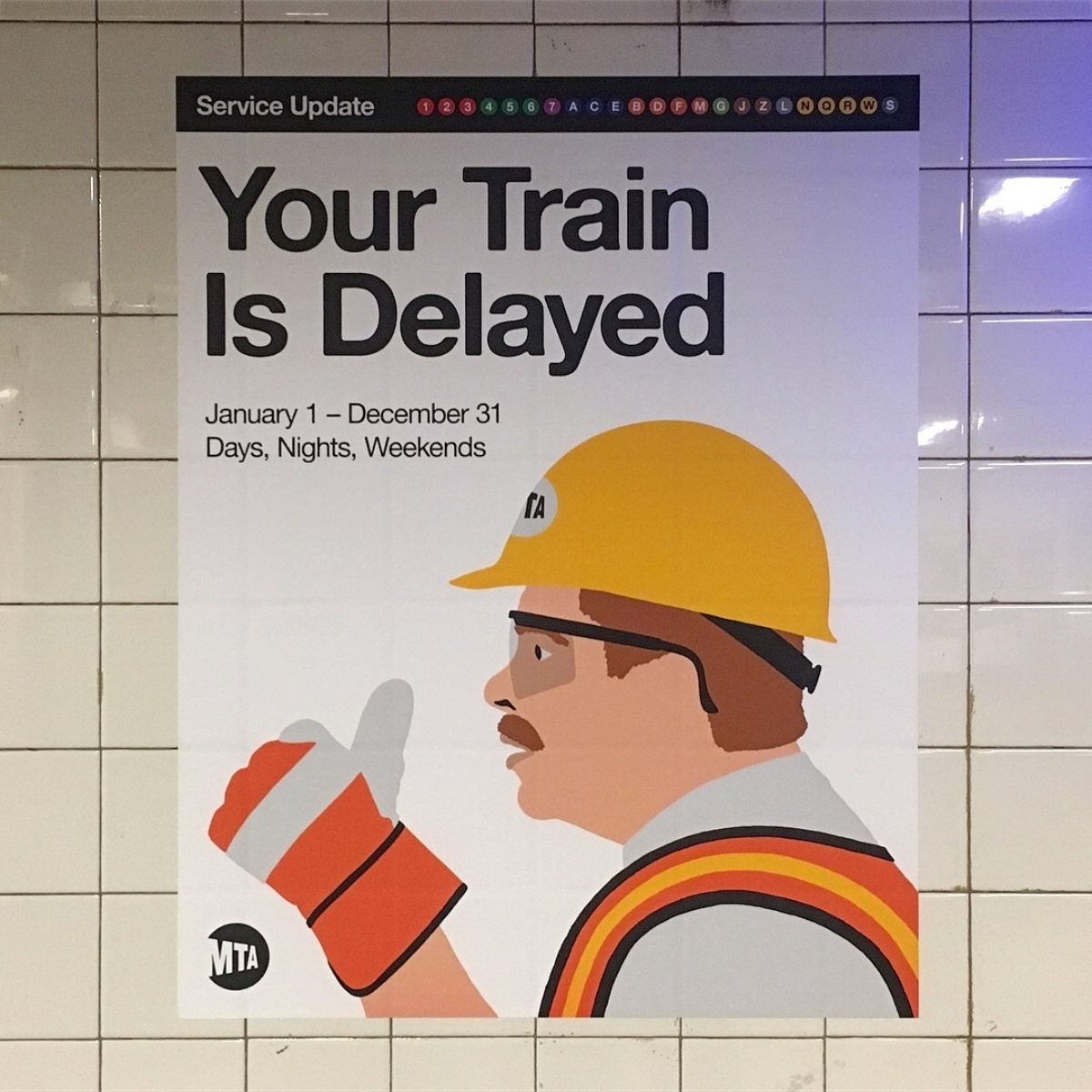
Maia Lorian: I come from a family of artists made up of third generation native New Yorkers. I was initiated into this world with a general sort of sense of fearless chutzpah. In the ’50s my mother won a subway poster art contest with her poster displayed in the system, and, as a child, I was in awe of this detail of my mother’s former life. I appreciate the lineage and full circle this work has created, delving into poster art and running our ads throughout NYC streets and within the MTA.
As a child actor, the stage was my first home/art form, and I’ve always been a comedic actress. As an adult, I spent many years working with companies like The Onion and CollegeHumor, who specialize in parodies and comedic viral videos. There’s a similar art form to online content, whether it’s viral videos or making memes, as there is to poster advertising, in that you have to catch the viewers attention immediately, or they’ll keep scrolling, or click elsewhere, or walk past the ad on the street without noticing. Because these are actual giant two-dimensional posters, we were gifted with having enough space to utilize Easter eggs and feature greater details for the passersby lucky enough to catch a poster in the act, all details furthering each poster’s message.
For me, the biggest difference in making these posters vs say my political memes, was working with low resolution vs high-resolution images. It’s a whole different scale, quite literally, and they cost money to produce, so we have to work within our means, which can be frustrating when you dream big. Abe is an incredibly skilled artist and graphic designer. When he was, for example, able to match the font for the Ivamka Sweatshop poster with the Victoria’s Secret font, it brought a level of specificity to our work that helped push our message to the finish line. Specificity is key in all my art forms across the board, whether creating a piece of theater, notes in a song, a meme for the masses, or an anti-Trump poster. Every sentence, every font, every detail in every image is there to further forward the message. Same as when working on the stage, every movement is visible so no movement can be taken for granted. I think all my art forms are connected.
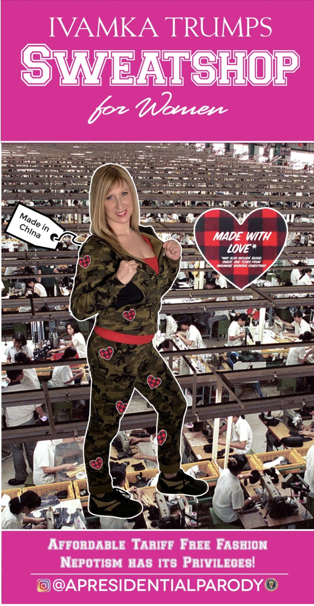
Ivamka Trumps Sweatshop for Women by Maia Lorian & Abe Lincoln Jr., 2018
PH: When you two met, how did the idea of collaborating come to be? Were you aware of each other’s work prior to knowing each other? What strengths do you feel the other party brings to the work that you couldn’t have done on your own?
ML: When I met Abe originally, I wanted to get involved with Resistance Is Female, but it had already come to an end. I’ve created protest posters, as well as my own anti-Trump memes – which had great success, and it felt empowering being able to use my voice to resist. I was a fan of Abe’s drawn artwork, and loved his Sloppy Jones ads, because of the ads’ believability upon first glance. I collected trading cards for years, and Wacky Packages stickers were always my favorite – they achieved the same thing, making believable advertisement parodies. I saw anti-Trump ad parodies as the perfect collaboration for Abe and I to work on together. As the presidency is such a parody in and of itself, the ads were nearly writing themselves. We’re just saying what everyone else is thinking, pointing out the comedic aspects of the whole debacle, instead of the tears we may be feeling on the inside when thinking of the actual reality and state of affairs. Abe and I would bounce ideas off each other and combine perspectives, which only added to the strength of our work. It was a true collaboration, in the fullest sense.
The posters themselves have been an evolution, and the seed began years ago. I was in a series of Cheetos commercials that ran 10 years back. As an artist and political activist, once the Orange Chief came into office, I’ve enjoyed the irony of using the snack as a medium in my work, and found myself incorporating the delicious treat into memes as well as protest posters I made right after 45 took office. That was the first time I brought a cheese curl protest poster up to Trump International. That idea eventually evolved into the Trumps Bistro poster you see today, which is a parody of both Trump’s Grill (no longer in business) and Mar-a-Lago.
AL: One night at an art show, Maia brought up the idea of a Trump parody collab. Her ideas were clever and funny, and I really got a chance to see how her creative mind worked in that first discussion. I knew it would be a great collab from the start. I had taken a break from political work after @resistanceisnfemale to focus on my own art for a minute. Maia brought the original concepts to the table and Art Directed the posters as well.
I knew of Maia’s work and had seen her on SNL before. I’d also seen her memes and followed her so I knew she was funny, smart, and had a gift for biting satire.
In terms of process, I have a total “smash and grab” aesthetic. I concept, design, put up the work, and don’t look back. I like zingers, but I’m not one for working through a concept and refining it and editing etc. Maia’s work in acting and her own art practice brought a level of refinement to the material which I think makes the work far more convincing and funny because it’s been optimized and every word is there for a reason.
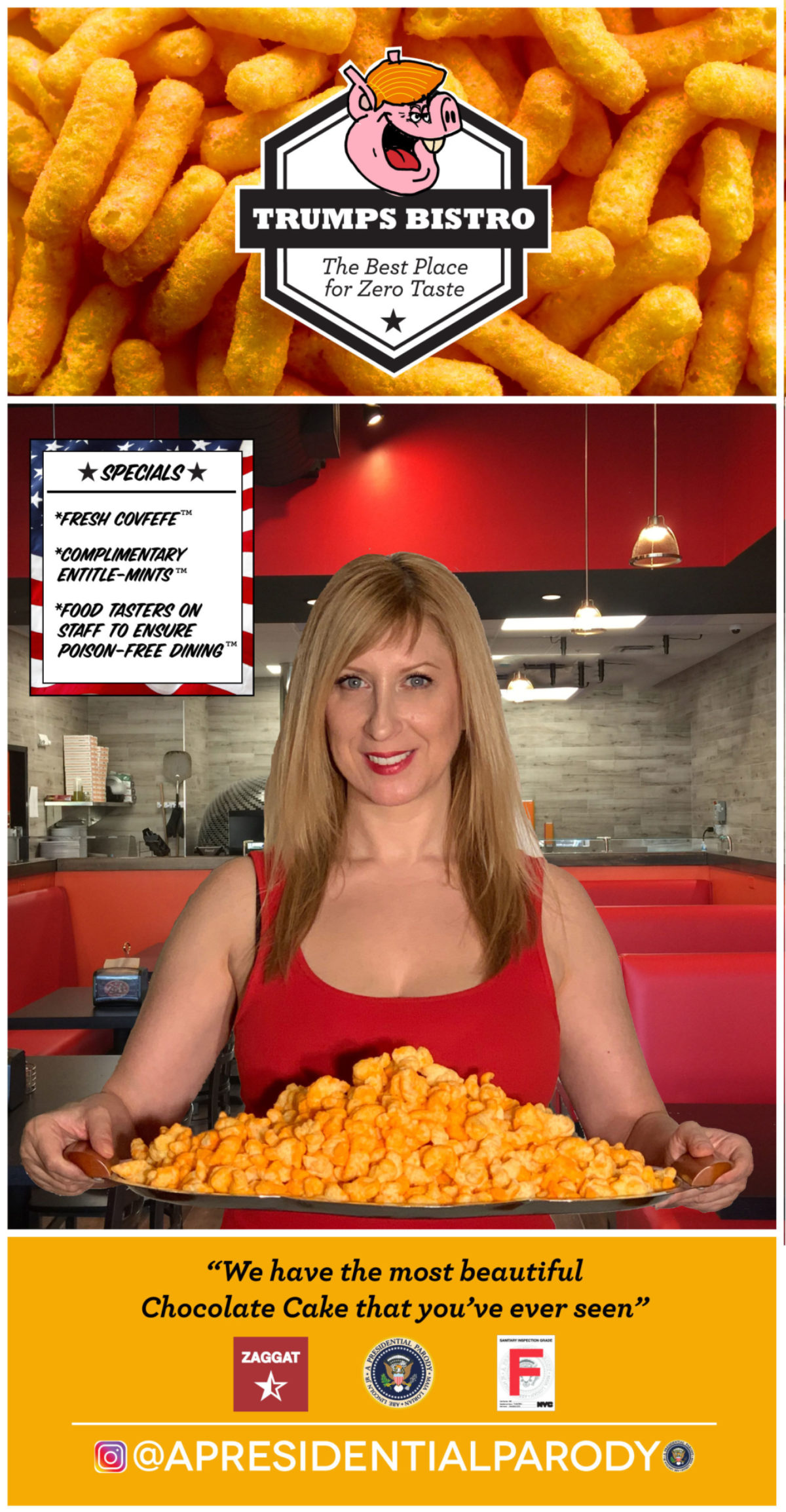
Trumps Bistro by Maia Lorian & Abe Lincoln Jr., 2018
PH: How did you choose the four topics within the A Presidential Parody campaign? Do you plan on making more images within the series?
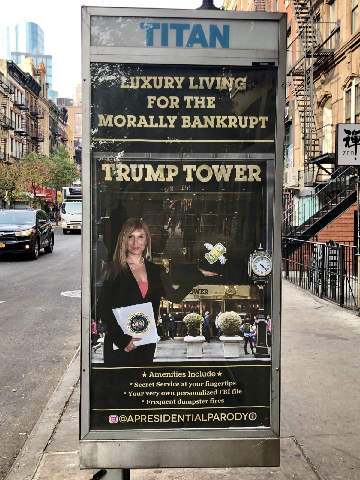
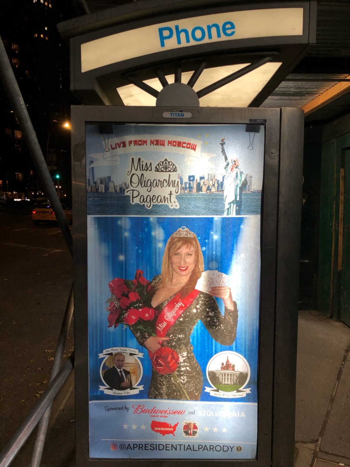
ML: We felt the Trump presidency was creating a nation placing higher value on the American dollar over the American life, so we felt it was time to release an ad campaign that reflects Trump’s “all American” values. Each poster presents as a real advertisement, parodying an actual Trump business that currently exists. For the Trump Tower Real Estate poster, we feature his architectural properties. For Ivamka Trumps Sweatshop for Women we’re poking fun at Ivanka’s luxury clothing lines made in China and her numerous Chinese trademarks, while using sweatshop labor to make her products. For Trumps Bistro we were creating a parody of his numerous restaurant businesses and even included a quote of his on the poster from when he was dining at Mar-a-Lago with Chinese President Xi Jinping, and he informed the Chinese president about the air strikes he authorized in Syria over the “most beautiful piece of chocolate cake that you’ve ever seen.” Of course that cake would be available at Trumps Bistro, along with fresh covfefe. For the Miss Oligarchy Pageant, we’re parodying Trumps involvement in the Miss Universe Pageant, as well as the Trump/Putin relationship and Russia’s infiltration of the American political system.
We plan on making more images in the series. The election is coming up in 2020, so we feel a sense of obligation to help Trump with his next presidential ad campaign. We’re also going to explore broader topics of the Trump presidency. For the first round of posters we stuck to the families businesses; for the second round we’re going to open the field to his policies.
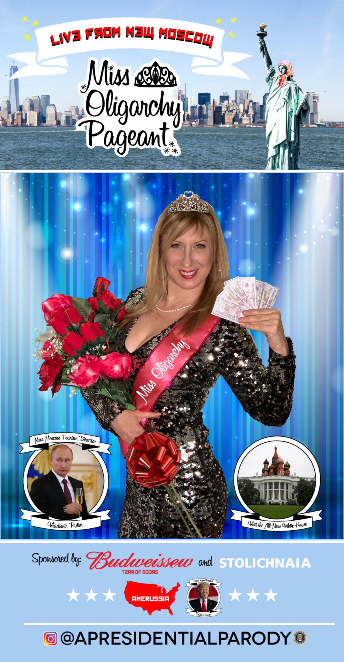
Miss Oligarchy Pageant by Maia Lorian & Abe Lincoln Jr., 2018
PH: What’s the best or most satisfying place you’ve been able to insert one of these posters?
ML: Our number one goal when making the Trump Tower real estate poster was to get it up as close to Trump properties as possible, but his properties are heavily guarded, so it felt like great success to accomplish putting up both the Trump Tower and Miss Oligarchy posters 200 feet from Trump International (and they’re wonderfully our longest running posters – still up at the time of this interview). We put up smaller versions of the poster (lamppost ads) on the actual block of Trump Tower, which was also a proud moment. There’s a rebellious sort of punk rock act within the whole body of these posters, from the posters themselves to their installation. There’s a thrilling adrenaline that accompanies the feeling of accomplishment once the poster is up.
AL: We put up the Morally Bankrupt and Miss Oligarchy posters up across the street from Trump International – that was the best.
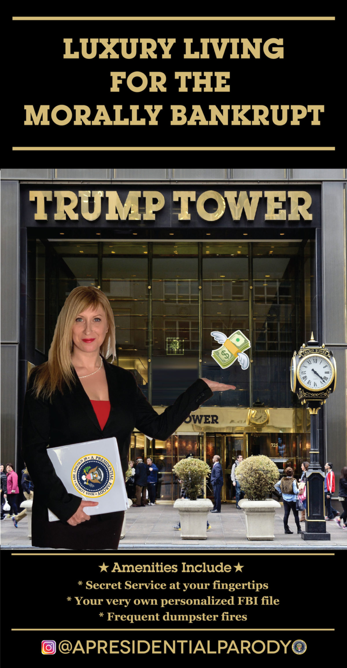
Trump Tower Real Estate by Maia Lorian & Abe Lincoln Jr., 2018
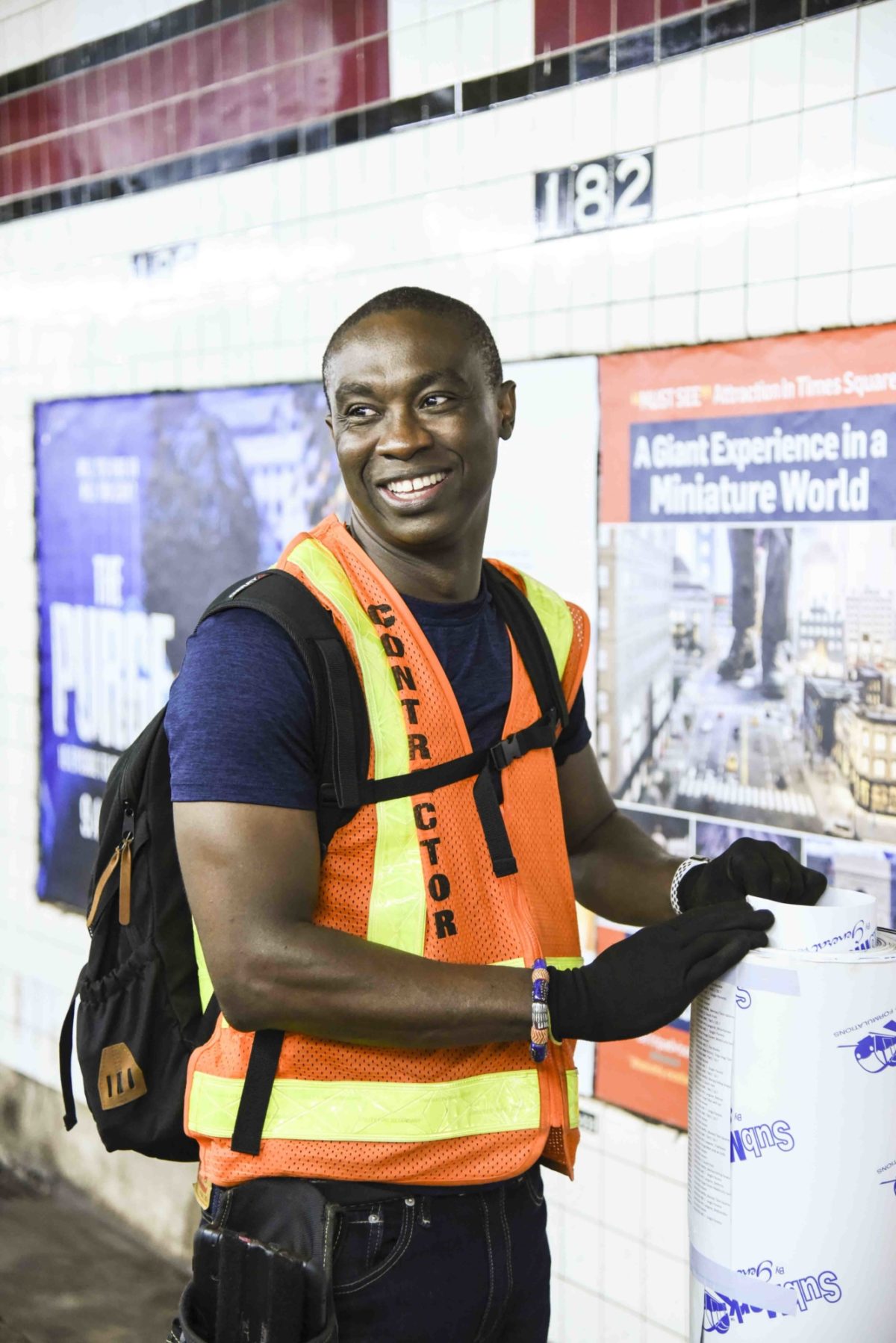
PH: I had the immense privilege of shadowing you guys one night on an installation. There was a moment when as soon as you put up a poster, a guy came by and stood in front of it for a few seconds in order to get a good shot on his phone. Is that sort of immediacy and excitement the norm when you or other artists you know do ad takeovers like this?
AL: I was putting up ad takeovers for over a year before a friend of mine hung out and took pictures of people taking pictures of the work. It had never occurred to me before.
Ad takeovers can run for months (like our posters by Trump International) or for less than a day. They’ll all wind up in the garbage eventually. I love that about them: I put them up and set them free. I don’t normally return to the scene of the intervention to people watch. It was fun to see that dude because it was a second after we put the poster in.
ML: Honestly it was awesome and I had gratitude to see him take the picture, first time witnessing that. I don’t think of the poster’s longevity the way Abe does. I think of the posters as wildfire, and when they’re documented (by strangers on the street), it helps the fire spread. As an actress, unless I’m creating my own work, I have to be cast by others which can limit my creative output. It was a choice to make myself the anti-Trump poster child, and I’m always flattered for being recognized or given accolades for my work, regardless of the medium or platform. I’m truly grateful for every write up, shared photo, or social media post we get. It helps get our message out, a message that was made for the people, so it’s a wonderful feeling to see people notice and appreciate it.
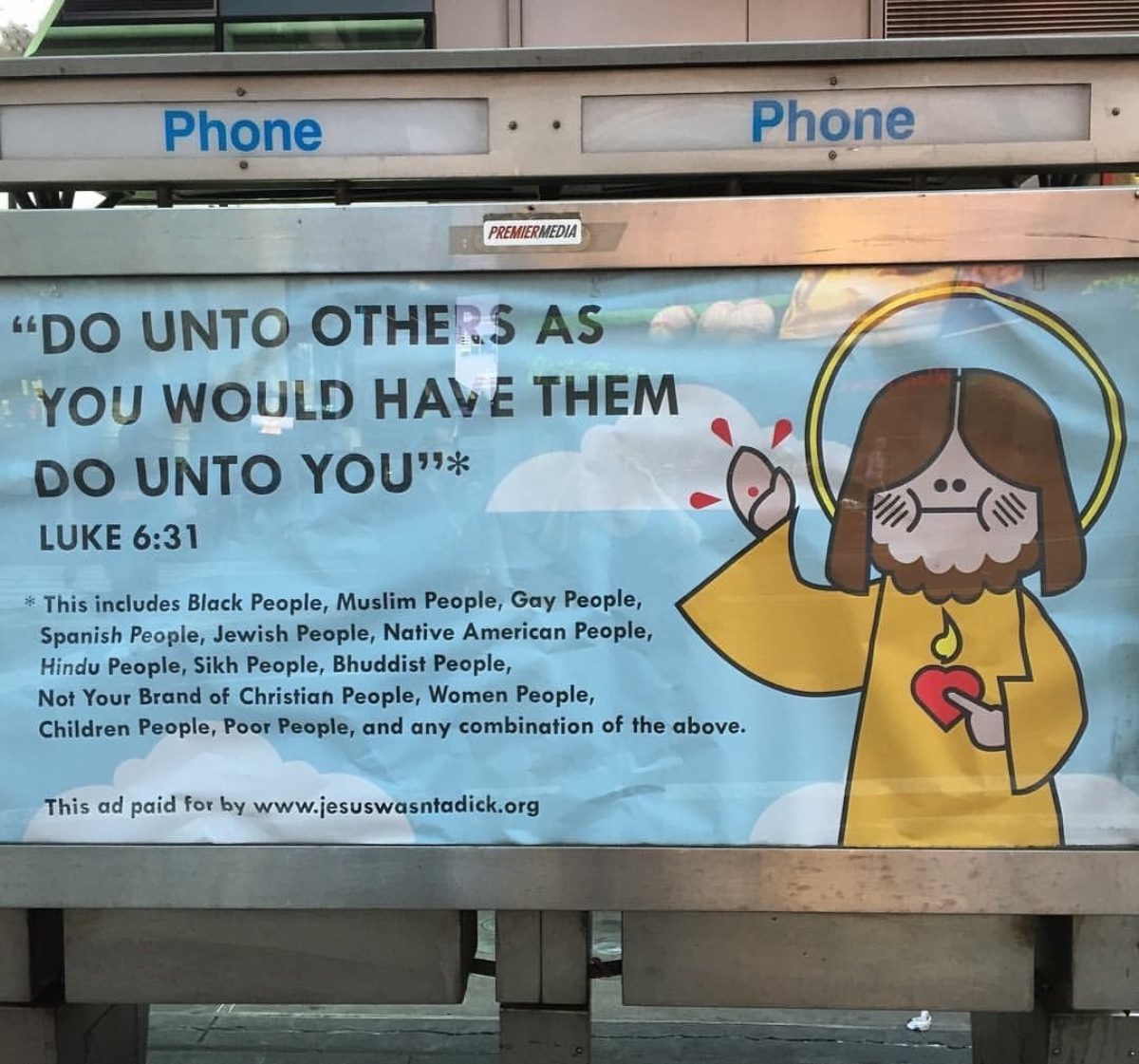
Jesus Wasn’t a Dick by Abe Lincoln Jr., August 2016 (in situ in Times Square)
PH: While I know they exist, I actually haven’t met many other female artists doing ad takeovers right now. Do you feel there is any prejudice or barriers to entry into that part of the street art world that make it more difficult for female-identifying people to participate? Also, feel free to give a shoutout to any female poster artists I should know about.
ML: I feel 100% that there is a prejudice/barrier affecting female-identifying artists across the board, and most of the time I don’t think it’s even intentional. I think it’s a male-dominated field, and for whatever reason (blame it on a lifetime of societal conditioning), it’s very difficult for female-identifying artists to get taken seriously, and can feel like trying to gain entry to a boy’s club. The majority of the time our project would get write-ups, all credit would be given to Abe without mention of my name, despite my face appearing on every poster and also before his name in any written release or caption on our end. My name appearing before his was entirely intentional since we were aware that even though I was the Artistic Director of the project, people would likely want to pigeonhole me into the role of the model and Abe as the director. This wasn’t my first merry-go-round working with a male collaborator where I wasn’t given credit, so we had an idea it might happen. Again, I don’t think my lack of credits were ever malicious (and I still appreciate every write-up). I think people want to advertise what they think sells, and Abe is a veteran male street artist, whereas I’m a new chick on the street art scene. I’m fully aware that many of the write-ups we got were because a man with a name already established in the street art scene was attached to the project. Would the blogs have given us the same attention had only my name been attached? Who knows. I’m still happy we got the press, and I can use my subversive powers through the work and try to make a change. You’re right, there aren’t that many female artists out there doing specifically their own ad take overs, but of the ones that are, I love the work of Tatyana Fazlalizadeh and Jilly Ballistic.
AL: I agree that there’s a boy’s club going on in the art world. The Guerrilla Girls have been championing equal representation for decades. Initially in street art they would have all-women street art shows, but the messaging was sort of “See? Girls can do Street Art too!!!” or “A Sexy Evening of Street Art BY LADIES!” That’s corrected itself a lot, but there’s still a lot of work to do. Strong female voices are often met with criticism or exclusions. Maia has a considerable amount of creativity, originality, and ability to push boundaries in new and interesting ways. She brought a distinct point of view about design and typography that really brought out the personality of the project. Being the veteran, I wasn’t as flexible as I could have been, and if I was getting a little too “mansplainy” she wasn’t afraid to push back and let me know that’s what I was doing. Not only was she right about the decisions (and the mansplaining), it actually changed my perspective and helped me grow in my own creative pursuits.
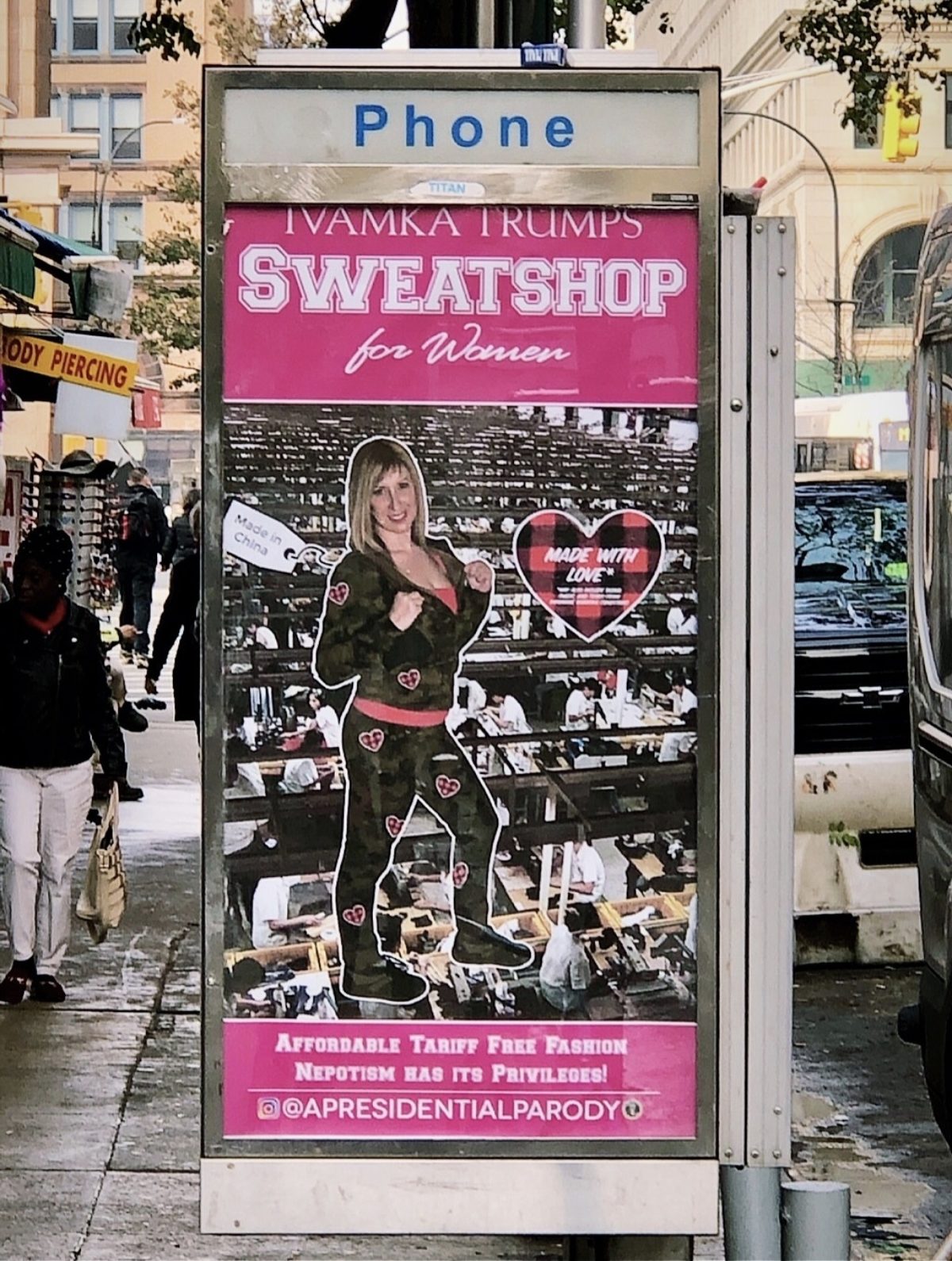
Ivamka Trumps Sweatshop for Women (in situ in the East Village)
PH: I find that when I meet people doing ad takeovers or poster interventions, most of you all know each other. Can you talk about the community of artists doing this right now? Are most of you veteran street artists?
AL: Jordan Selier is sort of The Godfather of NYC ad takeovers, and RJ from @artinadplaces has been involved in street art for a decade, too. Jordan and RJ were super helpful to me when I needed more information on certain arcane ad takeover topics. Initially another ad takeover master (who asked to remain nameless) imparted all the information to me. So there’s this whole community of takeover folks here and in Europe that sort of know each other and swap knowledge, tips, and stories.
PH: Just because the physical process of breaking into a phone booth or kiosk is more labor intensive and obviously can require very specific tools, is the ad takeover space a separate animal from the rest of the street art world?
AL: Fundamentally, it’s the same as street art but we’re crafty and are putting our work in clever places. The phone booth is an outdoor gallery – literally the art sits behind glass and has metal frames. The work is framed like art as opposed to a wall plastered with wheat pastes or a newspaper box covered in stickers.
Personally I like the physical separation that ad takeovers have from the walls of NYC. I feel that most street art in 2019 is pretty banal. There’s a lot of fluff out there and people who might be new to street art are eating it up. I like the fact that generally ad takeovers have a message behind them and that it’s not an endless parade of the same pop culture mashups and celebrity worship. Originally it was a voice of dissent and now a lot of it is just advertising for a new client.
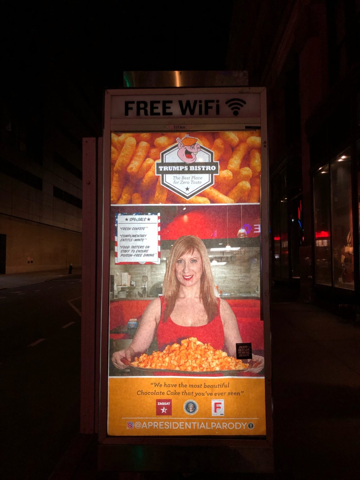
Left: Trumps Bistro (in situ in Union Square)
Right: Miss Oligarchy Pageant (in situ across from the Trump International Hotel)
PH: You mentioned during our night out that different public spaces actually have different laws that affect poster installations. Just because I was so unfamiliar with the fact that getting caught doing something in the subway carried a heavier penalty than doing something to a phone booth on the street, can you briefly go over those differences and what various artists risk depending on where they choose to put up their work?
AL: Well because of the crackdown on graffiti back in the day, if you’re caught with a tagging marker or a spray can, there’s a different set of rules than if you’re caught with wheat pastes or stickers. With wheat pastes and stickers you can theoretically talk your way out of it, but aerosol and markers are a one way ticket. That said I know a ton of people who have been arrested for stickers.
PH: Do you have any poster-related projects that you are working on in the future, both together and separately? What is the next step for A Presidential Parody?
ML: Our next steps for A Presidential Parody is to bring life to our posters, quite literally. Without giving away too much info, we plan to turn the posters into performative installations. We also plan to bring our posters to more cities throughout the country, and keep spreading our message.
AL: I’m starting a new ad takeover campaign that’s the spiritual successor of Resistance Is Female. It’s called #keepfighting. I’m curating artists and designers from around the world to promote progressive causes they’re into using the hashtag #keepfighting.
A Presidential Parody is an ongoing project that will be continuing with a new series of posters and expanding to new cities. I’m also really excited about the performative work. It’s in a space I don’t work in often, and one I’m excited to get into.
The full set of A Presidential Parody is now part of the Poster House permanent collection. You can follow Maia & Abe’s continued poster adventures and projects on Instagram @apresidentialparody. And if you see any of their work in the wild, take a picture and send it our way!
All images c/o the artists

