A Case for Cuomo’s Posters
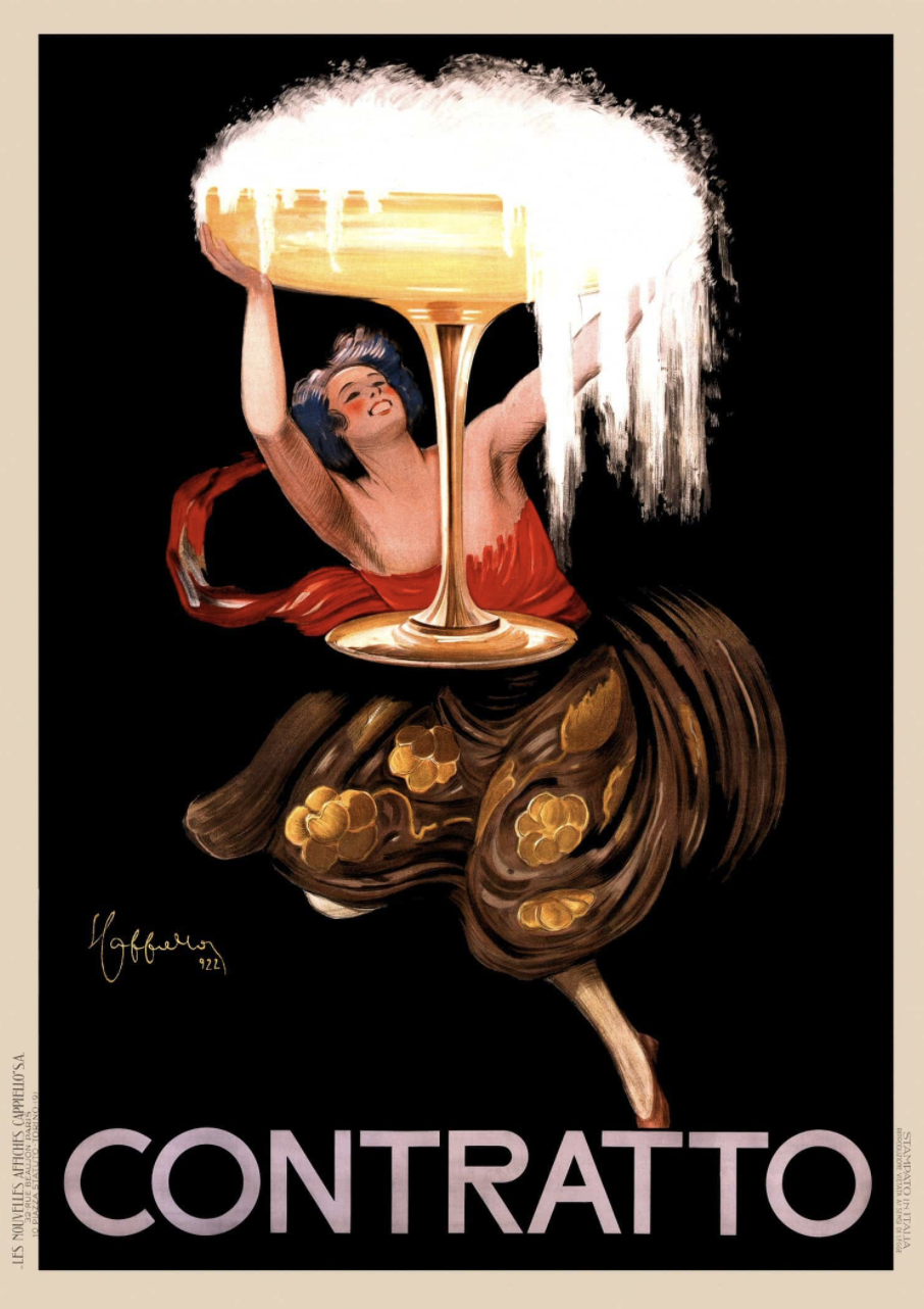
Contratto, Leonetto Cappiello, 1922
Image: RetroGraphik
When we think of classic posters, it’s often with that very French illustrational style in mind—the vintage alcohol ads of the 1890s–1930s that decorate Italian restaurants from coast to coast. And we generally think of that time period, that style, as the “Golden Age” of poster advertising.
I believe that that expectation for posters to look a very specific way has fueled much of the backlash—most of it quite funny—that has been dumped on the most recent of four political posters produced by Governor Andrew Cuomo.
It’s essential to recognize that Cuomo isn’t referencing that “Golden Age” style in his posters, and, as such, that snide criticism he’s received over the design choices is a little unfair. He’s not going for that European look, and I think that’s actually very appropriate. Cuomo is an American governor, and he’s choosing to specifically reference the early American style of poster design, which often gets overshadowed by its European counterparts.
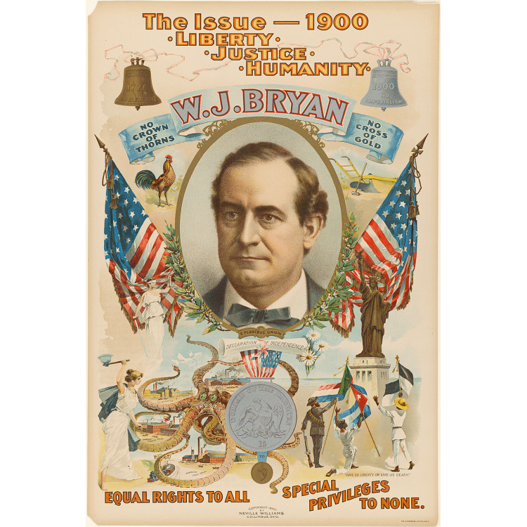
Left: W.J. Bryan, Designer Unknown, 1900
Image: National Portrait Gallery
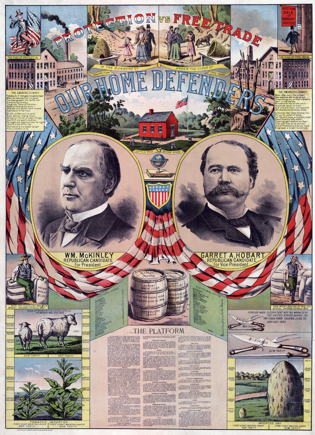
Right: Our Home Defenders, Designer Unknown, 1896
Image: Wikipedia
Generally speaking (and there will always be exceptions to this rule), American presses were smaller than European presses. Our preference for wood type, especially decorative wood type, in the 1800s led to a very specific American look in printing. Images were also typically created through etching or woodblock printing, not lithography (stone lithography wouldn’t be widely used until the 1880s in the United States).
These technological restrictions didn’t allow for that loose, caricature style that would come to dominate Europe, but instead lent itself to a very detailed, very busy compositional structure that relied on elaborate storytelling rather than immediate impact. They were also often accompanied by a lengthy text panel when more information was needed.
The purpose was not to catch someone’s eye for one second as they passed and convince them to buy cigarettes or gloves, but rather to invite a viewer—presumably male and somewhat literate—to stand in front of the image and decipher the various plot lines, promises, goals, even jokes of a given campaign. And yes, there are jokes in many of them!
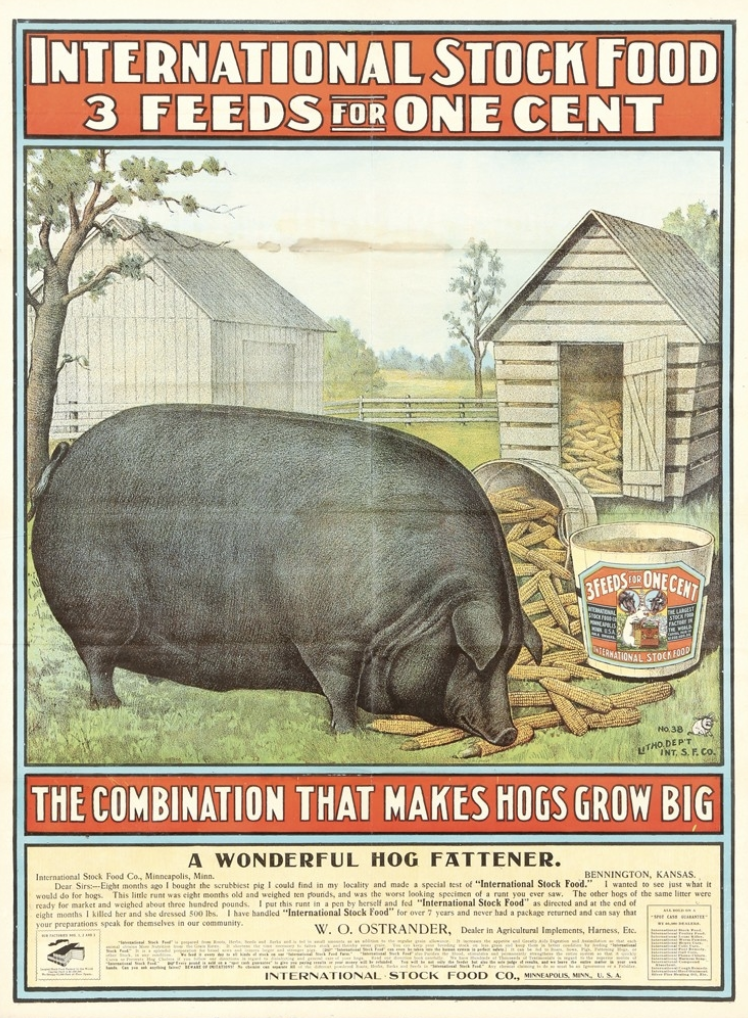
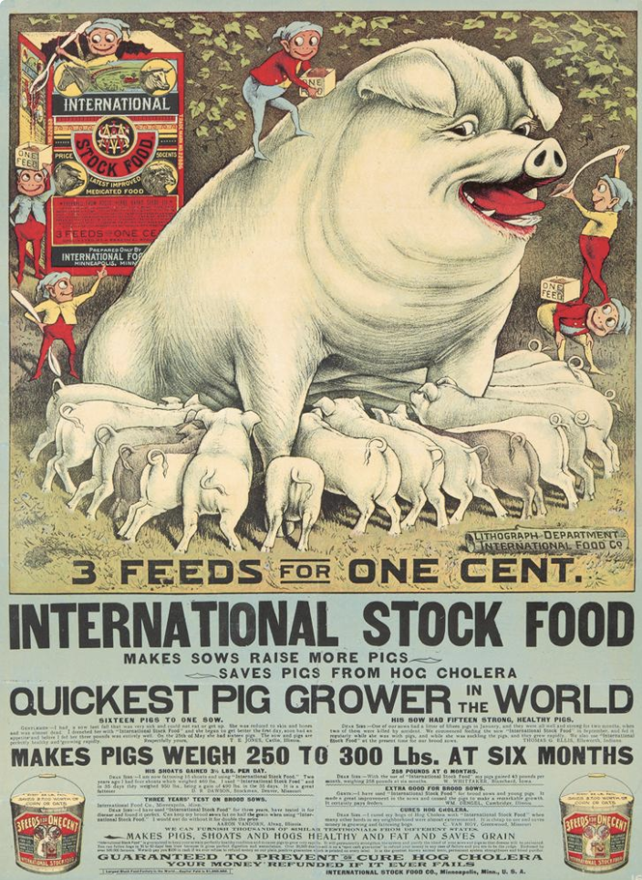
Left: International Stock Food, Designer Unknown, c. 1900
Image: Antique Advertising
Right: International Stock Food, Designer Unknown, c. 1905
Image: Pinterest
This method of elaborate communication wasn’t just for political posters. Other advertising images from that time, usually based on woodcut or etched designs rather than stone lithography, also tried created a narrative of persuasion within a given poster. In both designs above, there are large, central figures as would occur in many European-style posters, but the text is denser, the presentation of imagery more detailed that belies a more authentically American style.
In many instances, I wouldn’t even call some of these early designs posters because they’re really broadsides—a small but important difference when talking about the history of printing.

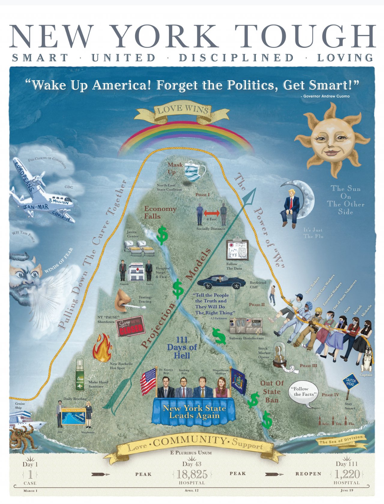
New York Tough, Designer Unknown, 2020
Image: Governor’s Website
So how do we use this knowledge to interpret Cuomo’s latest poster?
Well, whether or not it qualifies as “good design” by contemporary standards, everyone is talking about it, so it’s clearly an effective poster. Sure, if we look at through the “rules” of modern advertising, it’s too convoluted, too dense and non-linear. However, again, I believe Cuomo’s point is to look back at what was considered not just effective but necessary and celebrated within political advertising 150 years ago.
Based on the presence of his Pontiac GTO and his daughter’s boyfriend dangling off a cliff, we also know the visual narrative is a little tongue-in-cheek. So he’s having as much fun creating this design as we are looking at it. Does that narrative make sense to the contemporary viewer? Not necessarily, but that’s only because we aren’t taught to read images that way anymore—we’re used to TV commercials that all sound and look the same regardless of candidate or political party. But, by 1860s standards, this poster and the others he’s created are par for the course.
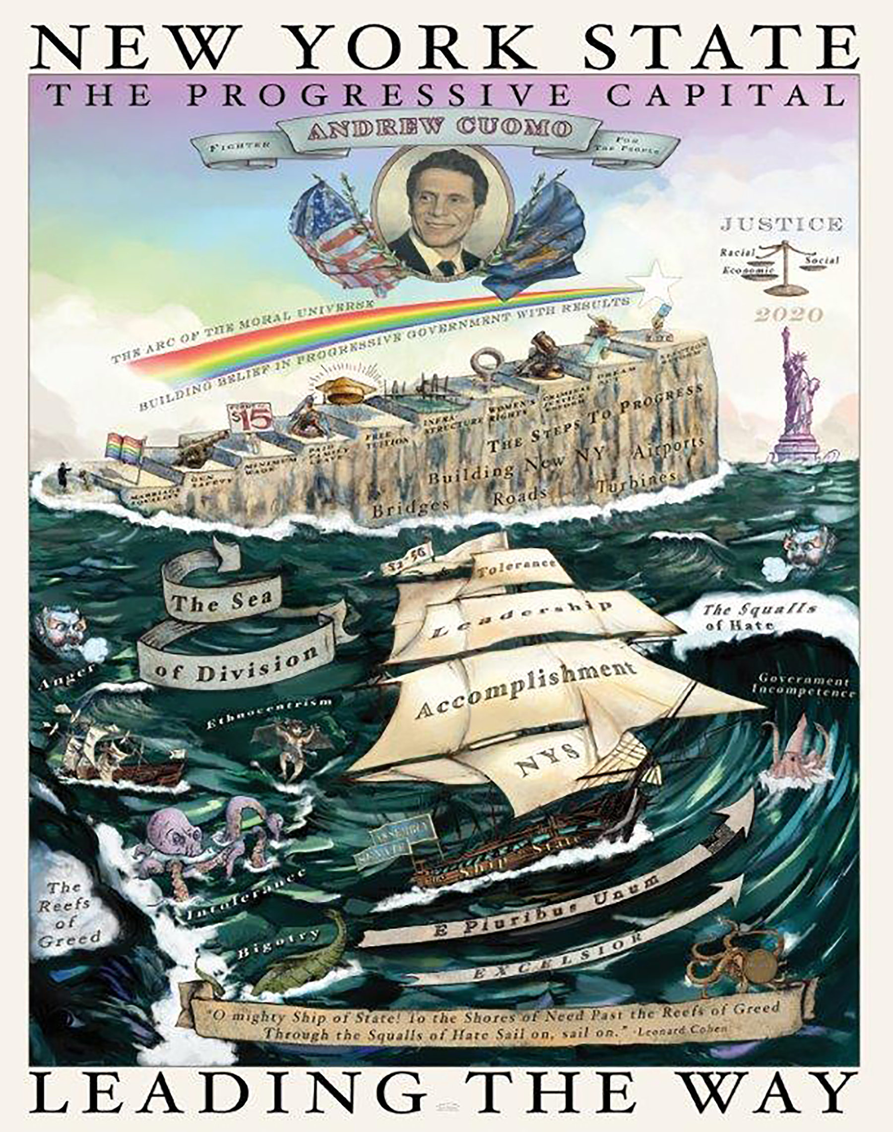
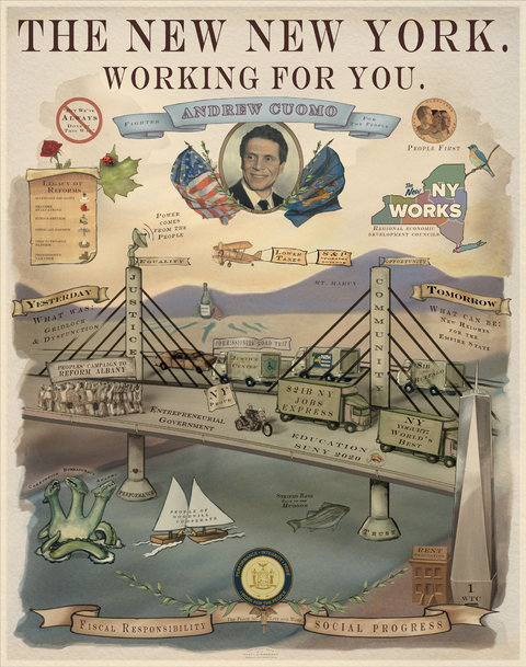
Left: New York State: Leading the Way, Rusty Zimmerman, 2020
Image: Twitter
Right: The New New York, Rusty Zimmerman, 2012
Image: Twitter
All that these posters prove to me is that Andrew Cuomo is a giant poster history nerd, and I certainly can’t be mad about that. Yes, it’s a lot of fun to break them down and marvel at his obsession with an antiquated form of communication—but there’s also a lot to learn from them as contemporary interpretations of what was once a necessary avenue for candidates and governments to persuade their audience.

